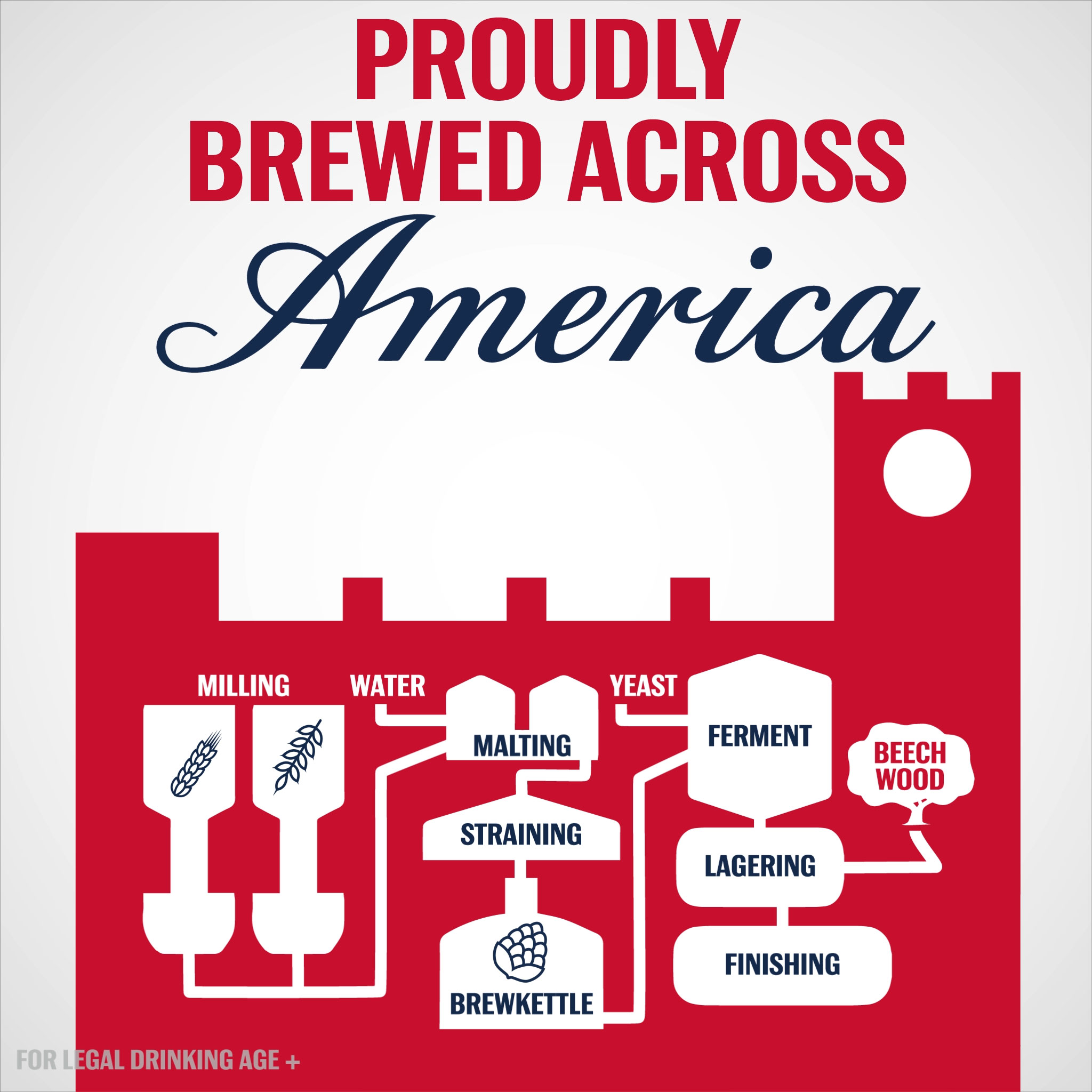
Looping infographic animation commissioned by Weber Shandwick for Budweiser’s 2017 summer campaign.
Read more
July 18, 2017 — Comments are off for this post.
Brewed Across America
March 15, 2017 — Comments are off for this post.
Seeking Minard
After examining the history of data visualization greats I have decided to collect my learnings in the style of history’s data visualization greats. The fifth of these visual summaries is presented and discussed below. You can explore the entire series here.
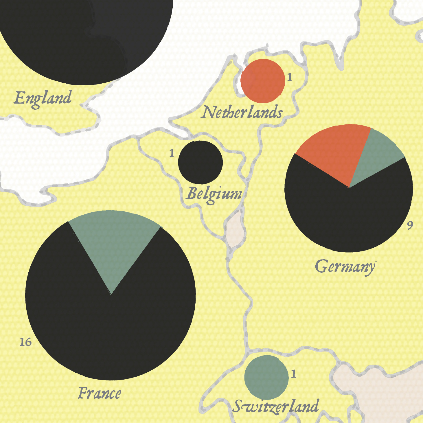
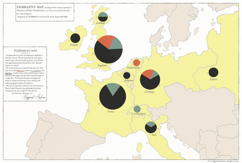
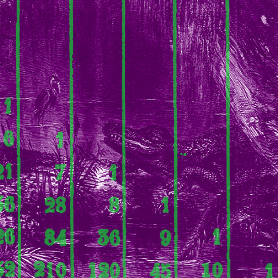
The large thematic map above shows the home country of 300 years worth of European data visualization pioneers, in the style of Charles Joseph Minard's 1858 quantités de viande examination of the supply of meat to Paris - the first work to size pie chart bubbles and place them on a map. I have so much to get to about Minard beyond this little map Read more
January 24, 2017 — Comments are off for this post.
Out of the Swamp
After examining the history of data visualization greats I have decided to collect my learnings in the style of history’s data visualization greats. The fourth of these visual summaries is presented and discussed below. You can explore the entire series here.
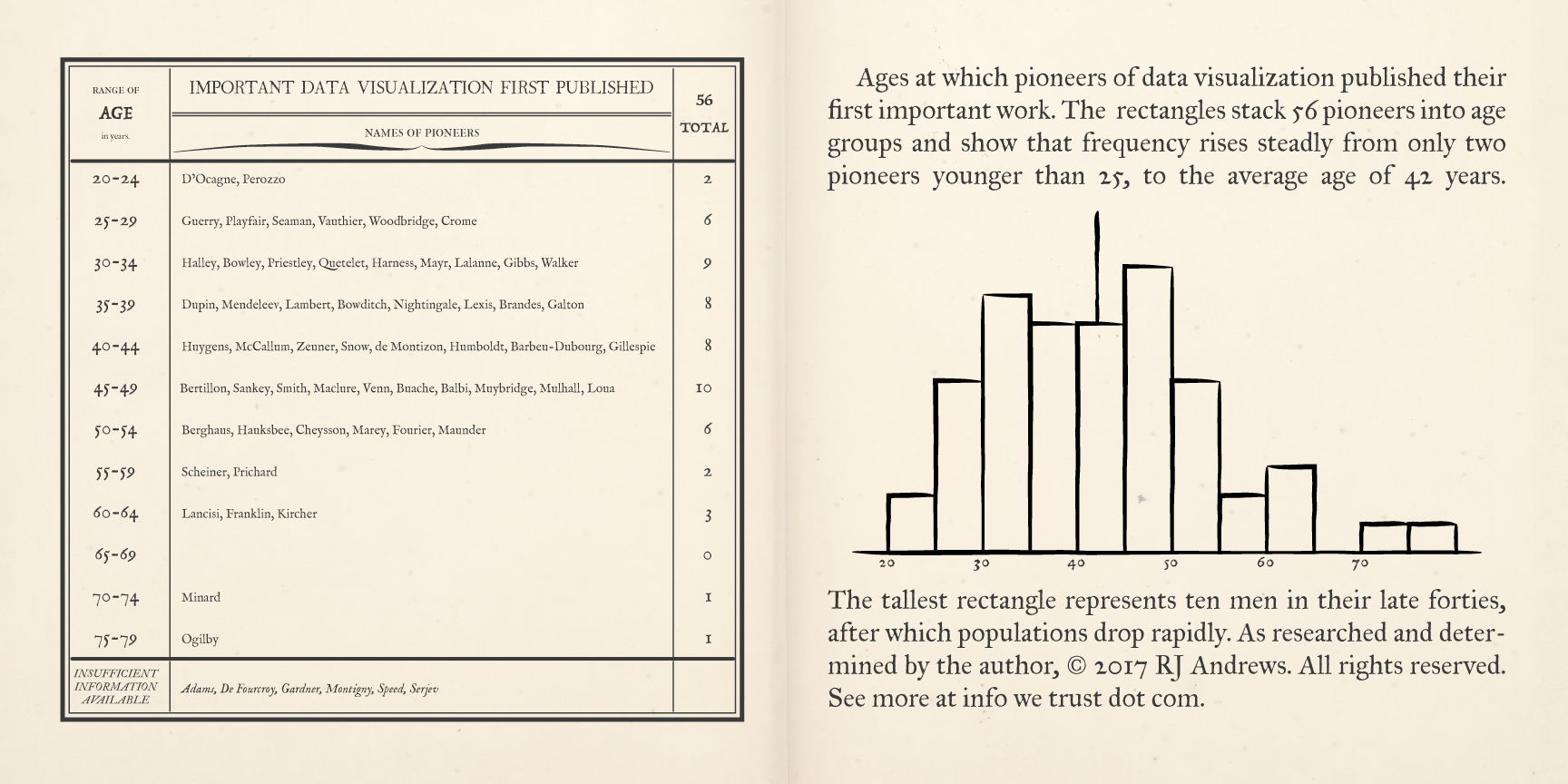
A pair of pages describe early data visualization pioneers, binned by the age at which they first published a significant chart, Read more
January 9, 2017 — Comments are off for this post.
History of Infographics
Explore the History of Infographics Interactive
The below work was translated to an interactive experience which you can enjoy by clicking the link above.
January 2017 Static Poster Design Essay
After examining the history of data visualization greats I have decided to collect my learnings in the style of history’s data visualization greats. The first of these visual summaries is presented and discussed below. You can explore the entire series here.
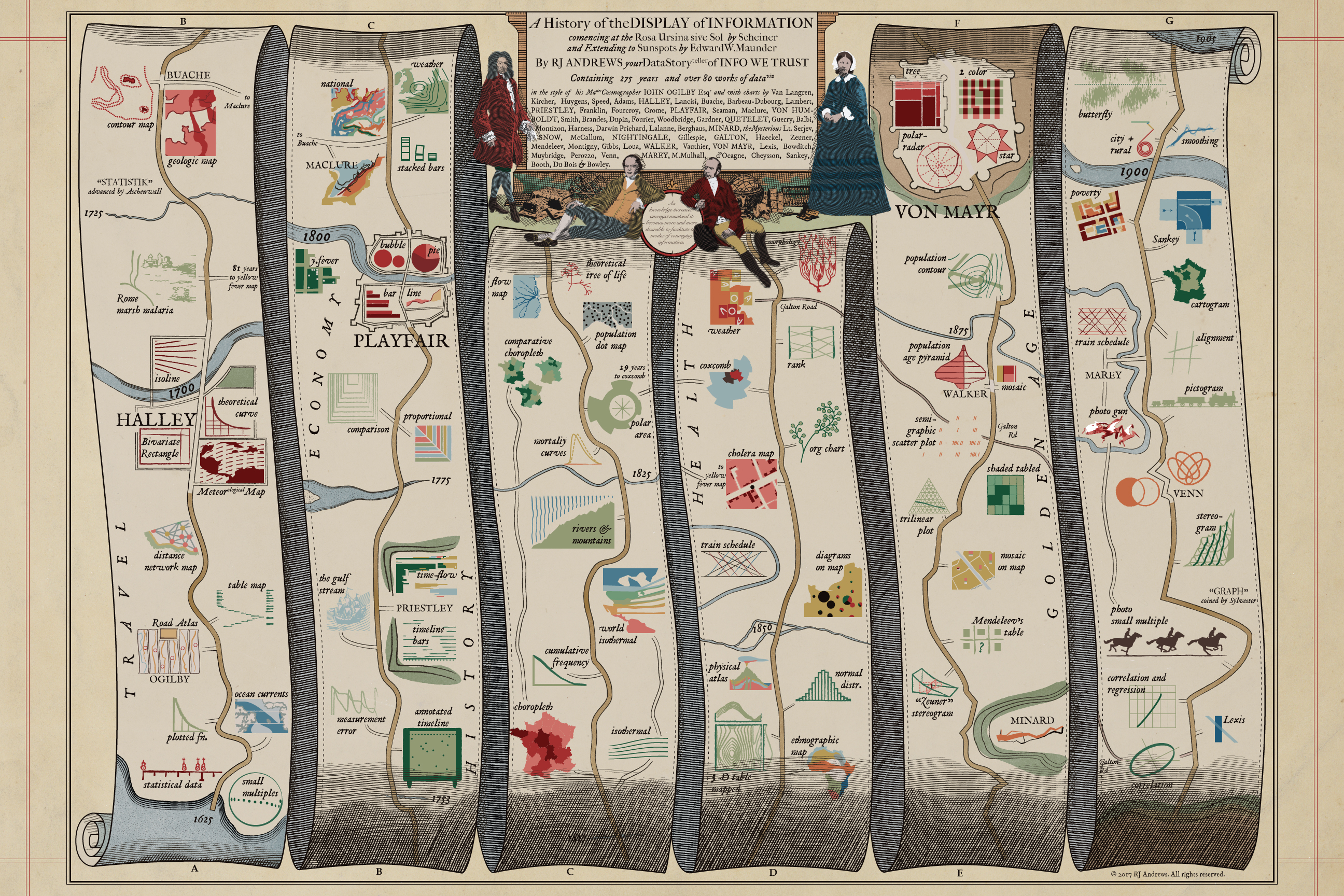
A map to guide you through the early developments of data visualization, including cartoons of 84 key charts, in the style of John Ogilby's 1675 Road Atlas. This image is sized for web-consumption and is only a fraction of the actual piece which can be properly enjoyed via:
ACCESS BIG 31mb JPG HERE
August 18, 2016 — Comments are off for this post.
Profiling the Parks
August 17, 2015 — Comments are off for this post.
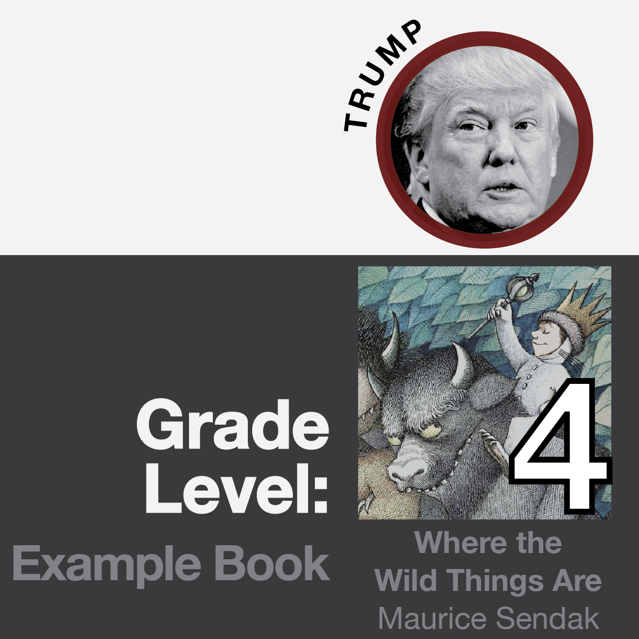
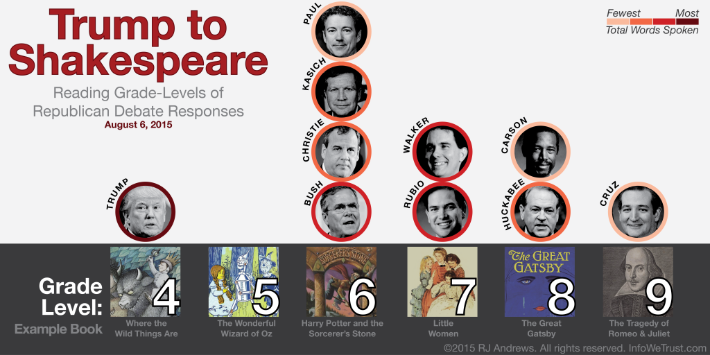
Trump to Shakespeare
Inspiration
I absolutely love Matt Daniels' award-winning Longest Vocabulary in Hip Hop and have thought about language analysis projects ever since. I thought the Republican debate might be a fun arena to Read more
July 28, 2015 — Comments are off for this post.
Board Member Overlap
The CEO of Disney is on the board of Apple, whose CEO is on the board of Nike, which has a board member on Disney... which all got me thinking: how many powerful companies are connected via their board of directors?:
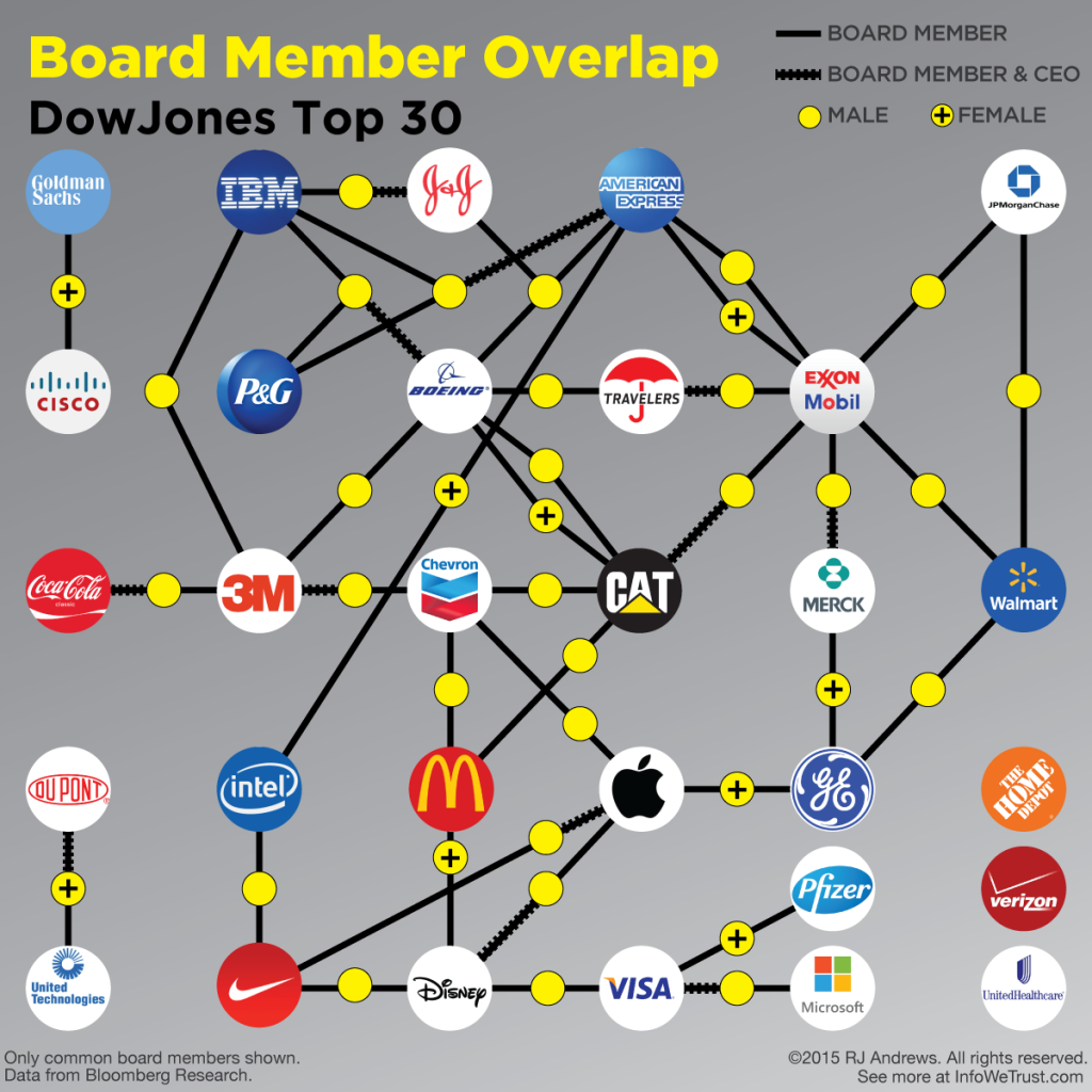
Are you surprised how well networked most of the boards of DowJones top 30 companies are... or surprised that not all 30 companies are connected? I find it fascinating that several people serve on the boards of not two, but THREE of the most powerful companies in the world. Read more
May 12, 2015 — Comments are off for this post.
Endangered Safari
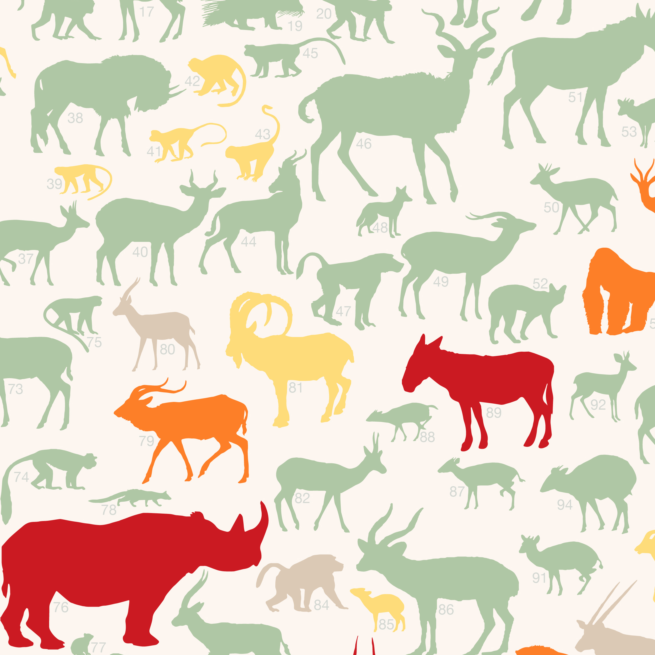
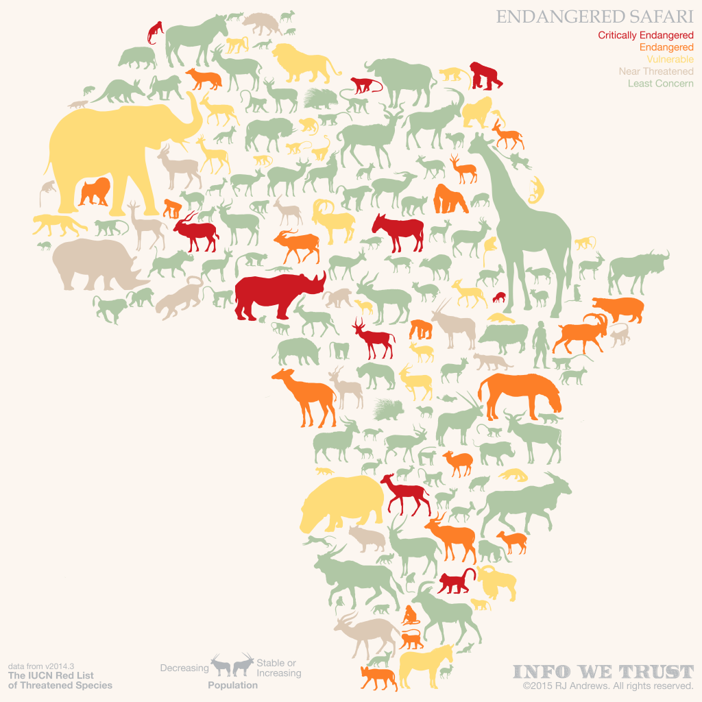
The ENDANGERED SAFARI project contains all of the large African mammals along with juicy info like animal size, family, population trend, range, and IUCN threatened species status. The static version, above, is an artsy layout that makes a great print, but to really dig into the data, including individual animal range maps, you will have to jump on a computer (it's not built for mobile) and play with the interactive below by hovering over each Read more
February 23, 2015 — Comments are off for this post.
BLOOM
one year in a Virginia garden
March 26, 2014 — Comments are off for this post.
Creative Routines
If you like Creative Routines you will love Info We Trust—the book!
"We all have the same 24 hours that Beyoncé has" and its various iterations took the web by storm in late 2013 as the megastar became the figurehead of not only having it all, but being able to somehow do it all too.
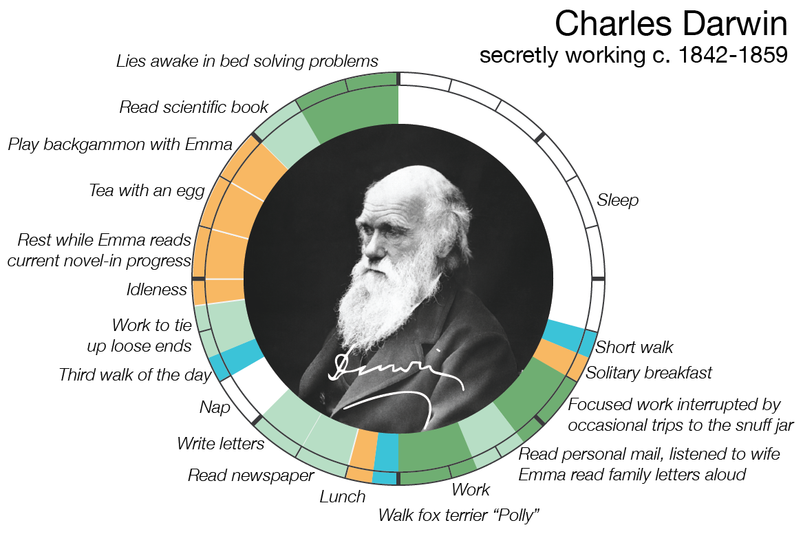
How do creatives - composers, painters, writers, scientists, philosophers - find the time to produce their opus? Mason Currey investigated the rigid Daily Rituals that hundreds of creatives practiced in order to carve out time, every day, to work their Read more
