Looping infographic animation commissioned by Weber Shandwick for Budweiser’s 2017 summer campaign.
Read more

July 18, 2017 — Comments are off for this post.
Brewed Across America
March 15, 2017 — Comments are off for this post.
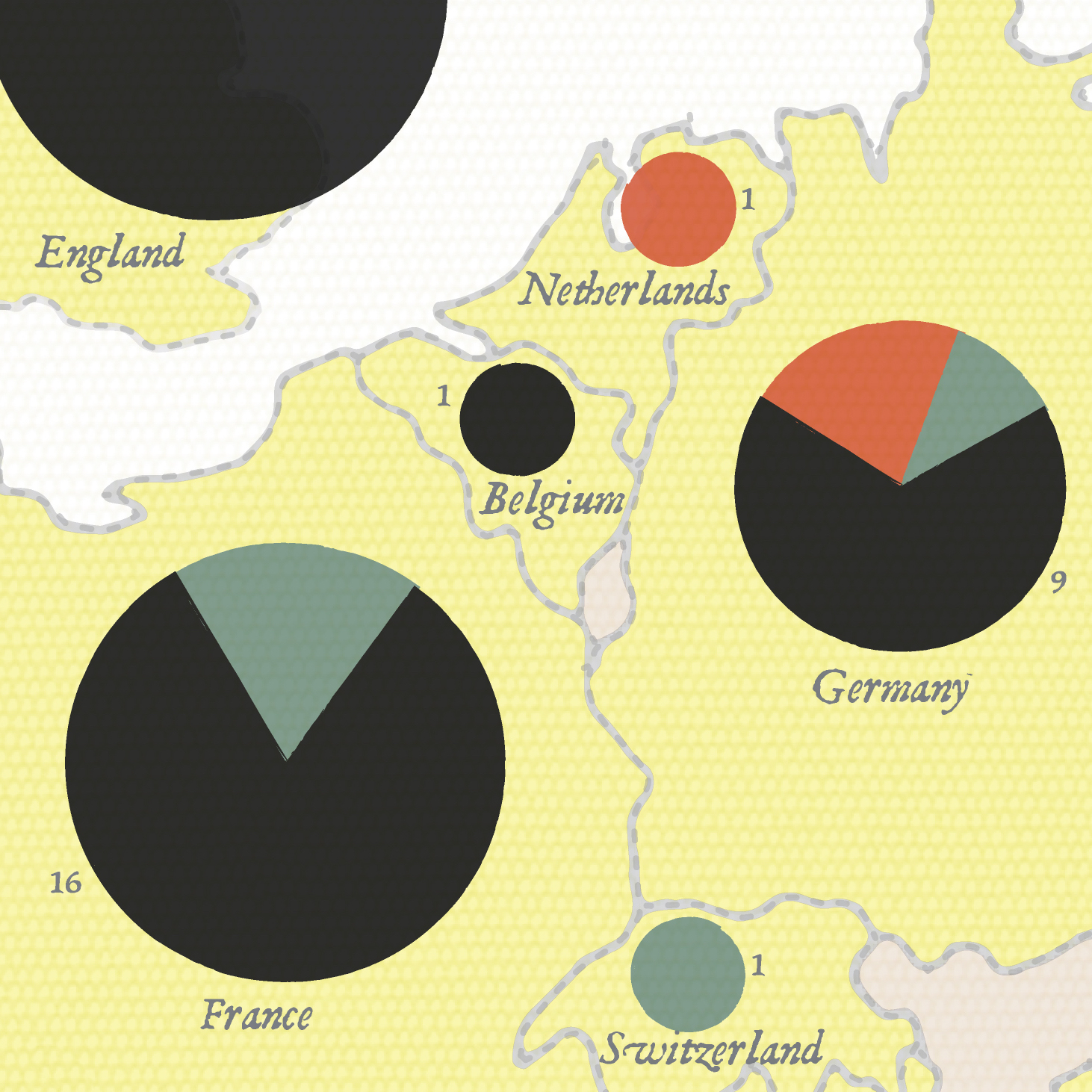
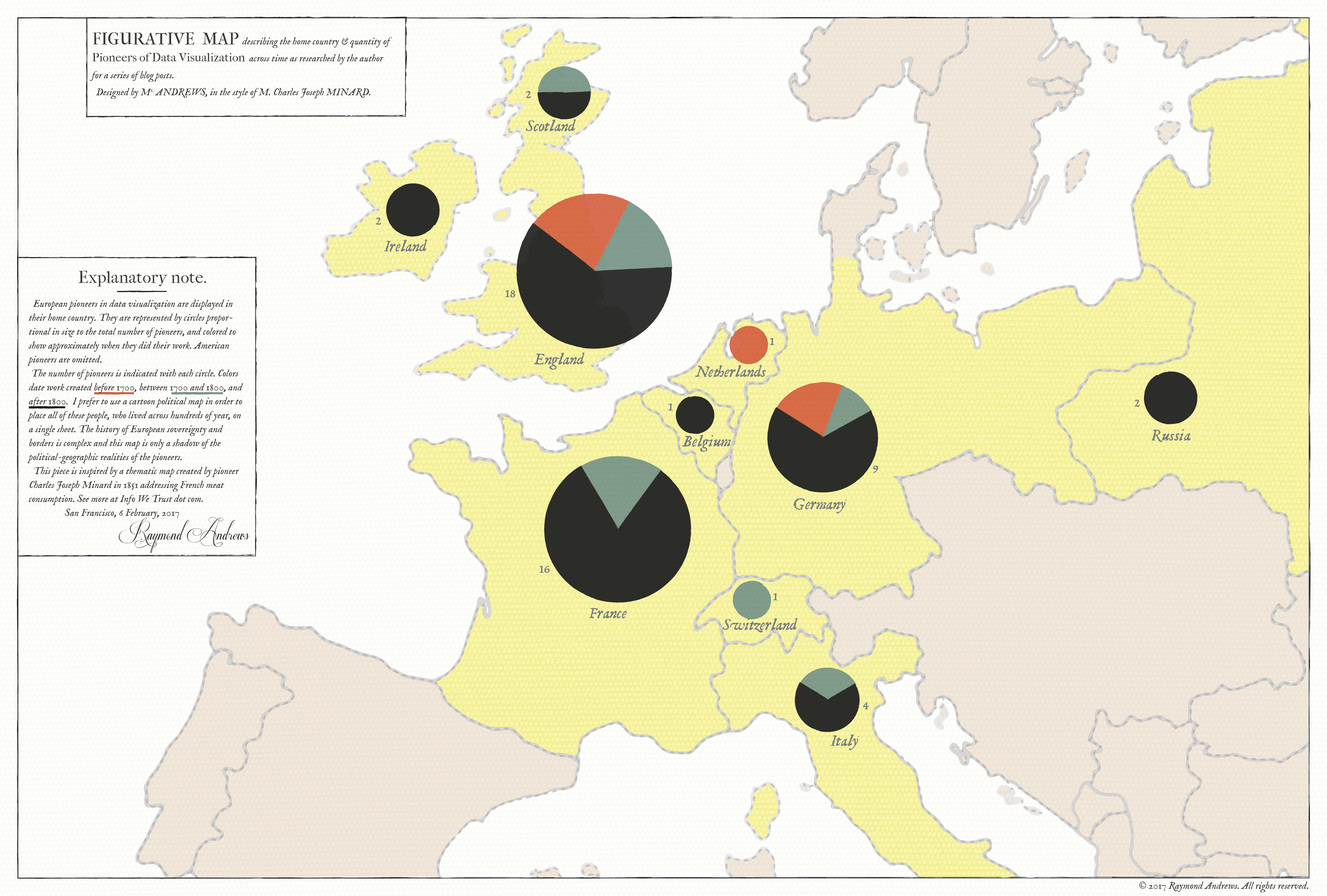
Seeking Minard
After examining the history of data visualization greats I have decided to collect my learnings in the style of history’s data visualization greats. The fifth of these visual summaries is presented and discussed below. You can explore the entire series here.
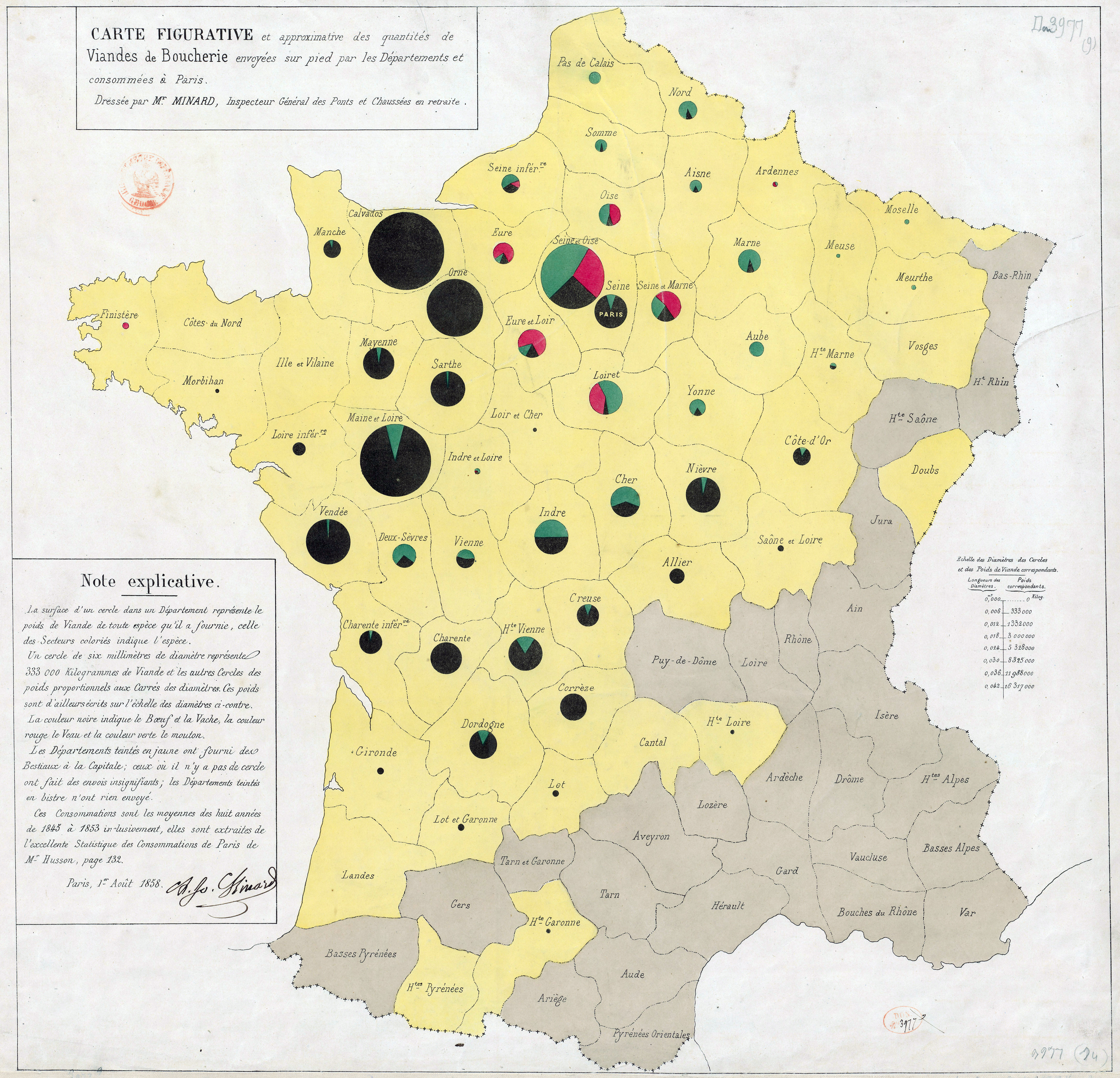
Minard. Carte des quantités de viande. 1858.
The large thematic map above shows the home country of 300 years worth of European data visualization pioneers, in the style of Charles Joseph Minard's 1858 quantités de viande examination of the supply of meat to Paris - the first work to size pie chart bubbles and place them on a map. I have so much to get to about Minard beyond this little map Read more
Published by RJ Andrews in GIF
January 24, 2017 — Comments are off for this post.
Out of the Swamp
After examining the history of data visualization greats I have decided to collect my learnings in the style of history’s data visualization greats. The fourth of these visual summaries is presented and discussed below. You can explore the entire series here.
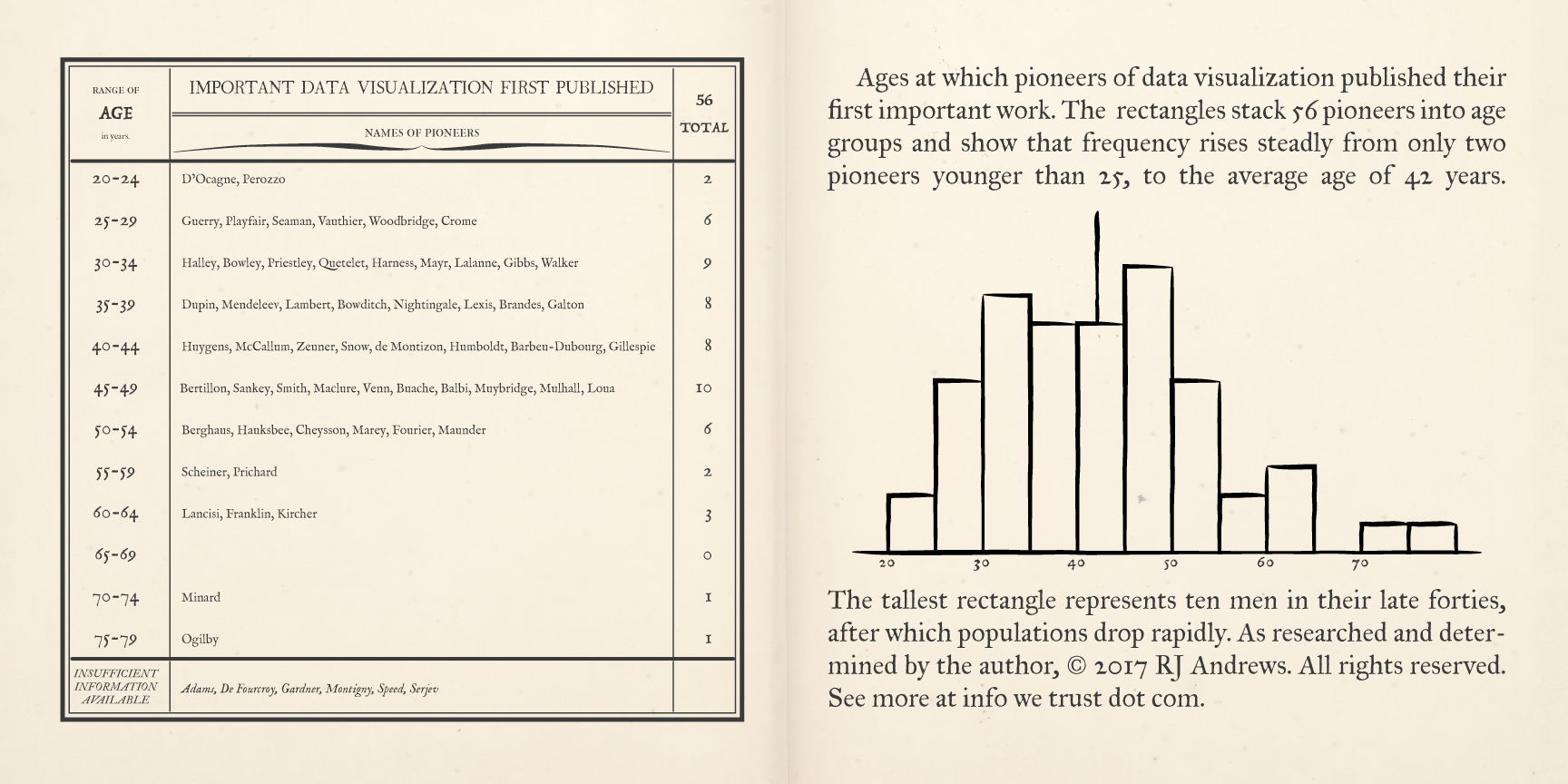
A pair of pages describe early data visualization pioneers, binned by the age at which they first published a significant chart, Read more
Published by RJ Andrews in GIF
January 19, 2017 — Comments are off for this post.
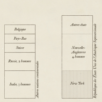
Population Cosmos
After examining the history of data visualization greats I have decided to collect my learnings in the style of history’s data visualization greats. The third of these visual summaries is presented and discussed below. You can explore the entire series here.
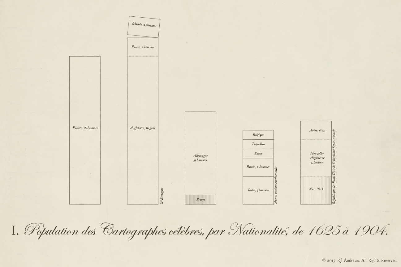
Stacked bars allow comparison across nations of the total number of early data visualization pioneers, Read more
Published by RJ Andrews in GIF
January 12, 2017 — Comments are off for this post.
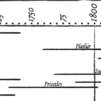
Chart-maker Biography
After examining the history of data visualization greats I have decided to collect my learnings in the style of history’s data visualization greats. The second of these visual summaries is presented and discussed below. You can explore the entire series here.
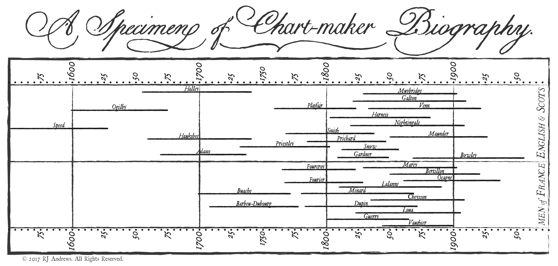
Timeline bars to show you the lives Read more
Published by RJ Andrews in GIF
December 31, 2013 — Comments are off for this post.
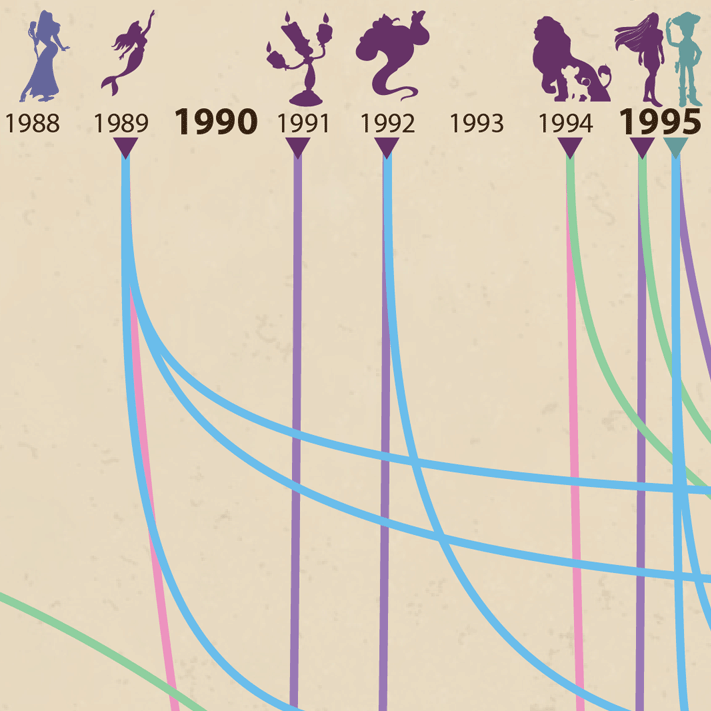
Disney Characters
Steve Jobs counseled Disney CEO Bob Iger to think in terms of brand deposits and brand withdrawals. Since 1937's Snow White, enduring film characters have been Disney's biggest brand deposits, and their success is most fantastically expressed with a dedicated theme park attraction in Florida at Walt Disney World. Track our favorite magic-maker's Characters by the Numbers:

click for a higher resolution version
Story Points
Several plot points about Disney's evolution can be inferred from Read more
Published by RJ Andrews in GIF

Info We Trust and Visionary Press are DBAs of Information Productions LLC, San Francisco.
Info We Trust ® is a registered service mark. © 2013–2026 RJ Andrews.