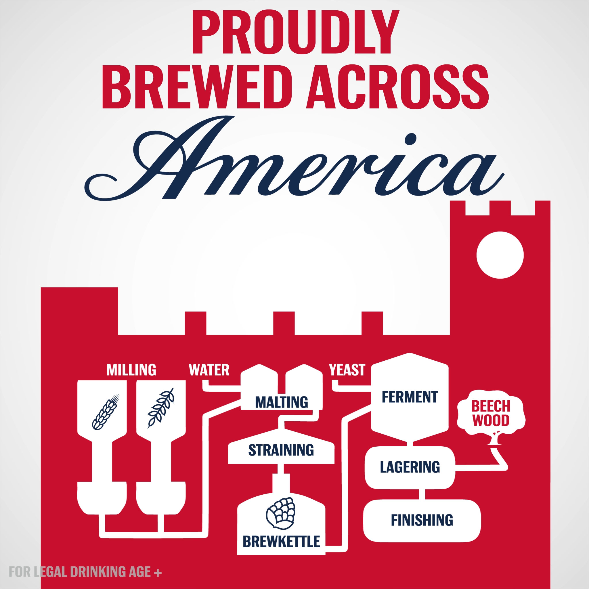
Looping infographic animation commissioned by Weber Shandwick for Budweiser’s 2017 summer campaign.
Read more
July 18, 2017 — Comments are off for this post.
Brewed Across America
January 24, 2017 — Comments are off for this post.
Out of the Swamp
After examining the history of data visualization greats I have decided to collect my learnings in the style of history’s data visualization greats. The fourth of these visual summaries is presented and discussed below. You can explore the entire series here.
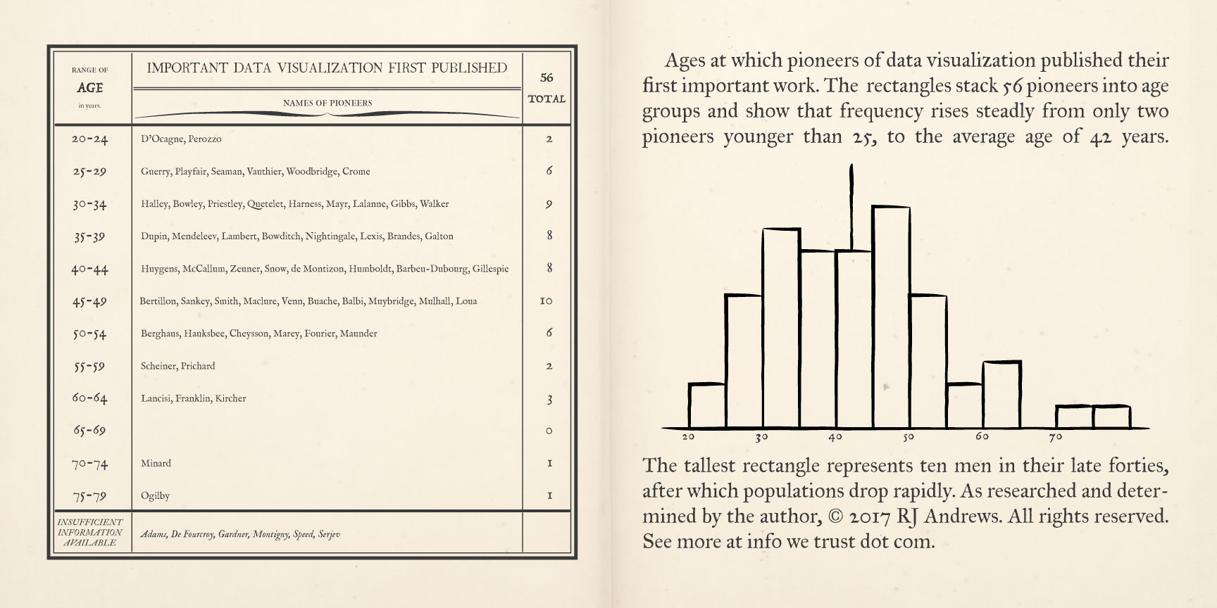
A pair of pages describe early data visualization pioneers, binned by the age at which they first published a significant chart, Read more
Published by RJ Andrews in GIF
January 19, 2017 — Comments are off for this post.
Population Cosmos
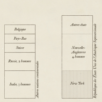
After examining the history of data visualization greats I have decided to collect my learnings in the style of history’s data visualization greats. The third of these visual summaries is presented and discussed below. You can explore the entire series here.
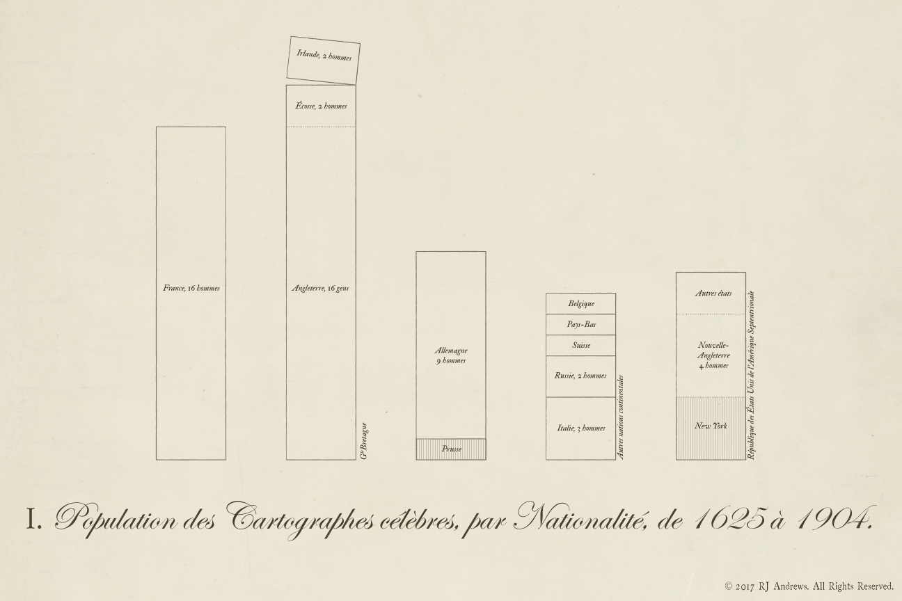
Stacked bars allow comparison across nations of the total number of early data visualization pioneers, Read more
Published by RJ Andrews in GIF
January 12, 2017 — Comments are off for this post.
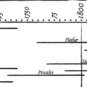
Chart-maker Biography
After examining the history of data visualization greats I have decided to collect my learnings in the style of history’s data visualization greats. The second of these visual summaries is presented and discussed below. You can explore the entire series here.
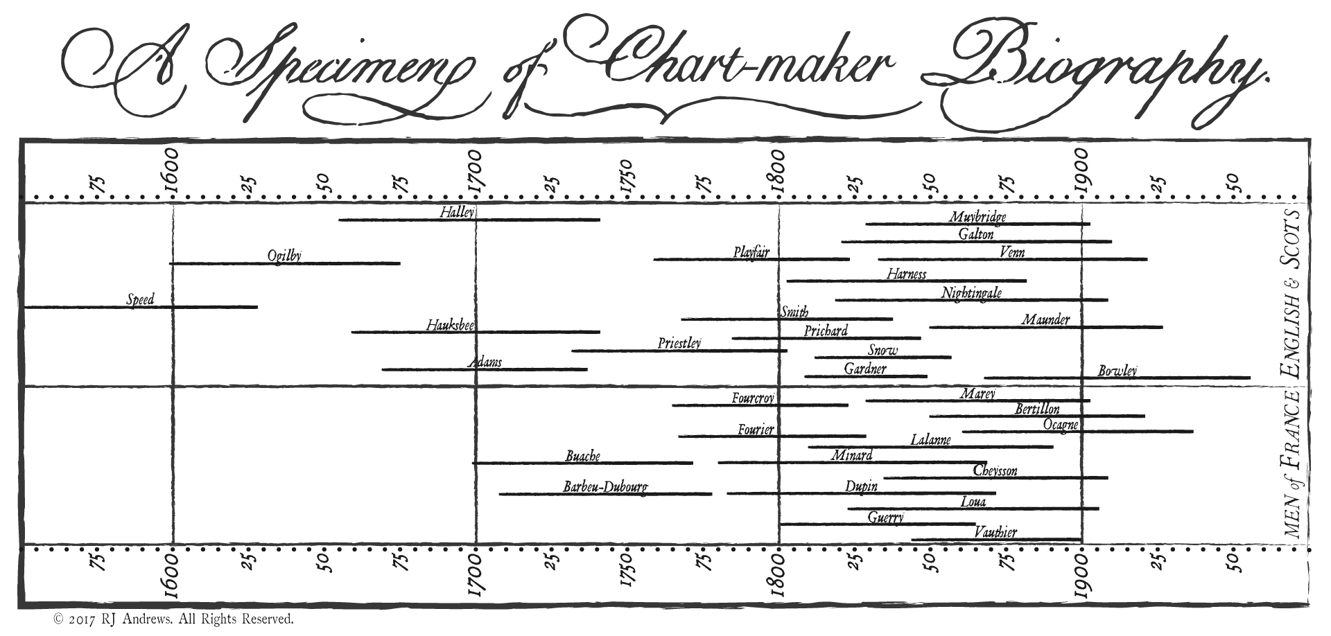
Timeline bars to show you the lives Read more
Published by RJ Andrews in GIF
January 9, 2017 — Comments are off for this post.
History of Infographics
Explore the History of Infographics Interactive
The below work was translated to an interactive experience which you can enjoy by clicking the link above.
January 2017 Static Poster Design Essay
After examining the history of data visualization greats I have decided to collect my learnings in the style of history’s data visualization greats. The first of these visual summaries is presented and discussed below. You can explore the entire series here.
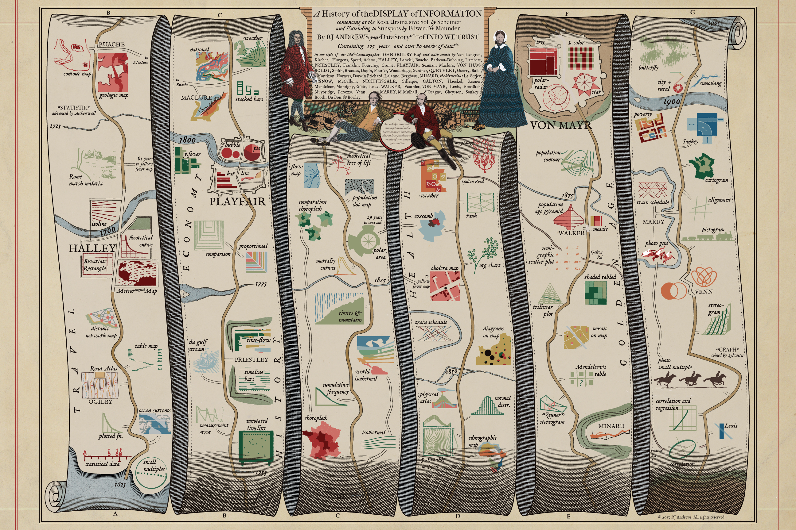
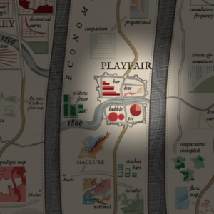
A map to guide you through the early developments of data visualization, including cartoons of 84 key charts, in the style of John Ogilby's 1675 Road Atlas. This image is sized for web-consumption and is only a fraction of the actual piece which can be properly enjoyed via:
ACCESS BIG 31mb JPG HERE
Published by RJ Andrews in GIF
October 19, 2015 — Comments are off for this post.
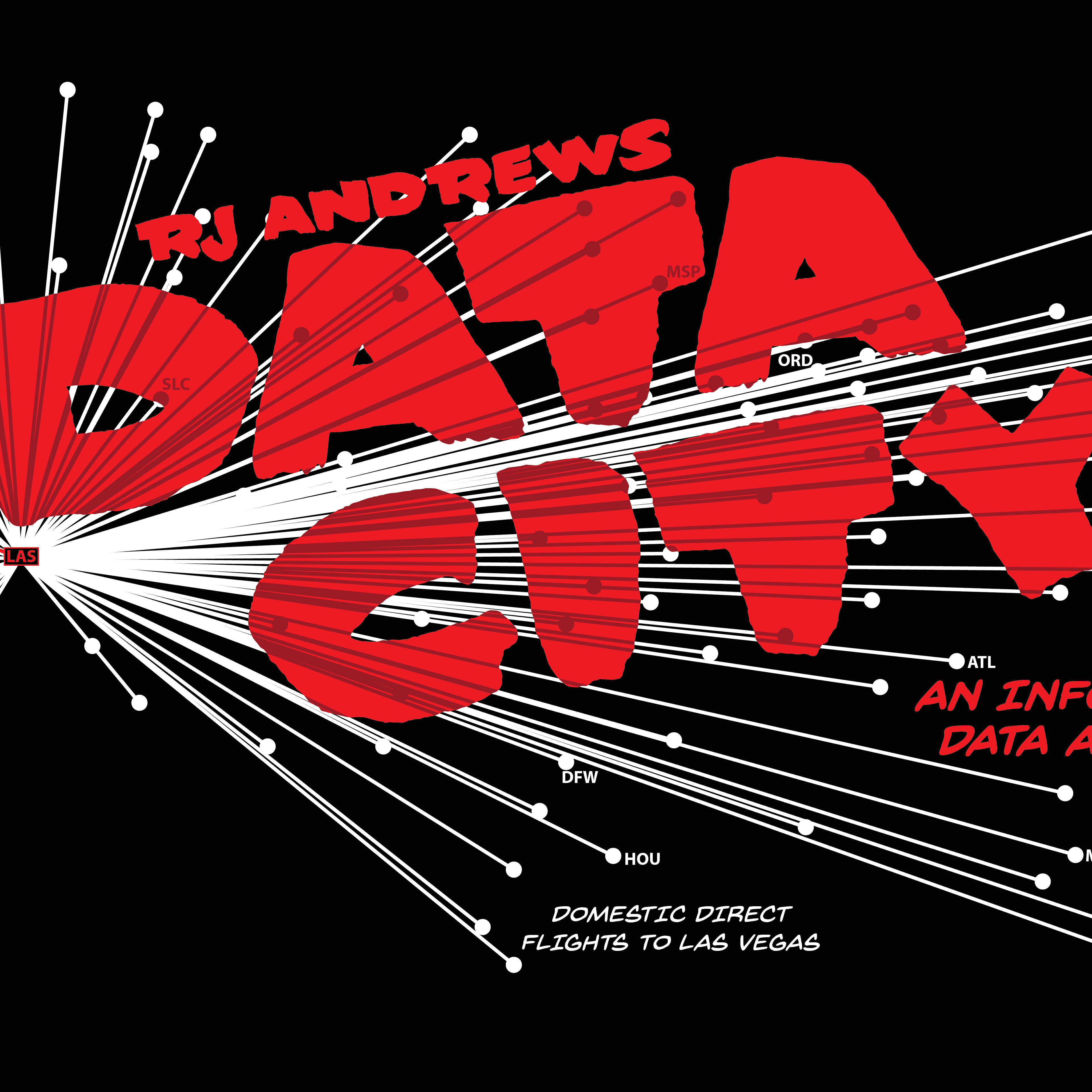
Data City
Data storytelling and the graphic novel are smashed together in one adventure through the numbers behind the city built on numbers: Las Vegas, Nevada. Explore the underside of tourism, gambling, and entertainment as we move through one exciting evening on the Strip.

Alternatively, you can click through the gallery below: Read more
Published by RJ Andrews in GIF
January 25, 2014 — Comments are off for this post.
Stacking Up Best Pictures
Nine films are in the running to win best picture at the 86th Academy Awards - and they could be compared in many ways. They all feature incredible stories, great acting, and, well, it gets pretty subjective very fast.
Let us let the masses duke it out: here are the the nine nominees for best picture with their Tomatometer scores (both all critics and audience), box office gross as of mid-January, and their total number of nominations.

The gaps between the critics and the rest of us is pretty interesting. Some films (Dallas Buyers Club, Captain Phillips) have Read more
Published by RJ Andrews in GIF

Info We Trust and Visionary Press are DBAs of Information Productions LLC, San Francisco.
Info We Trust ® is a registered service mark. © 2013–2026 RJ Andrews.