November 14, 2018Comments are off for this post.

Modern Classics

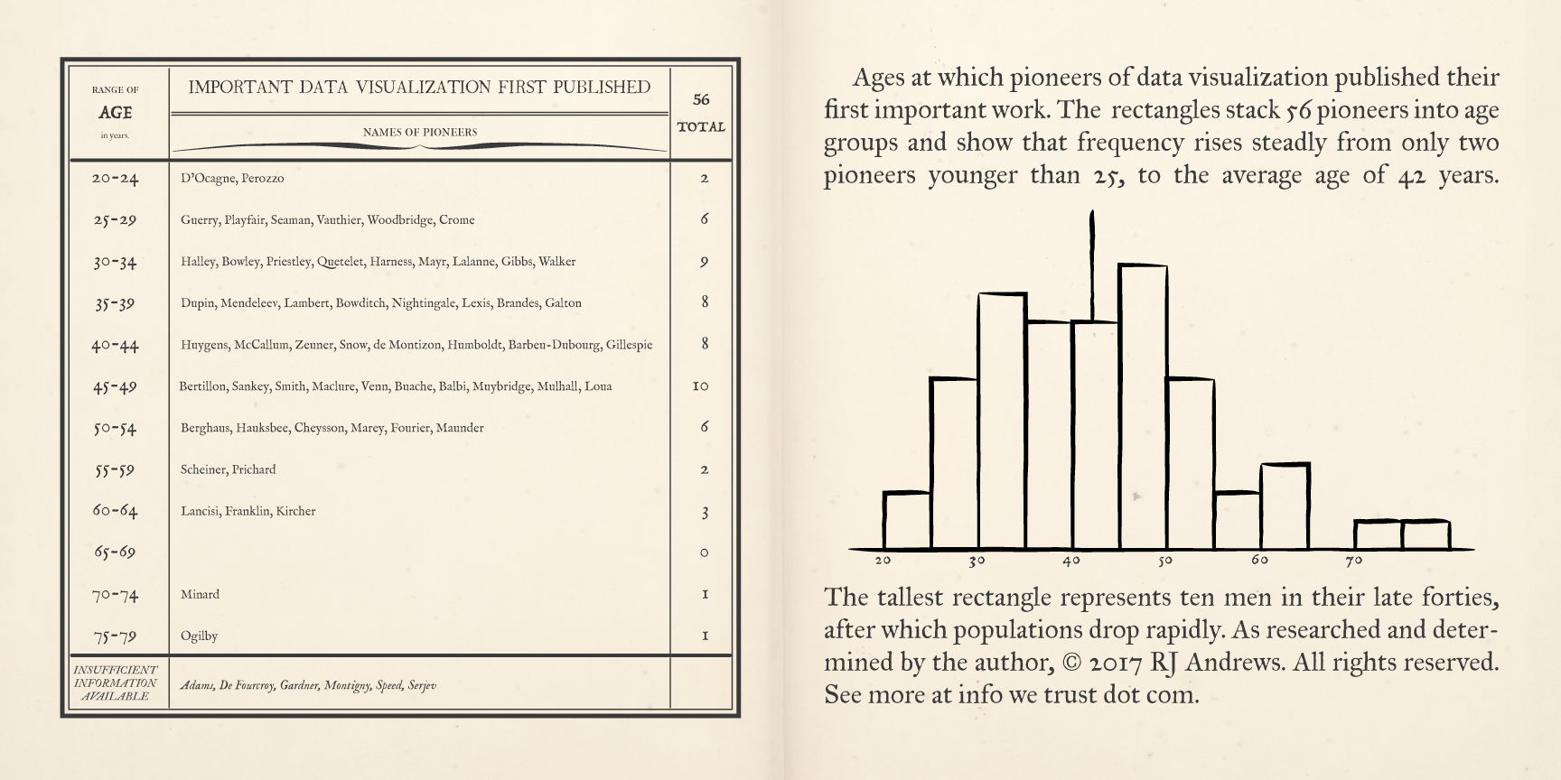
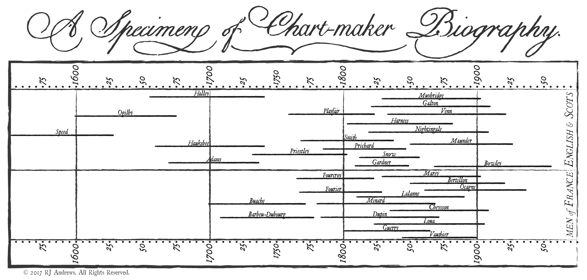
Today I want to share with you a set of data visualization books that are modern classics. Each one was published by 1985. Each one had an impact on my book, Info We Trust.

I read these books to discover what still rang true from the time just before interactive computer graphics made a big splash. My hunch was: if it was true then and still resonates with my own experience as a data storyteller today, then it has a good shot at being timeless. The enduring principles learned while informing past generations can guide us today. These are the books, by legendary authors, that most informed the skeleton of my own narrative adventure.

Read more

November 7, 2018Comments are off for this post.

Info We Trust (the book!)

I am so excited to share my most ambitious data adventure yet. It is called INFO WE TRUST: How to inspire the world with data. And it is published by Wiley.

Read more

November 7, 2017Comments are off for this post.

Picturing the Great Migration

This design essay is about the creation of two graphics for a SIGNIFICANCE magazine cover article. You can read the original article here and get lost in giant versions of both graphics here.

The Great Migration was the movement of over six million African-Americans out of the rural Southern United States to the urban Northeast, Midwest and West — possibly the largest peacetime migration in history. This essay details how US Census data was elevated to show this migration by mimicking the style of Charles Joseph Minard, 19th century thematic mapping pioneer. Read more

September 28, 2017Comments are off for this post.

Interacting with DataViz History

This is about the making of a full screen interactive that lets you explore the first 300 years of data visualization. I invite you to enjoy and experience it here: www.infowetrust.com/scroll. Across this design essay I review motivations for the creation of the interactive, take you behind the scenes to how it works and reveal many design decisions that were made in its creation.

Read more

July 18, 2017Comments are off for this post.

Brewed Across America

Looping infographic animation commissioned by Weber Shandwick for Budweiser’s 2017 summer campaign.
Read more

March 16, 2017Comments are off for this post.

Finding Minard

If you’ve been following the series on the history of data visualization you should know that this article - a personal tale of excitement and discovery - is a little bit different. You are welcome to go directly to the more standard module on Minard, otherwise I hope you join me for this short story of how the investigation of Charles Joseph Minard's life and work lead to a shared adventure of discovery.

The Call to Adventure

The following passage from Michael Friendly's Visions and Re-visions of Charles Joseph Minard jumped off the page when I first read it it six weeks ago:

Already primed with an enthusiasm for the broader catalog of Minard's work, discovering that his contemporaries were also big fans spiked my curiosity gap. The thought that a  Minard map adorned a French oil painting in a gallery somewhere was just too rich. Read more

March 15, 2017Comments are off for this post.

Seeking Minard

After examining the history of data visualization greats I have decided to collect my learnings in the style of history’s data visualization greats. The fifth of these visual summaries is presented and discussed below. You can explore the entire series here.

Minard. Carte des quantités de viande. 1858.

The large thematic map above shows the home country of 300 years worth of European data visualization pioneers, in the style of Charles Joseph Minard's 1858 quantités de viande examination of the supply of meat to Paris - the first work to size pie chart bubbles and place them on a map. I have so much to get to about Minard beyond this little map Read more

January 24, 2017Comments are off for this post.

Out of the Swamp

After examining the history of data visualization greats I have decided to collect my learnings in the style of history’s data visualization greats. The fourth of these visual summaries is presented and discussed below. You can explore the entire series here.

A pair of pages describe early data visualization pioneers, binned by the age at which they first published a significant chart, Read more

January 19, 2017Comments are off for this post.

Population Cosmos

After examining the history of data visualization greats I have decided to collect my learnings in the style of history’s data visualization greats. The third of these visual summaries is presented and discussed below. You can explore the entire series here.

Stacked bars allow comparison across nations of the total number of early data visualization pioneers,  Read more

January 12, 2017Comments are off for this post.

Chart-maker Biography

After examining the history of data visualization greats I have decided to collect my learnings in the style of history’s data visualization greats. The second of these visual summaries is presented and discussed below. You can explore the entire series here.

Timeline bars to show you the lives Read more

infowetrust-white

Contact
San Francisco, CA
©2013–2024 RJ Andrews