After examining the history of data visualization greats I have decided to collect my learnings in the style of history’s data visualization greats. The fifth of these visual summaries is presented and discussed below. You can explore the entire series here.
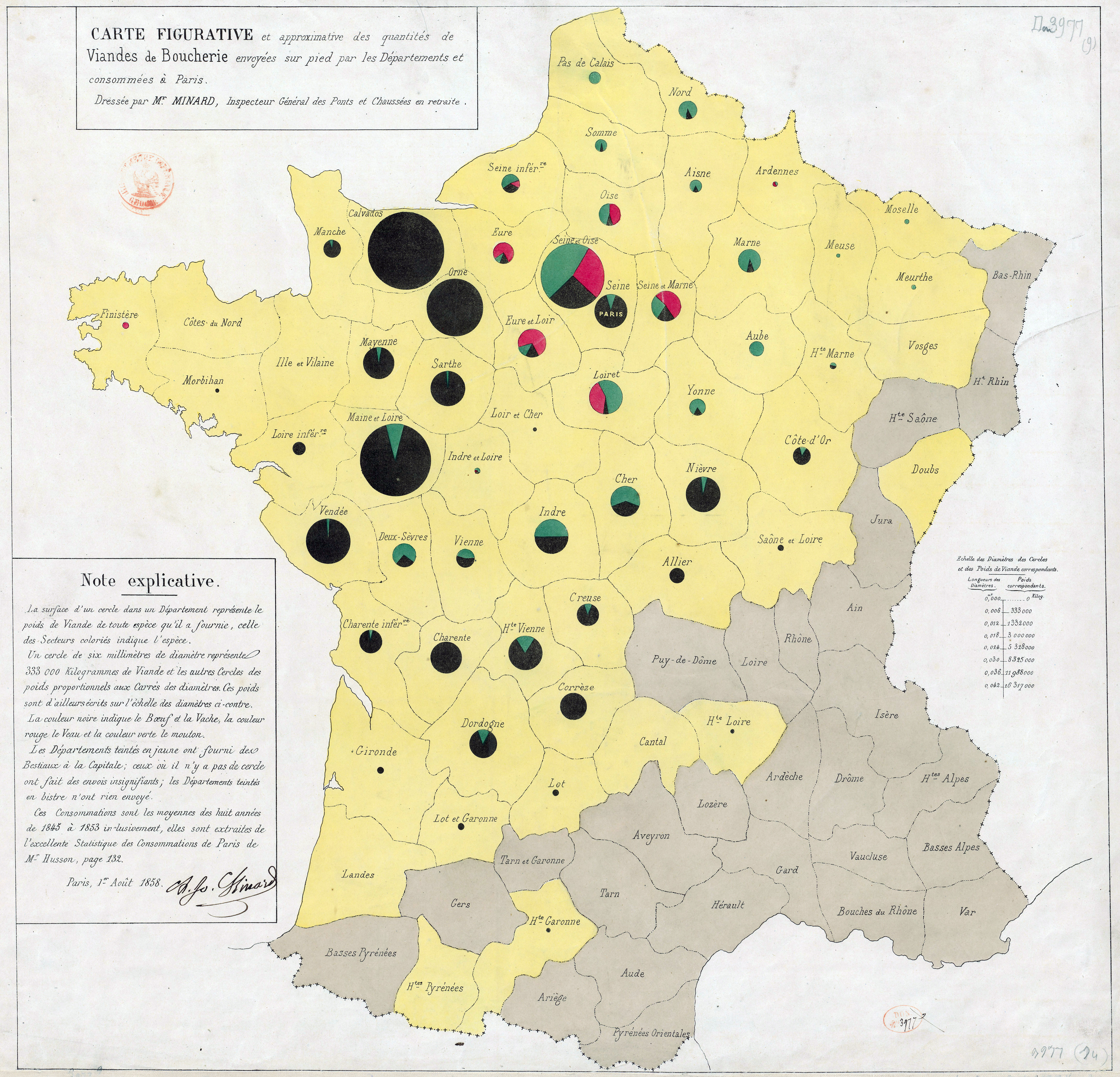
Minard. Carte des quantités de viande. 1858.
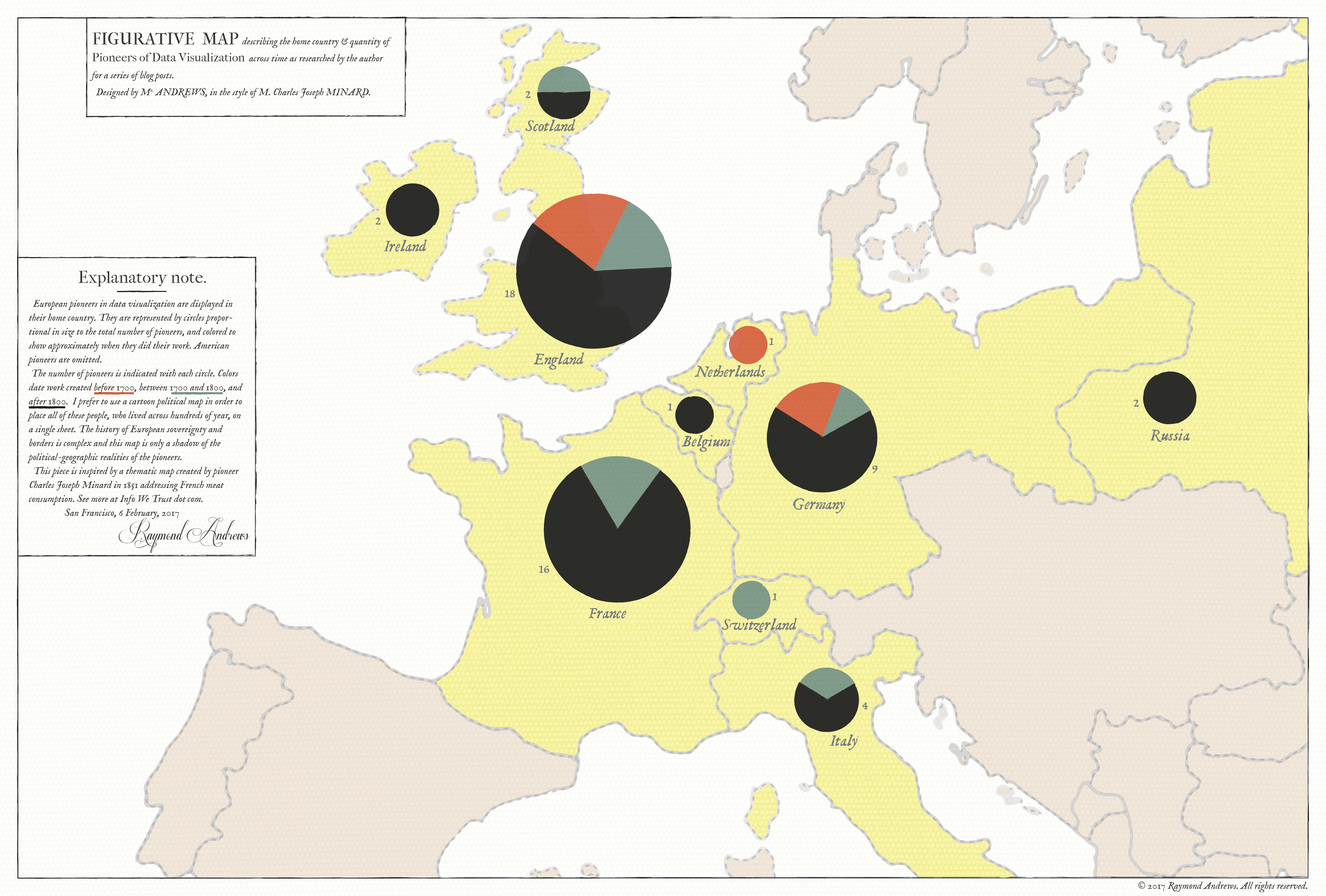
The large thematic map above shows the home country of 300 years worth of European data visualization pioneers, in the style of Charles Joseph Minard's 1858 quantités de viande examination of the supply of meat to Paris - the first work to size pie chart bubbles and place them on a map. I have so much to get to about Minard beyond this little map Read more
