Explore the History of Infographics Interactive
The below work was translated to an interactive experience which you can enjoy by clicking the link above.
January 2017 Static Poster Design Essay
After examining the history of data visualization greats I have decided to collect my learnings in the style of history’s data visualization greats. The first of these visual summaries is presented and discussed below. You can explore the entire series here.
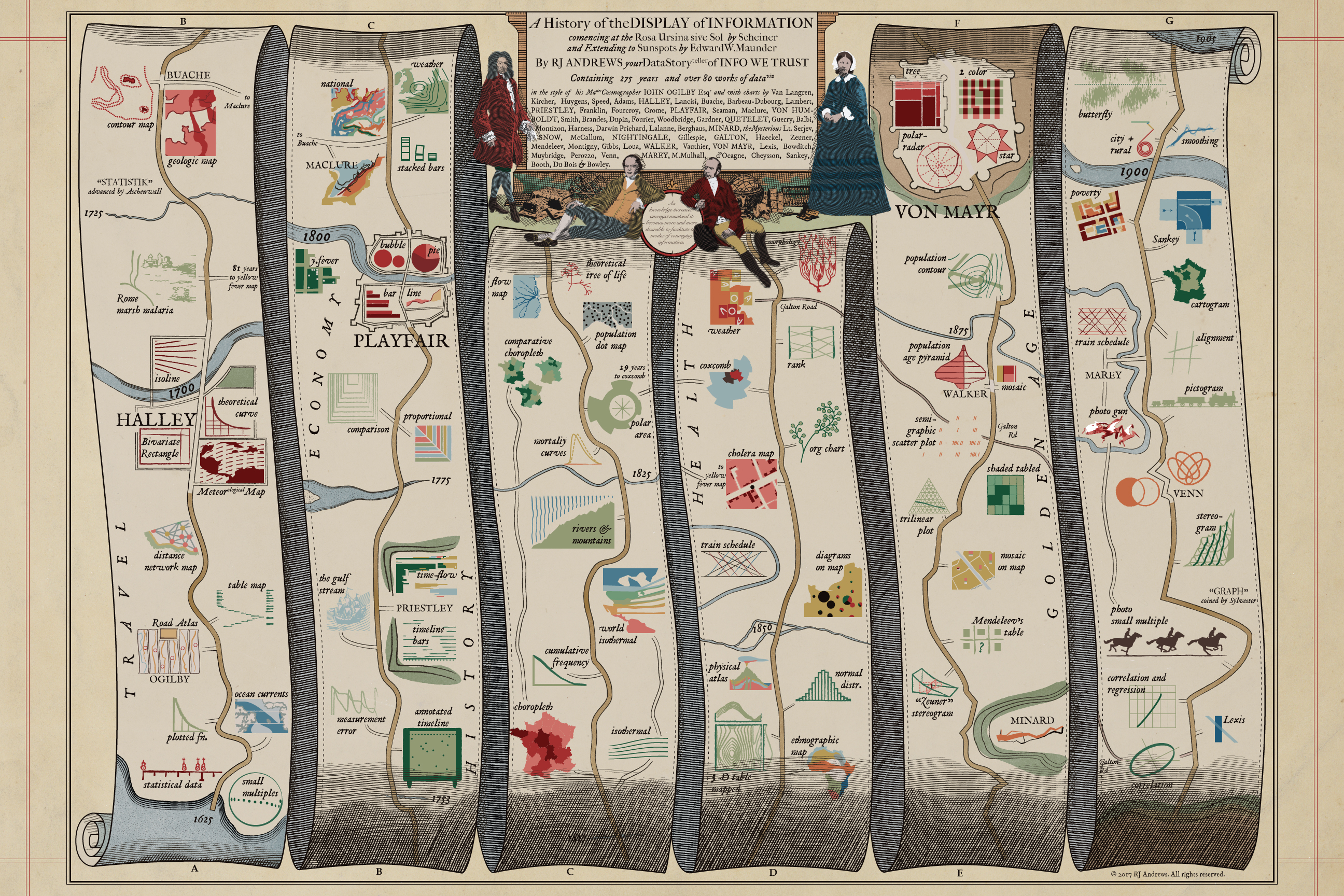
A map to guide you through the early developments of data visualization, including cartoons of 84 key charts, in the style of John Ogilby's 1675 Road Atlas. This image is sized for web-consumption and is only a fraction of the actual piece which can be properly enjoyed via:
ACCESS BIG 31mb JPG HERE
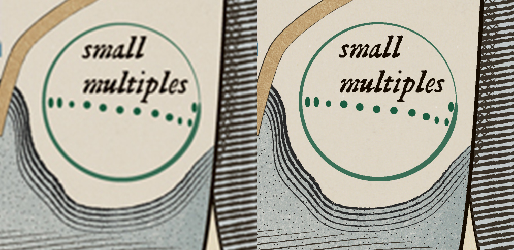
What you see here vs original file.
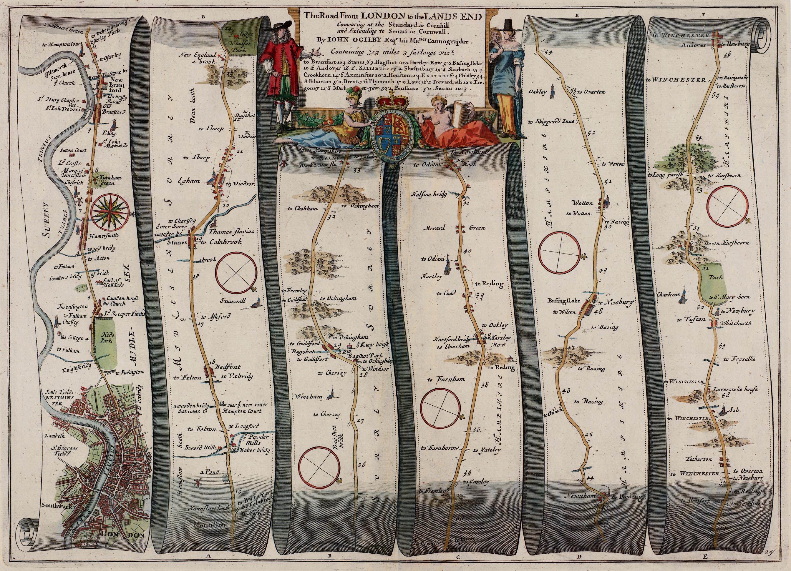
John Ogilby published his BRITANNIA road atlas, the first of its breadth and quality, in 1675. Plate No. 25, LONDON to Andover, became a visual and cartographic icon, revered and analyzed by many including Monty Python's Terry Jones. Innovations include establishing the scale of one inch to the mile and the consistent use of the standard mile. This most famous journey is below, you can see the other 99 plates here.

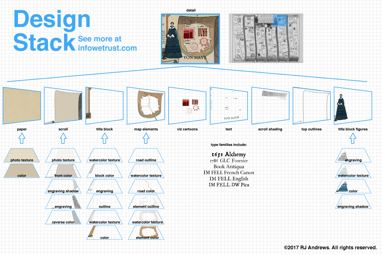
Design
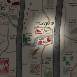
Cartoons representing important works of data visualization are placed along a fictitious scroll map in the style of Ogilby's atlas. The road marches you through time, passing many charts, through towns (named for key contributors whose charts make up said towns), and over waterways that mark important dates. You can learn more about all of these landmark charts and contributors to the field, including links to images of all of the original charts, here.
How did I choose what to include? I tried to focus on chart innovation, not necessarily the application of charting… although many simply famous charts are also included. The field is arguably thousands of years old - but developments before the 17th century are sparse and so I knew I wanted to begin around there. Chart innovation slowed in the early 20th century and so I knew I wanted to cut things off near the end of the golden age - certainly well before computers reignited the field. Discovering two charts that examine the migration of sunspots - one from 1630 and one from 1904 - provided poetic bookends for this project.
Within that timeframe many developments still got left on the cutting room floor. Thematically, I decided to not include: nomograms (charts used for computation), most maps except where relevant to the rest of the field (the history of cartography, especially map projections, is huge and deserves a separate exploration), non-visual statistical analysis, development of tools (graph paper, printing techniques, recording technologies, scientific instruments - sorry James Watt), reviews (society meetings, roundup summaries and books). If you think I have made a serious omission in the history of dataviz please let me know!
Details
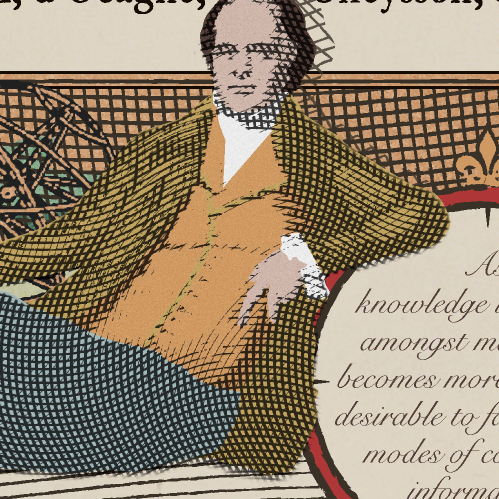
As knowledge increases amongst mankind, and transactions multiply, it becomes more and more desirable to abbreviate and facilitate the modes of conveying information from one person to another, and from one individual to the many.
Inspiration
I cast a wide net in order to learn the history of data visualization and was very lucky to discover the Milestones Project by Michael Friendly and Daniel J. Denis. I also came across these other interesting collections and discussions about historic charts:
- Infographics in the time of cholera (Scott Klein, ProPublica)
- The Repetitive and Boring History of Visualization (Rob Kosara)
- The Surprising History of the Infographic (Clive Thompson, Smithsonian)
- 100 Years of Data Visualization Best Practice (Andy Cotgreave)
- Digging Up the Nineteenth-Century Roots of Thematic Map Techniques (Margaret Pearce, NYPL)
- Landmark Thematic Maps (John Delaney, Princeton)
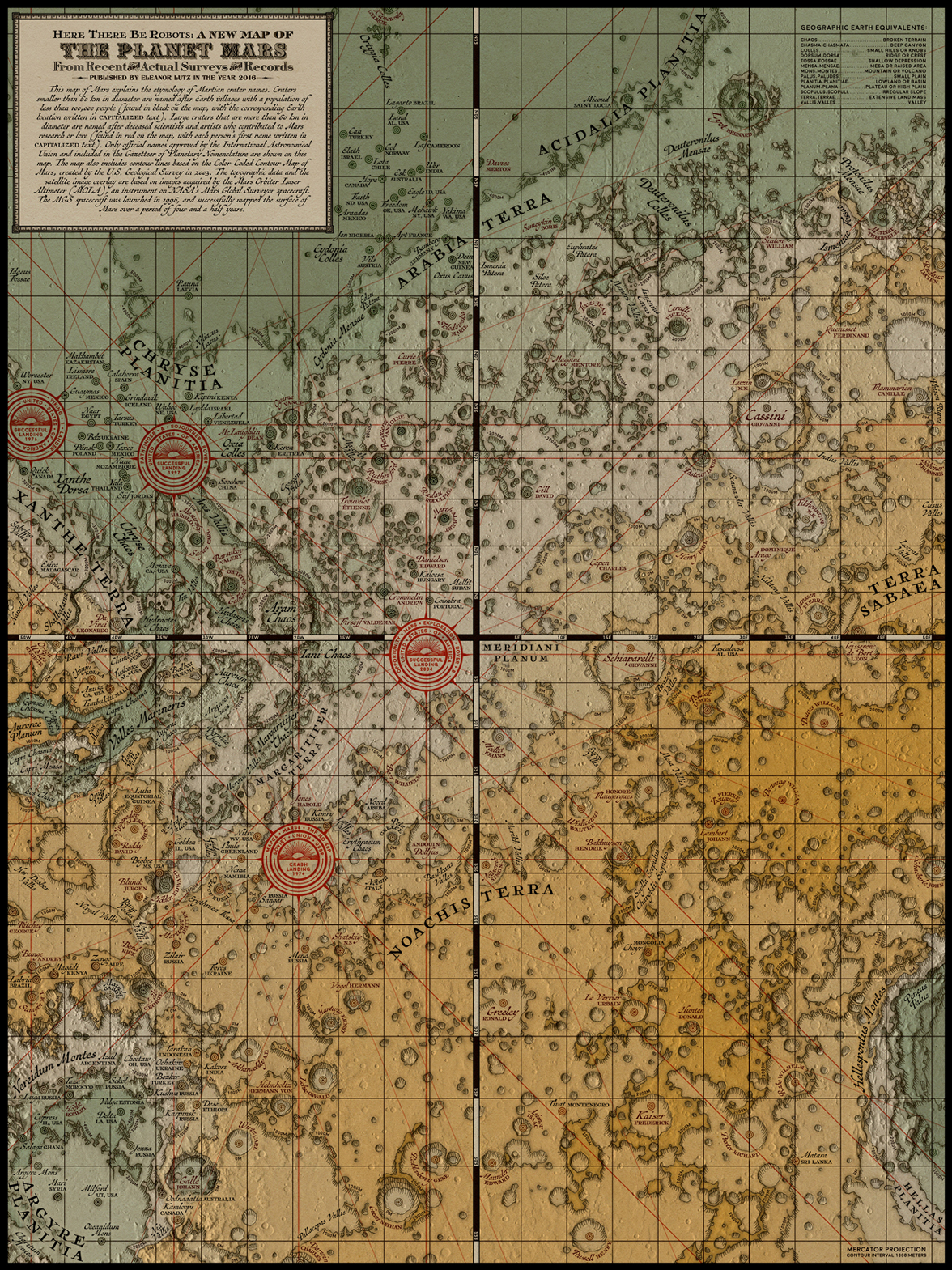
This project was set into motion by a conversation I had with Ben Jones this past fall about influential people and technology in the field of data visualization. I quickly realized my lack of knowledge beyond a few "sacred cows" and began reading up on the charts and designers who helped shape the field. Eleanor Lutz also inspired me to pursue a heavily-styled poster with her fantastic map of Mars.
Researching and especially creating this piece has proved to be incredibly inspiring - you learn so much cartooning 300 years of dataviz! I have collected several anecdotes and observations which I look forward to presenting separately sometime in the future.
This exploration of historic charts and the people who made them continues with Chart-Maker Biography. You can navigate the whole series using:


Info We Trust is an award-winning 'data adventure' exploring how to better humanize information. Data storyteller RJ Andrews is based in San Francisco. Please let me know what you think via Twitter @infowetrust, Facebook, or the contact page.

No comments.