Info We Trust is packed with hundreds of illustrations I drew just for this book: over 300 new charts, diagrams, maps, and depictions. There are full-page data stories, tiny ditties in the margin, and everything in between.
Committing to hand drawn illustration defined the feel of this book's storytelling adventure. This essay explains my thinking behind
this important design decision. It also reveals the mechanics of how I actually did it (spoiler alert: markers & paper). And of course it showcases some of my favorites along the way.A book about visual design should be an exemplar of visual design. Wiley, my publisher, supported my vision by extending a generous amount of creative control. I directed every aspect of book design: layout, fonts, cover, full color, hardcover, paper quality… I even picked out the head and tail bands. When it comes to polishing design, I can become a micro-managing perfectionist. Wiley’s production experts' patience for my curiosity and persistence never flinched
I decided very early that Info We Trust would not use any existing images, mine or others. Found examples work fine for certain books. They are also convenient, the work is already done! But found images bring baggage too. You might choose an existing work to highlight one aspect of its design. But the reader will see other facets too.
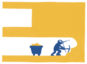
Info We Trust exhumes foundational principles which demanded archetypal imagery. I needed to strip visual information down to its core in pursuit of focusing attention to the lesson, like this cartoon showing progress from the start as one of the metaphors for horizontal bar charts.
Furthermore, found examples have no consistent visual look. A bunch of examples made by different designers working with different tools at different times feel different. I wanted the images to create a harmonious visual flow. A feel that complements and accentuates the written narrative.
But my data storytelling hasn’t yet matured to one definitive “look” (will it ever?). What uniform aesthetic could drive this book’s pictures? I knew I needed an approach that worked for the book and worked for my own production timeline. However I chose to create these illustrations had to be repeatable across many months of work.
After writing 50,000 words I selected a single chapter to prototype book design: layout, fonts, and illustrations. The text was still many months away from being polished. But it was good enough for me to start playing with the visual feel of the book (I plan on addressing layout design in a future essay).
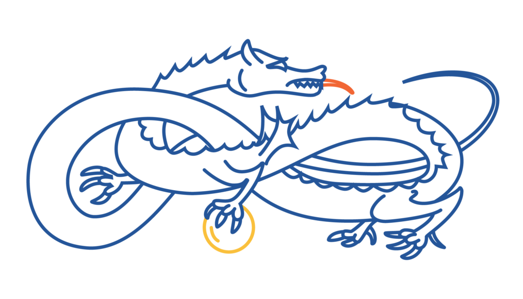
The first batch of pictures were prototypes for this proof-of-concept chapter. They were all digital vector art created in Illustrator. I thought these dozen line-drawings were promising. They also helped me abandon one early design concept which wove lots of small illustrations in-line throughout the text. Too much like emoji, yuck. Back then, I got into framing data as a dragon. It is a metaphor I eventually distanced the narrative from. Here is my vector dragon:
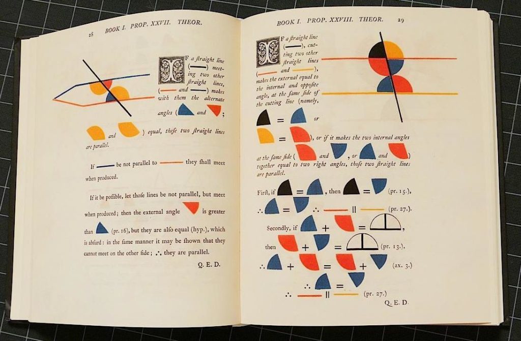
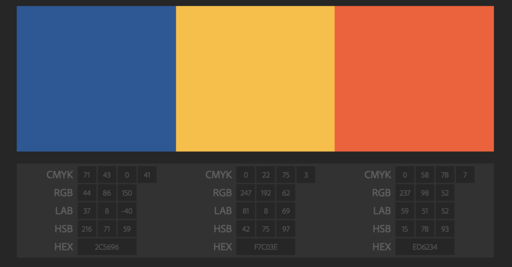
The first vector illustrations helped me pick my colors. Info We Trust is built on a primary color palette of dark blue, burnt orange, and golden yellow, inspired by Oliver Byrne’s 1843 Elements of Euclid.
I created a dozen swatch variations of Byrne’s colors. Then I mix-and-matched them into a few sets that I liked. I prototyped versions of a single page spread using each different color set, and picked the winner:
I turned away from digital vector art at a review of the prototype chapter. It all happened at Nick Sousanis’s comics lab. Nick is the creator of Unflattening, the most mind-blowing adventure I’ve ever taken between two covers. When we get together to talk books and visual storytelling he always helps me see better.
After looking at my vector art, Nick eyed my Moleskine notebook. It was overflowing with rough preparatory sketches. He pointed at them and told me to do that instead of the vector graphics. The sketches were messier, sure. But they were more human. They had more character, They were more me. And the book is all about how to inform people, not how to pull technology levers. Rough drawings were a better fit than cold vector art.
It took a while to swallow Nick’s advice. The idea of hand illustrating a book about data visualization was terrifying. Imagine tweaking or updating a statistical chart, by hand. But as I showed the chapter prototype to other designers, Nick's suggestion was validated again and again.
But I was still not ready to believe it had to be done off-screen. I skinned the vector art with a package of digital brushes (looked fake because it was fake). I tried illustrating by hand digitally... but I am not experienced enough to get the roughness I desired. Finally, I embraced the idea of illustrating by hand on real paper.
The clean perfection of the machine is nice, but not always preferable. We could be tempted to dismiss the appeal of human-wrought creations with superficial explanations. The roughness of hand-drawn illustration connects us to the unique individuality of the creator. It appeals to us as social creatures. It also pops out from an increasingly mechanical environment. But the real power of embracing the imperfections of hand-drawn illustrations lies somewhere deeper.
Our senses often favor a certain roughness, which might be intuited by exploring the winding streets and varying architecture of a Renaissance city center. A cobblestone stroll is more appealing to me than traipsing through a centrally planned metropolitan grid. There, every block is the same and every edifice makes you feel insignificant. Only numbered street signs tell you where you are. And those numbers are pure concept, only weakly associated with any feeling. Perfectly rectangular, a modern grid gives no chance for connection or belonging. Because real life is not perfect, perfection can feel dead.
The superficial aesthetics of roughness can be mimicked. New housing developments imitate old villages and smartphone apps turn digital photos into pencil sketches. Somehow, these approaches are all still stuck in an uncanny valley, but not because we lack the computing power. Perhaps what superficial styling misses is the time creators put into handmade production. This time can be spent meditating on the subject matter, which leads to better understanding. It is also time during which emphasis naturally varies across the creation, giving rise to the roughness. This emphasis may vary, often intuitively, in accordance with the values the creator, who is striving to convey the very essence of the thing, places with the information.
I believe that an audience can appreciate when true handmade production occurs. When more life goes into making something, it feels more alive.
It would take ten months to produce all the illustrations. From the beginning I knew that the last one I drew had to look like it belonged next to the first one. A consistent illustration product would keep line weights, colors, and image resolution consistent. I needed to be a good engineer and build a strict process with as much control as possible. This meant I needed to do a lot of work upfront to make sure I loved the look. And then I had to commit.
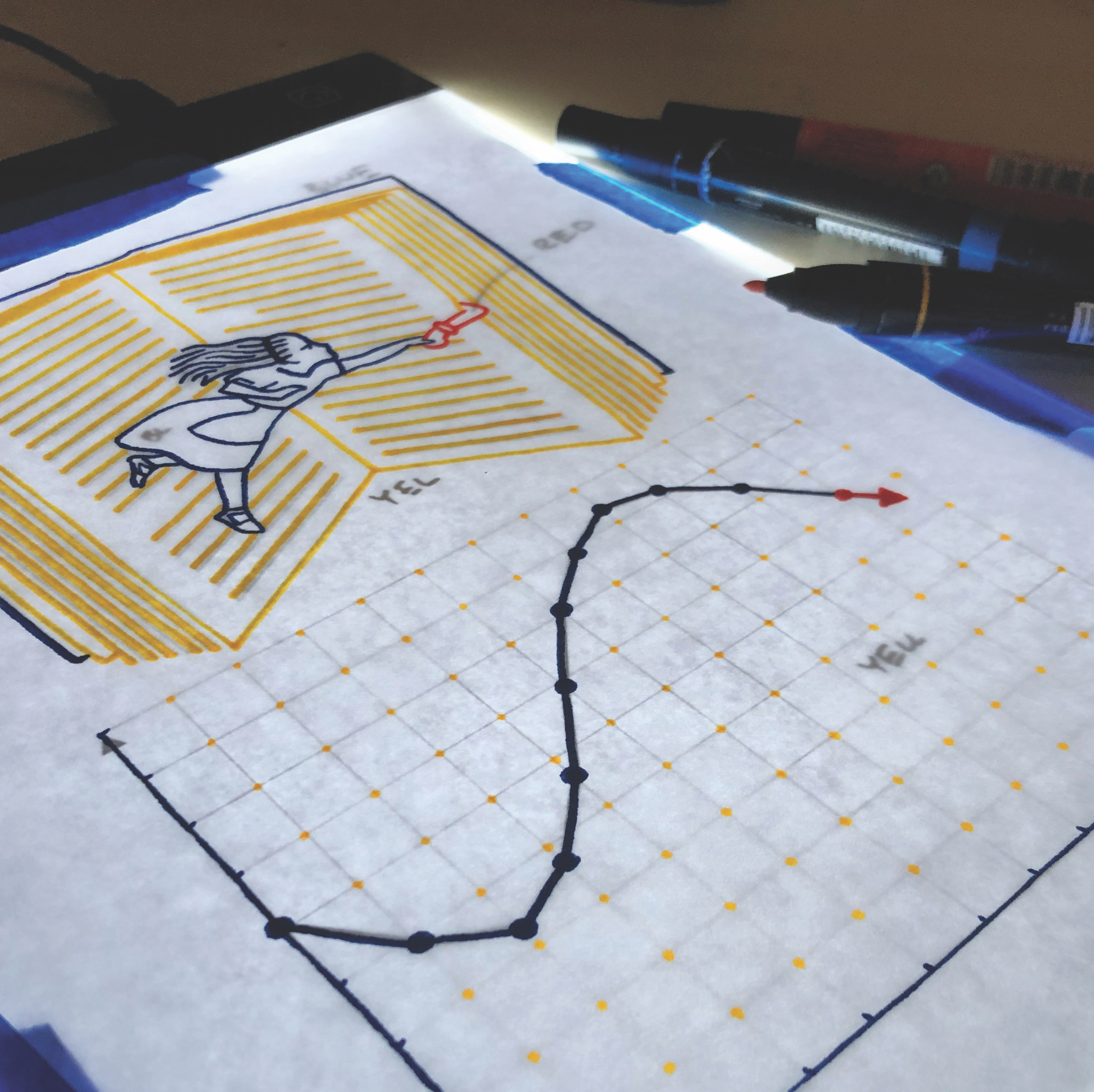
The variables to control were scale, tool, and color. The first thing I did was round up a bunch of candidate tools (pens, markers, charcoal, pencil...) and go to town. Here is one of several test sheets:
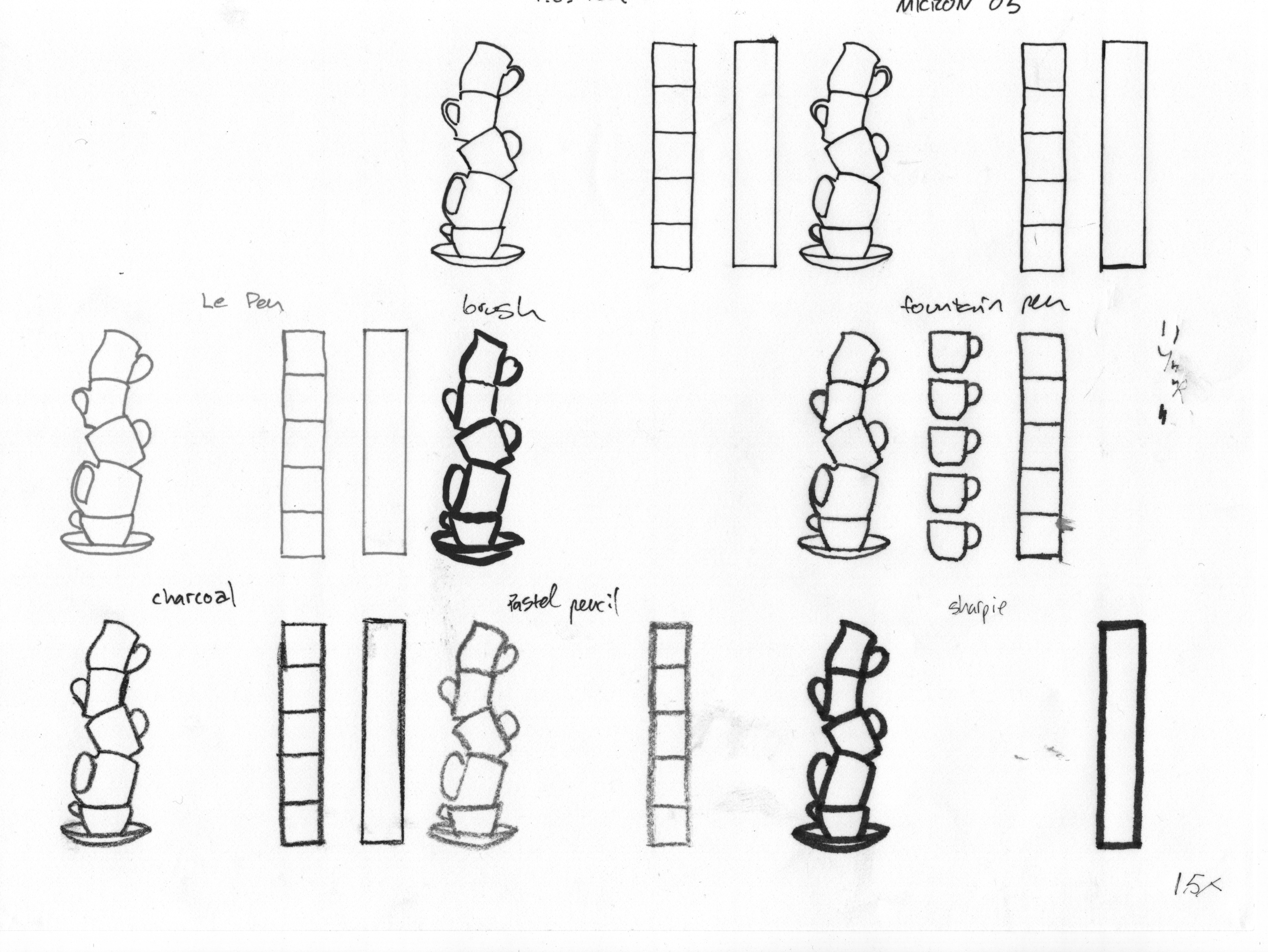
I focused my decision by tracing the same set of vector images using different weight pens and markers, at different scales. Moses is here reminding us that the word table (as in table of text and tabulated data) is associated with the word tablet:
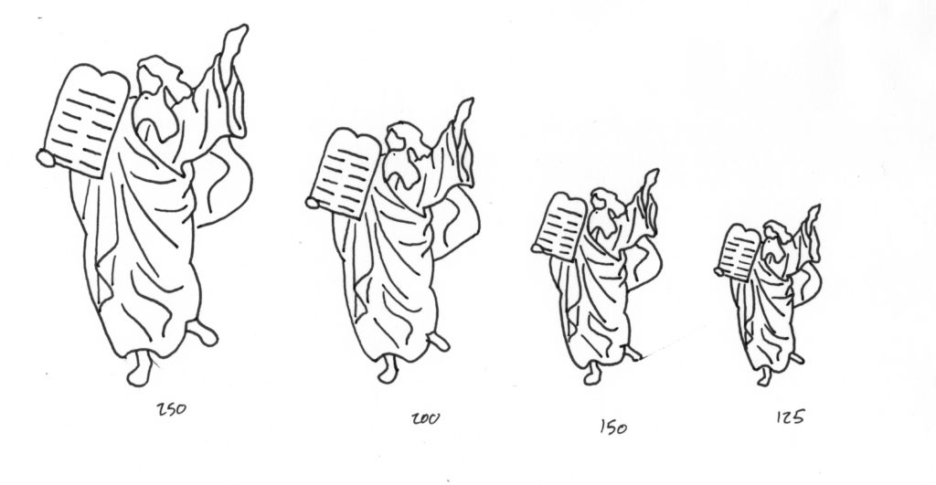
Once I scanned these different scaled illustrations I resized them for side-by-side comparison of the apparent line-weights. You might think of this process as filling up a 2-D grid with a categorical axis (different pens and markers) and a quantitative axis (scales bigger and smaller than the actual printed size).
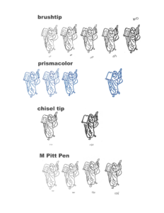
This process yielded a winning tool (Prismacolor Premier Art Markers) and scale of 250%. Drawing the illustrations ~2.5x bigger than they would appear in the book gave me the freedom to include lots of detail. I could also scan them on my home scanner at 600 dpi, yielding a final image that was >1200 dpi. It is also nice to have huge images for presentations and other collateral.
The issue with scaling down artwork is that line-weights also get shrunk. That’s why I used big markers. Marker widths are relatively fat. Additionally, markers have a fuzzy edge that gives each image a cozy feel. I drew on 18 lb Canson marker paper and am still amazed at how fast it absorbed and dried the marker ink.
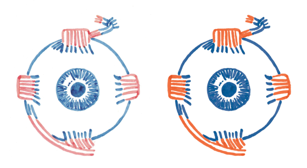
My neighborhood art store (it is so wonderful to be able to walk to an art store) has a big selection of Prismacolors. I chose the three that most closely matched my color palette: Indigo Blue, Spanish Orange, Poppy Red. These gave me illustrations that did exactly what the book needed: rough enough to convey emotion, but not so rough that they distracted.
I first thought I could just illustrate and scan and be done. This was hopeful. This was ignorant. Raw scans are too inconsistent to be presented without post-production work. Today, I still do not understand all of the forces that conspire to produce different colors across identical circumstances. Could it be: Marker age? How long it has been uncapped? Humidity? Scanner bulb life? Lunar phase? I never figured it out despite many attempts at keeping the process regular (storing markers horizontally and rotating them regularly). All I know is that the ink that flowed across the page was likely to vary in color. And what I scanned was likely to vary too. In addition to my scale, I also needed a strict post-production process in order to maintain consistency.
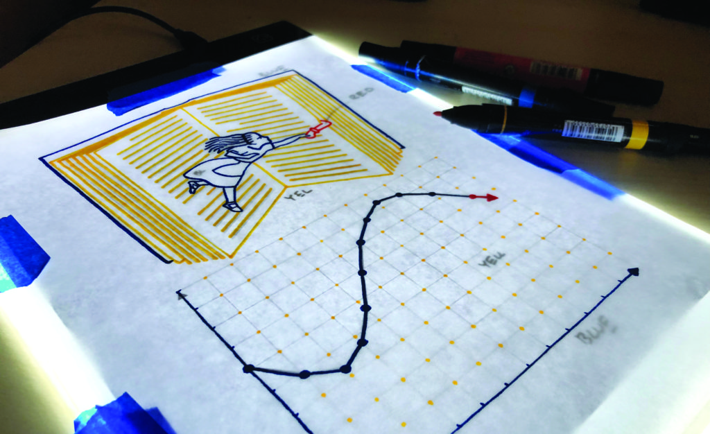
Post-processing isn’t particularly glamorous. I did it all in Photoshop. Once the illustration was scanned the important steps were: convert to CMYK, clean up dust and other errant marks, color correct (color range selection, colorize using hue/saturation adjustment layer), double check that whites are actually white, flatten, and save as a .tif. Here is what that process did to a scanned illustration:
I did not trust my eye for color correcting. I know too well how my biology would vary across the course of the day and across the many months of illustrating. Instead I color corrected to HSB color values. It was sort of like flying by a plane's instruments. I trusted the color numbers the eyedropper sampled. I soon memorized what adjustment nudges would get me in the ball park for each of my three target colors. Once close, I tweaked until each image was perfect. These steps happened across a cascade of folders, preserving important steps for opportunities for future alterations. It was a routinized process, but it never escaped the need of my careful attention.
Not a single marker illustration was attempted without piles of preparation. This is where the real work happened. The below series shows the major sketches that lead to the final Map of Contents full-page illustration (learn more about this map in the essay Contents Galore). You can see how certain ideas like the Yggdrasil tree and Pandora-like hanging islands got cut from the first concept, but it would have been impossible to get to the final map without them:
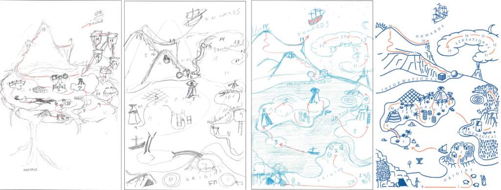
Illustration concepts emerged in many ways. Some ideas came early, while researching and preparing to write a chapter. In many cases the concept came while writing. Then I would type out as detailed description as I could in square brackets as a to-do.
A couple chapters' writing progress got far ahead of their visual development. In this case I printed out all the text, re-read it, and doodled, probing for some useful and compelling pictures.
In a few places I got stuck. I actually thought this will be my chapter with no illustrations at all, I should probably have one of those. Thank goodness for supportive readers and mentors. One particular chapter about trust limped along sans picture until visual-thinking author Dan Roam saw it. He knew just what to say, directing me to study sacred geometry. The resulting abstract pictures comprise one of my favorite turn-the-page gimmicks in the book. You can't experience it until you hold the physical book.
Once I had a concept I began pursuing picture drafts. All of the final illustrations reference some kind of rough draft. To be clear, when I say reference, I mean trace. I suppose I am an illustrator now. But I do not take much pride in my ability to draw. I have no formal artistic training. What I do have is the ability to start with soft lines and take the time to look and choose the ones that need to be darkened a little, and abandon the ones that don’t belong. You do this for a while, and as long as you don’t erase a hole right through the paper, you can usually get to a pretty good form.
Many of the drafts emerged from my own sketches. Many others emerged by making digital collages, clipping YouTube video frames, plotting charts (mostly with D3 BlockBuilder or Tableau Public), Google Earth views, and 3-D SketchUp renders.
I've dabbled in illustration before, but had never attempted hand-drawn statistical charts in any serious way. A minimal approach to most of the charts in the book kept these illustrations clean and consistent. None of them are technically perfect. The lines are not perfectly straight. The dots are not perfect circles. But they convey the concepts just as well. Perhaps even better than the "perfect" digital sources?:
In addition to modern web sources, Info We Trust references many historic illustrations. I believe they create a visual connection to the story behind how information and the emergence of civilization are all tangled up.
Most historic references are manipulated in some way to better serve the story. For example, a John Tenniel illustration of the Mad Hatter was transformed into a chapter title image. I repositioned his arms, gave him the teapot (which provides the scene with more action and creates a visual pun with the chapter title, "Infuse Meaning"), and created the stacks of cups by photographing a real stack of teacups in my kitchen. I went through five color combinations with the Hatter, trying to get it right.
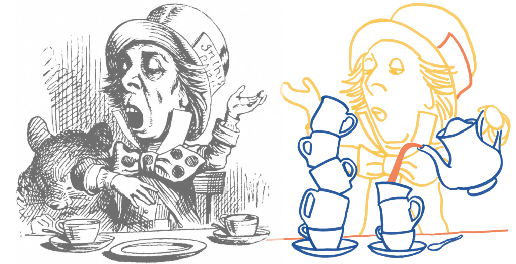
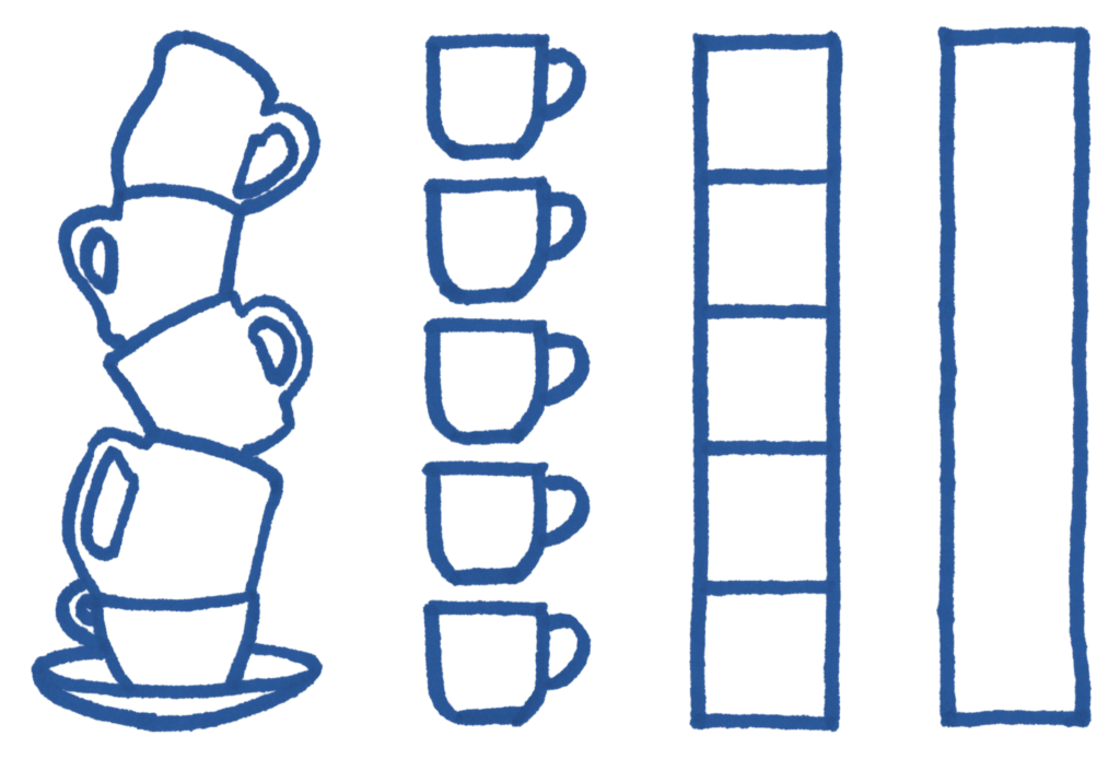
Later in the same chapter I employ the Hatter's teacups to talk about vertical bar charts as “stacks of stuff” and give an example of further abstracting reality. From actual objects you can stack to a continuous bar. I credit referenced images in the book's end notes.
For all of these sources I had to decide how to abstract the source material to a consistent form. Line drawings inspired by old engravings—no shading, no fill—was the easiest way to keep form consistent. I also found that the line drawing's abundance of whitespace put the illustrations in the right balance with text. Too bold and the illustrations drag the eye.
In some instances I strengthened a particular image by adding fill. This was almost always done in post production. Filling an image was a quick way to balance other illustrations on the spread. Here I filled in the water to help the city landscape hold its own against the bold heroine:
Once I created a rough draft I would scale it to the right size (2.5x) for tracing. To know its size meant I had to have a pretty good idea how the layout was going to look. And to block a whole chapter out meant I needed to be fairly confident in the text. Here’s what a rough page spread, pre-illustration, looked like. Sometimes I would print these out and doodle on these too:
If co-developing text and illustrations and layout seems complicated, you are right. It is one thing to get all three started. But that is only the beginning of the road to a polished spread. A big chunk of the work behind Info We Trust was massaging the the conversation between written, illustrated, and composition narratives.
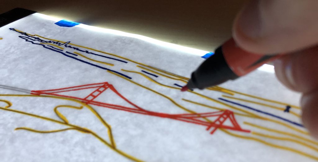
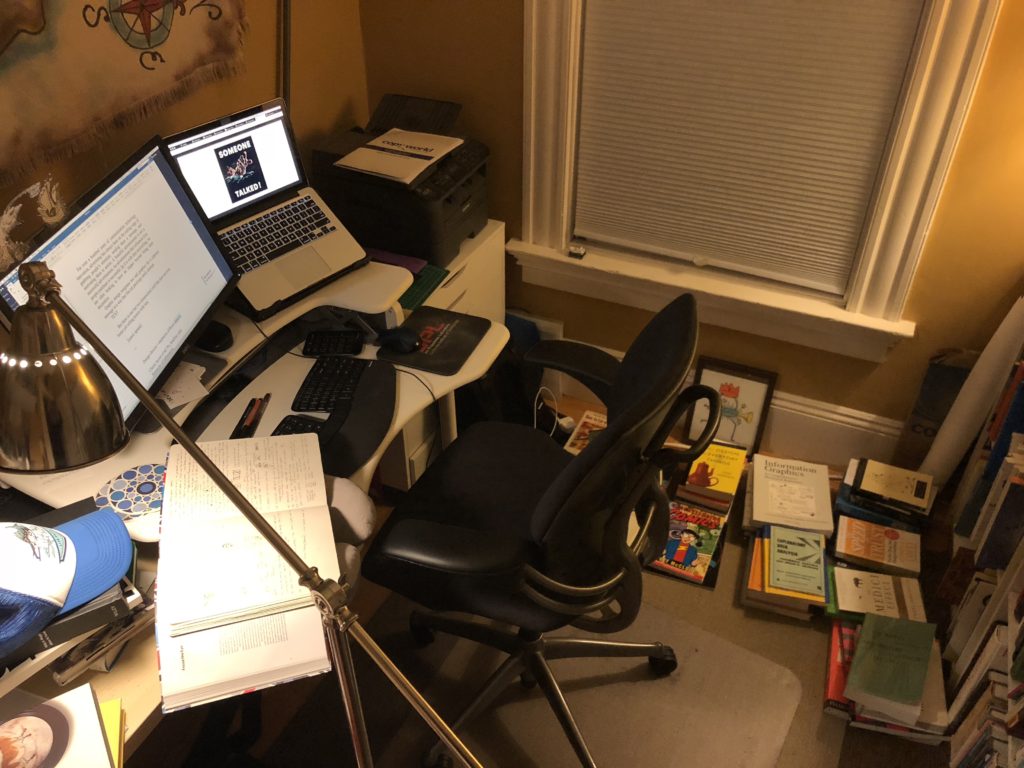
Once I had a chapter’s worth of scaled reference images I printed them out. Then, one-by-one, tape them to my cheap USB light board and go to town tracing them with my markers. This is a pretty mindless activity, but it’s a pleasant one I really enjoyed. I like zoning out for six hours, podcast or dance music in my headphones, watching the ink flow. I turned off the room lights to help see the reference draft better. Here is the room where it happened (the illustrating would occur on the portion of my desk under the blue hat):
More than once I forgot to place my white sheet of marker paper on top of the reference image. Then I proceeded to trace the entire image directly on top of the print-out reference. Oops.
Most chapters got one concentrated effort where I batch-illustrated a dozen or so images. Later revisions required more illustrations (new ideas, corrections, etc). I tried to collect these revisions in batches too so that I was never swinging into illustrating mode for only one picture. In the final months of production it was necessary to break work to execute a single image.
No matter how tired, I made sure to scan all the illustrations as soon as I was sure they were completely dry. I did not want to risk extra dust or page wrinkles, a real risk floating around my messy studio. Not ingesting quickly forces extra work and I did not have time for that.
Once in the computer, the Photoshop color-correcting could begin. This is also a fairly mindless task, but unlike illustrating it isn’t that much fun. After all that, you have a batch of illustrations ready to go into the Indesign chapter file. The most satisfying experience I had while making this book was opening a chapter file and dropping and insert an illustration. The image is the rights size for the right rectangular hole. It feels so good to have it snap into its home.
Reality is rarely as clean as the narrative we package it in. I had a few bumps along the road. I want to detail them here to give a sense of what the day-to-day design hurdles were actually like.
At the outset, I actually had a four color palette: blue, gold, orange, and black. That’s what Oliver Byrne used, so that’s what I wanted to use too. My sister Elizabeth (who has a beautiful artistic eye, more on her in a future essay too) pushed me to abandon black. She promised that I would find a way to re-color everything already drawn with only three hues. In some cases, I was able to do this re-coloring digitally. In others, I started over.
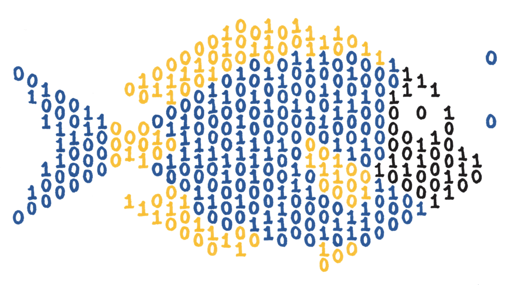
One illustration that didn’t make the book is this data-fish. The concept was more extravagant than needed, and didn’t really work with the page layout. I still think it is pretty cute on its own.
A few spots in the book reach beyond the three colors. Green, grey, and lighter shades of the three primary colors all make appearances. The book goes full rainbow in one chapter only.
The dark blue color is not only the anchor illustration color, it also colors all of the book’s headings and marginalia text. The manufacturing director warned that my particular blue would requires cyan, magenta, yellow, and black ink. Across thousands of offset prints, there was a risk for one of these four colors to fall slightly out of register. If this happened then the blue text might look a little fuzzy. Even though this scenario only threatened a low percentage of printed books, we decided to take action. I altered just the blue text to a very close analog created with only cyan and magenta ink, greatly reducing the chance of any blue text falling out of register.
Looking back, I am very proud of all the effort that went into making the illustrations. I believe they create the perfect visual narrative that both delights and informs as you read Info We Trust. I am so excited for you to experience it all.
See all of the design essays at the book’s main page and please consider ordering INFO WE TRUST today.
Info We Trust (the website) is an award-winning ‘data adventure’ exploring how to better humanize information. Data storyteller RJ Andrews is based in San Francisco and the author of Info We Trust: How to Inspire the World with Data. Please let me know what you think via Twitter @infowetrust or the contact page.

No comments.