A design interview with Fernando G. Baptista about his giraffe marvel for National Geographic.
The arrival of National Geographic is a monthly event at our house. Whoever intercepts the mail places the magazine on the kitchen table. There it remains sealed until we can preview its contents together. Scorn befalls anyone who sneaks an impatient peek.
This month delivered a magazine that deserves special acclaim. The October 2019 issue is loaded with photos, maps, and diagrams that soar above.

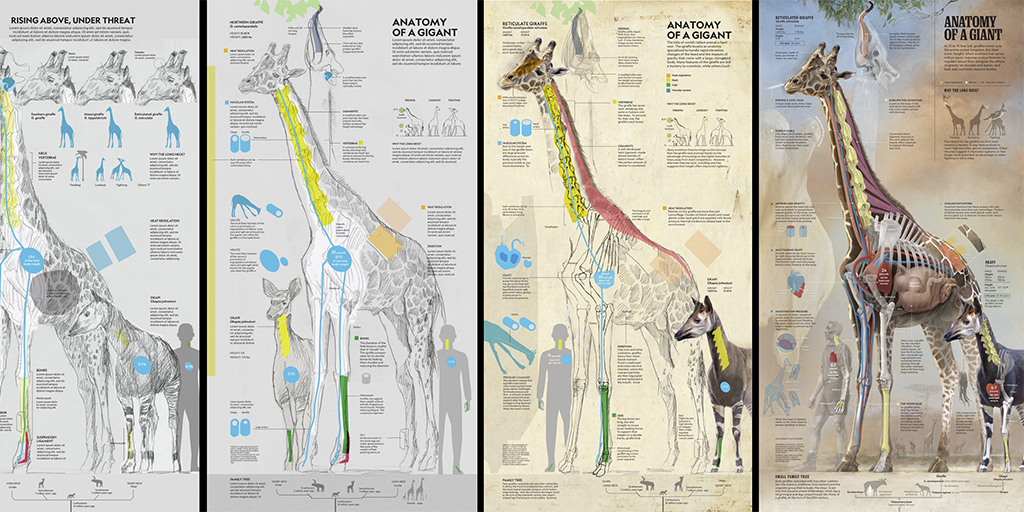
After beautiful stories about riverways, fossil collectors, sea turtles, and disappearing species the magazine unfolds into a graphic marvel about giraffe anatomy:
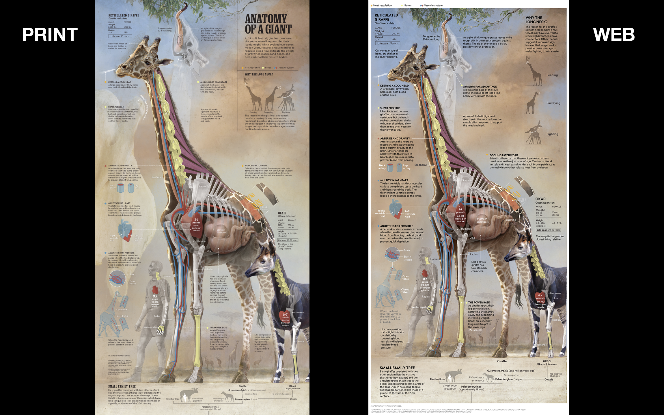
This giraffe infographic, titled ANATOMY OF A GIANT, can be viewed on the web, but I urge you to see the print magazine. Only the print version contains an actual size giraffe vertebra. This detail is one of its many beautiful design flourishes that I love:
- A phylogenetic foundation underpins the animals.
- Comparisons across species anatomy, emphasized with a bold primary color palette.
- Vitruvian superimposed positions explain that long neck.
- A “you could study this for hours” richness made possible with artful layering and expert composition.
ANATOMY OF A GIANT was created by a team lead by Fernando G. Baptista, senior graphics editor and artist for National Geographic Magazine. I am excited to share a behind-the-scenes look into the making of this infographic. Fernando answered my questions over email and sent lots of making-of sketches and video, all below. I made light edits to his responses and give context in bold.
RJ: How does a project like this begin?
Fernando: The process starts with the idea. My first goal is to find the concept of the graphic. I research by myself to get some background. Then I prepare initial ideas to share with the story team. The story team usually includes: text editor, photo editor, researcher, photographer, cartographer, and video producer. We met and figured out each part of the story.
Giraffes are really vertical, so I proposed a vertical fold out from the start. Once we had a plan we explained the story concept to the executive team. Then it was approved.
And how long did you work on this?
In the October issue I have two pieces, the turtle and the giraffe. Seven pages in total. I spent less than three months (working really, really hard) to produce both graphics. So I think I spent around 5-6 week to produce each graphic.
OK, so once you have approval, what happens?
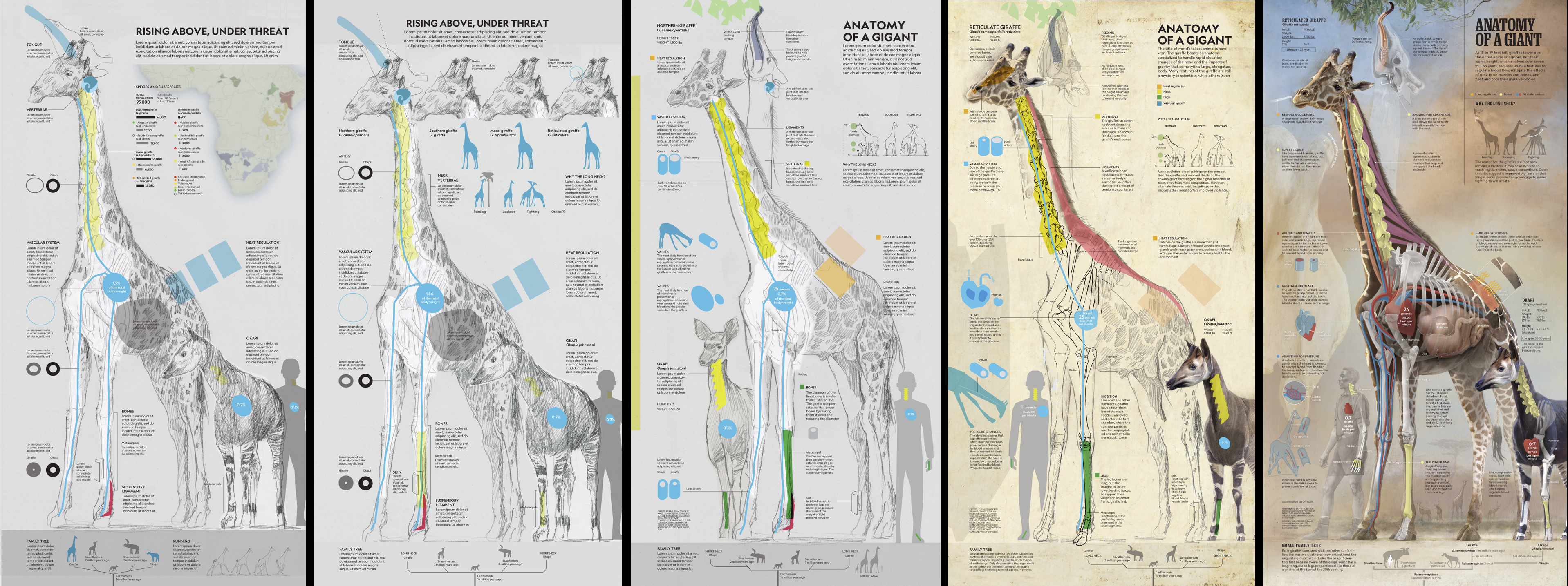
My next step is to get a first sketch, I spend a couple of days reading and sketching ideas. I found the anatomy of the giraffes really incredible. I thought that comparing the giraffe with a human and a close relative, the okapi, could give you more information and a sense of scale.
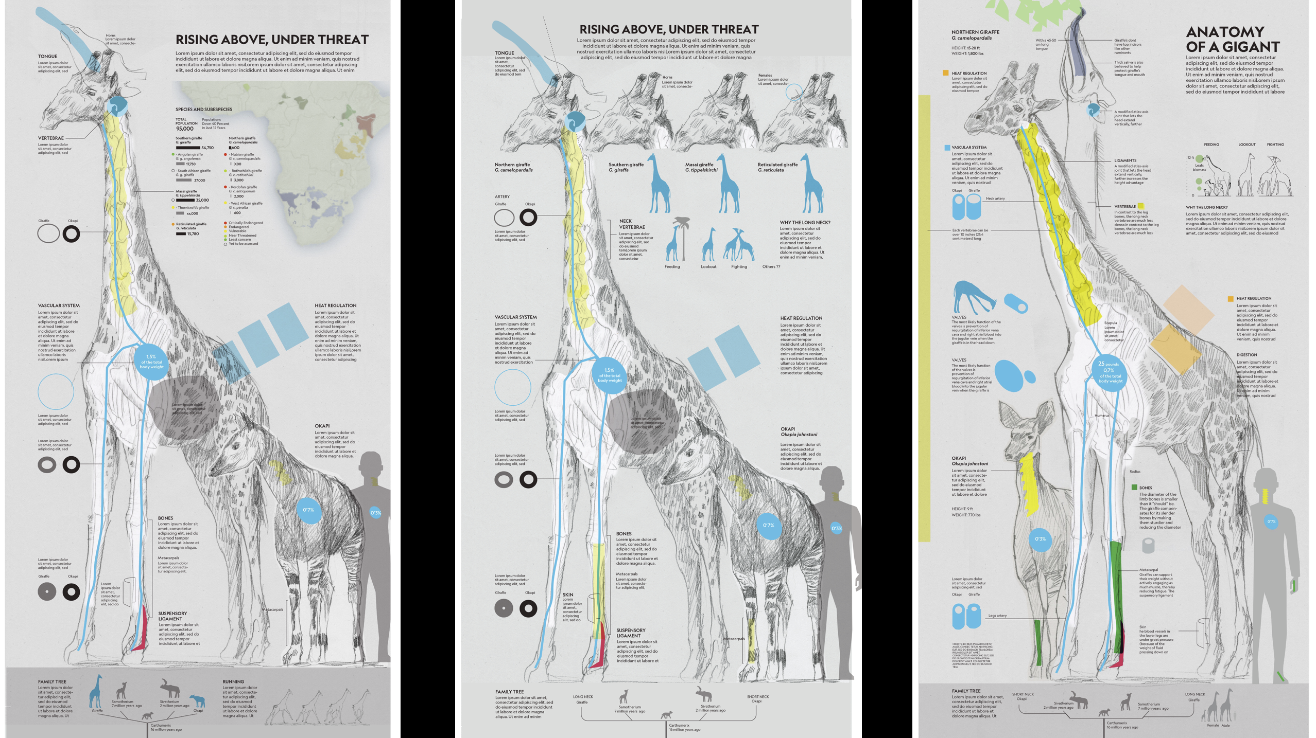
The first sketch had an initial map and possible portrait heads of the four main species of giraffe.
This was a team effort. What did everyone do?
In each project I work with a freelance researcher. In this one, Lawson Parker spent 84 hours researching. We discussed the concept of the graphic and then she prepared a research packet. From this information I produced a more refined sketch, with a near-final distribution of information, text boxes, and diagrams. Together we refined these different parts. Lawson also contacted the best experts to check all parts of the graphic.
I hired Shizuka Aoki and her assistant Gingyang Chen, experts in medical illustration. They helped me with the bones and arteries. I gave them my illustrations of the giraffe and okapi and then they created clean vector profiles of the bones, stomach, and arteries.
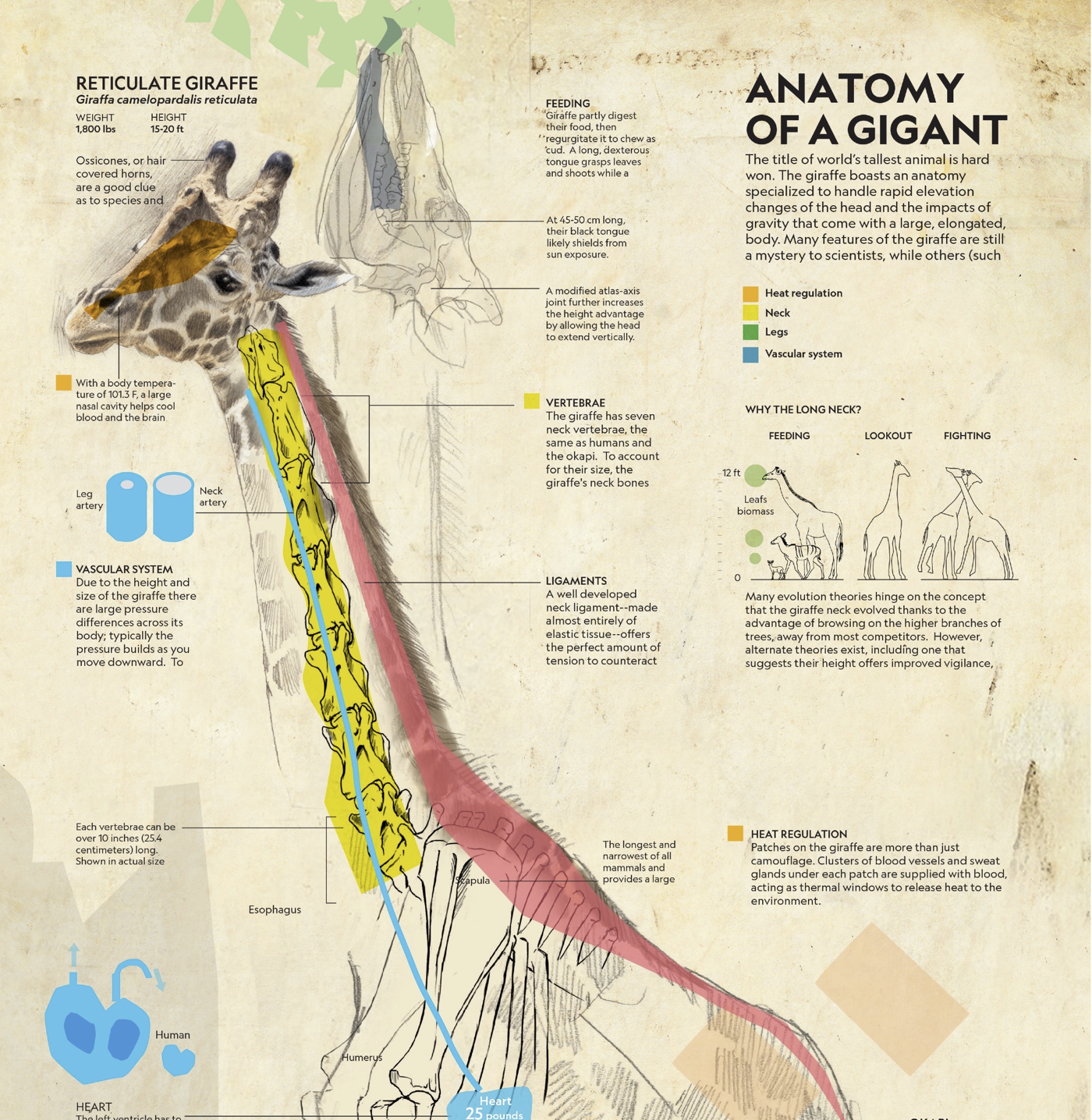
Eve Conant, graphic writer, worked very hard to explain in short text boxes all the information that we have. Intern Tania Velin helped with the family tree.
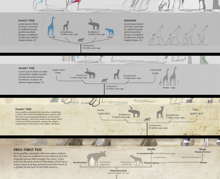
Taylor Maggiacomo, graphic assistant, worked with a couple of secondary elements and was in charge of the final production of the graphic.
And the team went on a field trip!?
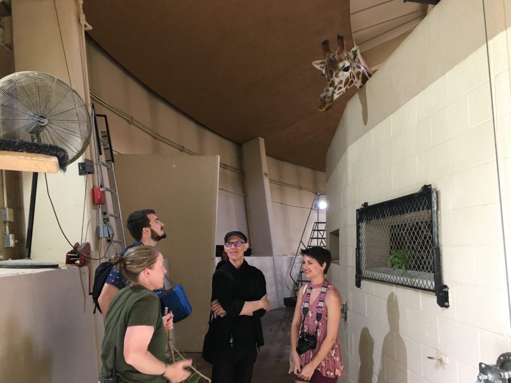
We found that the giraffe species that the expert suggested to highlight, the Reticulated Giraffe, is in the Baltimore zoo, close to our office in DC. So Lawson arranged a meeting there. People in the zoo were really nice. Riley Champine (cartographer of the story) and Taylor Maggiacomo (graphic assistant) went with me to see the giraffes and okapi. It was really helpful to see them, the giraffes are huge and gentle.
Tell me more about your process.
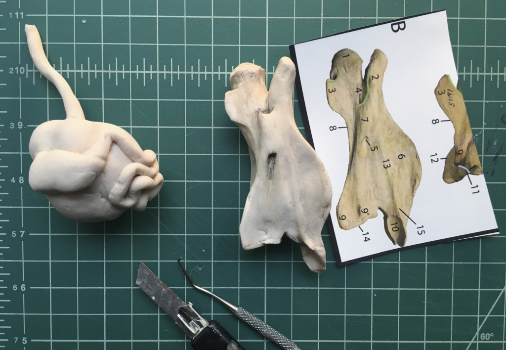
When the anatomy was approved by the experts I painted each bone and organ, using a mix of pencil, sculptures and photoshop. I built clay models of the giraffe vertebrae and stomach for light and perspective reference.
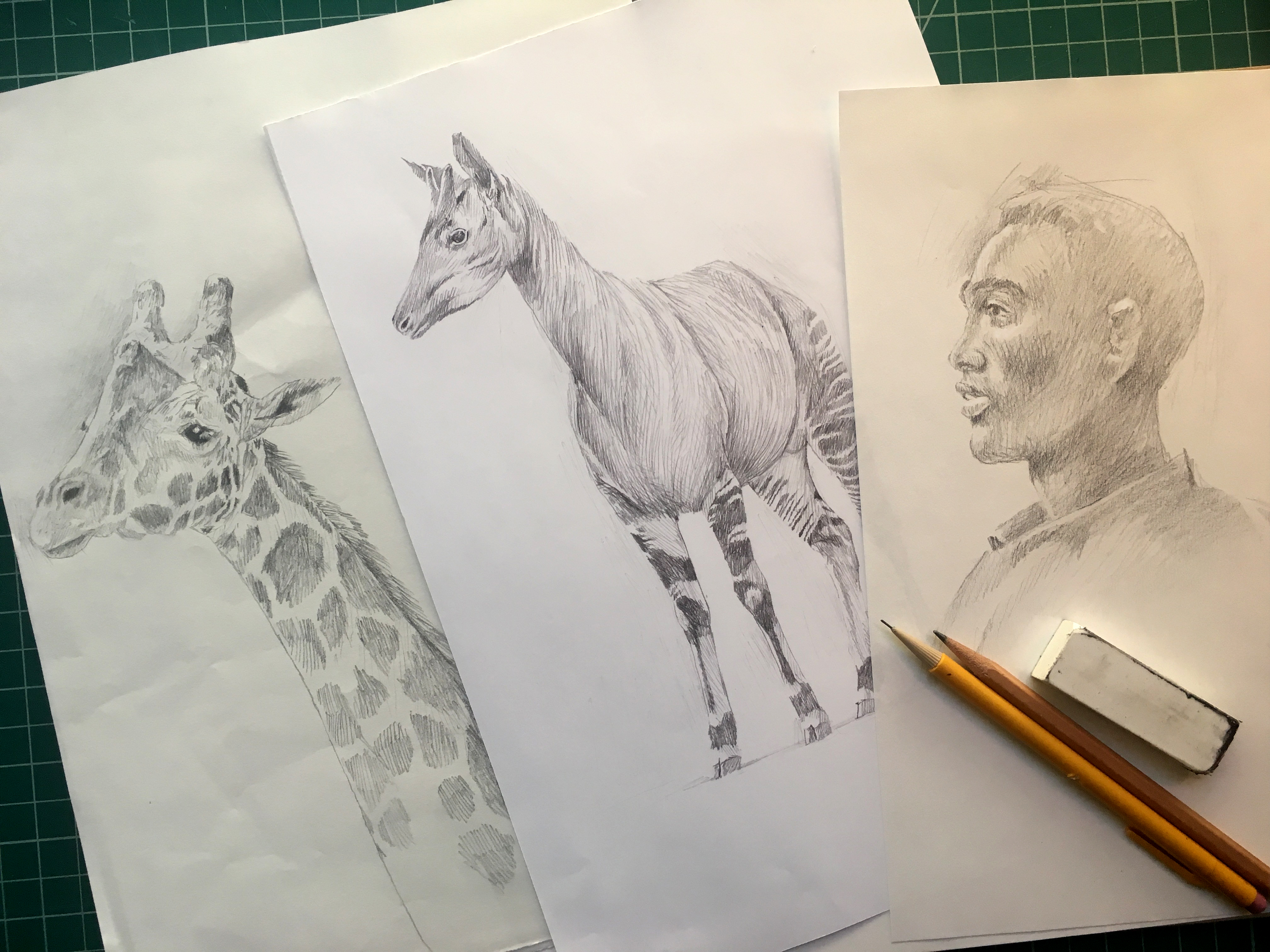
The art begins with a first layer of pencil and then color with photoshop.
This kind of graphic—with a cutaway showing the anatomy—is pretty complicated. It needs to be easy to understand. To show the different layers it takes time to figure out the transparency, layers, colors. Sometimes I have more than 1000 layers in Photoshop. Here is a video of the process of painting the okapi:
I try to give some kind of scale to readers. For that reason I put a vertebra in the background in actual size, pretty impressive size! We can do it in print but not on the web. I try to do this often in my graphics.
I showed my graphic in process to my bosses and coworkers and I got comments that help me understand how the readers use the graphics. It is very helpful. Sometimes we spend a lot of time working in a graphic and we don't read the graphic like a reader.
Finally, who is the man in the graphic?
I thought a local man, a person that worked with giraffes, would be appropriate. I looked for references of several men working in the area, some of them were park rangers. I drew one, using several photos. For the general pose I used myself. I show the man in a low opacity because the 'rock stars' are the animals.
Info We Trust (the website) is an award-winning ‘data adventure’ exploring how to better humanize information. Data storyteller RJ Andrews is based in San Francisco and the author of the book Info We Trust: How to Inspire the World with Data (Amazon). Please let me know what you think via Twitter @infowetrust or the contact page.
No comments.