
We can learn many lessons about informing from beyond the world of data. This essay reviews my favorite design books, most of which are not explicitly “design books”. Each one somehow transformed how I see the world.
The balance of this essay reviews my favorite design books, oriented to how they can help the data storyteller better inform. Most of these books are so rich that they could count in many silos. But, grouping and calling out one lead from each bundle allows me to pack in more recommendations.
Some caveats: You can think of my inclusion criteria, and prioritization schema, as a casual “Here’s a book I recommend you check out!” This is not a final authoritative anything. Plenty of information arts that have impacted my work are not included: songwriting, comedy, and even gardening—which cultivates the information signaling tools of plants for our benefit. I merely hope you discover one or two new friends across these books (titles link to Amazon). They have all been very kind to me.
See more when you look

The Shape of Content, by Ben Shahn (1957), is a little book with big lessons on how to think about creative work. Its title explanation of content & form is relevant to the analogous pair of data & information. Information is data arranged, or data put in formation. "Form cannot be greater than content, it is only the manifestation, the shape of content.” Shahn reaches inward to examine the creative habits of the artist: “an artist at work upon a painting must be two people, not one … On the one hand, the artist is the imaginer and the producer. But he is also the critic … a ruthless destroyer.” Shahn reaches outward to to the unifying power of art by its (paradoxical) impact on the individual viewer, especially by way of achieving the universal: "that unique thing which affirms the unique qualities of all things.”
Two other books helped me see creative work more clearly. Like The Shape of Content, they are very short works that punch way above their weight class.
Molly Bang’s Picture This: How Pictures Work (2000) walks you through the construction of a simple archetypal illustration. Bang reveals the emotional and narrative impacts of design decisions (shape, color, size, and composition). She concludes with a practical summary of principles, for example: "Smooth, flat, horizontal shapes give us a sense of stability and calm. I associate horizontal shapes with the surface of the earth or the horizon line... We humans are most stable when we are horizontal, because we can’t fall down. Shapes that lie horizontal look secure because they won’t fall on us, either….”
John Berger’s Ways of Seeing (1972) is based on a BBC TV series. Like Shahn and Bang, it emphasizes the role of the viewer in creating meaning, including the first viewer, the visionary artist. It pushes further into the audience to remind us that the development of fine art was fueled by its role as status symbol across societies, and this can be related to the use of image in modern advertising. Most unique is Berger’s inclusion of purely visual essays juxtaposed examples that will surely challenge the way you see.
Put graphic design to work

Ogilvy On Advertising, by ad tycoon David Ogilvy (1985), is my favorite book about graphic design because it focuses on how to put graphic design to work, "I do not regard advertising as entertainment or an art form, but as a medium for information ... when Aeschines spoke, they said, “How well he speaks.” But when Demosthenes spoke, they said, “Let us march against Philip.” Likewise, the success of data storytelling can often be judged by how well it motivates its audience to action. Ogilvy is packed with practical advice for how to do effective advertising design. It includes pointers on headline, copy, image, and composition. But it goes far beyond the printed page. He also emphasizes the preparation required (Ogilvy was a research/testing nut) and business organization necessary make effective graphic design.
Ellen Lupton’s How Posters Work (2015) goes deeper than Ogilvy into how to think about the design of the graphic artifact. Lupton shows how to analyze a static composition using basic design principles (focus, depth, diagonal). Story is the big goal, and can be achieved when the content of a single frame can communicate setting (context, where are we?), character (what do we care about?), conflict (what contrast and pattern can we see?), and satisfaction (what new knowledge have we learned?).
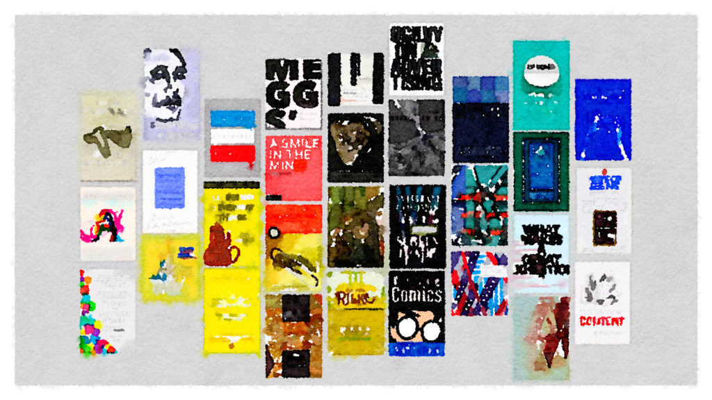
One of the best ways to learn more about graphic design is to consume lots and lots of graphic design. MEGGS History of Graphic Design (2016, 6th ed.) is the go-to reference to understand how we got here. It’s big, colorful, and the next-best thing to a university survey semester. A Smile In The Mind: Witty thinking in graphic design (2015 revised) organizes modern examples of graphic design into 22 different types of wit, e.g.: Missing link, Expectations confounded, Shift:time, Shift:scale. It really shows how playful and clever design can be. If you are delighted by the FedEx “evil arrow” then go get this book.
Invent new ways of seeing

Structures: or Why Things Don’t Fall Down, by J.E. Gordon (1978) is my favorite book about engineering. It explains fundamental concepts related to sustaining loads like elasticity, compression, stress and strain, and design for safety—topics which might be pretty uninteresting to the layperson—in a way that excites and engages. Gordon does this with fantastically familiar examples from across nature and human design. On stress concentration: “Thus the difficulty which a thrush has in pulling a worm out of a lawn does not depend on the length of the worm; a short worm is just as hard to extract as a long one." Illustrated with superb diagrams, Structures is a tour de force of explanation design.
Eugene S. Fergusons’s Engineering and the Mind’s Eye (1994) is the best treatment I’ve ever read about the creativity of invention. Ferguson explains why the individual, in conjunction with theory and empirical evidence, is critical to making new useful things. It’s an angle that I believe is fuzzy for techies, who “may believe that a designer’s judgment can be incorporated in a general-purpsoe computer program.” By examining the history of invention, Ferguson clarifies the role of the individual’s Mind’s Eye, along the way showing the role of drawing, failing, and persevering.
Two additional books on engineering design deserve mention: Henry Petroski’s The Evolution of Useful Things (1994) will make you question the “form follows function” quip through its detailed examination of how we got everyday objects like the paperclip and fork: “What form does follow is the real and perceived failure of things as they are used to do what they are supposed to do." Don Norman’s The Design of Everyday Things (2013, revised) is a good companion to Petroski. I appreciate Norman’s focus on finding the right problem, "Engineers and businesspeople are trained to solve problems. Designers are trained to discover the real problems.” All data workers can learn from his warning to not get lost simply designing for the robots: "Many codes …exist primarily to make life easier for machines and their designers without any consideration of the burden placed upon people." Petroski and Norman help the engineer remember: people are the stars of the show.
Tell better stories

Adventures In The Screen Trade, by William Goldman (1983), is my favorite book on Hollywood storytelling. Written by the screenwriting master who created The Princess Bride, it is a rare intersection of a creative genius’s honest career retrospective who actually knows how to write. This line about creative confidence makes me smile: "When I write, I must convince myself that it’s going to be wonderful. ... I’m going to write it and this time, this time, it won’t be crap. When I don’t have that confidence. I’m in big trouble."
Steven D. Katz’s Film Directing Shot By Shot: Visualizing from concept to screen (1991) uniquely connects visual and dramatic elements: “Graphic — Where is the camera stationed? Narrative — Whose point of view is being expressed?” Katz layers on loads of practical advice such as how to storyboard and how to place the audience in suspense. “A familiar pattern merely shows us what we already expect and does little to raise expectations or contribute to narrative motion.”
Scott McCloud’s Understanding Comics: The invisible art (1993) continues to amaze as both explainer of its craft and storytelling artifact. It is an indispensable resource one can return to and discover something new. McCloud’s linkage of space and time via a ruler that become a clock face (on page 100) delighted me most on our most recent visit.
Michael Austin’s Useful Fictions (2011) and Arnold Kling’s The Three Languages of Politics (2017) both give a greater appreciation for uncooperative audiences. Austin details the evolutionary psychology of why we are wired for storytelling, not facts: "Given a choice between a useful fiction and a useless fact, natural selection will choose the useful fiction every time.” I like Kling on political discourse because he shows how other people are “not crazy, or stupid, or evil” and insists that we can combat motivated reasoning and built a more trusting world. A worthy effort indeed!
Transform your perception

The Phenomenon of Life, Book One of "The Nature of Order” series by Christopher Alexander (2002), shocked me into a new way of looking at the world more than any other piece of writing I came across in my research for Info We Trust. Alexander’s way of seeing is the best description of how spatial relationships create meaning—how they create life—that I have come across. It anchors on centers and wholes: "When I think of them as centers, I become more aware of their relatedness ... The flower is not made from petals. The petals are made from their role and position in the flower.” His concluding 15 fundamental properties identify "structural features which tend to be present in the examples which have more life, and tend to be missing in the ones which have less life.” Some of my favorites are levels of scale, local symmetries, and roughness.
Nick Sousanis’s Unflattening (2015) is the book I gift the most. I love it because it inspires us "to discover new ways of seeing, to open spaces for possibilities, and to find 'fresh methods' for animating and awakening.” Sousanis accomplishes this with the most beautiful and compelling visual storytelling flair: Unflattening is a black and white comic that will make you reconsider how much imagination can be bottled on the printed page. "Imagination lets us exceed our inevitably limited point of view to find perspectives not in existence or dimensions not yet accessible.” This book most inspired me to be creatively ambitious with the design of Info We Trust.
Create attention-holding encounters

What Makes a Great Exhibition?, a collection of essays edited by Paula Marincola (2006), is my favorite book about experience design. It studies how the art gallery’s relationship to the world can offer the viewer “contemplation, education, and, not the least, pleasure.” I took the most notes on Robert Storr’s “Show and Tell” essay. it combines philosophy (“be uncompromising on behalf of the art”) with technical details of architecture, layout, sequence of works, lighting, signage, labeling, brochures, text-panels, typography, and even wall color. "The exhibition-maker’s job is to arrange this encounter between people and what puzzles them in such a fashion that they will derive the maximum benefit and pleasure from it.” “Focus hard on specifics while reminding viewer they constitute only a fraction of a larger whole.” I also thought Ingrid Schaffner’s explanation of how to annotate an exhibition to be delightful. Like Storr, she offers some powerful philosophy too, “Appeal to someone who knows more, less, and as much as you do.”
Stephen Bitgood’s Attention and Value: Keys to understanding museum visitors (2013), states that the success of exhibits is all about good management of visitor attention. Any higher goals, such as learning, is a byproduct of attention. To manage attention well, we must understand audience and setting factors. His detailed look at guiding principles (e.g. control fatigue, ease navigation) are just as important to data storytelling as they are to museum design. Of course they are, both have the same audience, the human mind. Like Marincola’s collection, I like how Bitgood's philosophy is balanced by practical suggestions, e.g.: if visitors do not look at an object as they pass by then examine sight lines, proximity, salience of stimuli, and search process.
For a really fun look at experience design and attention management, go find a copy of Designing Disney’s Theme Parks: The architecture of reassurance, edited by Karal Ann Marling (1998). It was produced to accompany an exhibition at the Canadian Centre for Architecture in Montreal and focuses on the original creation of a new architectural form.
Adventure through the creative journey

Finite and Infinite Games: A vision of life as play and possibility, by James P. Carse (1986), is a beautiful look at how to approach life. I see my whole adventure through data storytelling as one big infinite game: my goal is to keep playing the game and get more people involved in the game. In addition to how to play at the game of life, Carse has a lot of insight to how to look (and create new looks) at life which can help all visual designers. "Explanations establish islands, even continents, of order and predictability. But these regions were first charted by adventurers whose lives are narratives of exploration and risk. They found them only by mythic journeys into the wayless open. … Knowledge is what successful explanation has led to; the thinking that sent us forth, however, is pure story.” Where Carse describes the work of poets, I see the work of the data storyteller: “True poets lead no one unawares … They do not display their art so as to make it appear real; they display the real in a way that reveals it to be art."
Ros and Ben Zander’s The Art of Possibility reframes your perspective on what you can accomplish: with your life and with others, all while not taking anything too seriously. “Sail into a vast universe of possibility” is characteristic of the Zanders’ poetic language that will change how you see, characterize, and categorize the world: "Our willingness to distinguish good and evil may be one of our most enhancing attributes, it is important to realize “good” and “bad” are categories we impose on the world—they are not of the world itself.” If I didn’t know better, I thought they might be talking about what might be possible with data storytelling: "Art after all, is about rearranging us, creating surprising juxtapositions, emotional openings, startling presences, flight paths to the eternal.”
Rainer Maria Rilke’s Letters To A Young Poet, is a collection of ten short letters written over 100 years ago by German lyric poet Rilke to young would-be poets. The correspondence describes the difficulty and seriousness of creation: “Things are not all so comprehensible and expressible as one would mostly have us believe…." “[A] whole constellation of things must come right in order once to succeed.” I like Rilke most because his description of orienting your whole life to succeed in your craft resonates with my experience of becoming better at data storytelling, “…the birth-hour of a new clarity: that alone is living the artist’s life: in understanding as in creating.” Rilke’s sometimes desolate perspective is a good counter to the playfulness of Carse and Zander & Zander.
Get poetic

Six Memos for the Next Millenium, by Italo Calvino, explored five themes: lightness, quickness, exactitude, visibility, and multiplicity. His words are beautiful, "When the human realm seems doomed to heaviness, I feel the need to fly like Perseus into some other space. I am not talking about escaping into dreams or into the irrational. I mean that I feel the need to change my approach, to look at the world from a different angle, with different logic, different methods of knowing and proving.” His exploration of so many big themes is just as poetic: “Knowledge entails dissolving the solidity of the world.” “Narrative affects flow of time.” “Replace cause with causes.” "Weave together different kinds of knowledge.”
The Selected Writings of Paul Valéry are also packed with poetic insight into the nature of thinking and seeing. I like this quote from “On Painting” the most: "Man lives with what he sees, but he only sees what he wants to see. Try different types of people in the midst of any landscape. A philosopher will only vaguely see phenomena; a geologist, crystallized, confused, ruined and pulverized epochs; a soldier, opportunities and obstacles … They all experience a certain arrangement of colors; but each one immediately transforms them into symbols…."
Joseph Campbell’s Myths to Live By has a potent punch for the data storyteller. Its opening essay, “The Impact of Science on Myth,” includes my favorite Campbell quotes: "And is there no implied intention, then to rest satisfied with some final body or sufficient number of facts? No indeed! There is to be only a continuing search for more—as of a mind eager to grow. And that growth, as long as it lasts, will be the measure of the life of modern Western man, and of the world with all its promise that he has brought and is still bringing into being: which is to say, a world of change, new thoughts, new things, new magnitudes, and continuing transformation, not of petrification, rigidity, and some canonized found 'truth.’ "
Design for the metaphorical mind

Metaphors We Live By, by George Lakoff and Mark Johnson (1980), it the classic text on metaphorical thinking. A big chunk of Info We Trust anchors on embodied cognition and spatial metaphors, something inspired by my original reading of this book. Revisiting it, I saw how expertly it not only introduces metaphor, but also our whole experience of reality: "Truth is therefore a function of our conceptual system ... We understand a statement as being true in a given situation when our understanding of the statement fits our understanding of the situation closely enough for our purposes.” George Lakoff teamed up with Rafael E. Núñez to write Where Mathematics Comes From: How the embodied mind brings mathematics into being (2000). It extends the artistry of Metaphors We Live By to the cold precision of the number line, and was especially influential in my exploration of time.
Douglas Hofstadter and Emmanuel Sander’s Surfaces and Essences: Analogy as the fuel and fire of thinking (2013) is for the adventurer who really wants to submerge into metaphorical cognition. I love how generously it characterizes the audience, "People make the deepest analogies that they can, as constrained by their conceptual repertoires.” It concerns all of the big ideas we think about when trying to convey information: the senses, categories, encoding, mental mappings, and meaning. "One’s interaction with one’s body and one’s environment constitutes the heart and soul of human thought. The concepts that one creates, as well as one’s way of reasoning, are seen as emerging from such interactions. ... people do not mentally juggle with patterns of unanchored, meaningless symbols….”
Edward De Bono delivers a lighter tour of spatial metaphors with his Atlas Of Management Thinking (1981). It includes one page and one simple diagram each for 200 business concepts. Together, a graphic system emerges that encompasses all sorts of ideas. Its section on information includes: thrust, challenge, disbelief, exchange, detail, confusion, and more.
I have one last group of books to share,
but I am going to hold them for the next essay. Next week's essay is titled “Writing is Hard.” It will explain why I found writing to be so challenging. It will hopefully also show some things I learned so that it is not harder than necessary. With the additional writing books, the list will swell to 34, plenty to keep even the most spirited bookworm busy. Until then, catch up with all of the pre-publication goodies at the book’s main page and please consider ordering INFO WE TRUST today.

Info We Trust (the website) is an award-winning ‘data adventure’ exploring how to better humanize information. Data storyteller RJ Andrews is based in San Francisco and the author of Info We Trust: How to Inspire the World with Data. Please let me know what you think via Twitter @infowetrust or the contact page.

No comments.