The United States is currently in a partial government shutdown, but this isn't the first time. There have been 17 other government shutdowns - or spending gaps - since modern congressional budgeting processes began in 1976. They have always occurred in the fall and stemmed from disagreements about spending within Congress or between Congress and the President. Many (1977, 1984, 1995) have resulted because the temporary solutions of previous shutdowns could not be bridged to stable long term ones. Learn more about the opponents and issues that have managed to shutdown our government:
October 3, 2013 — Comments are off for this post.
Government shutdown: a brief history

October 1, 2013 — Comments are off for this post.
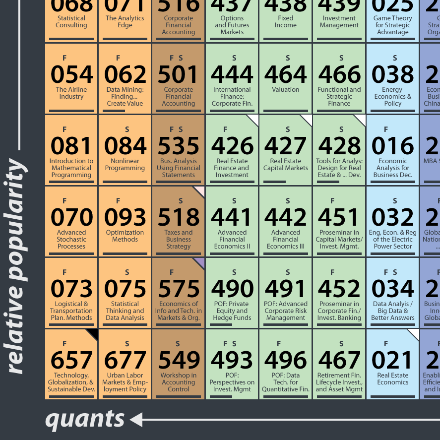
Navigating MIT Course 15
Perhaps it was the chemistry icons of Breaking Bad that drove me to organize the classes of MIT's Course 15 into a handy table. Or maybe it was just reflection on the incredibly knowledge-rich environment of MIT Sloan. For students still taking classes, alumni combing through old notes, and the public digging through MIT's fabulous open courseware (where over 170 management titles are available to all for free), navigate your way though the finest graduate business curriculum around using the Periodic Table of Course 15:

MIT and class names
For the unfamiliar, numbers rule at MIT, and classes are no exception. Read more
Published by RJ Andrews in GIF
September 19, 2013 — Comments are off for this post.
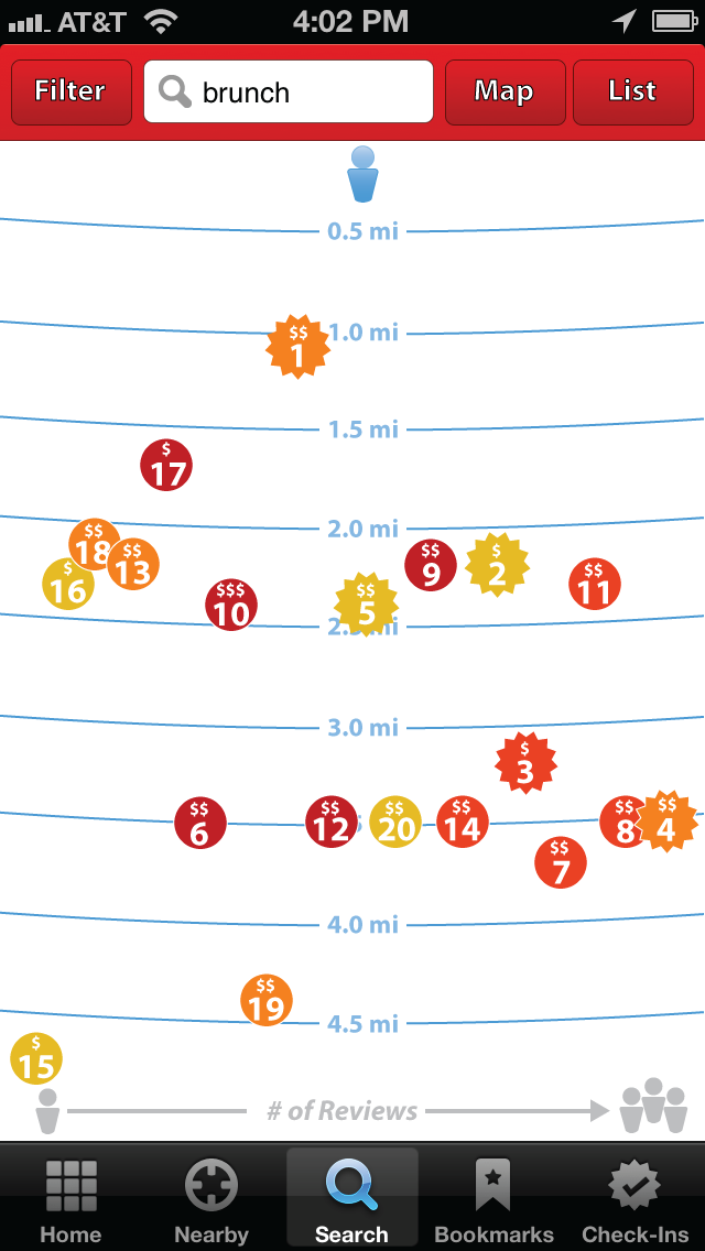
Digesting Yelp
After spending a week eating my way through the Pacific Northwest I became intimately familiar with Yelp (as if I wasn’t already) as it guided me through a gastronomic amusement park.
I found that using the Yelp app on my iPhone was terrific in making some of the finer decisions (highlighting often remarked menu items & displaying pictures of dishes) but rather clumsy when making the most important decision: where should we go to eat? Yelp's restaurant rankings never struck the excitement that their menu highlights did, and certainly did not approach the confidence that comes from a local friend's recommendation. What was missing? Yelp certainly commands a dazzling mine of data - but sometimes I feel it isn't being leveraged properly.
Yelp today
Yelp displays search results in two ways, on a map and in a list. Both of these methods have fundamental problems, which we can investigate by a simple search for brunch spots near my favorite brunch city: Durham, NC:

The MAP view, on the left, appears first Read more
August 28, 2013 — Comments are off for this post.
Prototyping with Vermeer
Imagine seeing the entire catalogue raisonné of an artist at once. What might you learn about the artist's life and painting - favored motifs, density of projects, size of pieces? What if Picasso's blue period could be pictured against the kaleidoscope of his surrounding other work?
Any quest requires the development of special skills. I am currently exploring approaches for visualizing an artist's entire body of work. Before tackling some of the big guys who produced hundreds of works, I am experimenting with the paintings of Johannes Vermeer - my Dutch guinea pig. His body of 34 accepted paintings is the right size to quickly produce a neat little infographic:
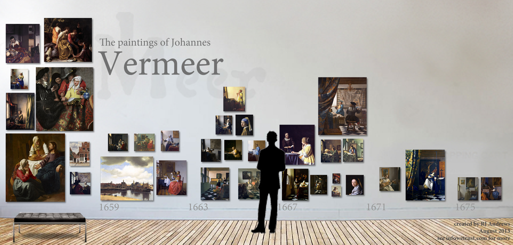
Even this small gallery reveals the repeated arrangements of Vermeer's subjects in the rooms of his house, evidenced by the common black and white floor and light pouring through from the window on the left side of his paintings. This Vermeer cartoon is a great start to my investigation of catalogue raisonnés, and I encourage Read more
Published by RJ Andrews in GIF
August 22, 2013 — Comments are off for this post.
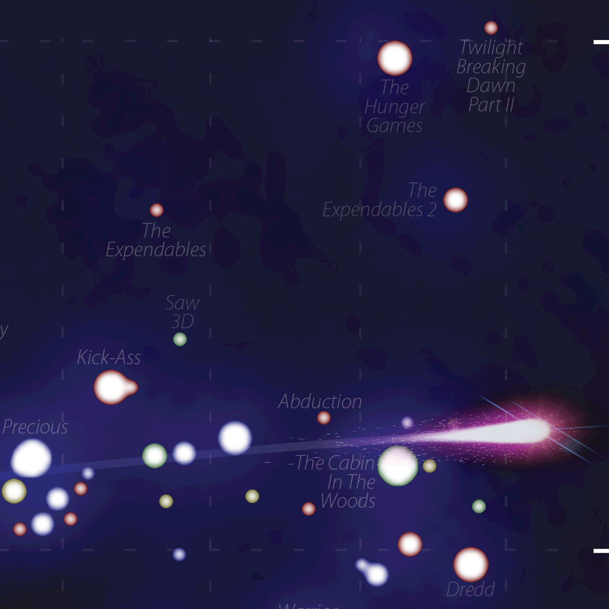
Lionsgate rising
The entertainment company LIONSGATE's (NYSE: LGF) rise to stardom is a Hollywood darling of a success story as perfect as any Oscar-worthy screenplay: from initial founding in Vancouver in 1997, through breakout success with daring features like 2000's American Psycho, to becoming the most successful independent film and TV distribution company in North America today with properties like Twilight and The Hunger Games. LIONSGATE's story was first brought to my attention by film money-baller HollyQuant.com, and we have collaborated since to produce a poster that sings the saga of this studio, The Lionsgate Universe:

click for a higher resolution version
Introduction to the design
The design of the poster is based on the company's Read more
Published by RJ Andrews in GIF

August 21, 2013 — Comments are off for this post.
Calling you to a data-adventure
Welcome aboard to Info We Trust - a data adventure! Together we can explore stories about our history, culture, and way of life with help from the magic of infographics.
Motivation
We must depart the old world of crawling through miles of text. There is a wide gap between the format of the information we consume and the way our mind recalls that same information. Today, information is presented in lists (pages of paragraphs on Wikipedia, newsfeeds on Facebook, search results on Google) which harnesses little of our brain's amazing pattern-recognition abilities. We use ctrl+F, Table of Contents, and other push methods to poke our way into the universe of information.
Imagine instead: complex information organized into visual patterns, with interesting pearls jumping at us visually and pulling us deeper to the most interesting facets. And while we are at it, why not present information beautifully? New types of navigation of our information universe are possible and it is a worthy pursuit to construct them.
Inspiration
I traveled to Queen Victoria's Osborne House at the age of 14 and was spellbound by Max Lindemann's Chart Showing Comparative Length of Reigns. Created to celebrate Victoria's Diamond Jubilee, it mapped the length of British monarchs's reign as ornate columns:

This 19th century infographic not only shows who reigned the longest, it also groups families, shrouds violently killed kings in dark cloth, and provides more detailed information at the bottom. Most importantly, this chart moved me when I first saw it and has stuck with me since because it is aesthetically pleasing. It is not only informative, but beautiful. So beautiful that it was framed and hung on the wall of a Queen's palace.
Since then an amateur education ranging from Charles Minard to the Pioneer Plaque has kept me excited. I am also indebted to many other fantastic infographic blogs which I look forward to writing about soon.
Let's set sail!
Enough with the manifesto - it's time to start exploring! So, please climb aboard the great infographic crystal ship to the stars and get ready for an exciting journey. Subscribe! Comment! and send me the stories that you want to see.
 ©2010-2013 ~InwardPoet
Info We Trust is a data adventure exploring how to better humanize information. The creator, RJ Andrews, is an engineer and proud Northeastern University and MIT graduate. Please reach out through facebook, twitter @infowetrust, or the contact page.
Published by RJ Andrews in GIF

Info We Trust and Visionary Press are DBAs of Information Productions LLC, San Francisco.
Info We Trust ® is a registered service mark. © 2013–2026 RJ Andrews.