Profiling the Parks is a data-driven, hand drawn exploration of the US National Parks. The following reflection details the inspiration, design, data, and collaborators who made this video short possible.
Inspiration
Profiling the Parks was triggered this past April while visiting Yosemite National Park. There is so much to sink your head into there: from the parkitecture of its Grand Lodge to unzipping my tent at sunrise to find two curious coyotes staring right back.
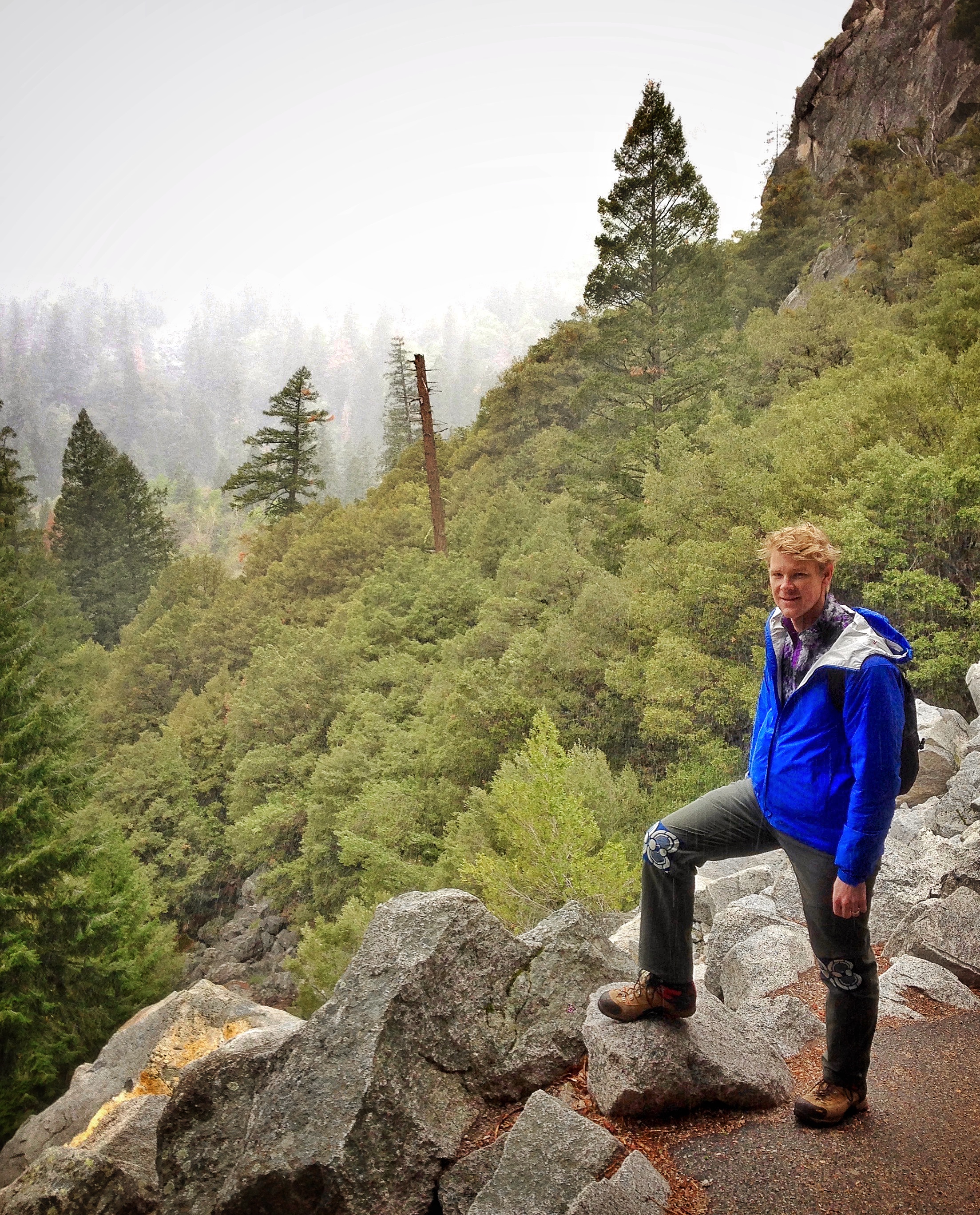
RJ day hiking Yosemite
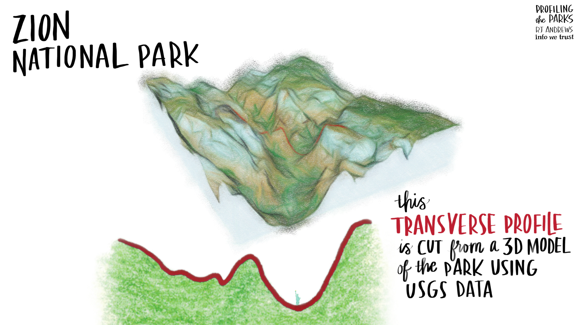
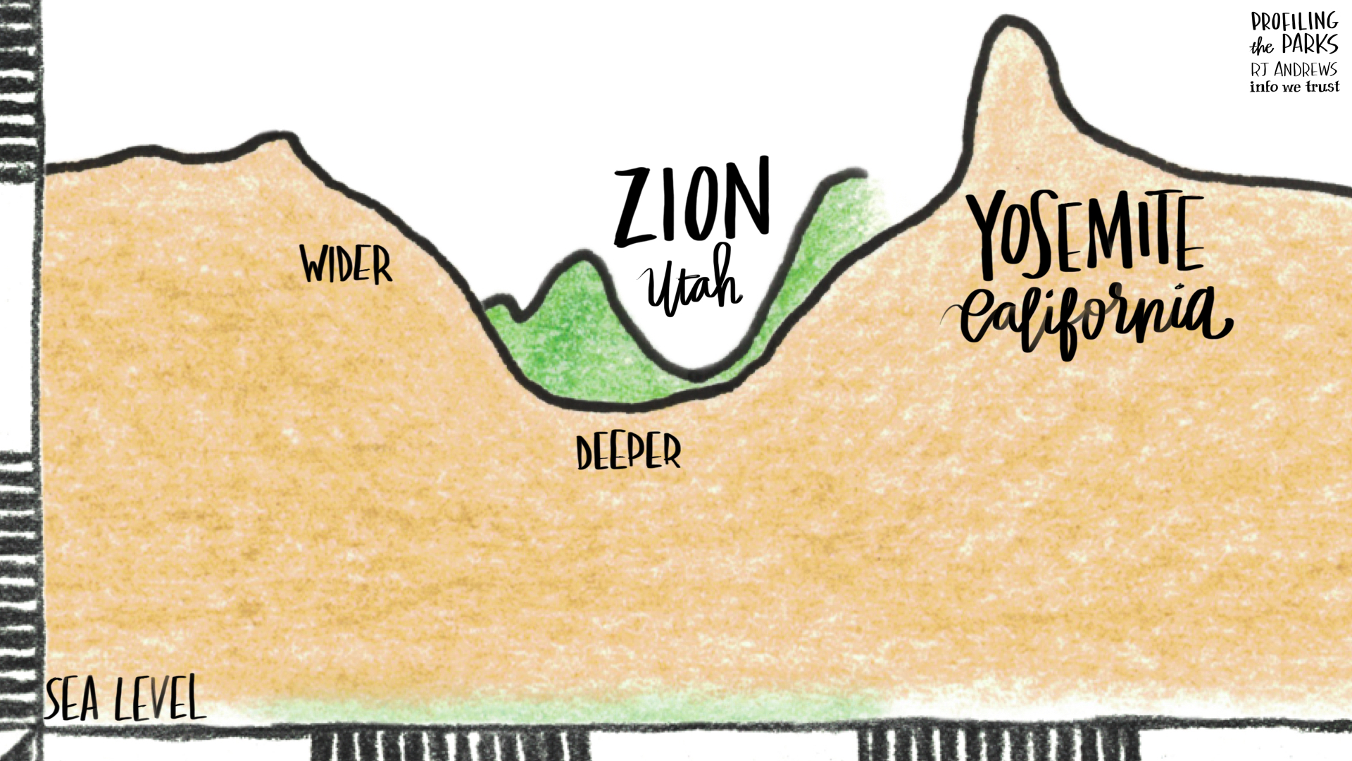
But admiring the valley from one of its pastures is the experience that really got me. I tried to picture the Yosemite valley compared to Zion, my favorite Park. Yosemite felt taller (it is) and also wider (yup) - but I couldn't really tell by how much. I also had no idea which park floor was at a higher elevation. This got me thinking beyond the flora and fauna of the park (previously explored here and here) - and into thinking about the land itself.
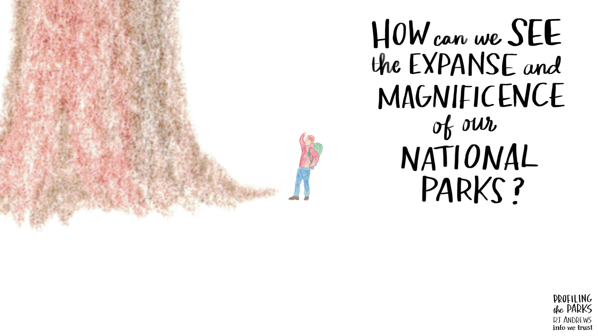
This Yosemite spark charged me to revisit previous trips into the American wild: from backcountry hiking the Grand Canyon to glamping in Yellowstone. I wanted to make something that echoed the awe that the Parks inspire - a simple bar chart showing annual visitors would not do. I believed a more passionate approach was more than deserved.
Design
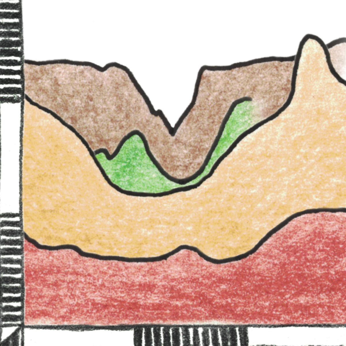
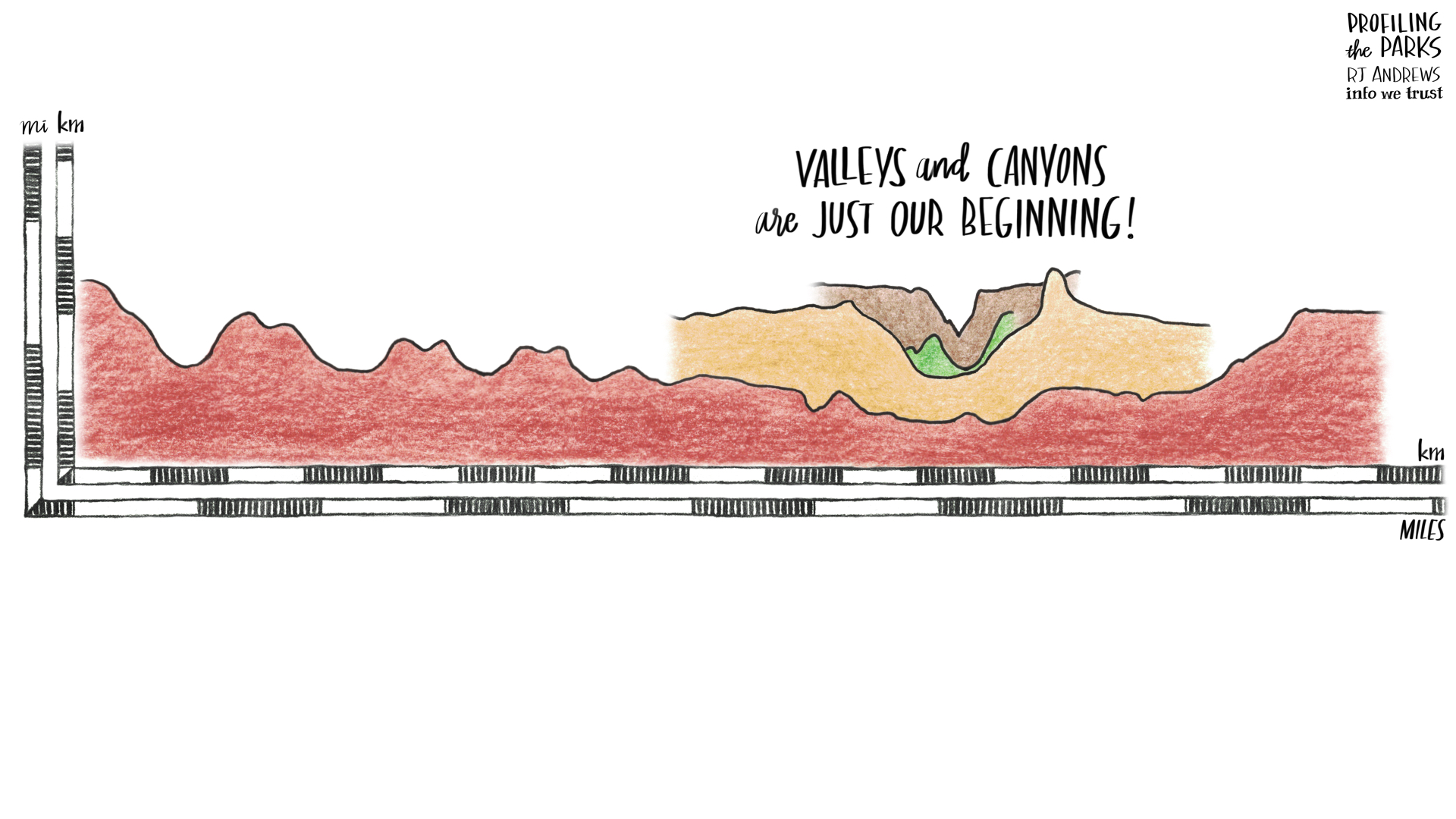
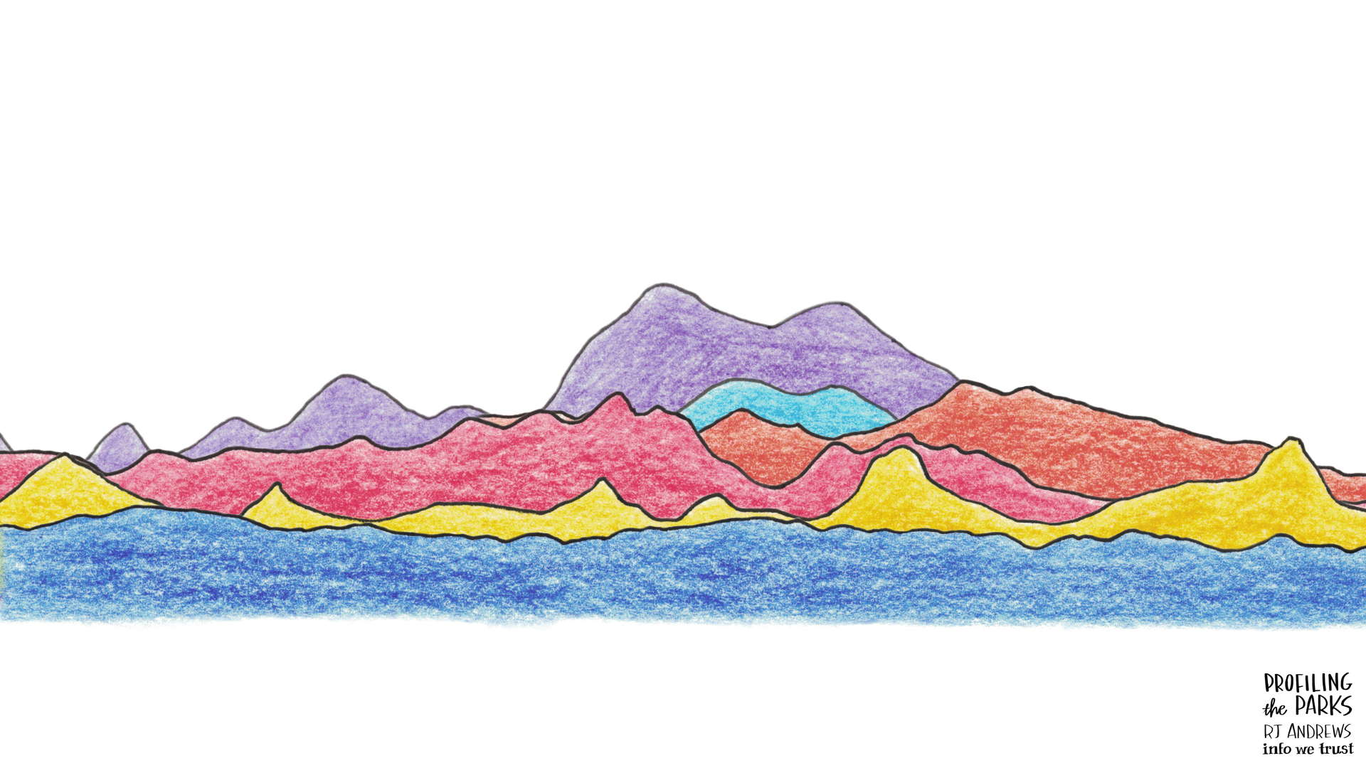
The design challenge was to enable effortless "Node A vs Node B" comparison between different landforms. The actual process was pretty messy and very iterative - lots got left on the cutting room floor. Data storytelling is a multidisciplinary craft, and this project blended many tools. The process and tools used were roughly:
- discover interesting profile cuts by exploring geologic data with digital elevation models: GeoContext, SketchUp
- create 2D and 3D models (both static and revolving) of these cuts: USGS data, DGI software
- illustrate models: Koh I Noor woodless pencils, Pigma Ink, Clearprint Vellum, Pastello
- combine illustrations (keeping scale intact!) and build a narrative: Nikon d800, brother scanner, Adobe PS & AI, Keynote, iMovie, lettering in Procreate
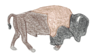
Using both kilometers and miles reflects how I (and other Americans?) think about the land; use metric when we go vertical. The desire to go beyond plants and animals is represented by highlighting the American Buffalo and Giant Sequoia in the opening sequence, which is a play on the National Park System's 1951 "arrowhead" logo, originally developed by Aubrey Neasham and Herbert Maier.
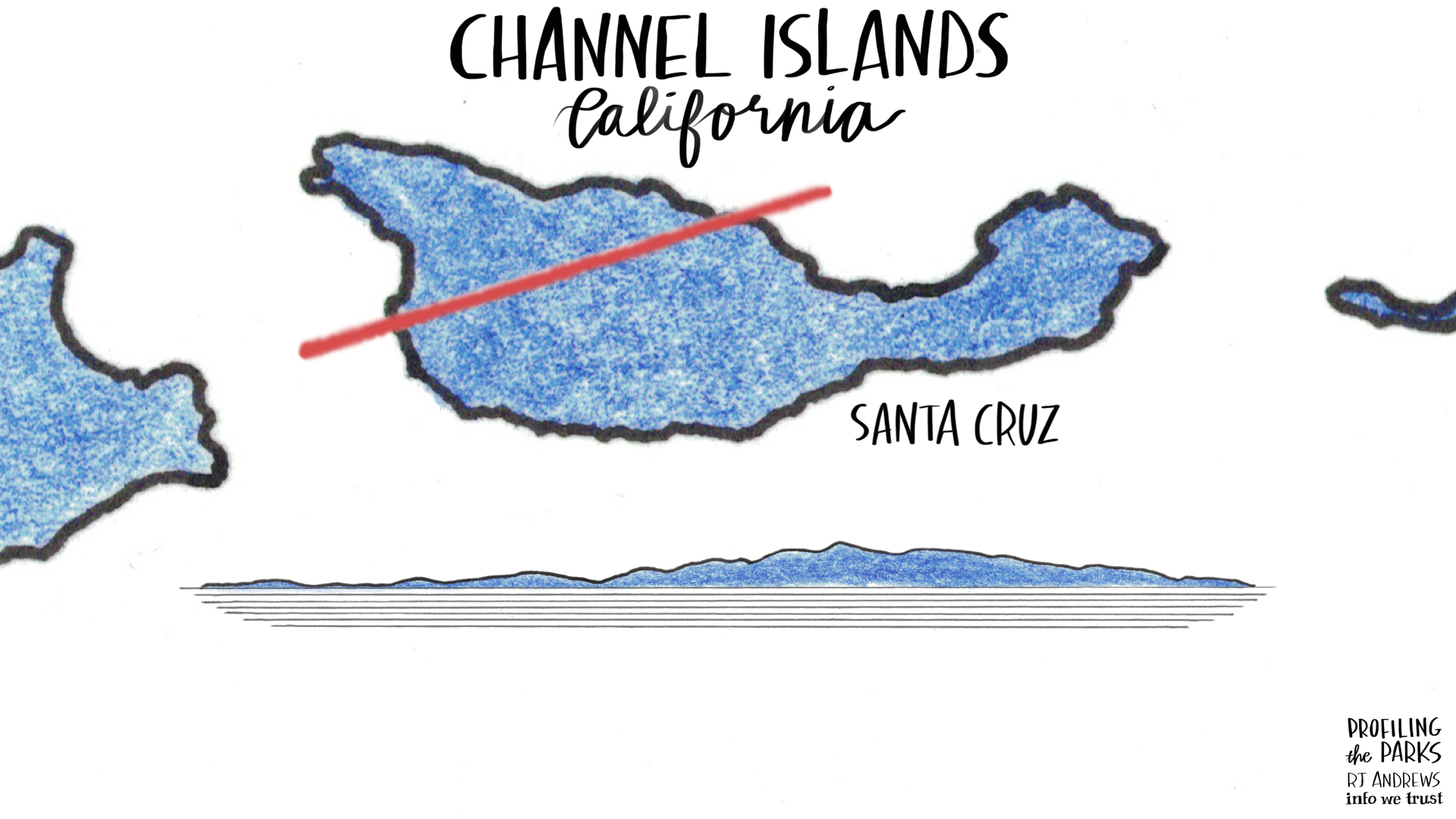
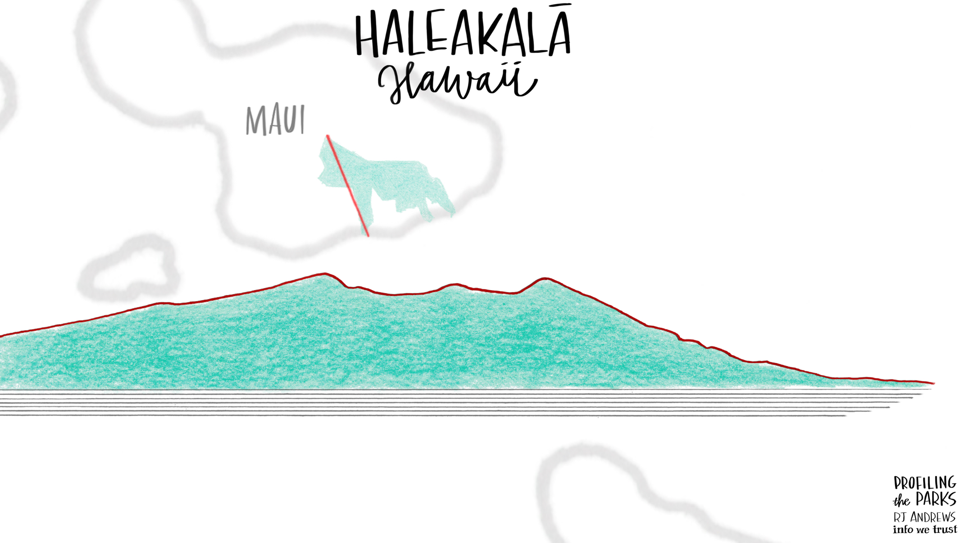
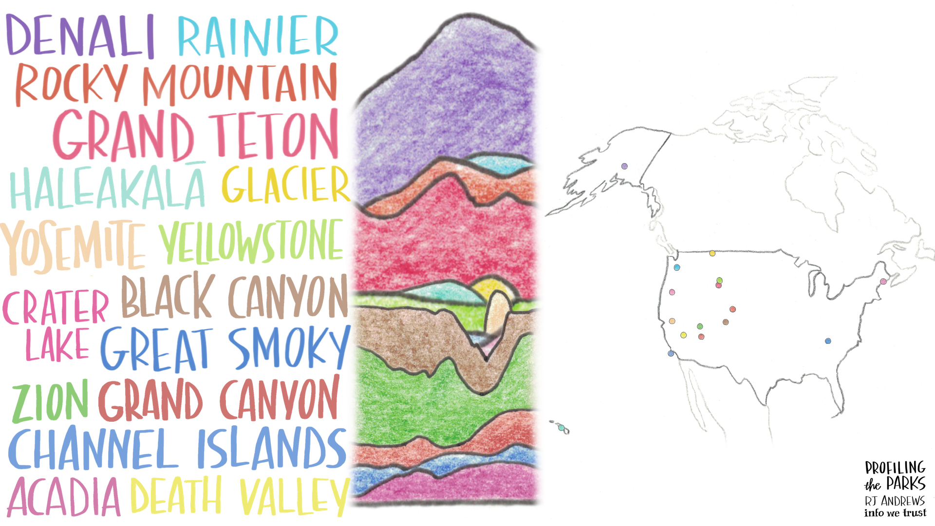
For style I consulted old hand-drawn maps and traveler journals. You can see a mood board here of all my favorites examples. Here is a gallery of selected stills from the short:
This project has been a joy to research. I wanted to see how the National Park Service used infographics to tell its story and so assembled a complete set of National Park brochures (hint: if you write they will send). I plan on binding the set into an enormous atlas. I also developed some art along the way (here and here). Fun!
Data Provenance
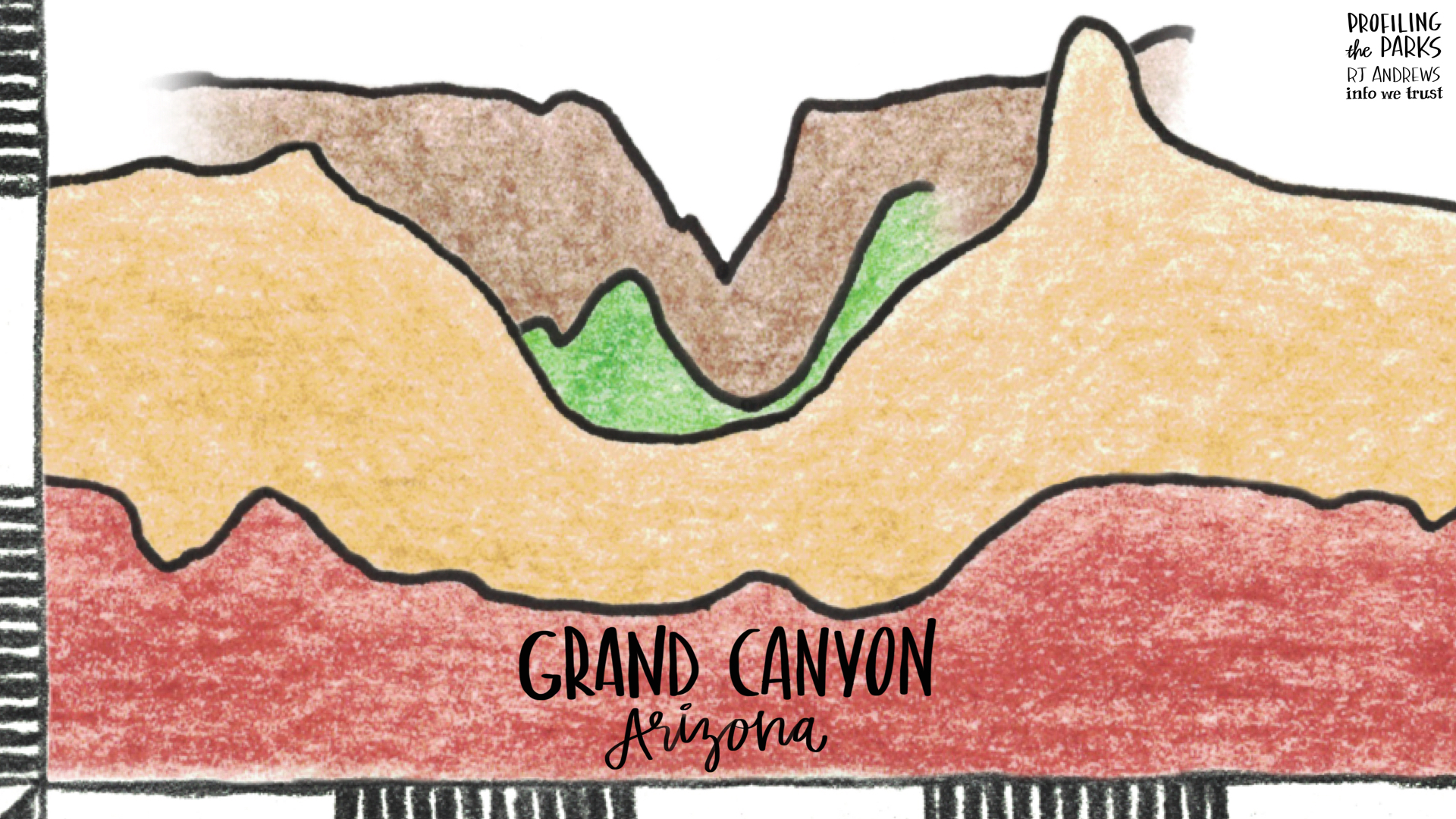
Each illustration is built on an enormous amount of elevation data provided by The US Geological Survey, you can explore it here.
Biases: I chose to feature these 16 Parks based on which ones are personally familiar to me, which ones I thought were iconic must-haves (need to include Yellowstone), and which ones I am most excited to visit next. And of course only a tiny sliver of each park chosen is exhibited. These slivers were constructed to feature aspects of each Park I believe are most pleasing. I tried to show a variety of interesting land forms, but alas many fantastic parks (e.g. Mammoth Cave, the Everglades) did not fit into my profile-driven approach.
Kudos
I am very lucky to have had many join this journey into our National Parks. Serious firepower was needed in order to translate USGS data to the models that power these illustrations. I discovered Dynamic Graphics Inc by digging through the National Geographic archive and reading the fine print about who helped make this classic 1981 graphic about Mount St. Helens:
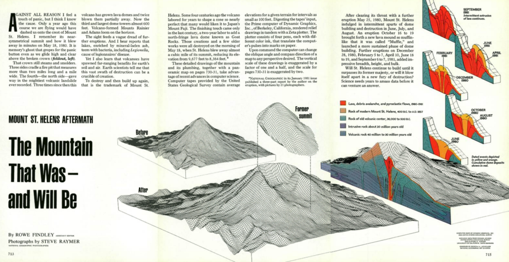
National Geographic Magazine, December 1981
The way the 3D model gets sliced was just what I wanted. I was delighted to learn that DGI is not only still in business 35 years later, but located just across the Bay in Alameda, California. They generously donated so much time (and patience) creating models of many many parks. Visiting them to nerd out on maps and models was one of the best parts of this project.
Catherine Madden hand lettered the entire story, elevating this endeavor to a level beyond my imagination. She is a leader in visual thinking and facilitation, especially when it involves data. Catherine is famous for producing beautiful visual recaps of events live. Getting her Friday newsletter is one of the best parts of my week.
Elizabeth Andrews is a professional photographer based in NYC. She not only helped me capture and bring the pencil sketches into the digital world, but also advised on color, composition, and story. Elizabeth's Instagram is a real treat (hint: go to tile view). I am very lucky to have her as a most inspiring and loving sister.
Hat tips to Scott Stern (for pushing me to think about the Parks after visiting Yellowstone last summer), Joost Bonsen (especially for helping me plus the title), and many friends who have gone to the Parks with me to hike, camp, and laugh.
Info We Trust is a data adventure exploring how to better humanize information. To learn more read the opening post here. The creator, RJ Andrews, is an engineer and proud Northeastern University and MIT graduate based in San Francisco. Please let me know what you think via Twitter @infowetrust, Facebook, or the contact page.
Are you interested in purchasing a limited edition hand colored illustrations related to Profiling the Parks? Please reach out if this or any other wall-mounted version of this project interests you. Prints of past projects are available here.

No comments.