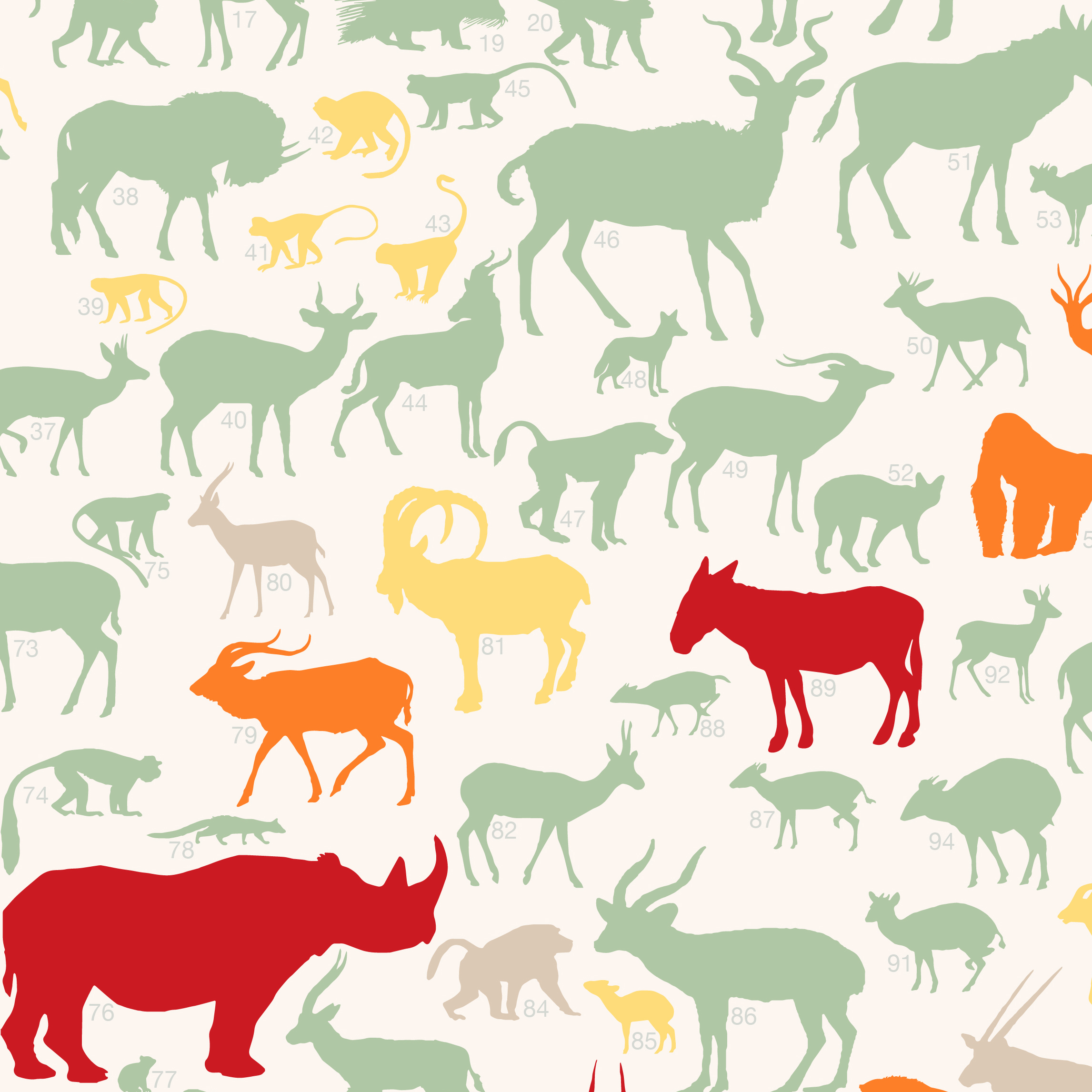
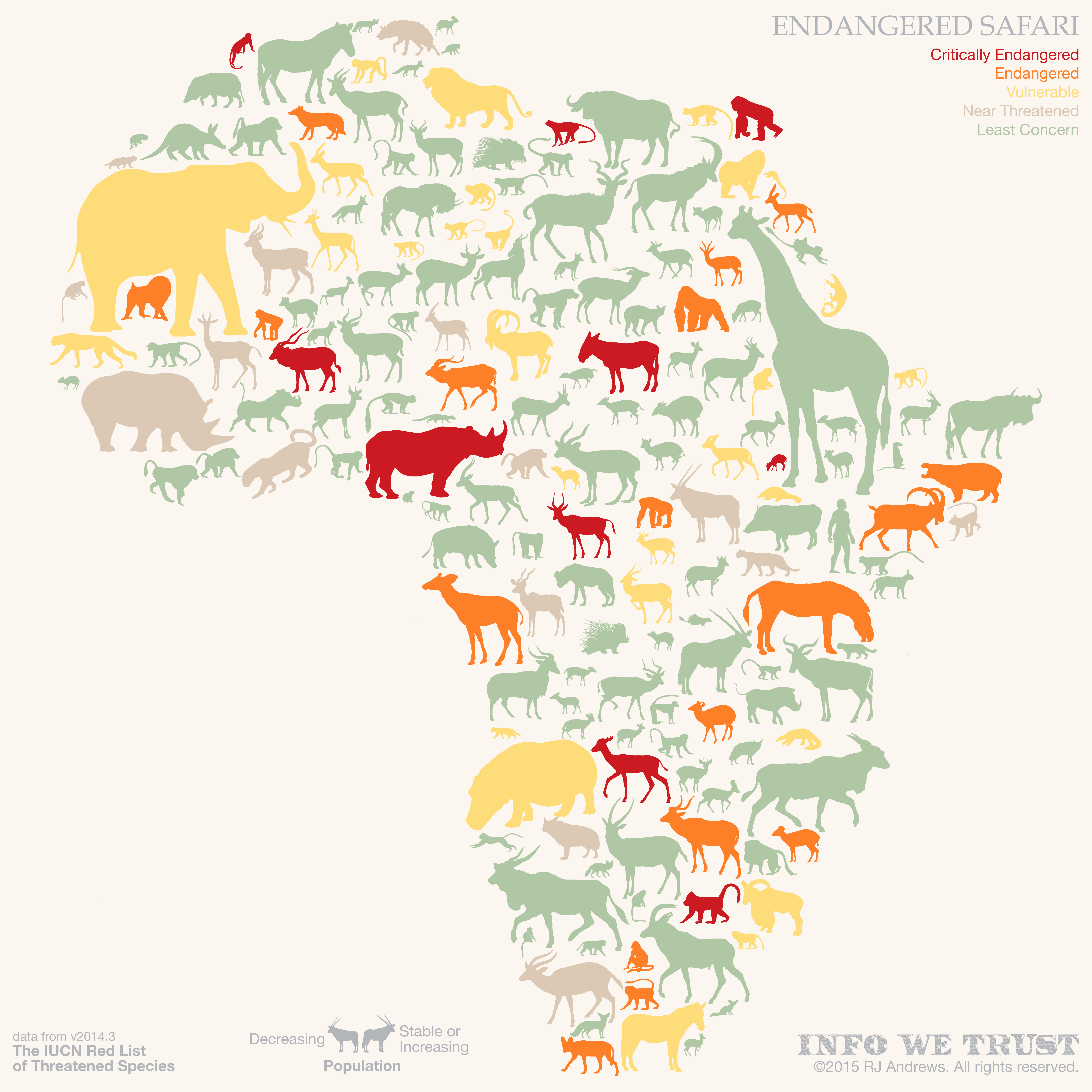
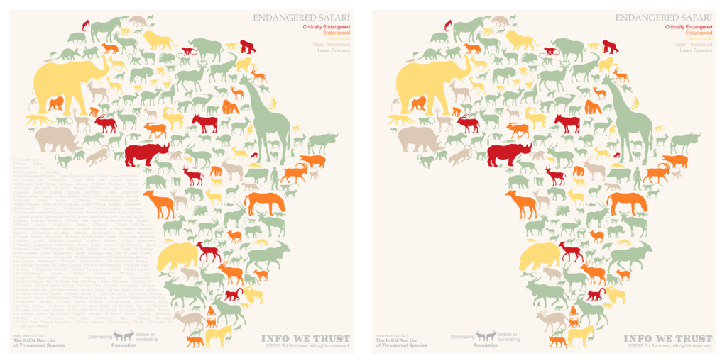
The ENDANGERED SAFARI project contains all of the large African mammals along with juicy info like animal size, family, population trend, range, and IUCN threatened species status. The static version, above, is an artsy layout that makes a great print, but to really dig into the data, including individual animal range maps, you will have to jump on a computer (it's not built for mobile) and play with the interactive below by hovering over each
animal:Note: this interactive looks great on a BIG screen. For optimal viewing, download the Tableau file, open it with the free Tableau Reader and enter presentation mode. Doing this will also allow you to switch between animals almost instantaneously.
Pouring over an old beat-up field guide I found on a dusty shelf in a Kenyan library was the primary inspiration for this work - but it has deep roots. I grew up with ZooBooks, a magazine that featured a different animal in each short issue. Descriptions of animal behavior combined with great pictures and diagrams fascinated me and was one of my earliest introductions to infographics.
ZooBooks
Fast-forward 20+ years and I am living in Kenya, within driving distance of some of the most incredible wildlife the world has to offer. I’ve had the great fortune to be able to travel to many Kenya Wildlife Service National Parks and reserves and have been, like most, stunned by the animals. Both the diversity and density of species in many of these parks are amazing, and saddening when I learned that even now the animals are not near the levels where they naturally should be. The whole safari experience evokes a feeling similar to the one I got when I first saw Haruo Takino’s Noah’s Ark; an awestruck wonder at the magnificence of life.
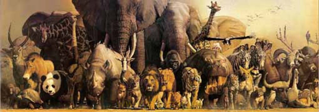
Noah’s Ark by Haruo Takino
Design
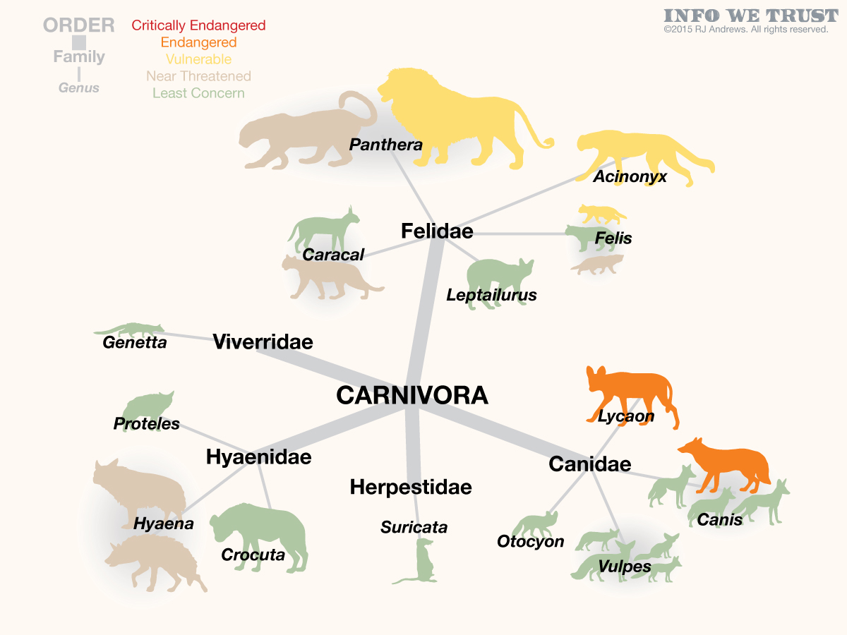
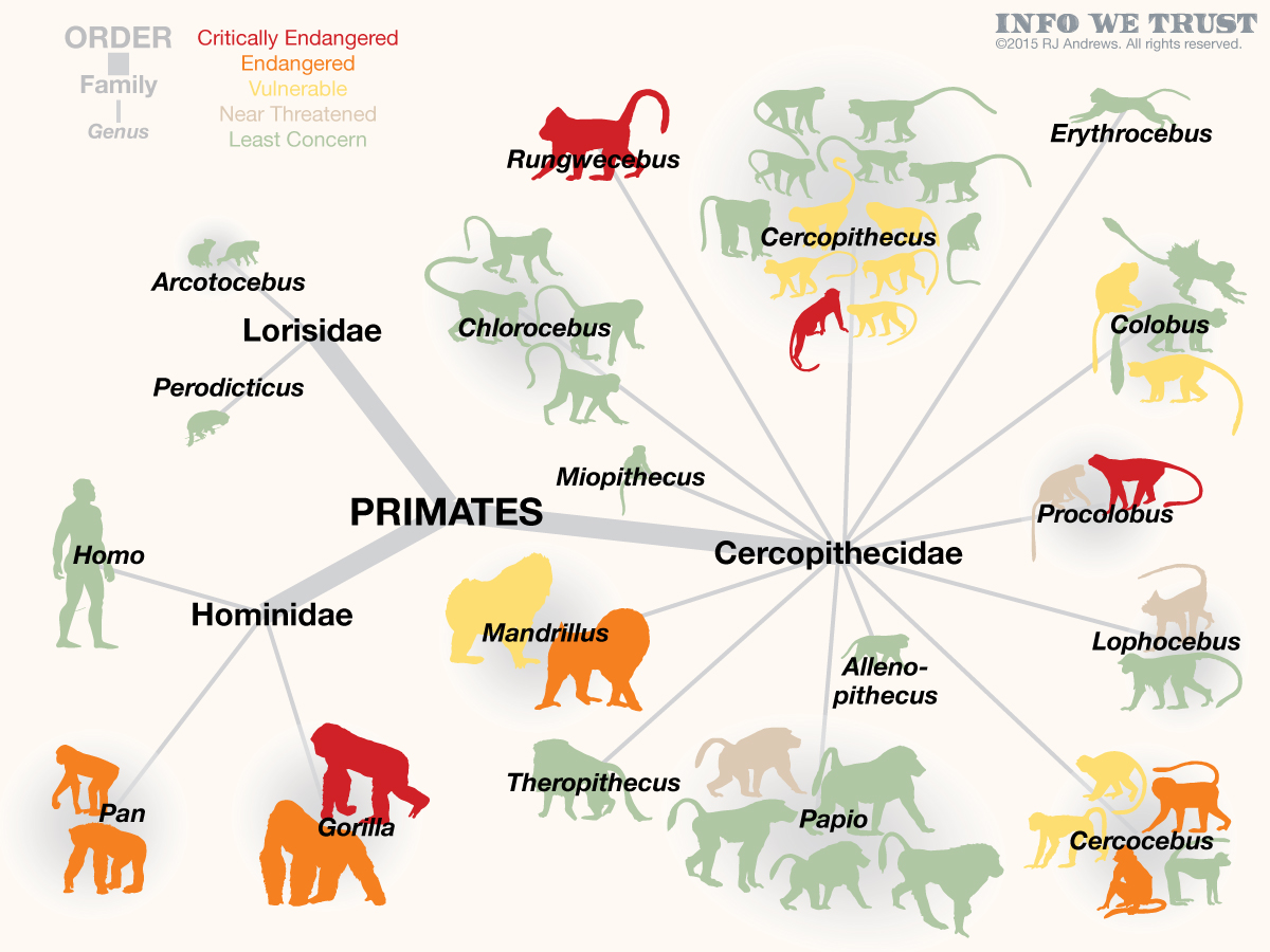
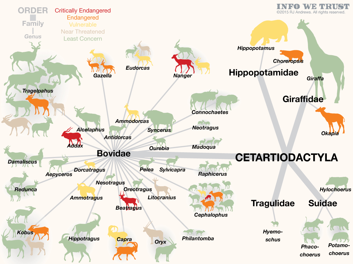
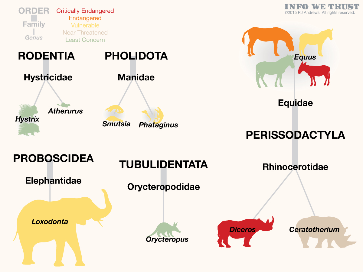
The interactive is packed with a ton of information so that, just like I used to spend hours reading and re-reading ZooBooks, you can really settle in and enjoy it for a while. Dimensions used include color (threatened species status), size (animal’s actual relative size), direction facing (population increasing/stable or decreasing), and placement (animal classification).While not as obvious, animals are positioned close to their relatives. So carnivores are on top, above monkeys and apes, who are above all of the food. Key large animals (elephant, rhino, giraffe, and cape buffalo) anchor each of the corners. Within each of the sections, related animals are also grouped. The lesser kudu is next to the greater kudu, all of colobus monkeys are together, zebras keep each other company, etc. Here’s a classification network diagram that explodes the piece out so you can see specific relationships:
Data Provenance
The list of African mammals, taxonomic group, and endangered status are from version 2014.3 of The IUCN Red List of Threatened Species. Map spatial data is also from IUCN, learn more at www.iucnredlist.org.

Animal silhouettes: I created the silhouettes mostly from illustrations obtained from MAMMAL’S PLANET, a database of animal illustrations. A complete list of artists of the original illustration can be found here.
Animal sizes: the silhouettes are in rough proportion to one another based on sizes found in the 1990 version of A Field Guide to the Larger Mammals of Africa, by Jean Dorst and Pierre Dandelot.
Only large terrestrial mammals are included - reptiles, birds, marine mammals are all beautiful but not the focus today. I filtered to these 174 mammals based on my own desire of what I want to see on safari. Weasels, most genets, otters, mongoose, and so many rat species didn’t make the cut - mostly because the are all pretty tiny. Additionally, the diversity of life is so incredible and unique on the island of Madagascar that I ultimately had to leave these animals out of the piece. Their numbers and unfortunate endangered status would have skewed the entire continent. Honestly, they deserve a visualization all to themselves.
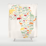
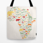
I created two prints for purchase here of the African continent version of the piece - one with animal names and one without:
Additionally, I experimented with some fun other merchandise, I'm interested to see if any of this interests you:
First thanks must go to the IUCN - for creating and curating such a phenomenal data resource and being so generous to open it up to us all. Learn more at www.iucnredlist.org. In addition:
Thanks to Nelson Davis for showing me the way through some of the logic of getting all of the data clicking. Thanks also to the great team that ran the Tapestry conference and inspired me to publish something fun with Tableau - especially Ben Jones for helping me polish the interactive.
Thanks to Simon Runc for writing a great tutorial on how to push ArcGis shapes into Tableau and BronzeHedwick who wrote a sweet script that exports layout data from Illustrator.
Bill Pitzer’s “Our Endangered Species” from the March 1995 issue of National Geographic might be the closest work I found when digging for similar pieces:
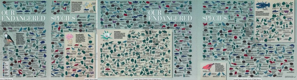
“Our Endangered Species” by Bill Pitzer’, from the March 1995 issue of National Geographic
And finally, a hat tip to David McCandless’ use of direction-facing dogs inspired me to use direction to represent population trends.
I have been delighted that Endangered Safari has received so much attention across its first year in the wild. It was named a Tableau Public Viz of the Week and selected for the 2015 Kantar Information is Beautiful awards interactive longlist. The associated video, Are gazelles endangered?, won the inaugural Science Data Stories video contest:
Info We Trust is a data adventure exploring how to better humanize information. To learn more read the opening post here. The creator, RJ Andrews, is an engineer and proud Northeastern University and MIT graduate. Please reach out through facebook, twitter @infowetrust, or the contact page. Prints are available here.

No comments.