
Standards for Graphic Presentation
Seventeen ways to improve data viz from 1915.
RJ Andrews
Jan 4, 2022 • 5 min read
In 1915, a group of men from American engineering, scientific, government, and business societies published seventeen general suggestions for the visualization of statistical and quantitative data. The committee hoped their recommended standards would improve how complex information was “imparted and interpreted.”
More than one hundred years later, it is worthwhile to read these standards, presented below with re-mastered figures. They help us acknowledge many design principles which are still useful today, and reflect on what we have learned about the presentation of data in the past century. —RJ Andrews
Joint Committee on Standards for Graphic Presentation
Preliminary Report Published for the Purpose of Inviting Suggestions for the Benefit of the Committee.
As a result of invitations extended by The American Society of Mechanical Engineers, a number of associations of national scope have appointed representatives on a Joint Committee on Standards for Graphic Presentation. Below are the names of the members of the committee and of the associations which have coöperated in its formation.
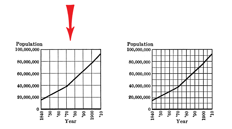
Willard C. Brinton, Chairman, American Society of Mechanical Engineers.
Leonard P. Ayres, Secretary, American Statistical Association.
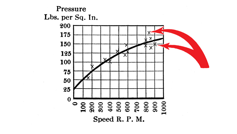
N. A. Carle, American Institute of Electrical Engineers.
Robert E. Chaddock, American Association for the Advancement of Science.
Frederick A. Cleveland, American Academy of Political and Social Science.
H. E. Crampton, American Genetic Association.
Walter S. Gifford, American Economic Association.
J. Arthur Harris, American Society of Naturalists.
H. E. Hawkes, American Mathematical Society.
Joseph A. Hill, United States Census Bureau.
Henry D. Hubbard, United States Bureau of Standards.
Robert H. Montgomery, American Association of Public Accountants.
Henry H. Norris, Society for the Promotion of Engineering Education.
Alexander Smith, American Chemical Society.
Judd Stewart, American Institute of Mining Engineers.
Wendell M. Strong, Actuarial Society of America.
Edward L. Thorndike, American Psychological Association.
The committee is making a study of the methods used in different fields of endeavor for presenting statistical and quantitative data in graphic form. * * * * If simple and convenient standards can be found and made generally known, there will be possible a more universal use of graphic methods with a consequent gain to mankind because of the greater speed and accuracy with which complex information may be imparted and interpreted.
The following are suggestions which the committee has thus far considered as representing the more generally applicable principles of elementary graphic presentation.
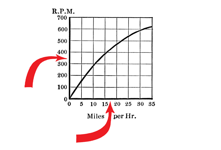
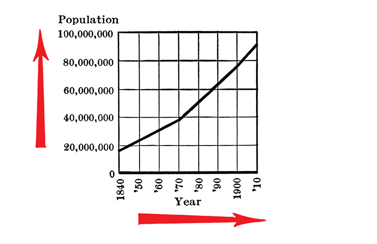
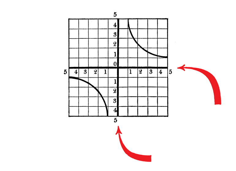
1. The general arrangement of a diagram should proceed from left to right.
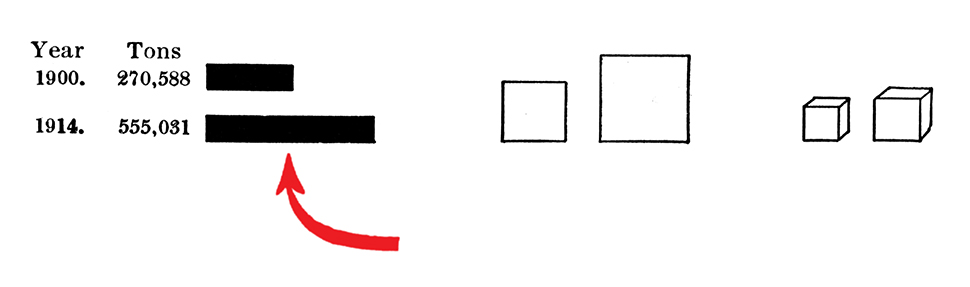
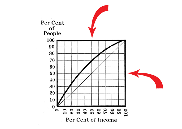
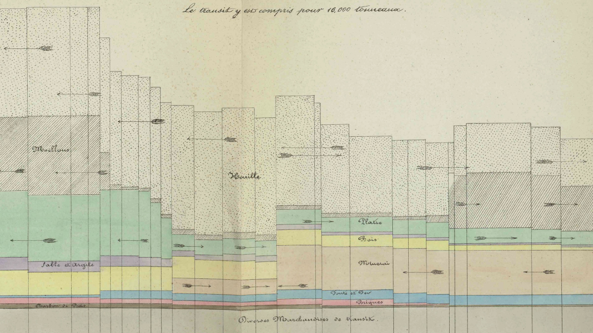
2. Where possible represent quantities by linear magnitudes as areas or volumes are more likely to be misinterpreted
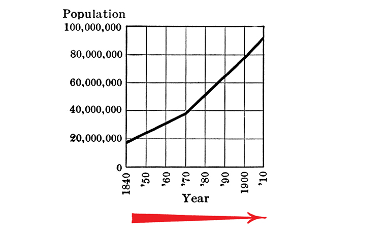
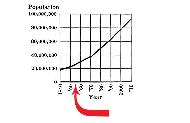
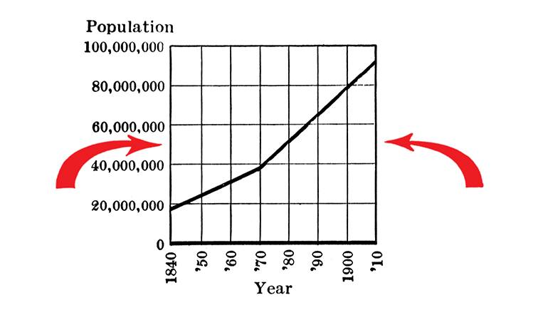
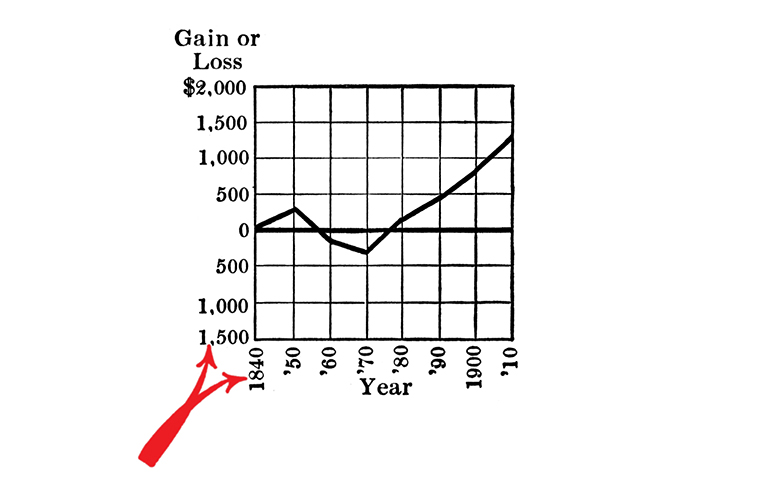
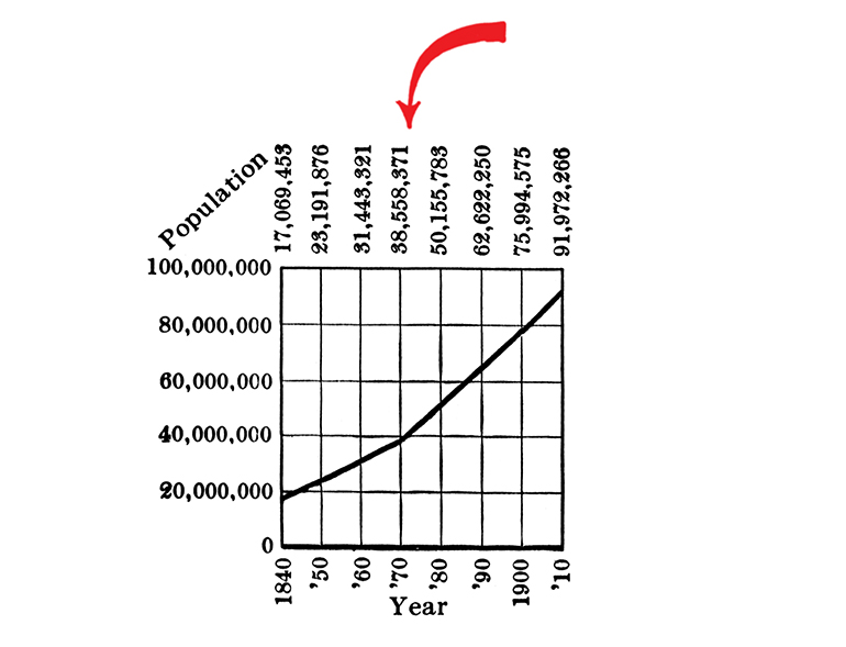
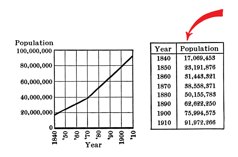
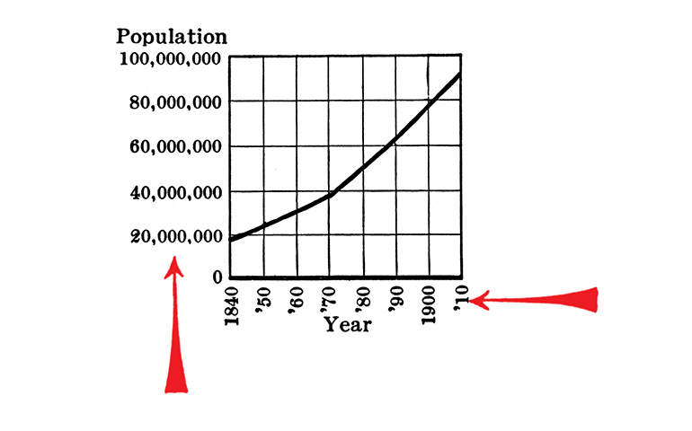
3. For a curve the vertical scale, whenever practicable, should be so selected that the zero line will appear on the diagram.
4. If the zero line of the vertical scale will not normally appear on the curve diagram, the zero line should be shown by the use of a horizontal break in the diagram.
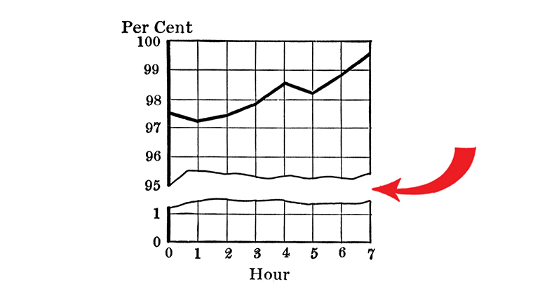
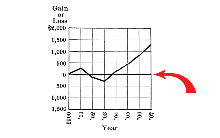
5. The zero lines of the scales for a curve should be sharply distinguished from the other coördinate lines.
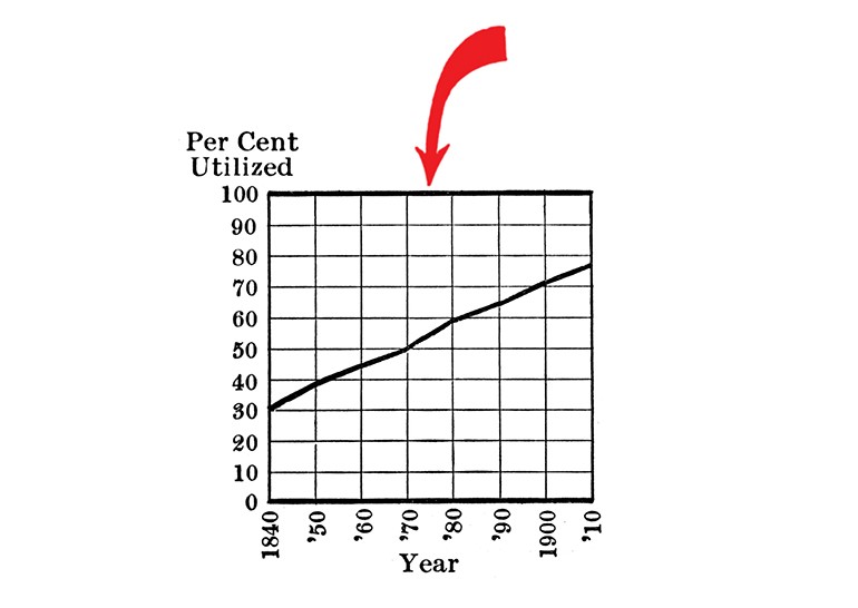
6. For curves having a scale representing percentages, it is usually desirable to emphasize in some distinctive way the 100 per cent line or other line used as a basis of comparison.
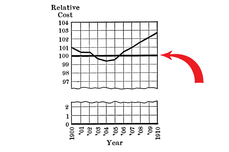
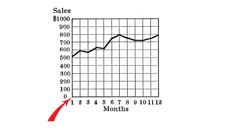
7. When the scale of a diagram refers to dates, and the period represented is not a complete unit, it is better not to emphasize the first and last ordinates, since such a diagram does not represent the beginning or end of time.
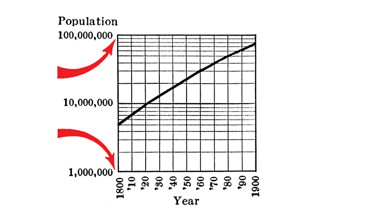
8. When curves are drawn on logarithmic coördinates, the limiting lines of the diagram should each be at some power of ten on the logarithmic scales.
9. It is advisable not to show any more coördinate lines than necessary to guide the eye in reading the diagram.
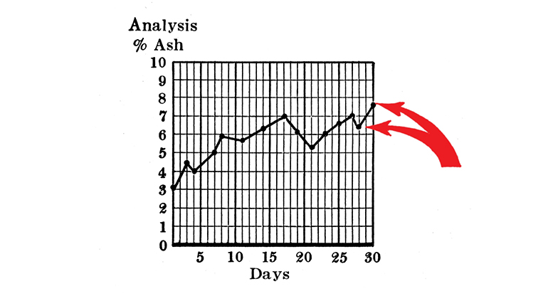
10. The curve lines of a diagram should be sharply distinguished from the ruling.
11. In curves representing a series of observations, it is advisable, whenever possible, to indicate clearly on the diagram all the points representing the separate observations.
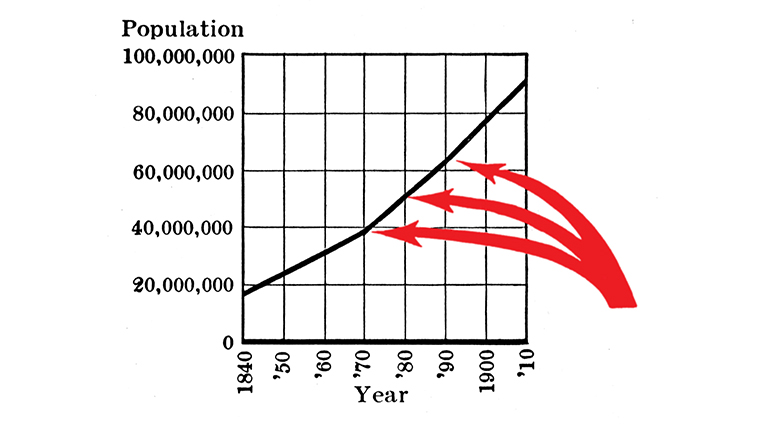
12. The horizontal scale for curves should usually read from left to right and the vertical scale from bottom to top.
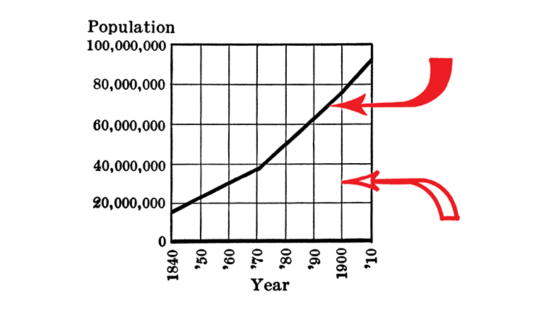
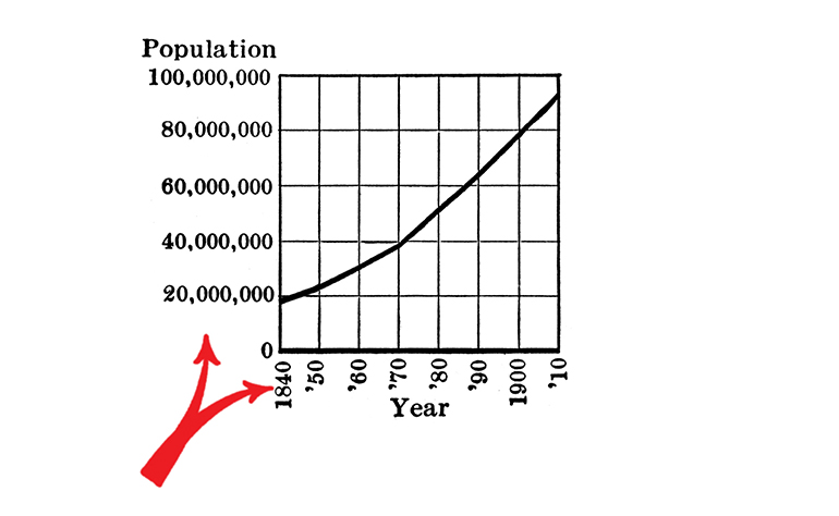
13. Figures for the scales of a diagram should be placed at the left and at the bottom or along the respective axes.
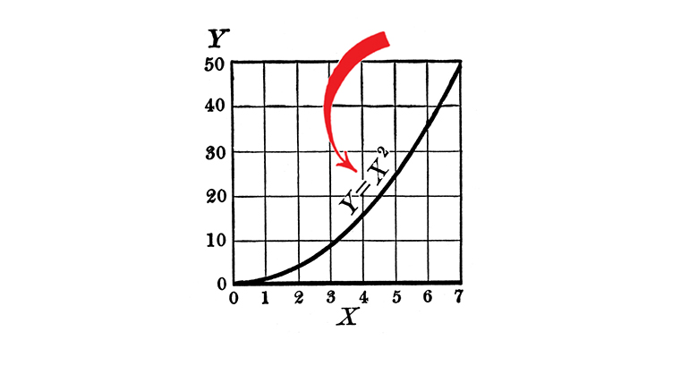
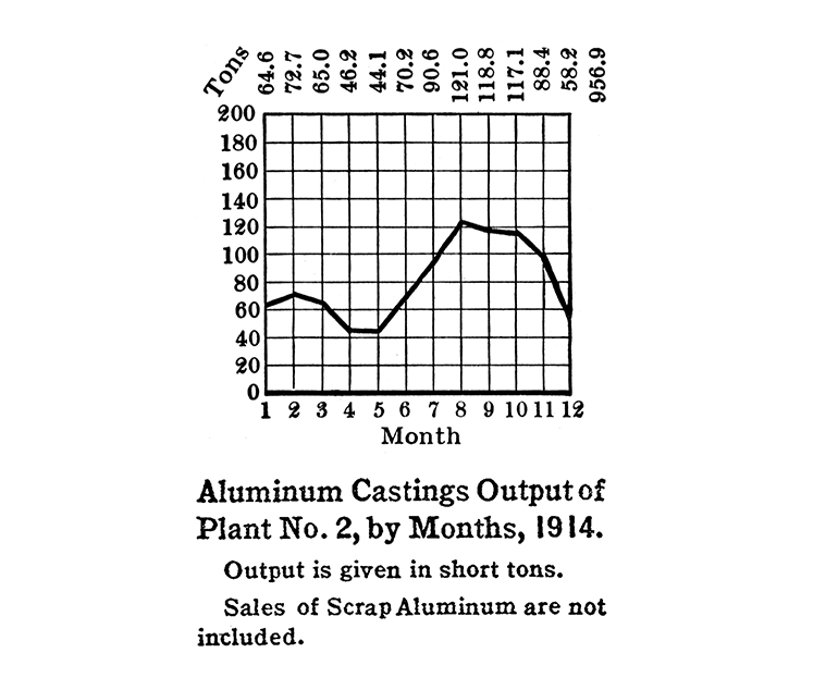
14. It is often desirable to include in the diagram the numerical data or formulae represented.
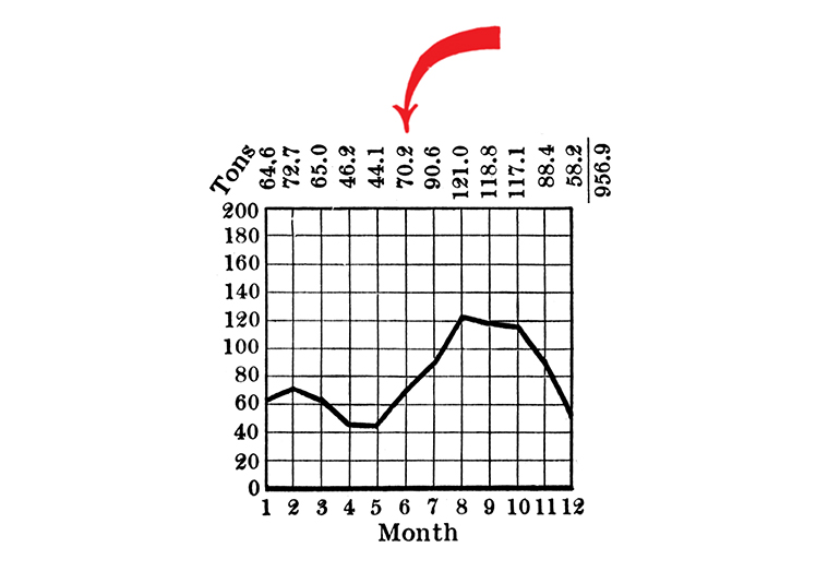
15. If numerical data are not included in the diagram it is desirable to give the data in tabular form accompanying the diagram.
16. All lettering and all figures on a diagram should be placed so as to be easily read from the base as the bottom, or from the righthand edge of the diagram as the bottom.
17. The title of a diagram should be made as clear and complete as possible. Sub-titles or descriptions should be added if necessary to insure clearness.
The standards were published in the Quarterly Publications of the American Statistical Association, 14:112, 790-797. They also appeared ten years later in Harold Rugg’s A Primer of Graphics and Statistics for Teachers. Both of these versions were referenced for this remaster. The arrows were colored red for this re-presentation (they were originally black).
Two decades after their 1915 publication, Howard G. Funkhouser described their impact:
The chairman and moving force of this committee was Willard C. Brinton, well-known mechanical engineer of New York City, who has probably done more than any other person in the United States to improve the methods of graphic presentation and to make them a valuable feature in the control of business. The report of this committee had a wide circulation and influence. One definite result was to arouse greater interest in graphic methods in the American Statistical Association which organized and continued for a number of years a standing committee on graphics.
These standards evolved over the following decades. For example, see Time-Series Charts, A Manual of Design and Construction “approved by the American Standards Association” in 1938 on HathiTrust.
Related Reads
“Illustration Invades Everything”
Reflections by Minard on his graphical impact.

Info We Trust and Visionary Press are DBAs of Information Productions LLC, San Francisco.
Info We Trust ® is a registered service mark. © 2013–2026 RJ Andrews.