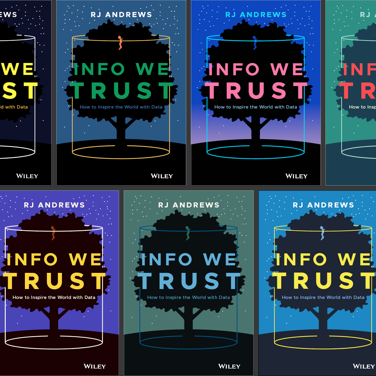
The book cover is a tricky design challenge. It has to attract attention, differentiate the book from the competition, and convey some idea of what’s inside. The cover must work online as a fuzzy compressed icon smaller than a postage stamp. The same cover has to work life-size on a bookstore display. And all this has to be solved long before the author completes the first draft.
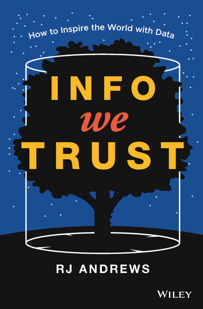
This essay, one in a series about making Info We Trust, begins with a reflection on the finished cover. Then it guides you through sixteen months of work it took to get here. In case you haven’t seen it yet, here’s the final result:
Words
My editor suggested we title the book Info We Trust, the name of my website. The domain began years ago as a pun that riffed on the dollar bill’s In God We Trust. The original joke commented on how information, technology, and data have become the new authority. The original logotype was even fashioned in engraved-currency chic:

Since then, "fake news” has entered the lexicon and data scandals have plagued the nation. Data and information have taken on a new meaning as everyone doubts trust. "Info we trust" seems more relevant now than ever.
Looking back, the title has new meaning for me too. The first word, INFO, evokes not only information, but also informing. WE centers us on what’s most important: the people being informed. This notion is so important that even the earliest cover drafts differentiated WE graphically. The last word, TRUST, points to the role information has in gluing us all together. It touches on many of the challenges information can create, and hopefully solve.
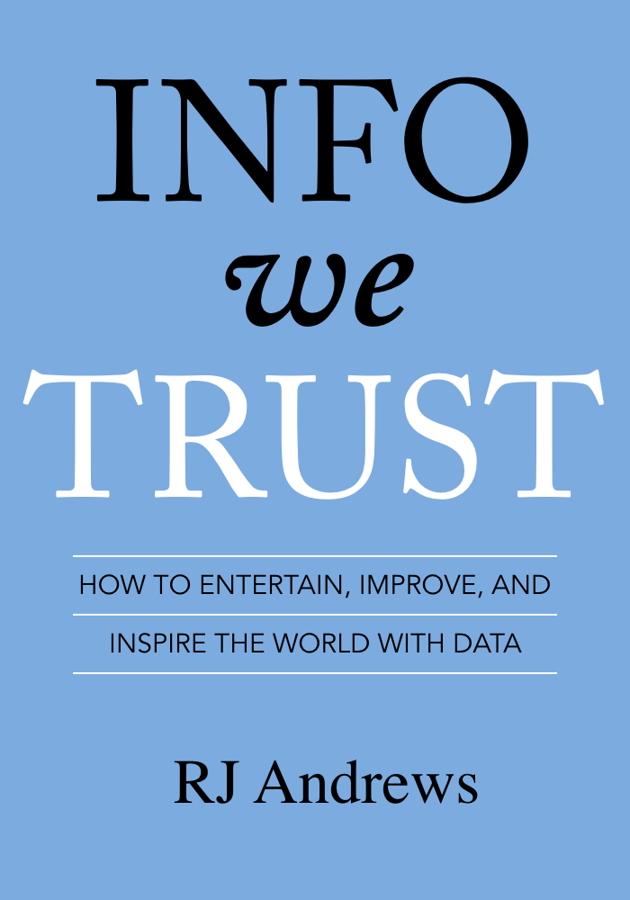
The book was signed with a longer subtitle: Info We Trust: How to entertain, improve, and inspire the world with data. This looked pretty good on paper. It bridged infotainment and action-oriented dashboards. But it was a mouthful. I found myself tripping over the triple-punch subtitle as I told others about my book. I had to pause at a dinner party to make sure I said it correctly. You try it aloud: How to entertain, improve, and inspire the world with data. It does not roll off the tongue.
But what if we shorten it?: How to inspire the world with data. This new svelte subtitle has more punch while still preserving the most important keywords for hallowed search engine optimization.
Image
Glance at the final cover and I hope it does one thing: spike your curiosity. If it attracts your attention and makes you want to learn more, then it has done about as much as anyone could ask.
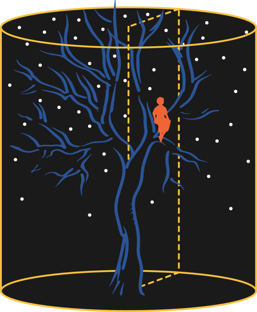
From the beginning I wanted to trigger some kind of cognitive-dissonance via the juxtaposition of two kinds of forms. The organic shape of the tree and rigid cylinder do not seem to belong in the same picture. Yet, there they are, together. This juxtaposition reflects the poetic and quantitative—human & machine, right & left brain—nature of data storytelling.
Perhaps the cover inspires more than curiosity. You are looking up, at a deep blue sky full of stars, just after magic hour. If I am really lucky, then the cover taps into that feeling of staring up into the night sky in wonder.
That tree...
Beyond curiosity and wonder, I have no expectations that anyone will discern anything more. But there is more. The most common question I am asked about the cover is: Why is there a tree? The full answer is in the book, but here’s a peek at what’s going on.
Ancient revered trees are all expressions of the axis mundi, the cosmic world axis. It appears throughout world beliefs and philosophies as the pole at the center of the world. The Mayan tree of life provided an axis onto which the universe clings. The Norse Yggdrasil tree provides a similar structure that connects the underworld, middle earth, and heavens. The axis mundi symbol may originate with our own evolutionary ancestors, who lived in trees. Back then, the tree was at the center of their world. Its trunk was the axis connecting the dangers of the forest floor to the energy of the sun. In short, the tree is a very very old kind of map to how the world is organized.

Izapa Tree of Life 
Uratrian Tree of Life 
Norse Yggdrasil
Trees are also ancient symbols of knowledge. Trees provide us with shelter, protection, food, medicine, fire, energy, weapons, tools, and construction materials. Stretching against gravity, from beneath the earth to the heavens above, trees are powerful symbols of growth, decay, and resurrection. Across history, trees were revered around the world. Ancient Assyrians, Akkadians, and Egyptians all had sacred trees. Gautama Buddha’s scene of enlightenment occurs under the holy Bodhi tree. Isaac Newton watched an apple fall in his mother’s garden, and the secrets of gravity began to unfold.
And how cool is this?: the book’s title word TRUST has its origins in the prehistoric word for tree. Trust embodies the functional qualities of wood—solid, firm, strong—in a social context.
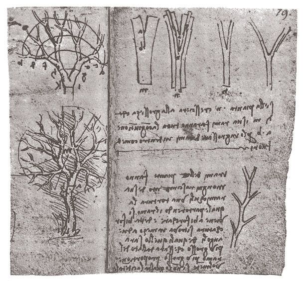
I became obsessed with one of Da Vinci’s tree illustrations very early in the book’s production. He made it to show how the combined cross-sectional area of a tree's daughter branches are equal to the cross-sectional area of the mother branch (something recently shown to help trees resist wind). I liked his naked tree so much that it was the center of early drafts. One of the reasons it appealed to me was that it reminded me of a brain neuron.
…And other layered meanings
The data-driven visual information that the book concerns could be summarized as maps, charts, and diagrams. The cover pays tribute to all three forms of visual information.
Maps are referenced by the stars on the cover. Our first maps were celestial, not terrestrial. The map is also seen in the four points on the circle at the base of the cylinder. They might remind you of a compass rose. I played with a heavier north point, but found that this was too direct and distracted from the overall composition. I wanted to keep these deeper connections to be more subtle.
Statistical charts are referenced by the stars, which look like like they could be data from a scatter plot. They are taken from a real chunk of the sky, which was intentionally chosen to not include familiar constellations. Like the compass rose, I wanted them to contribute to, not distract from, the overall composition.
The cylinder around the tree points us to the simplifying power of diagrams. The four points evokes the ancient balance symbolized by pairing the square (or cross) with the circle. It reminds me of the pre-mathematic power that sacred geometry wielded. And, of course, the entire cover graphic is an abstract cartoon diagram.
Against the grain
I looked at the covers of other contemporary data visualization books and noticed two things. Many modern dataViz books have a lot of white on their cover. Many modern dataViz books feature some kind of statistical chart. They are cartoon icons of charts, cropped dashboards, or complex graphs. You cannot understand the meaning of any of these charts from the cover alone.

These features must work, because you can see them repeated over and over. I think white conveys some kind of textbook seriousness. The chart form tells you what’s inside.
But together, they seem to tell me: For Nerds Only! I wanted to be as far away from this type of cover as possible. I wanted Info We Trust's cover to make it look less like an intimidating tome and more like an adventure story. Very early I resolved that the cover would be dark and have no complex abstract charts.
Drafts
The balance of this essay shows you lots of cover iterations with a running commentary on what I was thinking at the time: what I was striving for and what was not working. These covers represent dozens more iterations, hours of discussion, and hundreds of e-mails with many advisors. Cover design is hard.
August 2017: The book proposal included this cover image. It is a rip-off of Thiel’s Zero to One cover. I needed something quick that looked professional to convince the publisher this could be a real thing. See how from the very beginning I wanted to graphically emphasize the WE:
Sep 2017: I explored many different color combinations with this form:

Dec 2017: The first tree-cylinder concepts were more complicated than what finally emerged. They included a tree sitter, a plane radiating from the center, and even a sun path. The cylinder encompasses the whole world and the stars double as leaves. The book's color palette, inspired by Byrne’s Euclid, was already in place:

I stuck with the below mock-up on the left for a couple months, but the tree-cylinder graphic is too small to work as an Amazon icon. The mock-up on the right began to explore alternatives that might work better online.

March 2018: Maybe the stars should escape the cylinder? The graphic on the left expands the image to fill the entire cover and adds a hill for the tree to perch on. I still really like some of what is happening on the simple cover on the right, but believe it leaves too much on the table:
April 2018: I return from a weekend in Mexico City where I was inspired by its many vibrant palettes, particularly this exhibit wall at the Museo Nacional de Antropología. The digital sketch is an early attempt at combining title and tree. I didn't know it then, but this is the basic form that survived to the end. The rest of the work would be fine-tuning.

Inspired by Mexico City, I explored many different color palettes (and a couple gradients). This is the first example where the shortened subtitle appears. In this version the tree-sitter was moved to the top to try to create a hidden eye effect: the person's head is the pupil and the top of the cylinder is the eye edge 👁. It didn't quite work:

Recognizing that the tree-sitter was not working, I started playing with my favorite of the color palettes. I created some better drawn people, including a pair of children that referenced silhouettes of me and my sister done decades ago

Around this time I also visited a bookstore to consider what the design might look like in the wild. I was mostly encouraged. The cover has a strong bulls eye target in the middle with lots of space around it. This helps shoppers focus on it. I noticed how the color yellow really pops in a book store, and how (obviously) most of the books were not on display, but hidden on shelves. This prompted me to consider the how pop-out could help the spine design. I also threw together a simple back cover as a placeholder I could react to later.

My adventure through the rainbow was fun, but the turquoise-yellow cover did not really reflect the illustrations inside the book. I returned to the original primary color palette. I gave the tree-climber a ladder: boards nailed into the tree just like I used to do when I built tree houses growing up. The girl's leadership is emphasized with the bold color, hanging posture, and determined pointing: Let's go that way! The younger brother has a backpack on, ready for adventure, and looks up confidently—an expression of trust:

But putting kids on the cover was too much. They risked people misinterpreting the book as a kids book (it's not, although I do hope kids read it). The tree sitter/climber, a character who was part of the concept from the very beginning, had to go. But not without some more play. I adjusted the cylinder (notice the newly oriented top) and tried some more color combinations:

And, keeping the colors consistent, I also varied the color and placement of text in a systematic way to see lots of options. White text, black text. Straight text, curved text. Subtitle on top, subtitle on bottom:

May 2018: I chose the right combination of author-subtitle text. Even though the tree-sitter is gone, notice how the three ladder steps are still nailed into the tree. Now the viewer, you, is the hero-protagonist. You are invited into the scene and climb up to have a better look. We uploaded it to Amazon and I went back to concentrating on producing the insides of the book for the next five months.

October 2018: With a weekend to spare I returned once again to cover design. In the intervening months I received a pile of compliments from friends. Unprompted, people would just tell me that they thought the cover was great. Yet, something was missing.
Info We Trust's illustrations are all hand drawn. They all have a measure of intentional roughness. The cover is vector art. It is "pixel perfect." I wanted to take a crack at incorporating some roughness into the cover in pursuit of better representing what was inside. Look at a best book cover list and you will see that many feature rough textures. Maybe Info We Trust could benefit from some more love?
I tried illustrating the cover with markers, the same approach I used to create all of graphics inside the book. That didn't work. Then I thought about painting the cover. Paint has wonderful texture. I went to work and painted it, with the plan to layer all of the text on digitally.

I liked the painting enough to have it professionally photographed, and then I pitched it to my team. It didn't fly. They strongly recommended I stick with the vector art, so that's what we did. Even without texture or roughness, the vector art is bold. Maybe it won't win a design award, but I believe it does the job the cover needs to do.
November 2018: Only a month away from printing, it was time to revisit the spine and back cover. A sample hand-drawn illustration on the back cover gives a peek at what's going on inside. This picture of data storytelling had resonated with readers since its creation. There is also a gestalt effect where the people and campfire look like they are perched on the top of the hill.

I started hammering out the back-blurb and noticed that the storyteller's pants were a little ridiculous. Must fix those. I was also informed that I needed to recruit a powerful endorsement.
Alberto Cairo was the only choice for Info We Trust's endorsement. It was his The Functional Art that originally convinced me to devote myself to data visualization. Since then, I have observed what a generous pillar of the global community he is. You can read his endorsement, and the final book blurb, in the image below.
December 2018: We finished the total cover design shortly before the book went to the printer. Finishing touches finessed the layout of the text on the back, adjusted the data storytelling illustration, scalloped the text box corners, and fitted the proper thickness of the book's 272 pages. You can click the final image to read its details:

I still have more design essays planned to help show what making this book was like. Until then, catch up with all of the pre-publication goodies at the book’s main page and please consider pre-ordering INFO WE TRUST today. Every order counts a lot pre-launch, and we are counting every one!
Info We Trust (the website) is an award-winning ‘data adventure’ exploring how to better humanize information. Data storyteller RJ Andrews is based in San Francisco and the author of Info We Trust: How to Inspire the World with Data. Please let me know what you think via Twitter @infowetrust or the contact page.

No comments.