Today I want to share with you a set of data visualization books that are modern classics. Each one was published by 1985. Each one had an impact on my book, Info We Trust.
I read these books to discover what still rang true from the time just before interactive computer graphics made a big splash. My hunch was: if it was true then and still resonates with my own experience as a data storyteller today, then it has a good shot at being timeless. The enduring principles learned while informing past generations can guide us today. These are the books, by legendary authors, that most informed the skeleton of my own narrative adventure.
This essay is one of several planned for the entire road leading to the book launch of Info We Trust in January 2019. Please read the book's "Hello World" essay and consider pre-ordering it on Amazon.
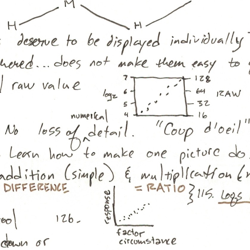
Before I get to the modern classics, here is how I processed material from research to writing: I underlined and made notes on the book page in red ink. Once read, I put the book aside, usually for about a day. After this short gap, I re-opened it to review the redlines. Every book got a page (or more) of handwritten notes in a big black Moleskine journal. I copied exact quotes, summaries, and my own reactions in color-coded handwriting into the journal. This process resulted in a hand-lettered notebook chock-full of sketches, quotes, and observations, here's a portion of one page of notes on John Tukey's EDA:
Condensing research into a single place was useful in many ways. A sequence of different looks at the sources acted as a set of filters. They also gave me and the material time to breathe. Collating everything in one notebook fostered unexpected connections. It expedited writing as I did not have to spend lots of time fumbling between hundreds of sources. As I typed, the journal was open and in view. It is now a neat physical artifact of my experience.
Before I started writing my first draft I wanted to read the books that I heard veterans talk about. These are not often studied by data storytellers who came of age with the mobile web (like me). I read them in the same order that they were originally published (each book image links out to Amazon). The goal of each summary below is to guide you to getting the most out of engaging with each book:
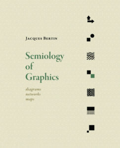
Semiology of Graphics: Diagrams Networks Maps (published first in French in 1967) is a colossal volume by cartographer and theorist Jacques Bertin. The first 15 of its over 400 pages delivered the most bang. Read the introduction to understand the book's general theory and spirit. Then use the Contents to navigate to what interests you most.
Like the earlier Enlightenment informers, Bertin makes strong connections between geographic maps and abstract statistical charts. I really like how he emphasizes the importance of producing informative singular images—temporal units of meaningful visual perception—while also negotiating how no one image can reveal everything.
Bertin's uses the word energy to describe the total salience of how data appears to us. It set the stage for many future authors to riff on their own systems of what Bertin called retinal variables: design dimensions that each have the ability to change how the value of a data mark hits the sensors of the eye's retina. They include position, size, darkness, hue, texture, shape, and orientation. Info We Trust references Bertin's work several times, and quotes him directly once: "The entire problem is one of augmenting this natural intelligence." Semiology of Graphics was translated to English in 1983 via the efforts of Howard Wainer (more on him in a future essay).
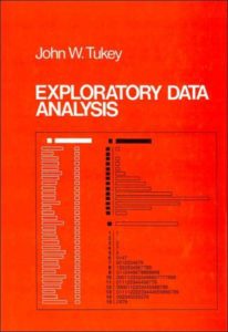
Exploratory Data Analysis by John Tukey (1977) is the modern classic I was most excited to read from this collection and it did not disappoint. Tukey looms large over the field of data visualization and computer science generally. He famously coined the term "bit" and invented the box plot. From page one of "EDA" you get a sense of what an incredible person he must have been: there is vivid metaphor and an almost folksy lightness throughout that reminds me of the most generous and patient teachers.
Tukey most informed my own book's tour through data exploration. I like how he exposed me to so many novel techniques (tally boxes, stem-and-leaf diagram, hinge diagram, and many more). Yes, they were were interesting to learn about, but they also showed me how creative you could get while exploring data. As he says in EDA, "don't expect standard summaries to reveal the unusual."
I most appreciated Tukey's tour of data transformations, and dedicated one of my own page spreads to re-introducing the "Ladder of Transformation" to a new generation. I consider EDA to be essential reading. Its length may be intimidating, but do not worry. Lots of the content is textbook exercises and examples, printed with multiple-page data tables for reference, all of which can be skipped as you plow through.
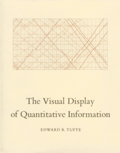
The Visual Display of Quantitative Information by Edward Tufte (first published 1983, I read the 2001 second edition) remains one of the most beautiful books about data visualization. It is also likely the most successful ever. Like many, it was the first book I ever read on the craft (although it wasn't the one that converted me, more on that in a future essay). Toady, I really luxuriate in how much praise Tufte gave to some really old work. I found Tufte's ability to describe what is so magical about data storytelling to be way ahead of his time, almost poetic. My favorite line is the very last one in the book, "the task of the designer is to give visual access to the subtle and the difficult—that is, the revelation of the complex."
I do not believe his advice on how to do it has weathered as well as his ability to describe how wonderful it is when it is done well. In the end, I was surprised by how few notes I took on this book and how little impact it had on my own narrative. I found his later book Envisioning Information (1990) to be much more interesting, especially his way of describing micro/macro readings, small multiples, and "narratives of space and time."
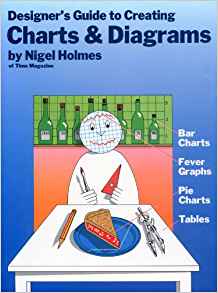
Designer’s Guide to Creating Charts & Diagrams by Nigel Holmes (1984) is a very fun look at the craft through the eyes of one of the greats: Holmes started at Time magazine working on charts and eventually rose to graphics director. But do not let the playful look of his work fool you. The book kicks off with a history of the craft that includes a rarely seen 1805 William Playfair pie chart. Then it speeds through many of the greats, including a nice tour of Isotype.
The strongest part the book shows how Holmes takes nine projects from initial data to published work. It includes lots of juicy preliminary sketches. His experience as a creator responsible for informing a vast general public, on deadline, is what really distinguishes this from all the other books listed in this collection. The others can at times feel too stuffy or pedantic. You never get that with Holmes. He is always tuned to informing his readers.
My favorite aspect of this book is its ending, certainly the most whimsical across the data visualization canon. The last chapter is titled Found Charts and highlights plenty of naturally occurring charts found in the world: rings of a tree (time, wet vs dry years), the shape of a suspension bridge (stress), NYC skyline (apartment prices), and more.
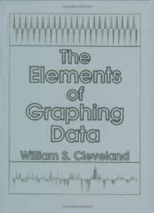
The Elements of Graphing Data by William Cleveland (I read the original 1985 version, newer copy pictured here) is the best follow-up to Tukey's EDA, and in fact references Tukey's work throughout. Together they guided my own narrative through data exploration.
I am stunned by how much Cleveland accomplishes throughout the book with only black and white. This book is a tour of graphic precision. Printed pages still have higher resolution (and a bigger canvas) than most screens. You can really feel that difference as you read his charts.
But even more than his take on EDA, Cleveland's voice influenced how I wrote Info We Trust. I especially like how he addresses encoding vs decoding, "Clever encoding does not always translate to visual decoding." The book appears very sterile and technical, but its narrative always leans into how to actually communicate. It leans away from absolute rules. It strives to transcend technology in hopes of reaching the human reader, always recognizing what a mercurial challenge this often is.
These are only five of many important books on data visualization. Reading just one will show you how smart pre-Internet data work was, how similar the challenges still are, and how lucky we are to have these classics to guide us.
I hope you like this first packaged bundle of books that influenced Info We Trust. In the future I will present additional thematic bundles, mostly outside of the field of data visualization (think: story design, way-finding, poster design). I will also slowly reveal more about the unique construction of the book itself.
Until then, check out Alli Torban's interview of me discussing creative routines and please consider pre-ordering Info We Trust.
Info We Trust (the website) is an award-winning ‘data adventure’ exploring how to better humanize information. Data storyteller RJ Andrews is based in San Francisco and the author of Info We Trust: How to Inspire the World with Data. Please let me know what you think via Twitter @infowetrust or the contact page.

No comments.