After spending a week eating my way through the Pacific Northwest I became intimately familiar with Yelp (as if I wasn’t already) as it guided me through a gastronomic amusement park.
I found that using the Yelp app on my iPhone was terrific in making some of the finer decisions (highlighting often remarked menu items & displaying pictures of dishes) but rather clumsy when making the most important decision: where should we go to eat? Yelp's restaurant rankings never struck the excitement that their menu highlights did, and certainly did not approach the confidence that comes from a local friend's recommendation. What was missing? Yelp certainly commands a dazzling mine of data - but sometimes I feel it isn't being leveraged properly.
Yelp today
Yelp displays search results in two ways, on a map and in a list. Both of these methods have fundamental problems, which we can investigate by a simple search for brunch spots near my favorite brunch city: Durham, NC:

The MAP view, on the left, appears first
by default. 20 hits are represented by location, tagged with their rank on Yelp's recommendation list (more on that soon). However, half of the hits are obscured by overlapping brunch spots. While the number 1 spot stands out, both 2 and 4 are hidden under other restaurants! This unsatisfying cluttered map prompts two actions: zooming into clusters for a closer look and tapping on individual spots for more information, or toggling to the LIST view (on the right) to see more details.
How does the Yelp ranking work? Who gets to be number one? Yelp answers this question on its FAQ page: Yelp's search results are based on an algorithm... based on a number of different factors including review text, ratings, and number of reviews.... In addition to ratings and number of reviews it most certainly also includes proximity to the searcher and probably also weighs for more recent reviews (I care more about a review written last week than one written three years ago).
With this black box algorithm in mind we see details of the top five restaurants on the first screen - and must scan through several screens worth of similar details to see information for just the top 20 restaurants.
Why it doesn't work
Here is a short list of items that are of interest to me when choosing a restaurant, all of which get baked into Yelp's algorithm:
- average review (star rating)
- number of reviews
- location (on a map)
- proximity (distance to me)
- cost (is it expensive?)
- cuisine (type of food)
The MAP view only displays location (and by a quick extension, proximity to me) and the Yelp ranking which lumps everything else into one number, which I don't completely trust. Displaying so few pieces of data, it still manages to hide some hits behind others because restaurants are often clustered into the same blocks. Also, the map has a north-south bias because of the dimensions of the screen: number 15 on the example above (the Eno River Eatery) is 4.7 miles north of the searcher, and would certainly not appear on the map if it was 4.7 miles to the east.
The LIST view displays a load of information for each restaurant - but makes it impossible to compare this information across restaurants: both because you can only look at five at once and further because there is no opportunity for quick pattern recognition comparison of multiple traits amongst the restaurants.
 Do we really care about a lousy picture and detailed address when considering a venue at this level?
One way to fix it
I like seeing restaurant locations on a map - but it should not be the starting point for your Yelp search (are you picking out a foody neighborhood or the perfect restaurant?). I believe it is worth trading the map location (a 2-axis plot that overlaps data points) for proximity (a single-axis plot) because:
- it allows you to devote the saved axis to another data type
- losing the map location allows you to space out overlapping spots
- comparing how far away your chosen destination is from you is really what matters, isn't it?
Including the number of reviews is also important - 600 reviews for a 3.5 star restaurant will almost certainly always beat out 25 reviews for a 4 star restaurant. The popularity that is hinted at by a high volume of reviewers inspires confidence. My solution seeks to
- explore 20 restaurants on one screen
- empower comparison using both average review and number of reviews
- empower comparison using distance from you
- display cost information
- still highlight the top five choices to look at first
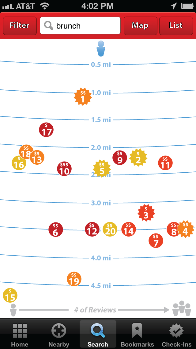
Here is my mock-up:

Of course from here you could select any spot for a little more information, and then dive in for the full restaurant page, just like the current Yelp app:

Details on the design
The same size spots are kept as on the original Yelp app map to represent each restaurant. They contain both the Yelp ranking and the cost-indicating dollar signs. The spots are filled using the existing Yelp coloring scheme, but these colors are assigned to a full quartile of locations instead of a specific star ranking (e.g. Dark red = top quartile, not 4.5 or 5 stars). This better exploits the color spectrum as so many restaurants have Yelp reviews in the 3.5 -4 star range - Yelp reviews are not distributed evenly! The top five spots have a star halo around each to highlight them further to the searcher.
The spots are plotted vertically according to their proximity from the searcher (represented by the blue figure at top), radiating downward as the restaurant gets farther away. They are spaced evenly across the horizontal axis according to how many reviews the restaurant has (indicated by a reviews legend at the bottom).
I believe presenting the data in this way delivers a much richer field for the searcher to consider, while still pointing out some of the top hits he may want to consider first.
This approach may not be perfect - but seeing the available Yelp data laid out certainly prompts questions:
- #1, with its low average reviews and number of reviews, does not seem like it should be the top hit.
- What makes #4 and #8 so different? They seem nearly identical.
What insights can you make? What are your thoughts?
Try seeing this image on your own phone:

One last thought: why does Yelp default to showing you both open and closed restaurants? When I use it, it is most often for finding a place for now, not later!
Info We Trust is a data adventure exploring how to better humanize information. To learn more read the opening post here.

No comments.