This design essay is about the creation of two graphics for a SIGNIFICANCE magazine cover article. You can read the original article here and get lost in giant versions of both graphics here.
The Great Migration was the movement of over six million African-Americans out of the rural Southern United States to the urban Northeast, Midwest and West — possibly the largest peacetime migration in history. This essay details how US Census data was elevated to show this migration by mimicking the style of Charles Joseph Minard, 19th century thematic mapping pioneer.
Enter Howard Wainer
The history of data visualization has me hooked. The ingenuity, beauty, and stories behind each information graphic milestone fill me with awe. In the course of evangelizing my learnings, especially through a bespoke interactive, I have been able to connect with other fans of information graphics history, and even a few real historians.
Fans of data visualization history may know Howard Wainer as the force that brought us the re-publication of Playfair (my favorite dataViz book), the translation of Bertin’s Semiology of Graphics, or the last thoughts by Tukey on the craft.

Go read this book.
So this incomplete introduction is my way of saying how delighted I was when Howard reached out to tell me he had an idea and wondered if I was open to a collaborating on a paper. It was an easy yes.
The idea: Howard was hot off successfully re-introducing us all to W.E.B. DuBois’s handmade charts and thought there was even more to tell. Here’s the initial pitch that got me on board:
Du Bois’ work shown in Paris in 1900 missed a great deal (obviously) of what was to come. The civil rights movement grew massively during WWI when lots of southern Blacks traveled to NY to join up with what became the “Harlem Hell Fighters” who distinguished themselves at Verdun, only to return to the US to racism, Jim Crowe, the Klan, lynchings and the huge race riots of 1920s. This led to the Black diaspora to the north and eventually to the civil rights movement of the 60’s. It would be a dramatic demonstration to show the diaspora as a Minard flow map (or a sequence of such maps).
And just like that our adventure had begun.
Data
Interesting stories are often built on under-utilized data. The Census records that powered this project is one of these under-appreciated archives.
1870 was a big year for the US Census. It was the first time Blacks could be counted post-Emancipation, punctuating years of strange, slavery-induced numerical paradoxes concerning how slaves should be tallied for different political purposes. For fans of data viz history, the 1870 Census also informed Francis Amasa Walker’s iconic visual Statistical Census of the United States.
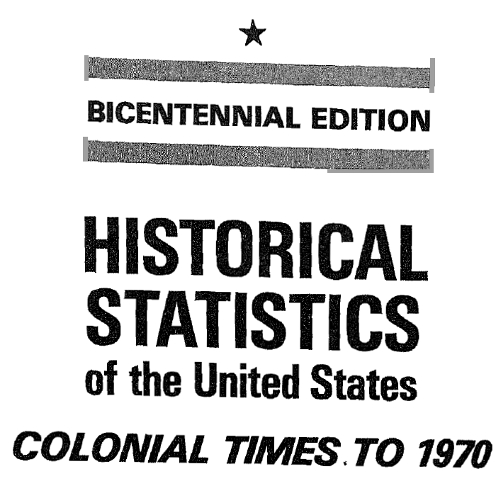
Only a portion of historic Census data has been structured for easy consumption on census.gov. To see more you have to be familiar with the 1975 publication Bicentennial Edition: Historical Statistics of the United States, Colonial Times to 1970. It includes more than 12,500 time series, mostly annual, providing a statistical history of U.S. social, economic, political, and geographic development during periods from 1610 to 1970. The original tables are available as PDF images from the Census here. We used optical character recognition to structure tables of interest. Totals provided in the Census data helped to quickly check and correct any OCR errors.
The racial breakdown included in the Bicentennial Edition ‘Internal Migration’ tables was exactly what we needed in order to investigate the Great Migration of African-Americans. The Bicentennial Edition (Series C 15–24: Native Population Born in Each Division of Residence, by Race) splits the population into WHITE and NEGRO AND OTHER RACES. The history of how Nonwhites (how we chose to relabel the latter category) are counted by the Census is a blurry window into the history of America. A half dozen footnotes detail how the counting of Indian territory/reservation populations, Mexicans, slaves, and free African-Americans has changed over the decades.
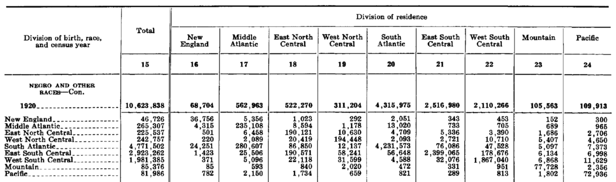
Excerpt from Series C-24 from the Bicentennial Edition. See Chapter C. Migration PDF
Internal migration is a more tricky data variable than meets the eye. On the surface it records two simple descriptors about the population: where you were born and where you live now. These two variables, place of birth and residence, are used to construct the table of our interest. Locations are regionalized to nine divisions.
Reviewing 100 years of internal migration reveals why this data variable is challenging: it is not a count of who has migrated only during a particular decade preceding each decennial census. It is merely a description of everyone living in a region at the time of each Census. Concurrent censuses are not mutually exclusive. If you moved from New England to The West as a baby in 1904, you will be counted as a NE→W internal migrant in 1910, 1920, 1930… and every other following decennial census for the rest of your life. Millions of lifetime-long shadows pervade the dataset.
These overlapping data would require a formidable amount of detailed birth and death rate information in order to properly untangle — perhaps impossible without referencing original Census records.
Aisch & Gebeloff. “Mapping Migration in the United States.” :TheUpshot | The NYT. Aug 14, 2014. Link
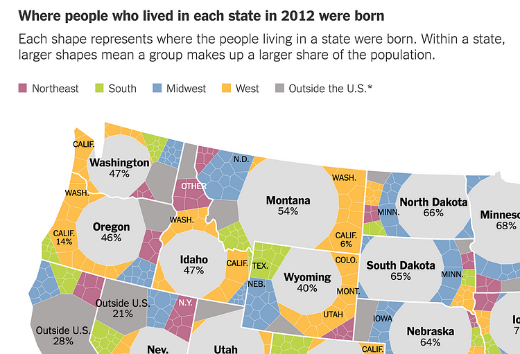
Gregor Aisch (at gregor aisch) and Robert Gebeloff had an interesting solution for visually dealing with this migrant data variable in a 2014 :TheUpshot article. They only describe percentiles of who is in each state and forget about trying to show absolute magnitudes or flow (with anything other than category colors).
But inspired by the genius of Minard, Howard and I were determined to show the Great Migration with flow. We wanted to illustrate an energetic representation so the world could see the movement. Accomplishing this sent us on a journey through design and statistical transformation that neither of us quite expected.
Design
Flowmaps have an interesting history. The first important ones by Harness were included in an Irish railroad atlas that showed passenger numbers increasing as lines approached Dublin. Minard used them to great effect in presenting multivariate data stories, but much more on him soon enough. Matthew Sankey juxtaposed ideal and actual models of the steam engine in cyclical flowmaps that show more than the capabilities of many modern Sankey diagram software (which do not allow for recirculation).
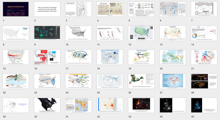
dozens of flowmap examples to explore
Flowmap design has evolved in a variety of fascinating ways since the 19th century. We tried to take these innovations into account by surveying the state of the “origin -destination” map (a particularly useful way of describing flowmaps). You can see dozens of examples cataloged here.
With these examples and some best practices concerning how to indicate flow and magnitude in mind, Howard and I were ready to tackle the challenges of visualizing the Great Migration.
Comparison challenges
John Tukey introduced us to Exploratory Data Analysis by identifying the basic challenge: make data more easily and effectively handleable by minds — our minds. This is often accomplished by enabling effective comparisons for the audience. But what to compare?
The basic challenge of the Great Migration is to show the flow of African-Americans from the former slave states of the Confederacy. But how should this flow be distinguished? The basic dimensions: number of migrants, racial group, time, and geography all threaten to obscure interesting comparisons.
Seeing concurrent White migrant flow can help place the main story in context with broader national trends — but the much greater White population also threatens to diminish the narrative. How should we acknowledge increasing population over time while still preserving effective comparisons within earlier years? Flows between regions with small populations are correspondingly tiny — but we should be careful not to let them shrink into oblivion.
Simply driving flow width by raw numbers makes for un-insightful maps, analogous to a scatter plot with too many points overlapping in one corner. Crude adjustments, such as normalizing dimensions using relative percentiles would highlight many of our comparisons at the expense of disingenuously cutting out many macro trends that are worth retaining. Our big design challenge was to create a visual framework that balances all of these important comparisons.
Ladder of transformation
As we identified these comparison challenges Howard began to prod me with a number of numerical transformations that could come to our rescue. Sensing my unfamiliarity with these techniques he broke into full-teacher mode, patiently introducing me to Transformations 101:
Most of modern statistics is built around data that are normally distributed — if not normal, at least symmetric. But data don’t always arrive on our doorstep like that, so we take a Procrustean view and transform them to match. The alternative, building new statistical methods for every data type is impractical. But how to transform? There is a simple idea called the ladder of transformation….
And so I learned about how this ladder can be used to solve problems of visual communication. In short, if your data is visually squished then you might try transforming one of the scales to take a better look. In practice the easiest way to transform a scale is to actually transform the data by using powers, roots, inverses, and logs. But which transformation to use? Ahh, that is where the beauty of the ladder comes in:
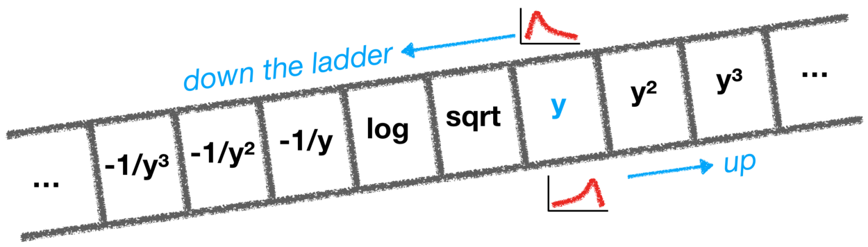
the ladder of transformation
If your data has outliers on its lower end (a bottom tail) then you might try walking the data up the ladder: y → y² → y³. If there is a top tail why not try walking it down?
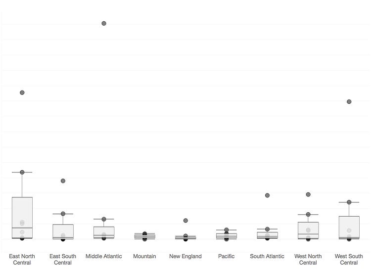
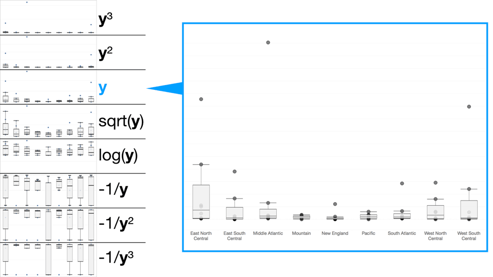
height = y reveals little
An excerpt of our data plots migrants between nine different regions (9*8 = 72 total points). We’ve used the nine destination regions as categories, creating nine strip plots with points located on the vertical access according to raw number of migrants, y. So the height of any point indicates the number of people who have migrated between two regions. The box plots reinforce how difficult it is to make any sense of this data visually. The outliers at the top of some of these regions make it impossible to see any patterns across the regions. Enter the ladder:
cycling through the ladder of transformation
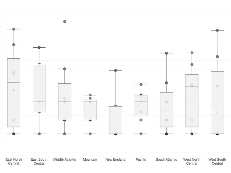
height = log(y) reduces the visual obfuscation by outliers
The log transformation reduces the impact of the outliers and lets us make a more nuanced inspection of the data. This is simple strip plot is a rough example of how transformations helped drive our process forward.
Because we are transforming for visual comparison, in practice we did not work with simple strip plots as shown here, but box areas and small multiple maps with flow lines that more closely approximated the final form of our visualization. Representing the data in different ways can change the the optimal transformation:
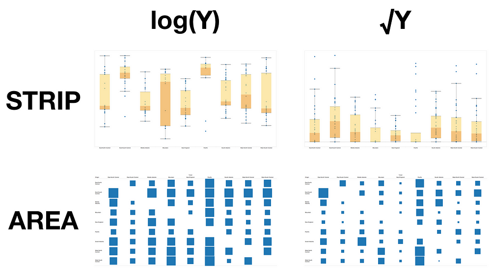
examining similar data: log works well for the strip plot, but square root is best for the box areas
We traded many slides through an iterative process of looking at the data, asking new questions, transforming, and looking again:
example attachment from our questioning of the data
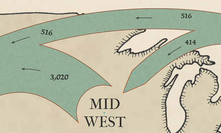
For our flowmap the best balance between all of the different desired comparisons was a square root transformation. What works for a one dimensional strip plot (log) may not do the job on a two-dimensional thematic map.

“proportional to the square root of the raw number”
Beyond the transformation
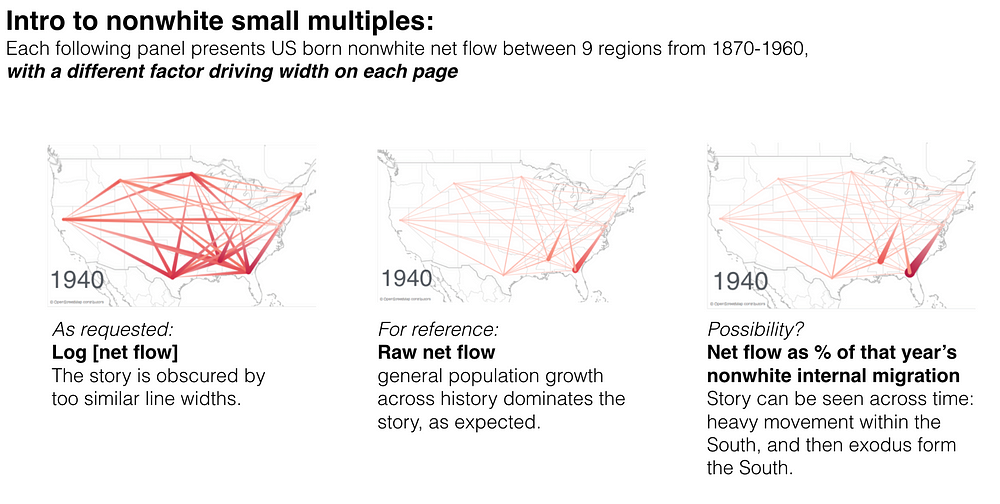
One more important decision was made using simple data-sketches: how many connections should be plotted? Nine regions are provided in the original census data, but showing all leads to a rat’s nest.
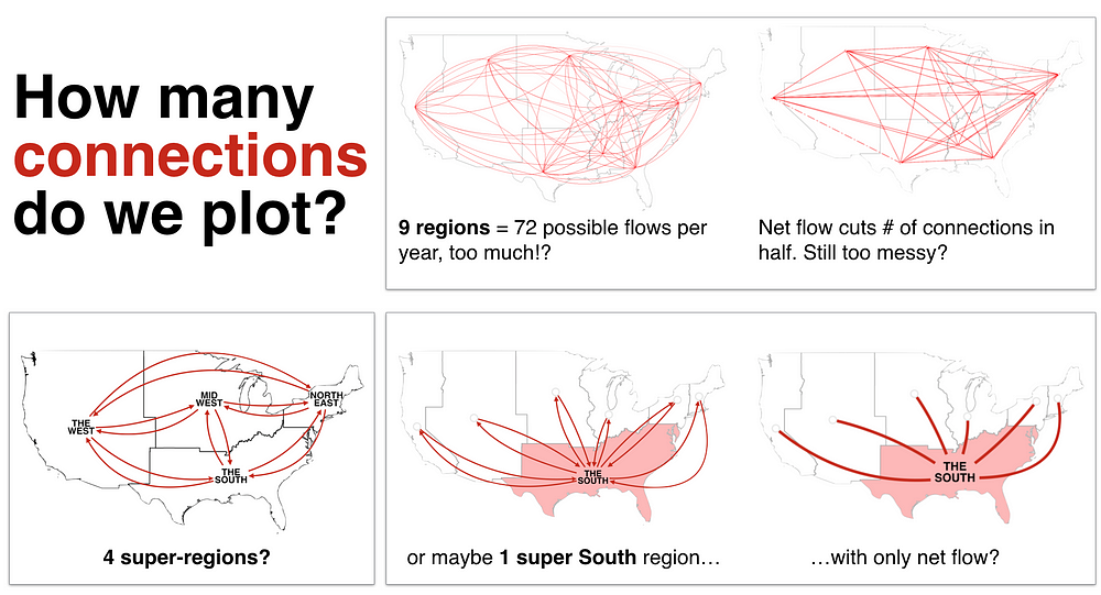
example early visual discussion about what connections to plot
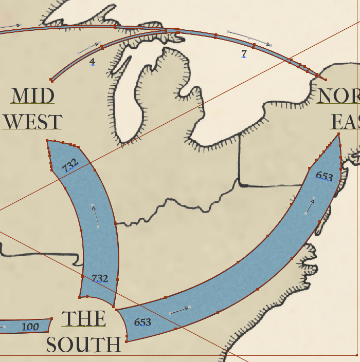
We considered many options and ultimately decided to show all net flows between four super-regions: NorthEast, MidWest, The West, and The South. This decision was at the expense of losing some internal migrant between regions that are massed into a super region, e.g. flow between the Pacific and Mountain regions is now not shown as both are members of The West super-region. From the article:
showing migration destinations to the nine census regions, rather than the four super-regions we constructed, added more noise than structure….
Production
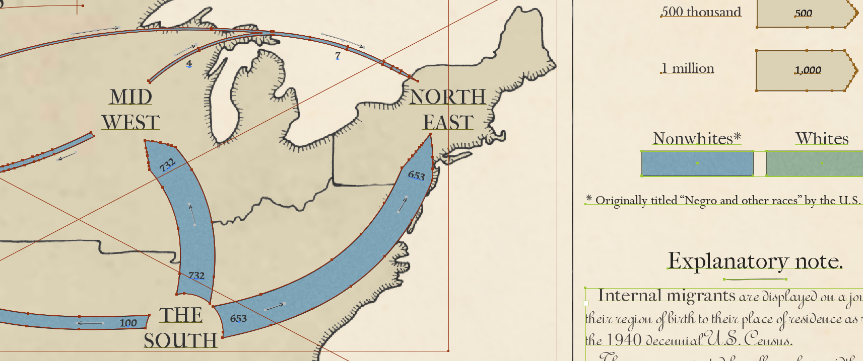
With our data encoding set we could begin constructing the final graphics, determined to highlight two aspects of the Great Migration’s narrative. The first would be a general history of Nonwhite internal migration. The second would focus on the 1940 Census, which provides a stark contrast between White and Nonwhite movement.
Minard’s famous Napoleon-Moscow flowmap inspired the format of our general history. The decision to include only every-other Census and the lynching data are addressed in the article directly:
We are using this variable (lynchings) in the same way that Minard used temperature in his map of Napoleon’s march, as one possible causal variable… Looking at decade-by-decade plots added little that was not more clearly shown by collapsing across 20-year periods….
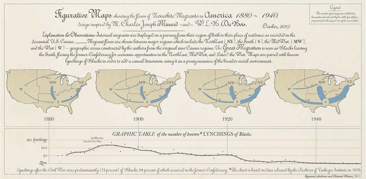
from the article, see a large version of this graphic at Signifcance
A less familiar series by Minard on cotton was used as inspiration for the layout design of our second graphic, which compares Nonwhite and White internal migrants as recorded in the 1940 Census. The difference between the two is striking:
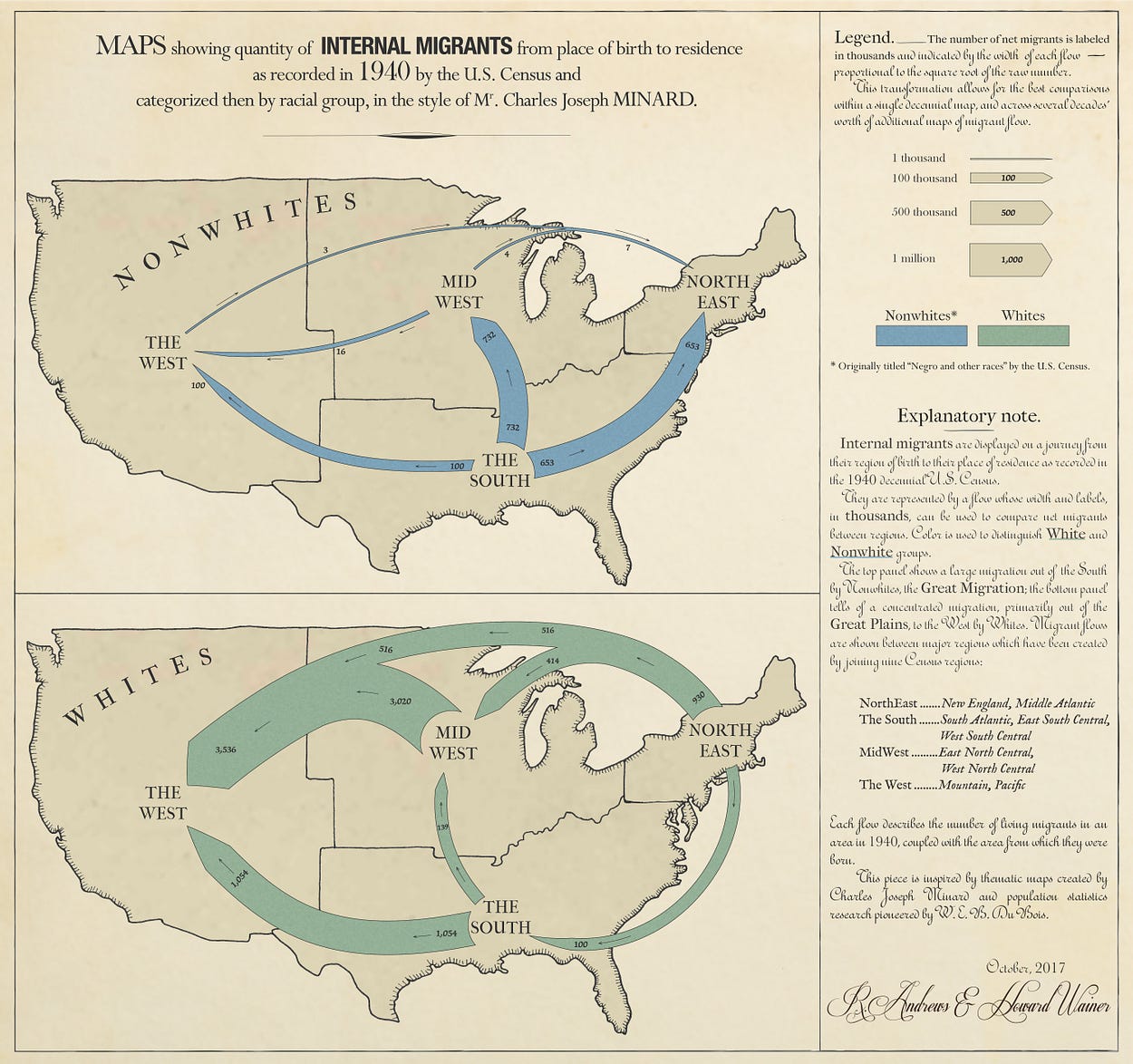
from the article, see a large version of this graphic at Signifcance
Seeing both graphics the success of the square root transformation is evident. Whites migrant flow certainly appears larger than Nonwhite, but not so large that the Nonwhite patterns are obliterated. Population increase over time in the first graphic is apparent, but once again does not drown out the other interesting patterns. Even small flows of only 3,000 migrants remain visible.
I will leave further commentary on the story to the finished graphics — just like Minard we included a detailed description and explanation for what you are looking at and why you should care in each.
Mimicking Minard
I learned a little bit about imitating different types of old manuscripts through my series parodying classic data visualization.
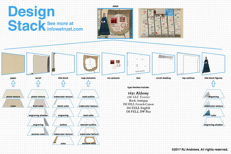
how to style an old-timey data viz. see more here
Old paper textures, noisy color fills, and careful font selection all combine for a convincing graphic that sometimes can even fool the audience. You can read more about this part of the process in this design essay about the making of the history of data viz interactive with modern graphic tools.
Much more important than convincing textures and colors was to understand how Minard communicated flow. Revisiting my survey of all of Minard’s works I was able to identify many guiding principles from the old master such as “annotations go with the flow.” Read all general lessons from studying Minard’s work in this tweetstorm. I particularly find the way his flows organically mege into and out of one another quite beautiful.

For Minard, annotations go with the flow.
A specific challenge in making our flows was how to indicate flow direction. Arrows make nice pointers and are preferable to other directional solutions such as color gradients, but arrow heads can be bothersome: their size bullies the rest of the graphic. For us pointed tips indicate the destination end of each flow without dominating the graphic. They are balanced on the origin end with a correspondingly simple semicircle mask that suggests the feathered backend of an arrow.
flows merge in and out in our graphics
Our flow design was executed in Adobe Creative Cloud Illustrator by: 1. draw arc splines with custom point shape 2. scale width to match transformed data value 3. expand to a filled shape 4. merge flows 6. mask the origin of each flow with a label-centered circle 7. color and texture with noise.
Now that I’ve written it out that sounds like a lot of work. A multi-step process like this can become frustrating if something small needs to be tweaked and the entire stack unravels, all in pursuit of attaining a hand-drawn aesthetic. In fact the American map was inked by hand and then scanned. Sometimes the old ways are best.
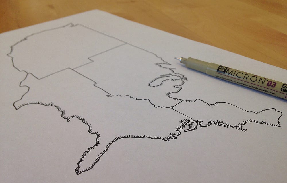
mimic hand-drawn map by drawing the map by hand
Coda
You can only imagine my delight when I heard from Significance’s editor Brian Tarran (who saved me from publishing more than one error) that our story would be featured on the cover of its October 2017 issue. I was so excited to receive it in the mail just last week, not enough data storytelling escapes the virtual world:

I am very grateful to Howard Wainer for bringing me on this project, it has taught me so much: data-munging dusty records, powerful transformations, Minardian design, and of course the Great Migration. I hope this essay communicates the care that was taken in considering many design decisions and points to a future rich with inspiring data stories.

No comments.