Data Viz in the Movies
How information graphics benefit feature films.
Data visualization often references comics, film, and mythology for inspiration. The emotional and visual nature of entertainment media provide powerful lessons for us on how to better communicate complex information to a broader audience. But just as we benefit from Hollywood’s tips and tricks, feature films also take short-cuts from our world to weave audiences through its narratives.
Charts, maps, timelines and other diagrams have been used across the entire history of cinema for exposition (pausing to explain the backstory of the film’s universe or the plan for the next adventure) and mood creation (establishing a detailed and complex world such as the cockpit of a spacecraft or the detective’s mental map). Here’s some of the best of Hollywood dataViz:
Timelines
My favorite Hollywood timeline is also a map. Apollo 13’s “failure is not an option” scene centers on Flight Director Gene Kranz’s chalkboard diagram. He uses it to explain to all of us in the audience that there is a big gap between when power runs out at 45 hours and SPLASH DOWN, 143 hours after launch. This helps summarize what’s happened in the film so far and frames the high stakes and technical challenge that the next scenes will tackle:
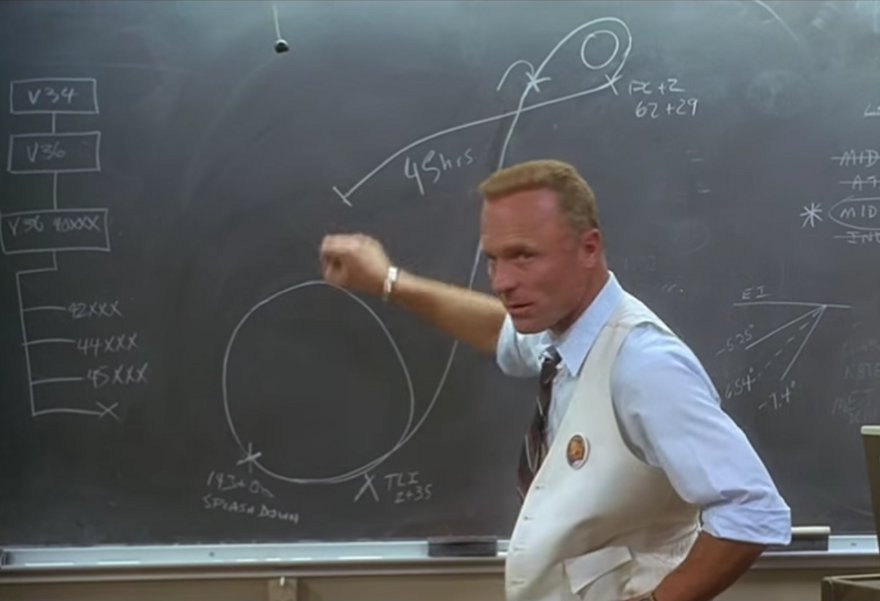
Other milestones highlighted in this shot are the Translunar Injection Maneuver 2 hours 35 minutes into the mission and the “PC+2” burn, where the descent engine was used two hours after pericynthion (the closest approach to the Moon) to speed the return to Earth. See how much more complicated the actual mission was by reading the real NASA timeline.
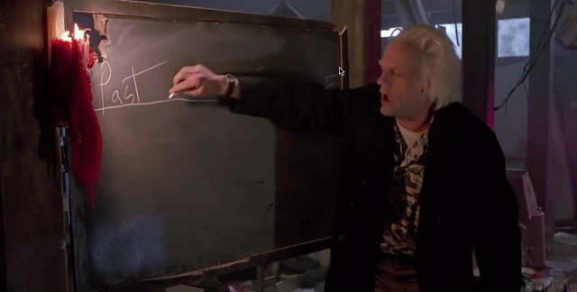
Doc Brown’s use of a simple timeline to explain the alternate 1985 world of Back to the Future II is another excellent movie chalkboard diagram. Like Apollo 13, it helps orient us to what’s happening in this film’s universe and where the action is headed. Teaching on a chalkboard also reinforces Doc’s eccentric character:
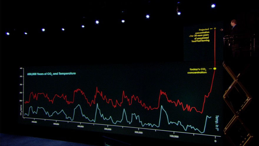
Any conversation about classic movie timelines must include Al Gore’s scissor lift stunt from An Inconvenient Truth. It helped punctuate and take mainstream hard lessons from science about global warming: CO2 and temperature are correlated, and we have recently generated CO2 levels that are terrifyingly off the scale:
Maps
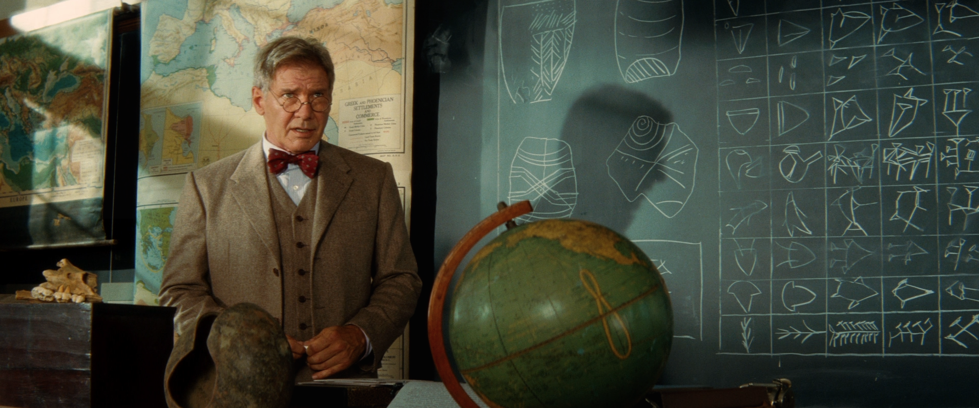
George Lucas is my favorite Hollywood cartographer. Indiana Jones films use maps extensively to boost the excitement of the adventures. Iconic travel montages help us understand where we’re transitioning to, build out Indy’s world by showing us the technology of the day (including how often you had to refuel), and pay homage to the 1930s serialized shorts that inspired the franchise:

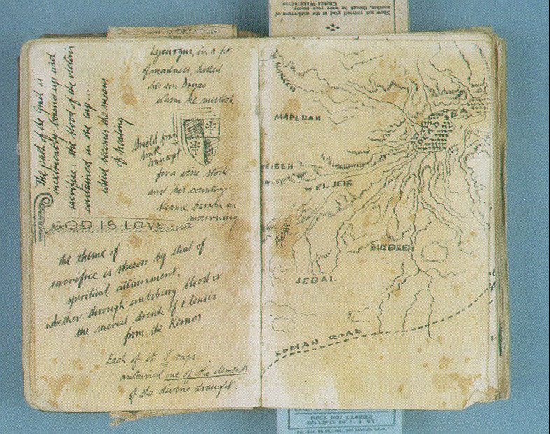
Raiders of the Lost Ark features a Map Room where the location of the Ark is revealed, and Dr. Jones Sr.’s grail diary from The Last Crusade is packed with beautiful hand drawn maps — making it perhaps the most delightful treasure map in movie history.
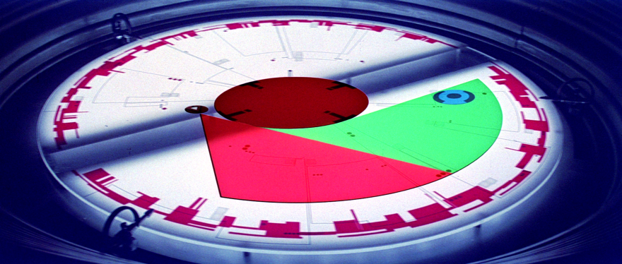
Lucas also uses maps throughout the Star Wars universe, perhaps most expertly in A New Hope as the Death Star slowly approaches and erases the Rebel base’s planetary shield. In addition to illustrating what’s going on, the map becomes the clock on a ticking time bomb and increases the sense of urgency for the Rebels to destroy the colossal weapon.
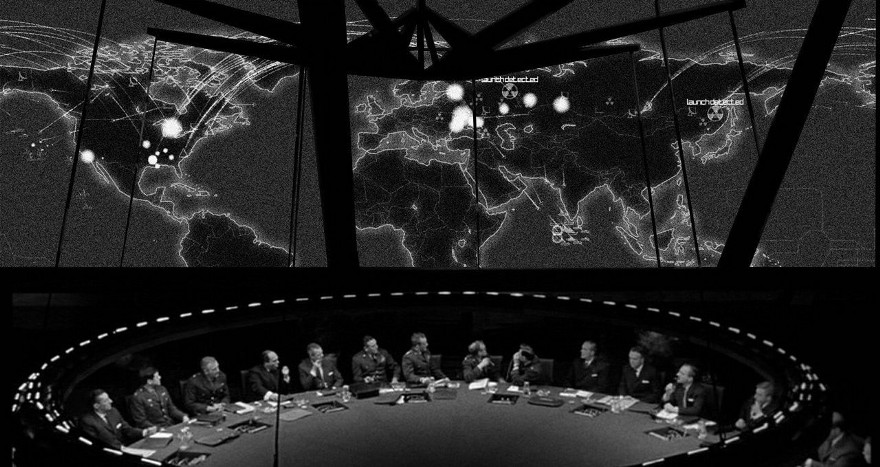
“Are you aware of what a serious breach of security that will be? He’ll see everything! He’ll see the BIG BOARD!”
Big displays (whether whiteboard, blackboard, screen, or 3D hologram) are often used to provide exposition to the audience. While the visual content doesn’t always tell the whole story, it allows the characters to talk about what’s going on and bring us all up to speed. The display’s vertical orientation and often transparent materials (think equations written on windows) allow the film maker to emphasize the characters as they talk us through.
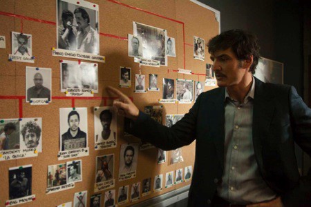
Contrast network laid out in Netflix Narcos to an actual cartel network graph.
The detective’s criminal network, composed of glossy 8x10’s and colored yarn, can help us track the hero’s progress as he assembles the map, crosses off bad guys as they are eliminated, and edges closer and closer to the big bad villain.
The interactive displays of Minority Report painted a compelling vision of where technology is headed, and how it will look and feel. They famously came out of an idea summit that Spielberg convened in order to build a convincing futuristic world not plagued by existing Sci-Fi gimmicks.
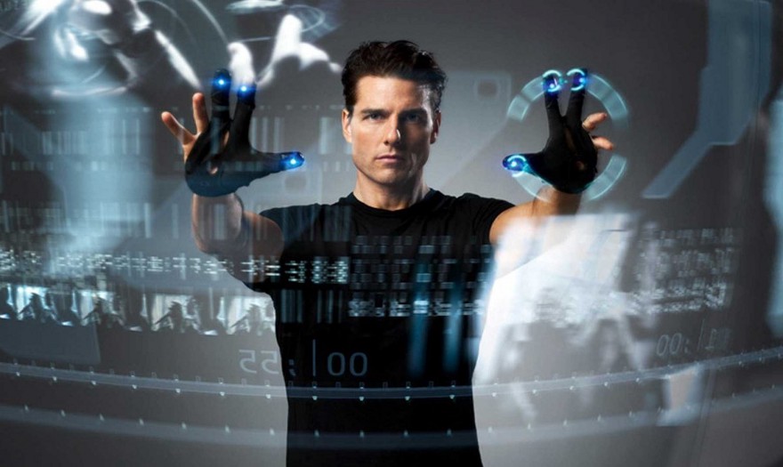
Minority Report proved inspirational to filmmakers and technology designers alike. While it’s hard to understand the content of complex futuristic dashboards, we can appreciate their general aesthetic (especially color schemes and layout) and gain a hopeful perspective that the future will indeed be more data-driven. Tony Stark’s mechanical and biological Iron Man HUD dataViz (designed by Jayse Hansen) and the fantastic displays from Guardians of the Galaxy (designed by Territory Studio) stand out and will surely inspire the next generation of designers.
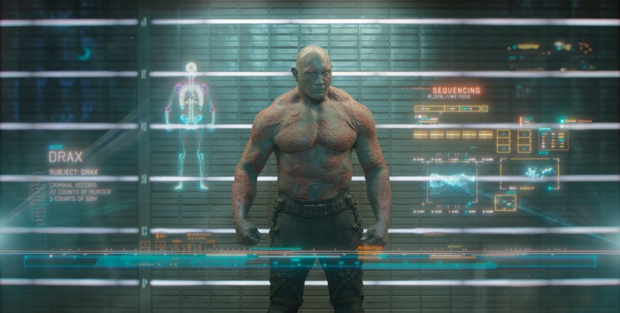
DNA, skeletal composition, and more as we size up Drax from Guardians of the Galaxy.
“How it works” Infographic
Adam McKay’s The Big Short is like one big cinematic infographic. He uses multiple storytelling techniques, including fantastic celebrity cameos, to engage the audience with a complex story about how the housing crisis happened. The Jenga scene in The Big Short, while not data-driven per se, uses a great visual metaphor to explain a complex idea and is composed with the same spirit of the best visual journalism: help a broader audience appreciate a story more deeply.
Contrast McKay’s patient effort to The Wolf of Wall St, where villain protagonist Jordan Belfort cuts short his fourth wall-breaking explanation of what an IPO is because he believes we just aren’t interested. Scorsese uses Jordan’s disregard for the film audience’s intelligence and curiosity to reinforce the character’s repugnant behavior on display throughout the film, but leaves us hanging for any deeper appreciation for what’s actually happening.
The best Hollywood data storytelling may sometimes be a little light on data, but is always effective at helping audience get quickly oriented to what’s happening and why it’s important.
• • •
Related Reads
Data stories that inspire
Info We Trust is a creative studio that makes powerful data stories. Our craft is fueled by design and science.
We’ve helped Fortune 50 companies, research universities, tech startups, and international NGOs humanize data, build trust, and increase understanding. Along the way our work has won awards and been translated all over the globe. Learn more.

Info We Trust and Visionary Press are DBAs of Information Productions LLC, San Francisco.
Info We Trust ® is a registered service mark. © 2013–2026 RJ Andrews.