Multiple Book Narratives
Weaving text, marginalia, and illustrations.
This essay is all about book design. It especially details how Info We Trust's layout supports a multi-sensory voyage through the craft of data storytelling.
Info We Trust is built on a graphic system that weaves three narratives into one harmonious flow. The main text in black is the page-turning workhorse. The illustrations put the lessons into practice (read about them in Hand Drawing a Book). Marginalia adds color in the blue margins.
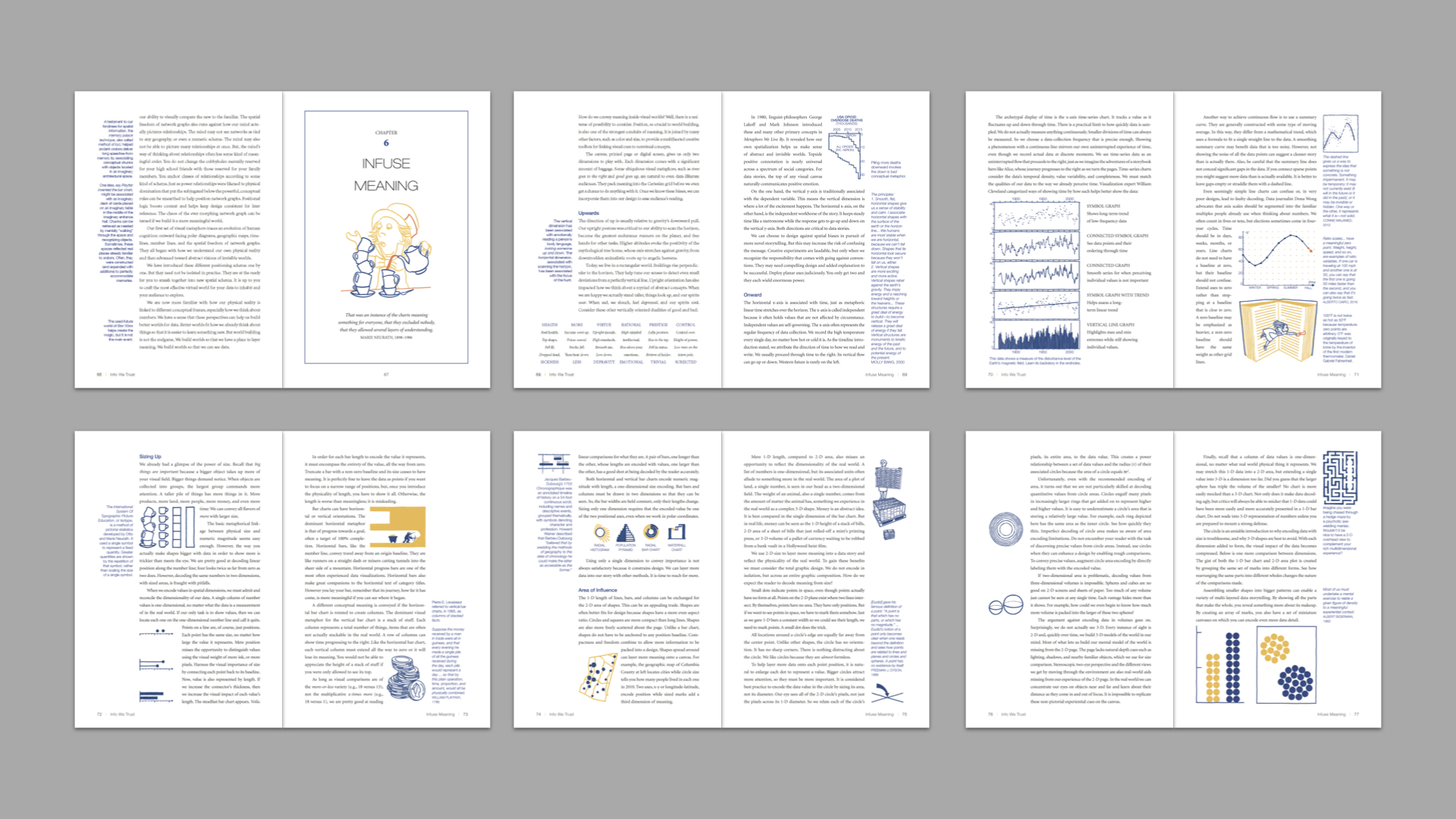
Sample page spreads from Info We Trust.
I prototyped a single chapter to figure out early what the feel of the book would be. From the outset I had one inspiring design reference in mind: Robert Greene’s 48 Laws of Power. This book updates Machiavelli for our time. It details the dynamics of power, leaving it to the reader whether to use them for good.
Greene’s book benefits from a smart narrative structure. Each of his laws gets its own chapter. Each law's chapter begins with a definition. It continues with lavish historic instances of observance and transgression of the law. Each chapter concludes with the “keys to power” and a note if there are cases where the law does not apply. That is the end of a chapter, but it is just the beginning of book design magic.
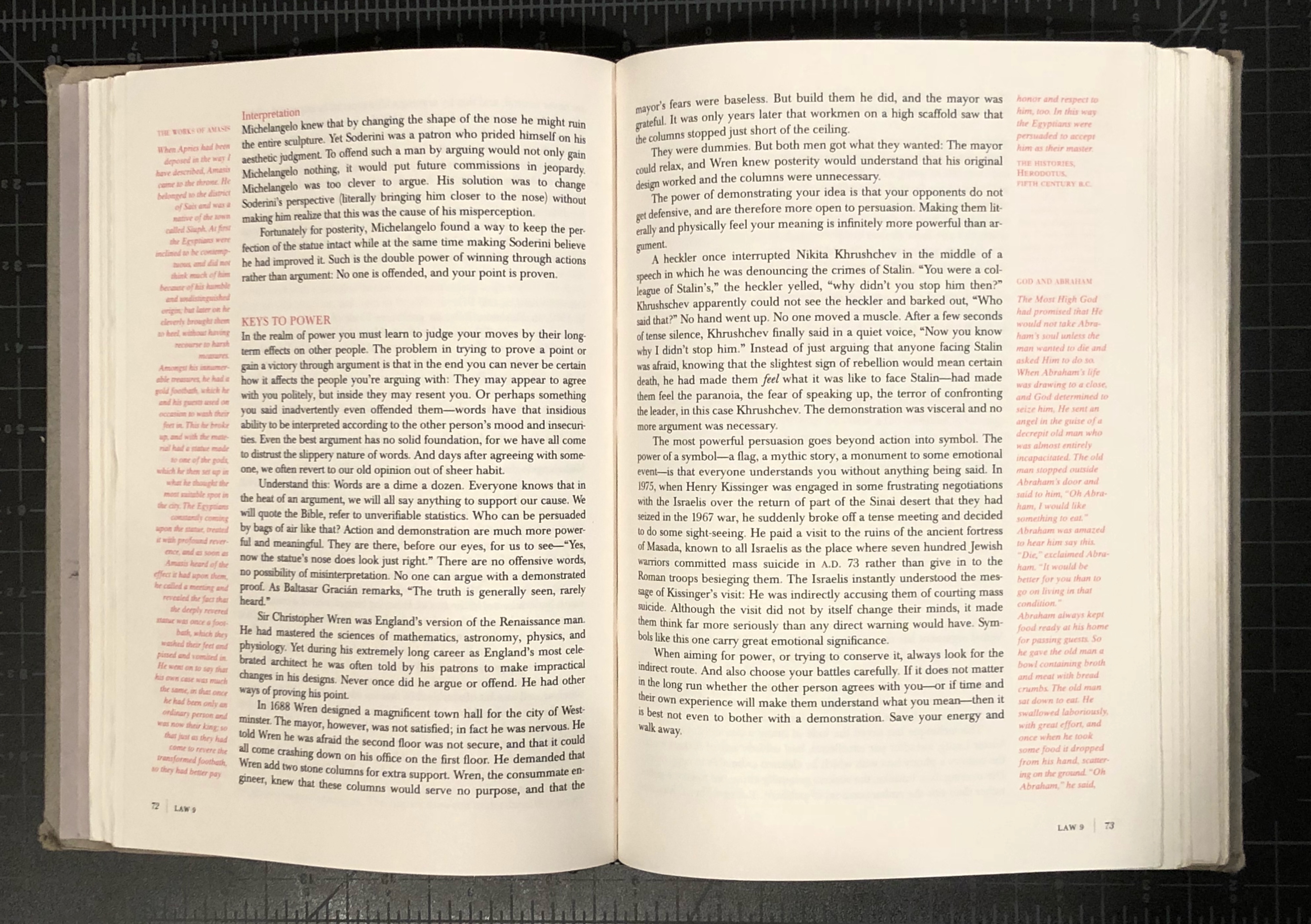
Robert Greene's 48 Laws of Power.
Besides the central text in black, Greene also provides an assortment of marginalia in red. They include anecdotes, parables, and poems related to the law. The red marginalia is reflected in the central narrative by red headers and occasional short bits of text in shape verse, also in red.
Greene’s marginalia and red text elevate the reading of 48 Laws by providing an extra dimension of information. Because the black and red are topically related they are positioned near one another. But it is up to the reader to choose when to read the red text. It is up to the reader to make the associations between the black and red too. Greene’s book not only provides an additional layer of information, it also creates an opportunity for a whole new dimension of meaning. And the red marginalia does this in a way that does not disrupt the reading of the main text. Unlike a textbook (also rife with extra annotations), Greene’s red text does not distract.
As much as I admired the aesthetic of 48 Laws, what I most desired was the functionality of its design. The narrative of Info We Trust covers an enormous breadth of knowledge that overflows with sparks of insight and inspiration. To include it all in the central text would be impossible because the required narrative framing would balloon the book to becoming unreadable. I wanted a way to include these sparks that would otherwise get left on the cutting room floor.
Could it be done in a way that savored all the magic without dragging on the reading experience? Without making the whole thing feel like a textbook? Can design help pack information in a way that elevates the reading experience? In many ways only you the reader will be able to answer these questions. Today I can tell you all about how I attempted to serve your experience.
Right away I adapted Greene’s approach by changing the marginalia from red to blue. A book about power can get away with red. A book about visual information must use red more delicately. Blue is also pleasing and the next choice after black for pen color.
Around the same time I was anchoring on blue marginalia my editor and I also determined that the page would be 7x10”. It is a splendid size: big enough for illustrations and it can hold its own on a coffee table, but it is not so big that you can’t take it on the subway and keep reading. Even more, 7x10” is a very standard print size for mass-market books. From the beginning, I wanted Info We Trust to have a shot at attracting the attention of many. I did not want odd-packaging to dissuade anyone. 7x10" not only makes the book cost-effective, but it also (hopefully!) helps introduce data storytelling to many eyes.
Professional Help
Blue margins and page size were two important inputs into my early chapter prototype (made in Illustrator because I didn’t know better). But they weren’t enough, for that I needed a pro. I have benefited from having Ron Toelke and Barbara Kempler-Toelke watch over me for my entire life. They own a graphic design firm that specializes in book design and print publication. Last winter I traveled to their studio in the shadow of the Catskill Mountains where Ron helped me tackle the design of Info We Trust.
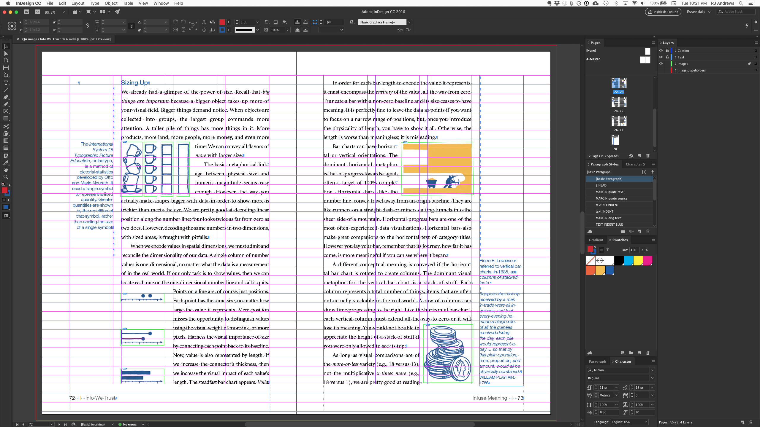
Ron helped me create an Adobe InDesign chapter template that served my goals. He refined and polished my prototype by creating a 4-column system with a strong baseline grid. He further differentiated the blue marginalia from the main text (in Minion) by using a sans serif font (Helvetica Neue Light)—a kind of textual double-encoding. Here is what one of the final spreads looks like inside InDesign, notice the columns:
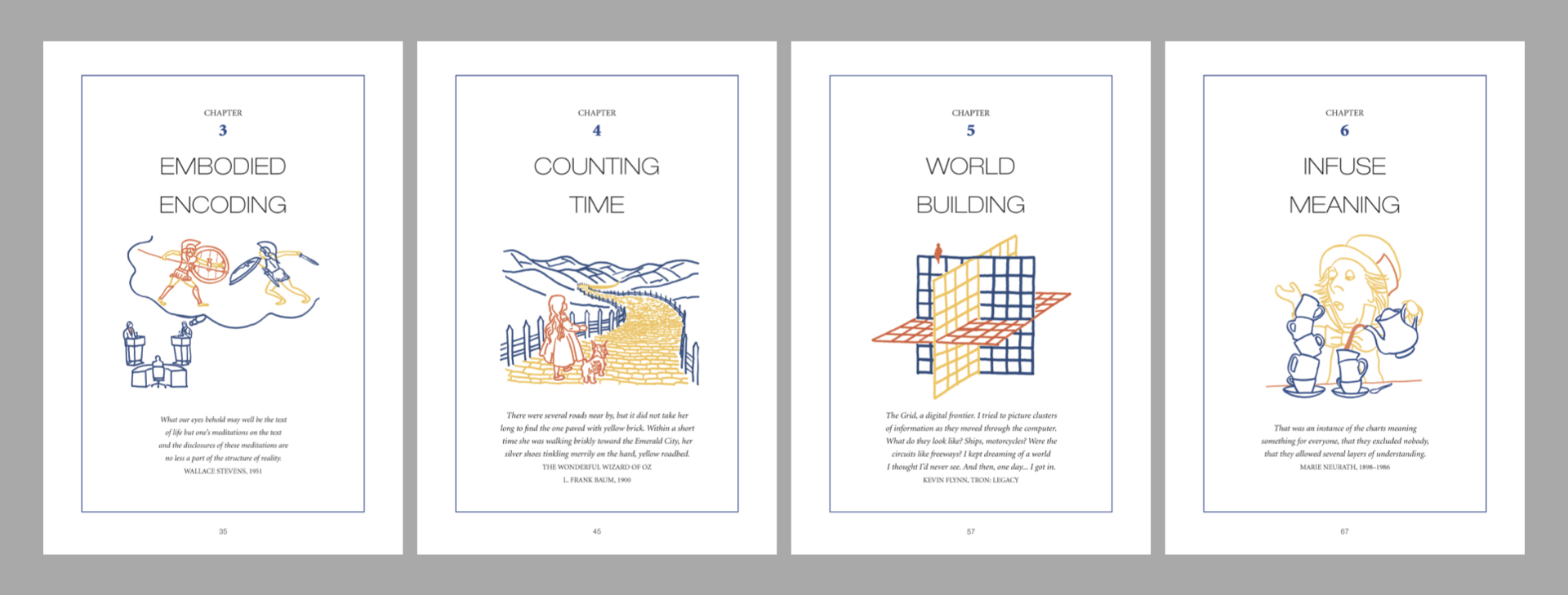
Ron also pushed me to, like 48 Laws, have strong chapter title pages. Each one has a title (in Thin Extended), 3-color illustration, inspiring quote, and blue frame. Here is one series of the book's chapter title pages:
Finally, Ron gave me a crash course in how to work InDesign. Of course, it wasn’t really final, as his expert eyes came to my aid throughout the months I worked on the book.
A Menagerie of Marginalia
I am quite fond of my "menagerie of marginalia.” Here is how I introduce them on page five: "This book’s blue margins are packed with quotes, explanations, and diagrams. Dance between the black and blue text across your first read, or just focus on the central narrative and save the marginalia for later."
The margins gave me the freedom to include quotes from cracks and crevasses that bring the narrative about data storytelling to life. They are packed with insights from philosophy, design, storytelling, and much more. Info We Trust is not a history chronicle. It wastes no time peering at dusty charts. But it does elevate timeless principles from the long tradition of visual information. I get so excited reading a description of information design from hundreds of years ago that still holds true. It makes me feel connected to a tradition that has improved how people see the world for a very long time. And it helps reinforce that the craft is still improving.
Out of hundreds of pieces of marginalia, this short ditty, which accompanies a spread that tours the use of size to show importance, highlights many aspects of what makes the marginalia special:
Pierre E. Levasseur referred to vertical bar charts, in 1885, as columns of stacked facts.
It is an unfamiliar quote, found while translating the proceedings of an old statistics conference. Levasseur is not a household name (he was new to me), but his way of describing bar charts is a perfect visual metaphor, and it rhymes, how great is that! I suppose I could have woven it into the central narrative, but it really isn’t essential. It works better in the margin as a reward for the adventurous reader.
Levasseur’s stacked facts is immediately followed by Playfair’s more famous description, 100 years older, of the bar chart as a stack of coins (also in blue). These marginalia are illustrated with a depiction of a stack of coins. And all that blue cloaks the central narrative.
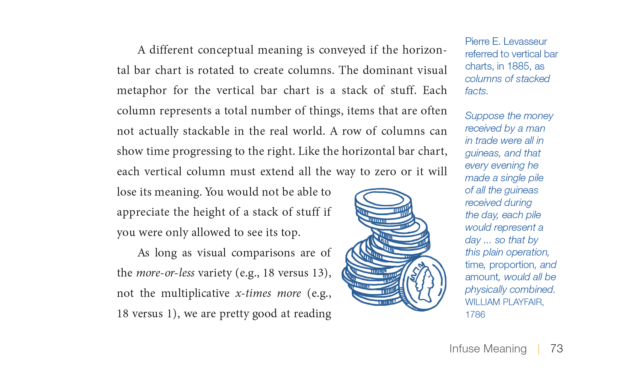
The two pieces of marginalia talk to each other. The marginalia also talk to the illustration. And they all talk to the black text. If a reader makes any of these connections then it becomes a more meaningful and more lively read. The three planned narratives (text, illustration, marginalia) give rise to the most important fourth narrative: the unique story happening inside the reader's head. The entire book is designed to work like this.
Connections Abound
It is hard for me know how many of these connections will be made, by how many readers. The stacked coin connections are in plain sight. But plenty of meaningful threads throughout the book are less obvious. Some rely on turn-the-page gimmicks. Others depend on visual puns. Many bridge dozens of pages. Easter-eggs are everywhere.
I have resigned to categorizing the connections I planned inside and across the book’s text, marginalia, and illustrations as:
- Connections a reader notices.
- Connections a reader does not notice, but adds to their implicit experience. This is especially true when a connection helps create a consistent world for the book’s narrative to play-out in. For example, you may not realize I intentionally return to some classic Greek imagery throughout the book. But even if you do not acknowledge the togas and vases, they help stake out the world of the book. They give the book a particular feel.
- Connections that make no difference to the reader, but helped me write by giving structure and meaning to the creative process.
The most interesting connections might be the ones that the reader spots but that I did not intend at all. Imagine all the possible ways to find meaning across 90,000 words, 300 illustrations, and 400 pieces of marginalia. I am so excited for you to experience Info We Trust and, hopefully in some way, learn about what you see.
Doing all of the writing, illustrating, and book design was not the original plan, just as hand-drawing the illustrations was not the original plan. I realized some months in that I would have to do it all if there was to be any hope of creating meaningful connections. As an author, I found it impossible to communicate to another book designer what I was going after because so often I did not know. Only by doing the work of smashing text, marginalia, and illustrations together did I discover what was possible. This expanded the scope of my work as the author by quite a lot. Doing the book design was a key contributor to blowing my original deadline. But it also introduced a wonderful set of storytelling constraints to my process. I no longer considered words or pictures in a vacuum. Each benefited from being polished in the context of the other.
Actually doing the book design work felt like putting together a puzzle. All of the raw pieces had to fit together, but could not be forced. Sometimes pieces had to refashioned in order to work. Plenty of layout tricks came to my rescue. I grew to really like working in InDesign. It is a program that fits its purpose beautifully.
Coda
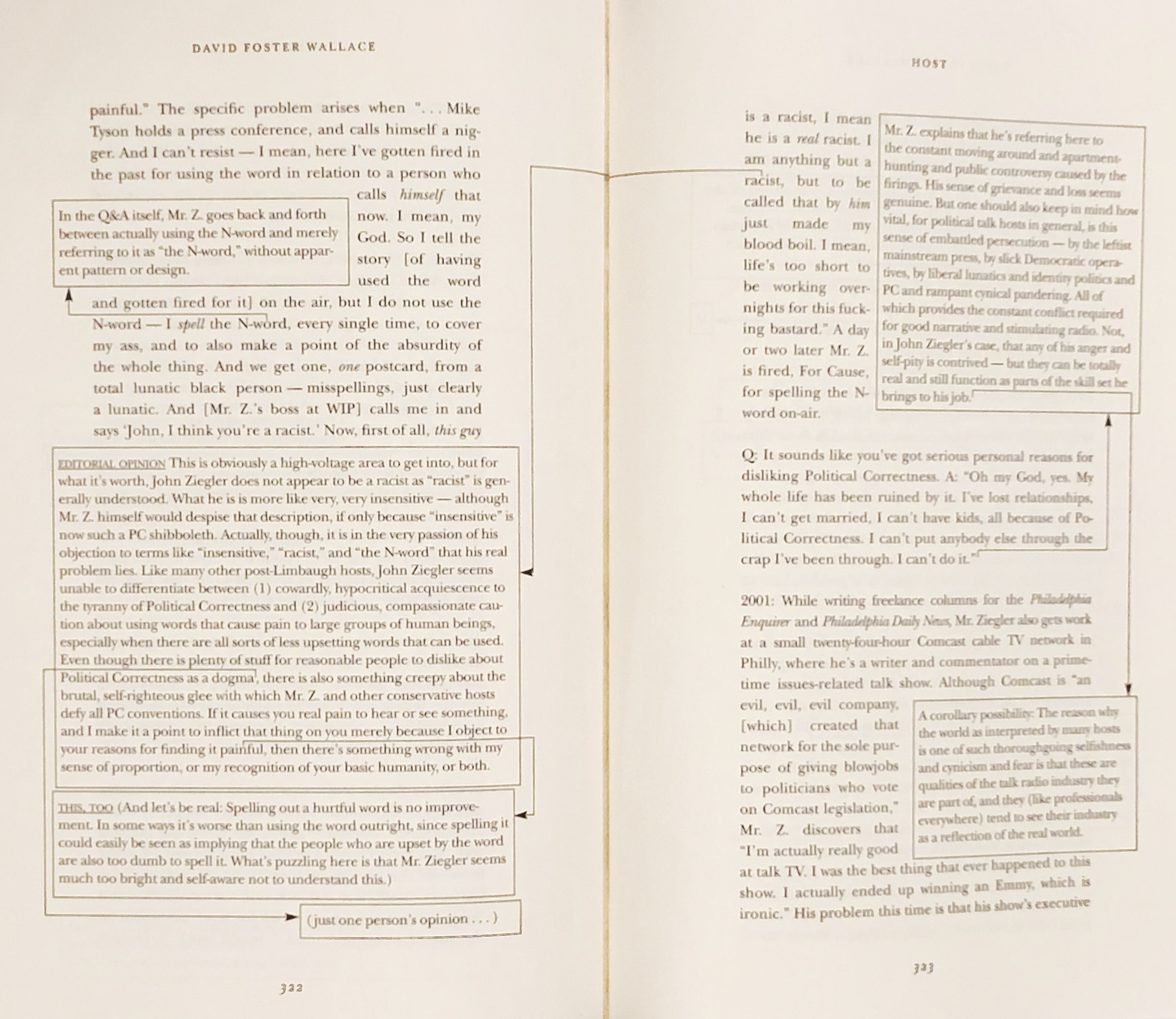
After showing drafts of Info We Trust to some friends I have heard about two other sources that also take advantage of “multiple narrative” designs. One is David Foster Wallace, who sometimes extended his many-layered storytelling to the spatial design of the page. Here is an incredible spread from his essay “Host”:
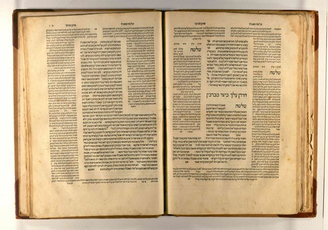
The other source mentioned by some is the Talmud, the central text of Rabbinic Judaism. Many Talmud page designs feature beautiful interlocking commentaries and notes that surround the central text:
While the comparisons to David Foster Wallace and the Talmud are flattering, I did not have either in mind while designing Info We Trust.
• • •
Data stories that inspire
Info We Trust is a creative studio that makes powerful data stories. Our craft is fueled by design and science.
We’ve helped Fortune 50 companies, research universities, tech startups, and international NGOs humanize data, build trust, and increase understanding. Along the way our work has won awards and been translated all over the globe. Learn more.

Info We Trust and Visionary Press are DBAs of Information Productions LLC, San Francisco.
Info We Trust ® is a registered service mark. © 2013–2026 RJ Andrews.