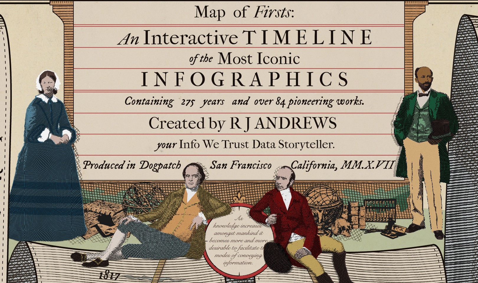
Interacting With History
300 years of information graphic milestones.
This design essay reviews motivations and decisions across a project exploring the first 300 years of data visualization and information graphics.
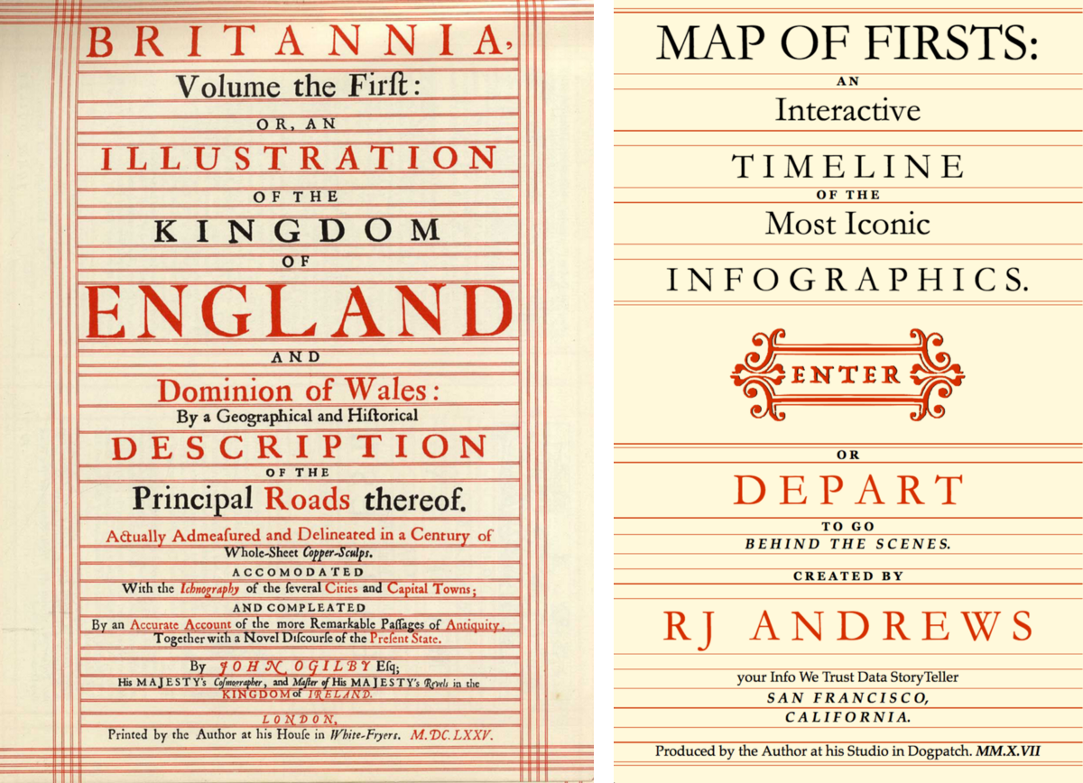
The project's first iteration was a static poster (January 2017) in the style of John Ogilby's Britannia road atlas. It evolved into an interactive, published later that same year, best experienced on a big screen:
Historic Reference
John Ogilby published his Britannia road atlas, the first of its breadth and quality, in 1675. Its strip map design became a visual and cartographic icon. Ogilby's map innovations include establishing the scale of one inch to the mile and the consistent use of the standard mile. Britannia Plate 25 is below, you can see the other 99 plates here.
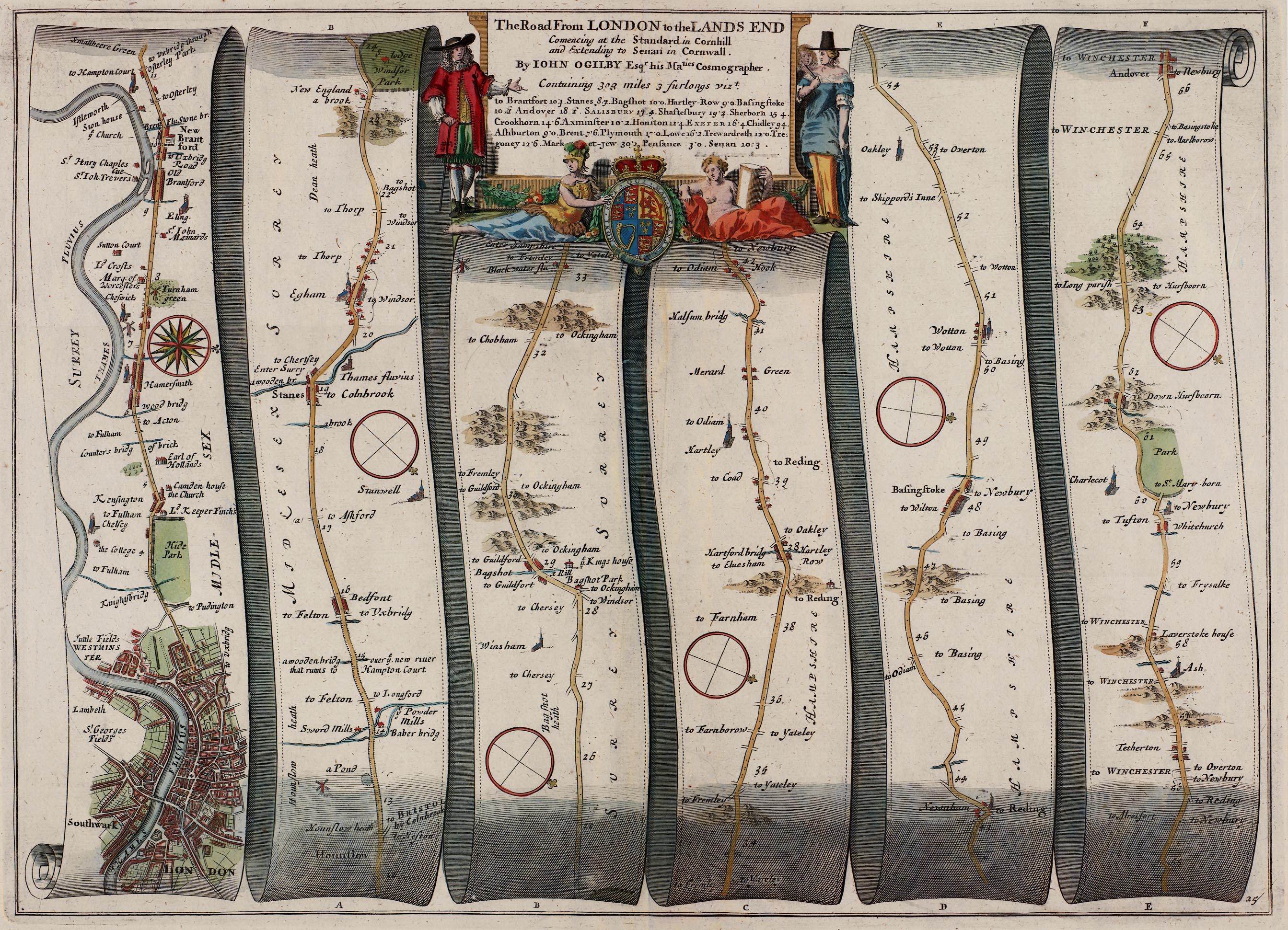
John Ogilby was born in Scotland in 1600 and, like so many dataviz pioneers, adventured through daring exploits and twists of fortune. Young Ogilby used the winnings from a lottery prize to set his father free from debtor's prison and apprentice himself to a master dancer. In time he was able to establish a dancing school of his own, but (perhaps to our benefit) a fall during a performance lamed him for life.

John Ogilby.
Unable to dance, Ogilby turned to teaching. He moved to Ireland to tutor noble children. There he established Ireland's first theatre before being nearly blown up defending a castle during the Irish Rebellion of 1641. Ogilby was shipwrecked on his return voyage to England. After walking to Cambridge he learned Latin and began a successful career translating ancient classics.
Ogilby moved his translating business to London, established a press, and was appointed "His Majesty's Cosmographer and Geographic Printer." He published the Britannia atlas, honored here, the following year. Ogilby died soon after in 1676, and was buried in Sir Christopher Wren's newly constructed St. Bride's Church.
Reference and Inspiration
This project was set into motion by a conversation I had with Ben Jones this past fall about influential people and technology in the field of data visualization. I quickly realized my lack of knowledge beyond a few "sacred cows" and began reading up on the charts and designers who helped shape the field.
I cast a wide net in order to learn the history of data visualization and was lucky to discover the Milestones Project by Michael Friendly and Daniel J. Denis. I also came across these other interesting collections and discussions about historic charts:
Infographics in the time of cholera (Scott Klein, ProPublica)
The Repetitive and Boring History of Visualization (Rob Kosara)
The Surprising History of the Infographic (Clive Thompson, Smithsonian)
100 Years of Data Visualization Best Practice (Andy Cotgreave)
Digging Up the Nineteenth-Century Roots of Thematic Map Techniques (Margaret Pearce, NYPL)
Landmark Thematic Maps (John Delaney, Princeton)
Eleanor Lutz's fantastic map of Mars inspired me to pursue a heavily-styled aesthetic. Researching and especially creating this piece has proved to be incredibly inspiring - you learn so much cartooning 300 years of dataviz!
Curation Challenges
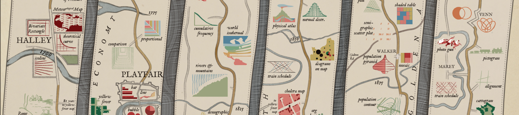
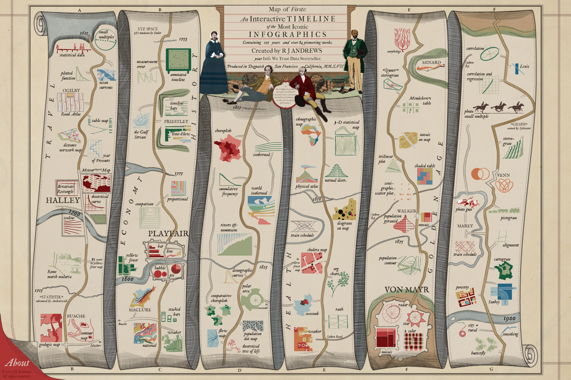
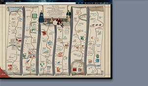
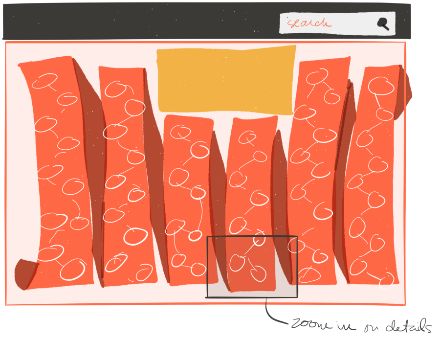
Cartoons represent important works of data visualization. They are placed along a fictitious timeline map in the style of John Ogilby’s 1675 atlas. The road marches you through time, passing many charts, through towns named for key contributors, and over waterways that mark important dates.
How did I choose what to include? Editing might be the most important part of storytelling. Developing a good sense of what is core to the message and what has to go is a tough matter, especially if you are the original creator. It doesn’t make it any easier that I am an infovore and don’t mind drowning in information.
I focused on chart innovation, not necessarily the application of charting… although many simply famous charts are also included. The visual communication of information is arguably thousands of years old — but developments before the 17th century are sparse and so I knew I wanted to begin around there. Chart innovation slowed in the early 20th century and so I knew I wanted to cut things off near the end of the golden age — certainly well before computers reignited the field. Discovering two charts that examine the migration of sunspots — one from 1630 and one from 1904 — provided poetic bookends for this project.
Within that timeframe many developments still got left on the cutting room floor. Thematically, I decided to not include: nomograms (charts used for computation), most maps except where relevant to the field of visualizing statistical information (the history of cartography, especially map projections, is huge and deserves a separate exploration), non-visual statistical analysis, development of tools (graph paper, printing techniques, recording technologies, scientific instruments), and reviews (society meetings, roundup summaries and books).
I left out a few pieces of important viz that were difficult to summarize in my cartoon format. These include some really incredible examples like James Watt’s automatic recording of bivariate data (pressure vs. volume in steam engine), Francis Hauksbee’s literal line graph (where a hyperbola section was formed by capillary action of colored water between two glass plates), and Crome’s 1782 statistical map of production (possibly the first thematic economic thematic map).
The poster’s reception pushed a wave of information and enthusiasm for the history of information toward me, further increasing my interest in the field. I am most excited when someone tells me I am missing something from the timeline because then I get to add it in and we can all benefit. If you think I have made a serious omission in the history of dataviz please let me know!
Reference
One of the most wonderful boons to come from this project has been befriending Professors Michael Friendly and Howard Wainer. Their scholarship, passion, and especially Michael Friendly’s comprehensive Milestones Project, is the foundation for my exploration of this history. Their work is linked to throughout the interactive.
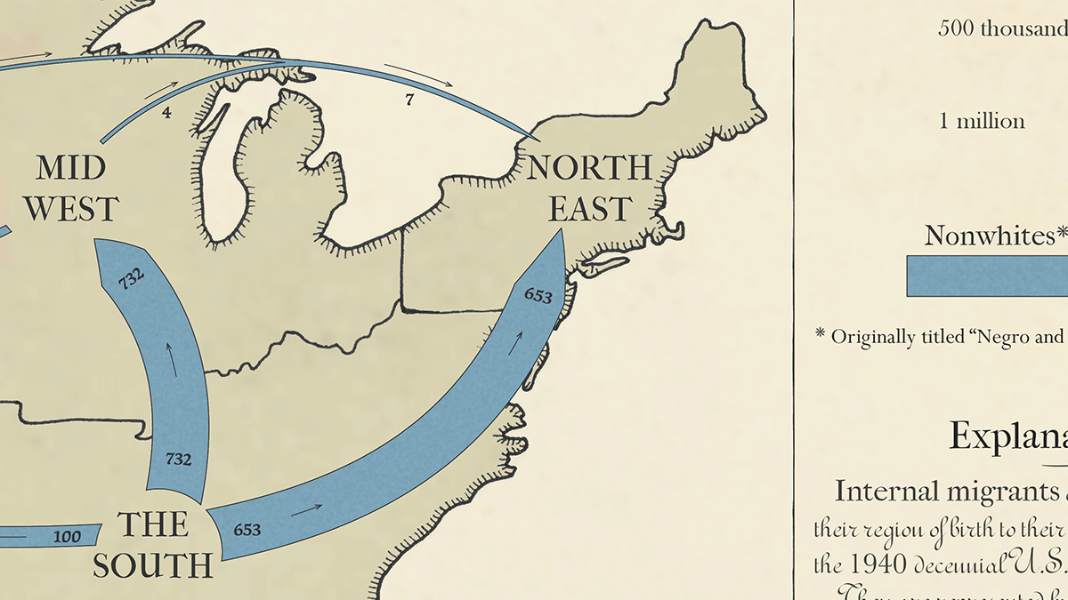
Nightingale, Playfair, Snow, & DuBois (L-R). A relative's likeness was used for William Playfair as he has no surviving portrait.
In addition to their publications, Friendly and Wainer have also personally shared many lessons about data visualization as a practice. We have embarked on a couple of collaborations which I will be excited to share with you soon. One of these projects involves the pioneering social science work of W. E. B. Du Bois and directly influenced my decision to include him as one of the four figureheads at the top of the interactive, along with Florence Nightingale, William Playfair, and John Snow.
The original static poster received a wonderful amount of attention. It also seemed incomplete. The abstract cartoons went a fair distance in communicating the depth of the history of data visualization, but they did not completely connect the dots. To really appreciate the history you have to see the real work. But to see all of the real work you have to spend days surfing the Internet rummaging through obscure libraries and hopping research gates. I know this now because that’s what I’ve spent the last few months doing.
And so I built an interactive to show off the real work and link to the best resources available on each milestone. The balance of this design essay goes beyond the underlying motivations and explores how and why the interactive works.
Building An Interactive
Translating the static timeline map into an interactive presented fun challenges that helped me get better at basic frontend web development. Here are some things that are critical to the viz working that took me a while to get right. All code is commented and includes links to source tutorials that helped me.
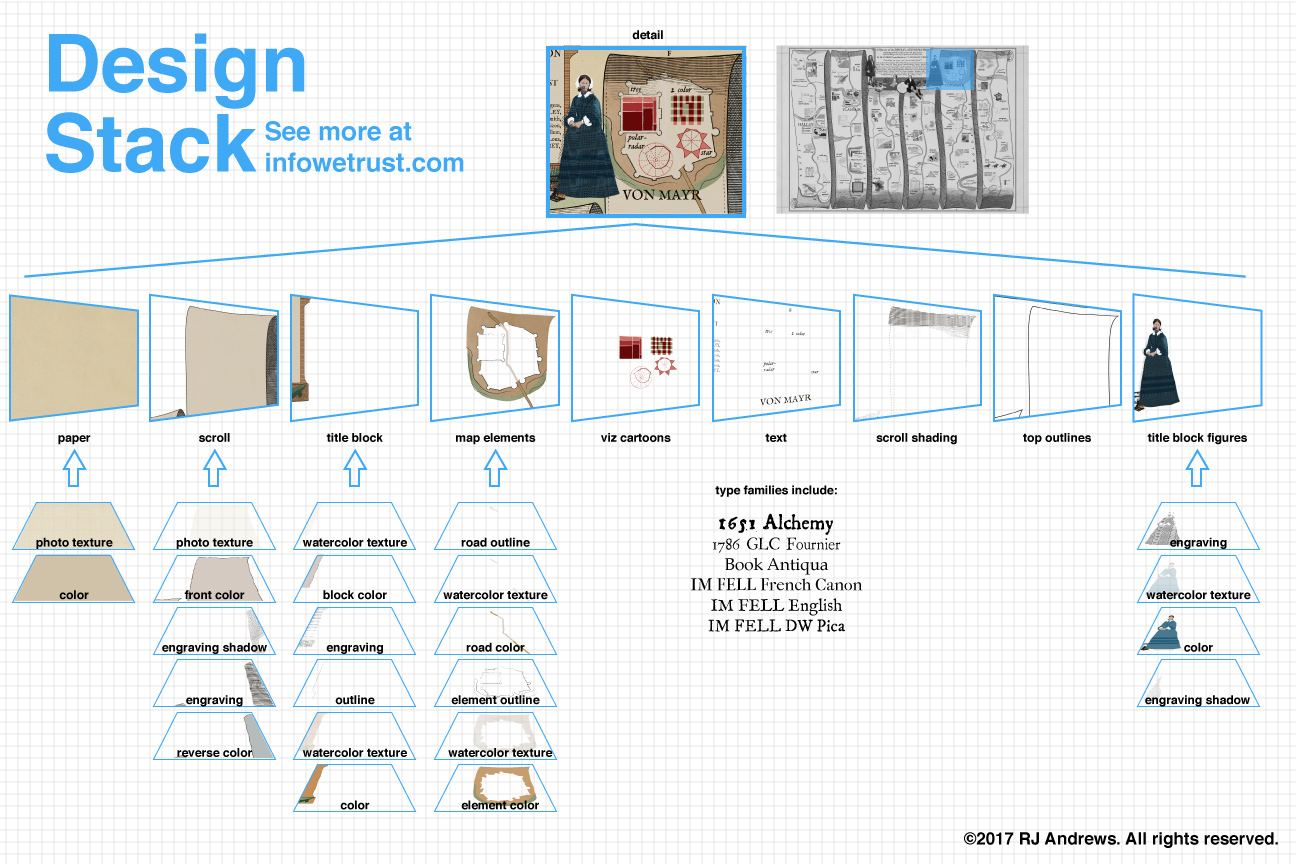
27 layers of static poster.
The original static illustration was assembled from dozens of vector layers to create the aesthetic effect of a 17th century manuscript. For the interactive I wanted to preserve as much of this look as I could without load times getting out of hand.
Could the interactive look good and be fast? Speed and beauty are balanced by reducing the static poster to only a handful of layers, each at different resolutions prioritized by the importance of the information they convey:
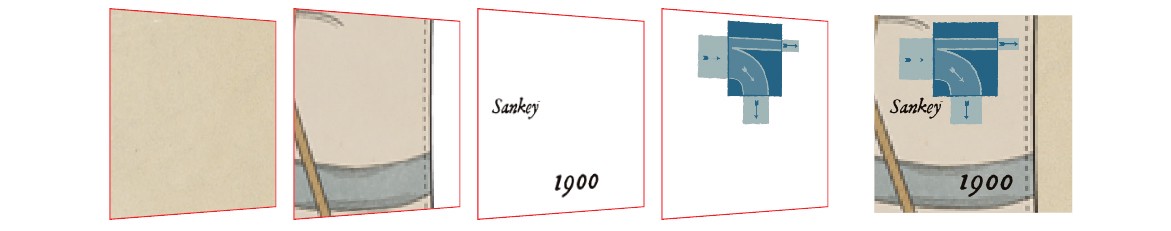
4 layers of interactive.
From left to right: an old paper .jpg anchors the viz and loads very quickly. Next a .png with the textured and engraved scroll, shadows, roads, and waterways comes in at a higher resolution. A single high resolution .png with all the raster text follows. Highest resolution elements such as the people and clickable fleet of cartoons are individually placed on top.
Each of these images was tweaked to be as small as possible while still looking OK on a big screen. I flirted with using image sprites and .svg but ultimately didn’t have the capacity to realize any of the gains these may have delivered.
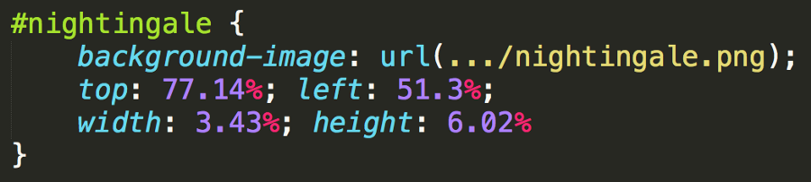
% Relative CSS and consistent id’s.
All content layout originated in Illustrator, from where I could export coordinates and generate hardcoded positions and sizes for images. The size and layout of each of these features are defined by percentages in relationship to a single parent container.
Parent container resizing in action!
The timeline is at its best when you see its entirety. The parent container actively looks at the window size, decides whether window width or height constrains the desired 3:2 aspect ratio, and informs the sizing and placement of all items accordingly. A set of functions is needed to resize text appropriately as relative CSS sizing like vw does not work in cases when the window was too wide for the defined aspect ratio.
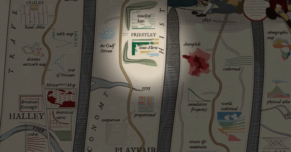
Each work’s side panel holds the answer to why I made this interactive: for you to learn and further explore the history of the craft. You can select any cartoon to see more detail about the milestone. Here is what happens when you click DuBourg's annotated 1753 timeline:
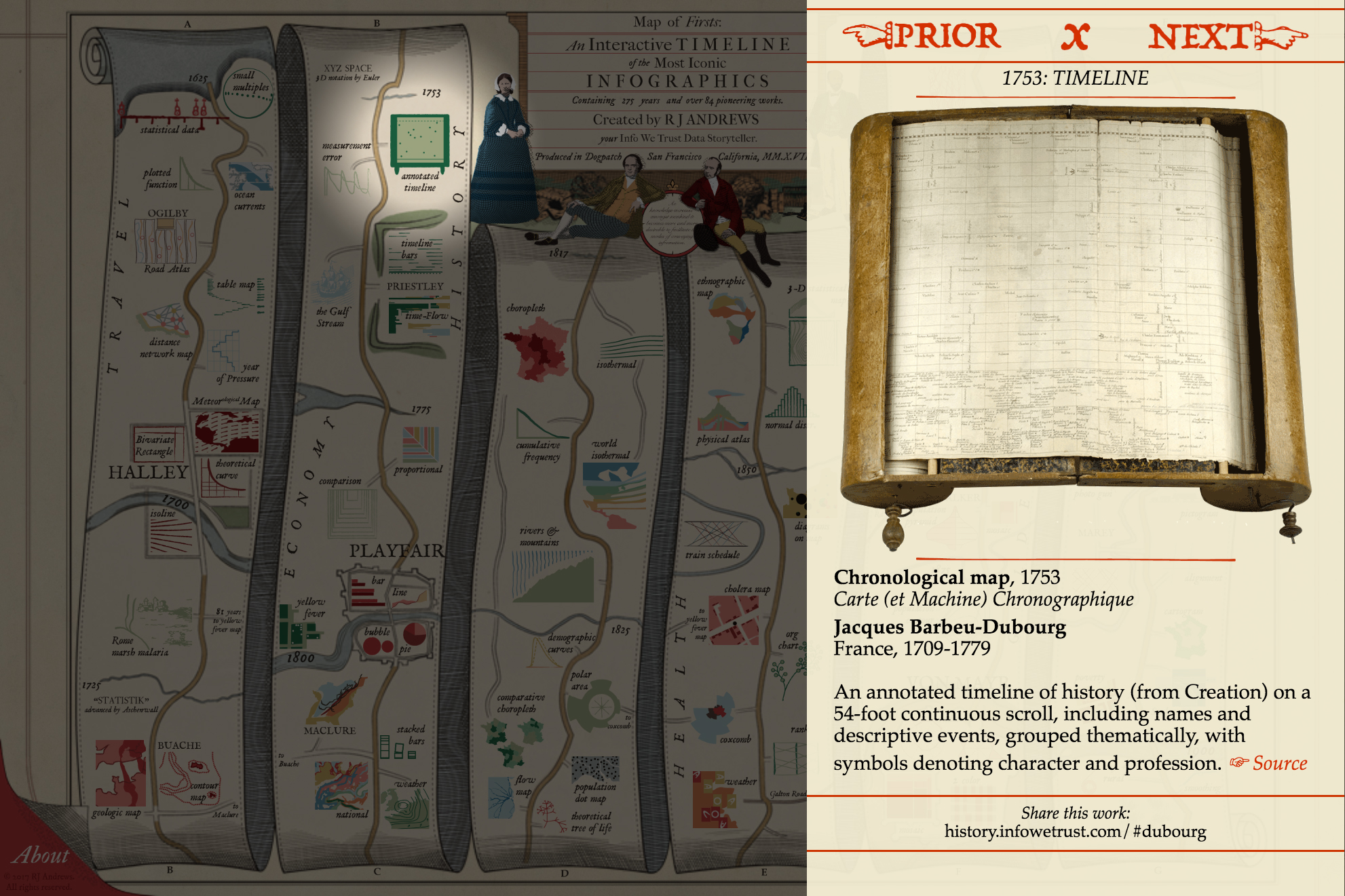
Curating the message in each side panel presented special challenges as the format risks oversimplifying the story behind each piece.
Naming a year for each piece is tough. Some were iterated across several years. Some were published years after being written in a letter or notebook. Some only became famous in later editions. Naming a single author is tough. Few of these are the products of lone geniuses. More often they are collaborations inside studios, or between designers and draftsmen. Wherever possible I tried to pay wide tribute to the pioneers.
Side panel information is arranged in a hierarchy of importance. It is filled in from a single .csv using mustache.js templating (you can grab that table here). The date and why you should care are in a static position below custom navigation buttons. They stay in the same vertical place across all works so that you can quickly browse using the buttons (or keyboard arrows) and read the most important blurb on why each work is included.
Title, creator, and a short blurb on the work are below the image. This information is produced in a way to evoke a museum placard in pursuit of elevating each work’s status.
A source link in red concludes the blurb. It opens whatever freely available piece of information I thought was the next best thing to read about the work. In the best cases this is a highly detailed copy of the work or an academic paper about it. Sometimes we have to settle for a general Wikipedia entry on the creator.
An individual #url balances the content and invites you to share interesting discoveries. Each historic work is associated with a text string, usually the creator’s last name. The same key is used to identify the cartoon and real work images, CSS id, row in data table, and #url.
The use of red horizontal lines and contrasting text is directly inspired by John Ogilby’s original 1675 road atlas, which contains some beautiful front matter:
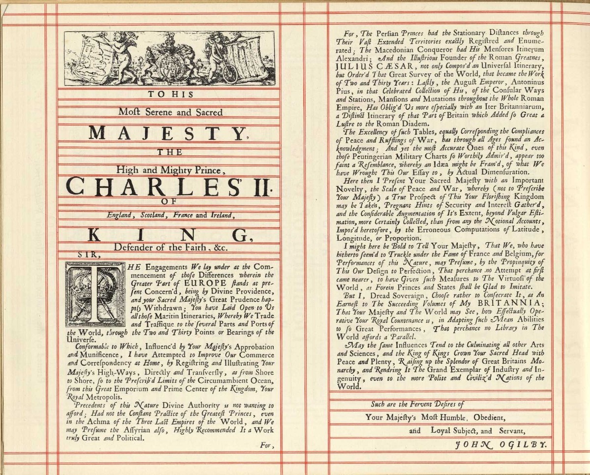
Preamble to John Ogilby’s BRITANNIA.
A large spotlight .png centers on the selected work to help showcase it. The shadow’s slight opacity preserves context about where the piece stands in relationship to the larger history. Moving the spotlight is a fun way to move down the road through time. Keyboard keys (arrows, escape, x) all provide a smooth flow through the interactive.
Design (Thinking?)
My capacity for design-thinking was noticeably restrained by how much effort I had to devote to get the interactive to work at all. In many ways I relish the mental trench you fight through when working on a new technical problem. I used to work as a pure engineer and this was life every single day.
Now, after layering years of design and strategy work on top of my technical skillset I am very aware of the many perspectives that can escape me when I am solving challenging technical problems. I tried to absolve my absent design thinking with a lot of ad hoc user testing. If you talked to me at all during summer 2017 I probably made you visit the dev site and play with a half-working contraption. Hey I have this cool thing you should probably see… There are a lot of you out there and you all helped this project come alive.
Fantastic feedback from experts in interactive design, communication, and the technologically-illiterate (they give the most valuable feedback) helped change my stubborn opinions.
The project is inspired by Ogilby's work, but there are certain quirks of 17th century design that are incompatible with web design. It took many tries to strike the right balance between the two.
The biggest change was flipping the orientation of the timeline. Ogilby’s original begins in the bottom left and proceeds up. This is how I made the first poster and I never paid close enough attention to people’s reaction to accept what a problem to 21st users this orientation is.
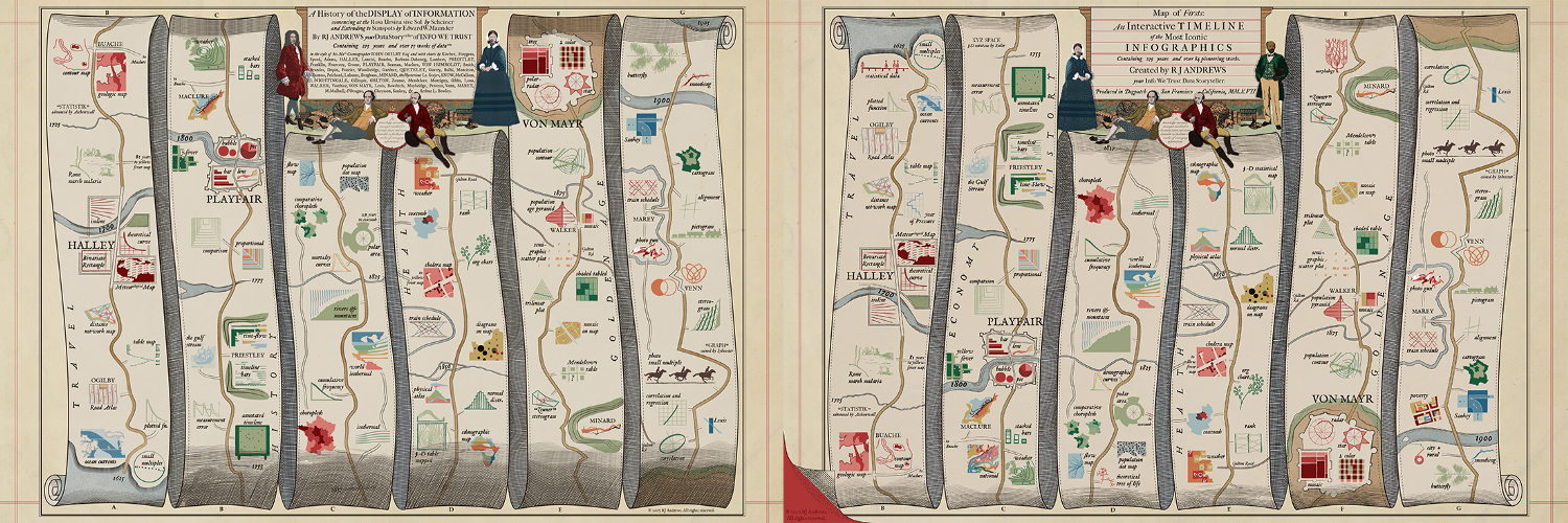
Original poster (left) begins in bottom left and proceeds up. Interactive (right) flips orientation.
Eventually I accepted way how strong our “top-left = start” bias really is and re-oriented the interactive. Everything was flipped to accomodate top-left bias. Flipping everything was not a trivial matter. All of the graphics, textures, and engravings had to be manipulated in order for the skeuomorphic shadows and connected scroll to still work. Each element had to be re-positioned individually, all text was massaged. Everything that was hardcoded had to be re-hardcoded.
I tried many instructive modals on load that explained how to read the thing, where to start, the fact that it is a timeline, etc. But design is like a joke: if you have to explain it then it’s probably not very good.
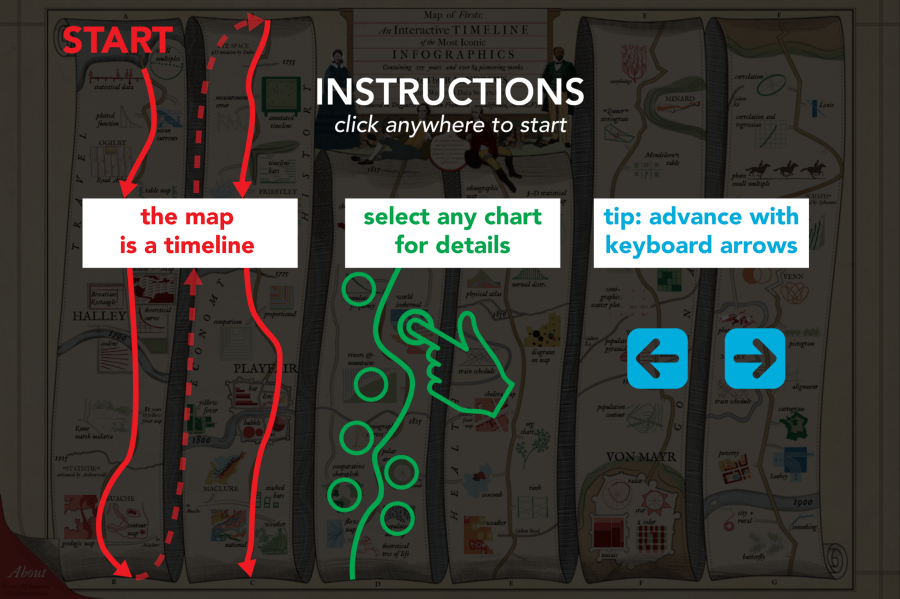
One of many attempts at kicking things off with an instructive modal.
Another challenge was communicating that you can click the cartoons.
General feedback was that the base visual is so overwhelming that one can get fully loaded just consuming the static overview. Each cartoon enlarges on hover to indicate you can click, but this doesn’t help on mobile. In addition to the modal instruction I flirted with having one of the side panels open on load.
Right now I’ve settled on pulsing the earliest piece of dataViz on load (which you should totally check out) for a limited time to indicate that you there is more to discover.
The current solution.
Another last-minute change was removing the splash title. The interactive originally had an intro title in the style of Ogilby’s original title page. I believe it is an extraneous barrier to the interactive. All of the information it contained was moved to the smaller title block in the interactive.
1675 title page and the last iteration of my splash title before it got cut.
Coda
Many friends advised and helped make this thing possible. Two in particular were critical to its success.
One of many concept sketches by Catherine Madden.
I would not have been so emboldened to pursue this without Catherine Madden. She helped me work out the original vision for what an interactive could accomplish. Who wouldn’t want to work all summer to make her sketches a reality?
I also want to credit Micah Stubbs, without whom I don’t think I could have finished the interactive. He patiently answered my novice coding questions, helped identify memory leaks, and even took over my keyboard to squash a bug. Thank you Micah!
I am still on the first rungs of learning this history.
An early lesson for me is appreciating how bold these pioneers were. Often polymaths, they were not afraid to go on expeditions in search of new information, make their own scientific equipment, all while drawing beautifully in sketchbooks and letters. They maintained impressive professional networks through voluminous correspondence. And of course, they were not afraid to invent new visual ways of communicating information that suited their data, message, and audience.
William Playfair's 1786 quote from the interavtive.
I hope their stories can inspire us to believe that the field of data visualization has not yet matured and that there is still much left to explore and create. I would really like to keep working on further communicating lessons and stories from the history of data visualization and am looking into ways to do that into the future. I would be delighted if you reached out with enthusiasm for the history of data visualization.
• • •