Profiling California
A new map in a classic Isotype style.
Jason Forrest (Twitter) is Editor-in-Chief of Nightingale: The Journal of the Data Visualization Society. In this design interview he asks RJ Andrews questions about RJ's new data story: Cross-sections through California, a foldout map now available from Visionary Press.
Jason: How did you get the idea to recreate this kind of Isotype Map?
RJ: The California map idea emerged during fall 2019 at the intersection of two vectors: Isotype and NACIS.
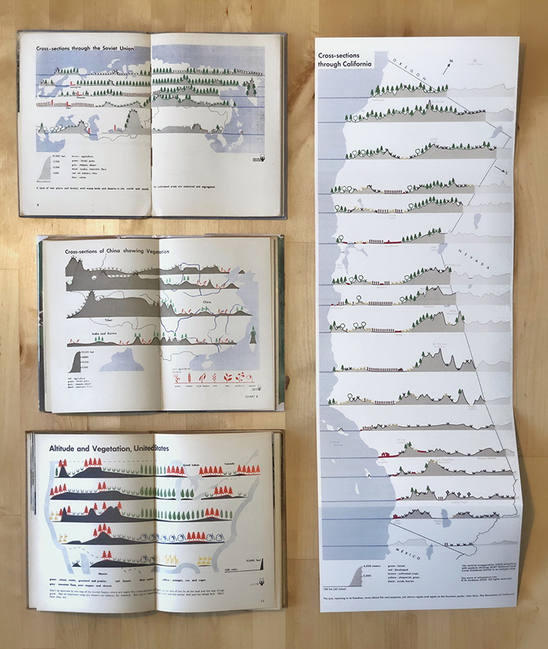
The first influence is a joyous obsession with Isotype information graphics. Isotype is a visual education process from the 1930s and ‘40s that produced many iconic graphics. Isotype design seems particularly relevant now. Its approach makes data-driven understanding more appealing and accessible to all. While Isotype is widely known by its stack-of-icon bar charts, it also produced many maps.
Here are some of the Isotype cross-section map inspirations alongside the new California map:
The second influence stems from attending the 2019 meeting of NACIS (North American Cartographic Information Society). The conference was full of inspiring cartographers and many maps. Read a summary of my NACIS presentation How DataViz Sees Cartography on Twitter. Coming out of NACIS I wanted to make a map to submit to the NACIS Atlas of Design, a biennial publication of maps.
So Isotype and NACIS were the background motivators. A couple weeks after NACIS I posted an Isotype map on Twitter that attracted the attention of many designers I admire including Riley D. Champine, Maarten Lambrechts, and Zan Armstrong. This was the first outside encouragement I received to pursue this style.
Why did you want to design for California specifically?
I moved to California in 2015. Immediately I was amazed by its geography. Growing up exploring the U.S. Eastern Seaboard’s rolling hills was poor preparation for the American West. The West is just so big. This initial wonder motivated me to create Profiling the Parks, a short film about the U.S. National Parks that cored on elevations cross-sections.
Since then I befriended Rob Simmon, earth-visualizer extraordinaire. Across many conversations he has taught me about California’s unique land, always spiking my curiosity to learn more. Rob also gave me constant encouragement and feedback throughout my making of the California map - it would not exist without his input.
When you went to create the map, did you find any challenges with sourcing or processing the data?
The underlying datasets are USGS elevations and land coverage from the Multi-Resolution Land Characteristics (MRLC) consortium.
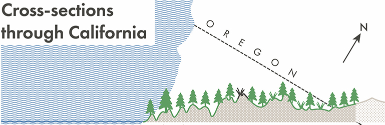
The most unique data challenge resulted from rotating north-south away from vertical. The rotation better fits California’s shape onto the rectangular canvas. The rotation also presents the state in a way we think about California: the Sierra-Nevada mountains and Central Valley run up-down, not exactly north-south. The Pacific coastline faces left, but not exactly west.
This rotation has some precedent. California road maps going back to at least 1917 have rotated the Golden State:
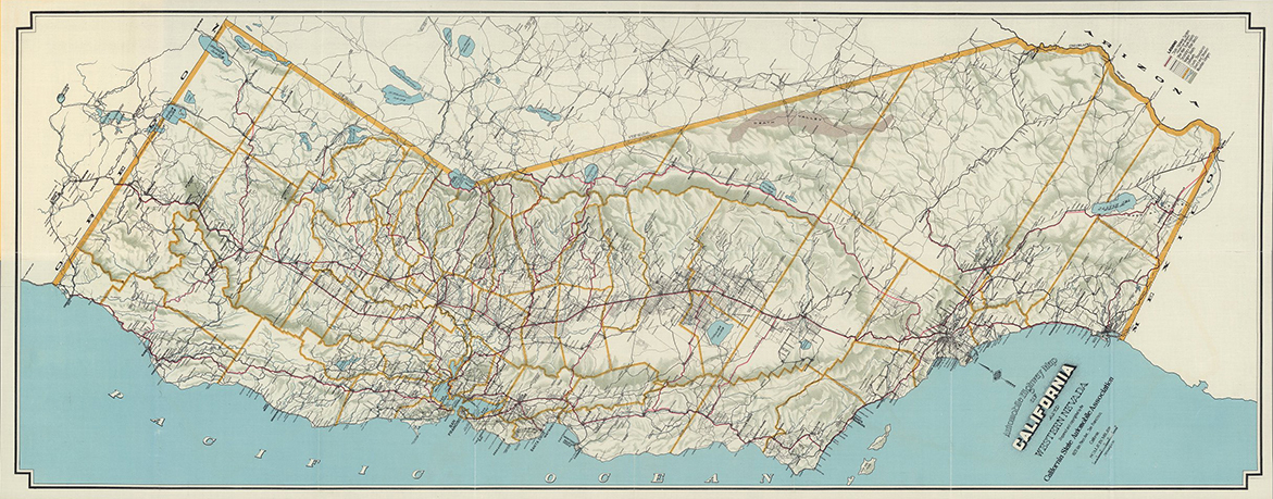
Automobile highway map of California and western Nevada by California State Automobile Association, 1917. Learn more at David Rumsey.
I chose the final rotation angle by working with Andre Kaschcha. He added a feature to his cross-section mapping tool that allowed me to rotate California and select the angle I thought looked best. See how the north arrows points away from the vertical and state lables are rotated to match:
The data-implication of this rotation was planning the cross-sections. In other projects, elevation cross-sections follow a constant latitude. But once I rotated the map I needed to consider how to define the course of the cross-sections so that they still appeared horizontal.
The California map uses the Mercator projection, the classic map projection for navigation. The Mercator projection has the useful property of representing any course of constant bearing as a straight segment. Such a constant bearing course is known as a rhumb line.
I needed to define rhumb lines that passed through points of interest. I addressed this challenge by using a rhumb line calculator. For each cross-section profile I began with a lat/long of a point of interest. From there I used the calculator to build out a line with constant bearing, iterating until I had start and end points that went from the Pacific Ocean and beyond the extent of my map. It was an iterative process to get each line right. With endpoints determined, I could then pull the right USGS elevation data, careful to sample the data at the same density along each line.
Isotypes inherently aggregate data to make a subject more understandable and easier to remember. What was your process or strategy for understanding the data and aggregating it into a more generalized format?
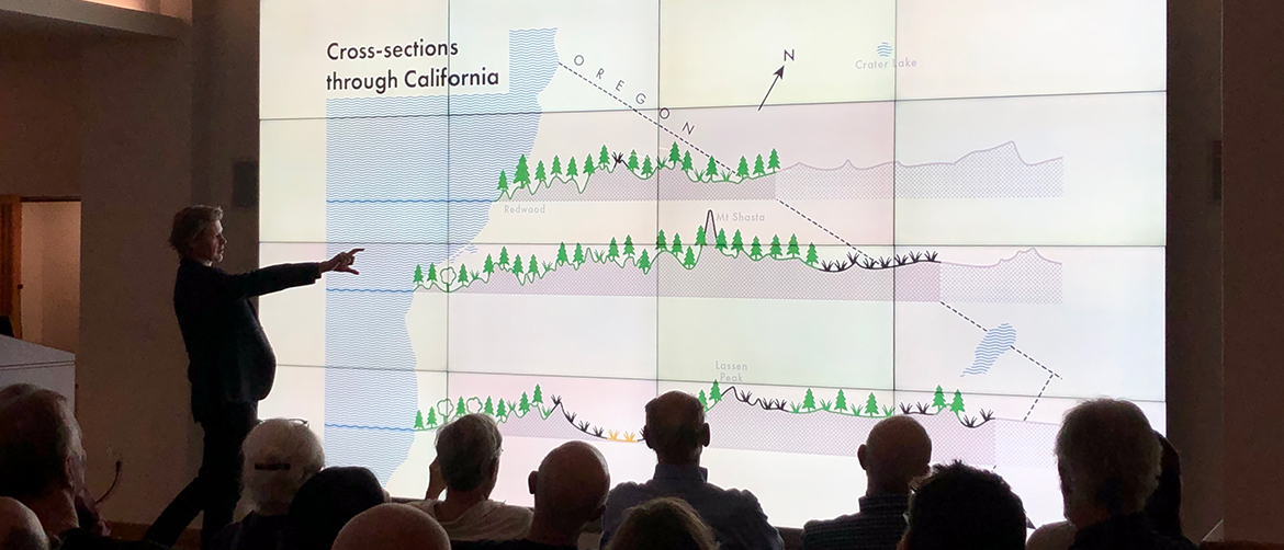
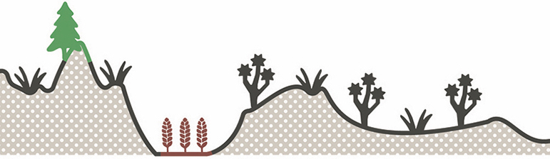
This map will not help you win an orienteering competition. It is a fluffy design meant to convey big sweeping contrasts across California: valleys and mountains, arid and temperate, tamed and wild.
My California map is created at the same graphic scale as original Isotypes: icons, fonts, textures, and line size are all consistent with original Isotype publications. However, the California map’s canvas size is much bigger than any original Isotype map. Their maps fit on the spread of a small book while mine is a large fold-out print.
This canvas-size difference means that the entire California composition contains much more information than a typical Isotype map. Despite this difference, I believe that my essential design challenge was the same as original Isotype: abstract data to caricature proportions in a helpful way. I did this abstraction all by eye.
For the elevation data I began by loading the elevation data into Adobe Illustrator (using its onboard charting tool - a first time for me!). This data appears very spiky in the black shape below. This is partially because California has some sharp peaks and also because of the low resolution I am sampling data at.
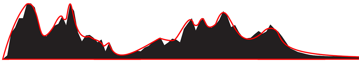
Sampled data (black) with smoothed profile (red).
To smooth the spikes and achieve the desired aesthetic effect I processed the profiles using Illustrator’s new Simplify Path feature. This process reduces the number of anchor points necessary to create a vector shape. It smooths the profile. Then I tweaked the profile’s anchor points manually until I achieved a satisfactory cartoon of the original data (red line in above image). Throughout this process I kept the original data plot in the background as a visual reference.
The land cover data is also greatly abstracted from detailed data. The map style represents a large amount of land with a single icon. I considered the dominant land cover along the profile section represented by the icon and also the area north and south. It was helpful that the native land cover data color scheme is very similar to the Isotype categorical color scheme.
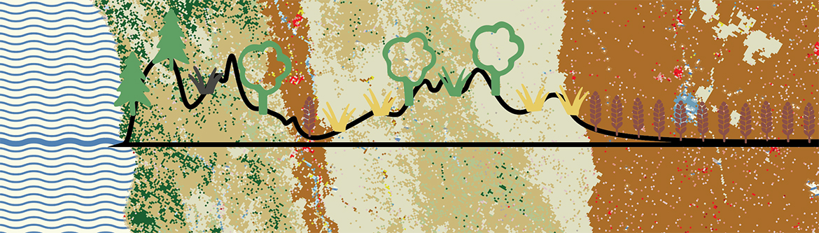
Reference land cover data behind smooth profile and land cover icons.
The drawing of your map is delightful. Since you explained the illustrations in your last book, what kind of gems of wisdom did you learn when you created this project?
There is a natural variation in the original Isotype publications that helps make them so attractive. This original variation comes from the way in which they were printed and especially from the way their inks interacted. The scratches, overprints, and bleed-throughs make each icon unique.
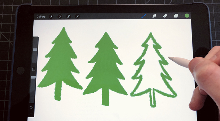
Imitating this roughness is a fool’s errand. However, I made a small attempt at variation by using multiple digital illustrations of each icon. For example, there is not one green pine on the map, but a half dozen. Each one slightly different because of the variation of my original hand. These differences should not be detected by even a discerning viewer, but I believe they contribute to the overall composition feeling more human.
What was the process to complete the map and how did it differ from other projects?
This map is different because it my first print-first! I have created many data stories over the past decade, but they have all been for the web. One of the problems with doing print is it takes forever compared to digital. One of the things that makes this great is that I had a lot of time to reflect on the map design and make it better.
What kind of advice do you have for other dataviz practitioners to create their own isotypes, maps, or historically influenced works?
Mimicking historic information graphics can teach you a lot. There are lessons in the experience that I do not know how to access otherwise. You learn about design decisions made by the original creator. When you try to repurpose original approaches for your own data you realize how perfectly those original forms were fit to the original data—and how hard it is to transfer them. It’s a really worthwhile and insight-inspiring challenge.
I like to get deep enough into historic aesthetics that I can make a faithful copy. However the goal is not to make something that could pass for an original on inspection. Mere aesthetic imitation would put your own design in some danger. When you mimic historic work, you fall in love with design flourishes that aren’t really relevant to today’s audiences. It is hard to know what design details are useful.
To solve this trap it is essential to have your work critiqued by others. You (Jason Forrest), Kenneth Field, Rob Simmon, Catherine Madden, and Rosemary Wardley all critiqued drafts of Cross-sections through California. Sometimes you told me what wasn’t working. Often you told me how to do it better.
For example, an early version of the California map included an original Isotype symbol of a black dead tree:
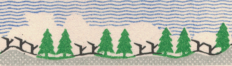
Tundra and forest symbols in original Isotype map of Soviety Union.
It was only through critique that I learned that this dead tree icon did not work. No one understood what it meant!
Another critique suggested I create a new icon to represent one of California’s unique natural wonders: the Joshua tree. Previous immersion into Isotype design helped me create a new symbol that fit with the originals:
New Joshua tree symbols.
Your kickstarter was funded in a week - there's obviously an audience for this kind of work, what's next?!?!!?
First I am focused on printing, packaging, and delivering these maps!
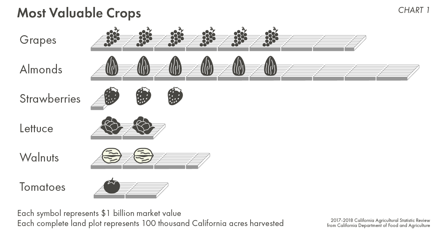
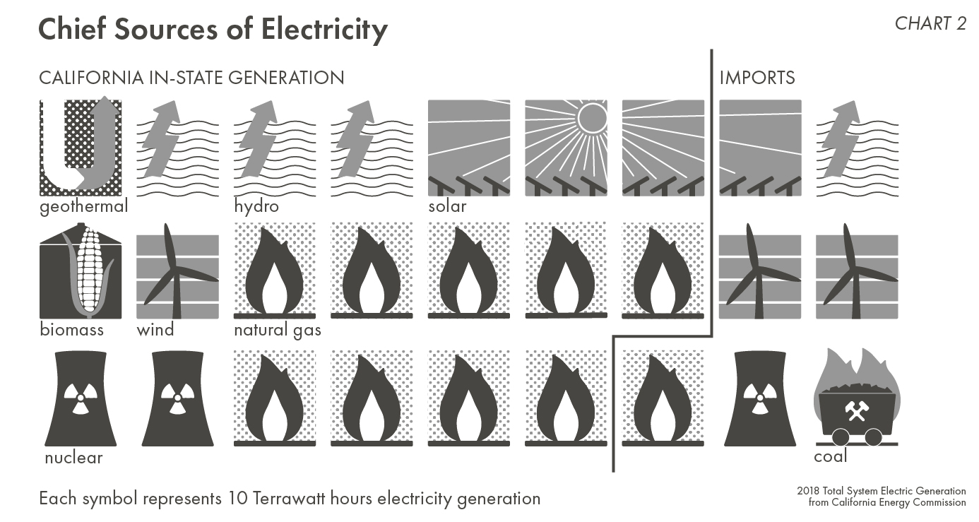
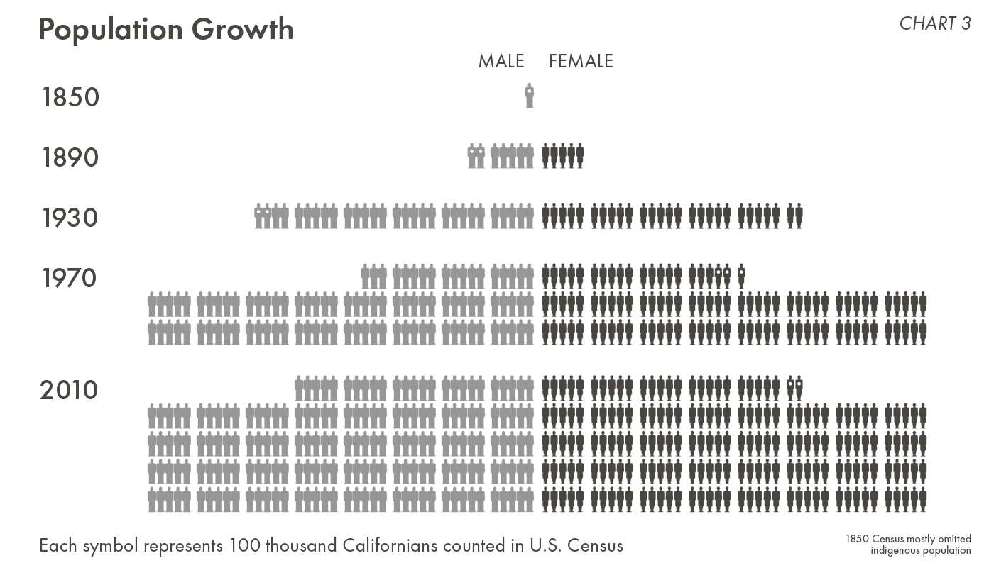
I am generally interested in making more charts in an Isotype style. The successful funding of this campaign gave me the opportunity to develop several abstract Isotype charts about California for the back of the map. They are about California’s crops, energy, and population growth. You can preview their drafts below:
Some have suggested I make more maps in this style. They want to see Cross-sections through New England, or the Rockies, or the Pacific Northwest. Maybe we should make an entire atlas. The next map will be easier to produce because the design language is now defined. But ultimately it is a very human design that cannot be fully scaled and executed by a machine. As designer you need to select a set of elevation profiles that tells a story about the land and points of interest. This story must resonate with natives and visitors alike—I would need a local partner for each new map who really knows the territory. It’s all gotta hang together in a way that rings true. The computer can’t do that on its own.
Finally, I am interested in printing more original work. I also want to help others print their own work. And I want to print books. More on that… soon!
Purchase a copy of CROSS-SECTIONS THROUGH CALIFORNIA at Visionary Press:
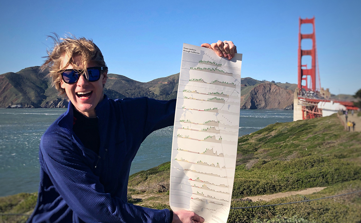
RJ holds a print proof of his map at the Golden Gate.
Related Reads
Data stories that inspire
Info We Trust is a creative studio that makes powerful data stories. Our craft is fueled by design and science.
We’ve helped Fortune 50 companies, research universities, tech startups, and international NGOs humanize data, build trust, and increase understanding. Along the way our work has won awards and been translated all over the globe. Learn more.

Info We Trust and Visionary Press are DBAs of Information Productions LLC, San Francisco.
Info We Trust ® is a registered service mark. © 2013–2026 RJ Andrews.