Tear Up Your Baseline
A design flourish for line charts.
A torn paper metaphor brings non-zero baselines to your reader’s attention. This intentional design flourish is inspired by one of data visualization’s pioneers who, 100 years later, is still showing us how to do more with data.


Zero has special significance for many axis scales. If you are traveling at zero miles per hour then you are standing still. If you have zero dollars then you are broke. The zero line is often emphasized accordingly by making it thick. Willard Cope Brinton explains in 1939’s Graphic Presentation:
The horizontal axis, zero line or other line of reference, should be accentuated so as to indicate that it is the base for comparison of values. There is no such base of comparison for the time scale in a time-series chart, however, there being no beginning or end of time. … The zero line or other base of comparison should never be omitted when the interest is in relative amount of change between points on the same curve.
The zero line is essential to bar charts 📊, which link total value to total height. William Playfair introduced this rule in 1786 using a stack of coins metaphor¹. If a man stacked all the coins he made at the end of each day into a new pile, then he would be able to see time, proportion, and amount all at once simply by looking across all of his stacks. Pierre Levasseur poetically referred to vertical bar charts in 1885 as columns of stacked facts². In either case, you have to see the whole stack, i.e. the zero line, to have an honest look.
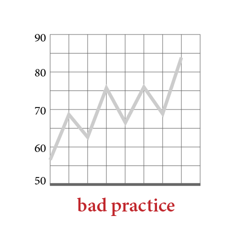
We sometimes omit the zero line on line charts 📈 when our interest is in the absolute, not relative, amount of change. In this case a non-zero baseline appears (in the cartoon above, 50). This is familiar to many as the movement of a stock price over time. We like zooming in to see detail. It is bad practice to accentuate this non-zero baseline because that implies undue importance. Instead, today’s standard practice has us style all non-zero lines the same way because they all share the same significance. Design mirrors — and conveys—meaning.
Standard practice does not directly indicate the omission of the zero line. I contend that this standard practice is too passive—and passive design is risky design. Here, the risk is that the non-zero baseline’s position, even with uniform styling, may still convey undue importance. How can our approach be more active? Brinton provides the answer:
Brinton, Graphic Presentation (1939), p. 303.
A torn paper metaphor helps. A jagged or wavy baseline calls to the reader’s attention: This is not a reference line! It alludes to the zero line, offscreen, by showing that only part of the scale is on display. The wavy baseline is intentional. It is forward. You might even say it is more honest.
Brinton, Graphic Presentation (1939), p. 386.
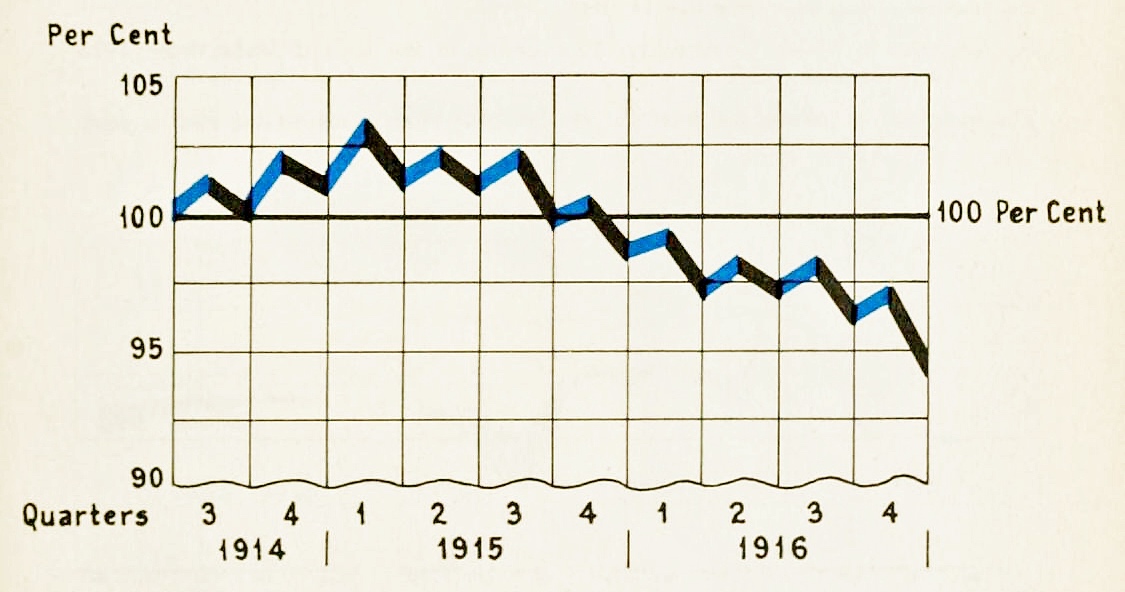
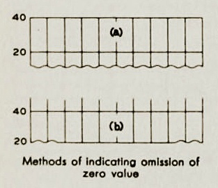
Brinton’s wavy lines³ are not an accidental fluke. They appear in many more examples and their use is detailed in the chapter “Standards for time series charts”: When the zero line is omitted, this is one method of indicating its absence. Brinton even includes a variant, a straight line waved at each end, pictured above as method (b).
Data visualization, and graphic computing generally, has made great hay from pictorial metaphors that mimic the real physical world. By linking abstract concepts, like deleting a file, to real-world objects, like the 🗑, we make the strange more familiar. Designing with worldly metaphors in mind, such as bar charts representing stacks of stuff, can help us produce visualizations that are more accessible, and more meaningful, to all.
• • •
Willard Cope Brinton was an American consulting engineer famous for his landmark Graphic Methods for Presenting Facts, a 1914 textbook that perfectly packaged all of the previous century’s graphic inventions for modern industrial use. He also led the Joint Committee on Standards for Graphic Presentation, which included 15 scientific societies and 2 Federal Bureaus. Andy Cotgreave, Tableau’s Technical Evangelism Director, was the first to introduce me to Brinton via his 100 yrs of Brinton tumblr. Read Andy’s highlights from Brinton there, then dive into hundreds of beautiful charts and expert commentary from the original book and its sequel: Graphic Presentation (1939):
"There is magic in graphs."
The torn baseline example above was brought to my attention by Jason Forrest. He shared it in a Data Visualization Society thread about historic visualization. While we certainly delight in appreciating the craft of those who showed before, I believe our interest has a practical undertone.
Historic practitioners faced the same challenges we do today: Data overwhelmed their capacity to manage it. The audiences they had to inform were lacking in graphic and numeric and statistical literacy. Yet, historic practitioners worked to meet these similar challenges in totally different contexts. They had different tools, different constraints, and different advantages compared to modern practitioners. It is the intersection of such a similar pursuit with such different conditions that produced so many interesting solutions. Many of their natural solutions, like the torn baseline, are less likely to emerge in today’s digital environment, where we work under own unique constraints.
Certain creative paths open at different moments in history. I am so happy to have learned from this example and am excited for the future discovery of more past solutions. It excites me to return to Brinton—and the many who inspired him—and keep looking.
• • •
[1]: From William Playfair’s The Commercial and Political Atlas (1786) p. xi: “Suppose the money received by a man in trade were all in guineas, and that every evening he made a single pile of all the guineas received during the day, each pile would represent a day … so that by this plain operation, time, proportion, and amount, would all be physically combined.”
[2]: Levasseur’s original text is “ Les colonnes de faits empilés.” See the original essay “La Statistique Graphique” in the Jubilee Volume of the Statistical Society (1885). Link.
[3]: Of course, the lessons from this single Brinton example do not have to end with the wavy baseline: note the beautiful year-quarter labels, accentuated 100 Per Cent line, and use of color to show change in data.
• • •
Related Reads
Data stories that inspire
Info We Trust is a creative studio that makes powerful data stories. Our craft is fueled by design and science.
We’ve helped Fortune 50 companies, research universities, tech startups, and international NGOs humanize data, build trust, and increase understanding. Along the way our work has won awards and been translated all over the globe. Learn more.

Info We Trust and Visionary Press are DBAs of Information Productions LLC, San Francisco.
Info We Trust ® is a registered service mark. © 2013–2026 RJ Andrews.