Classic Map Color Design
Recreating palettes from the Albums de Statistique Graphique.
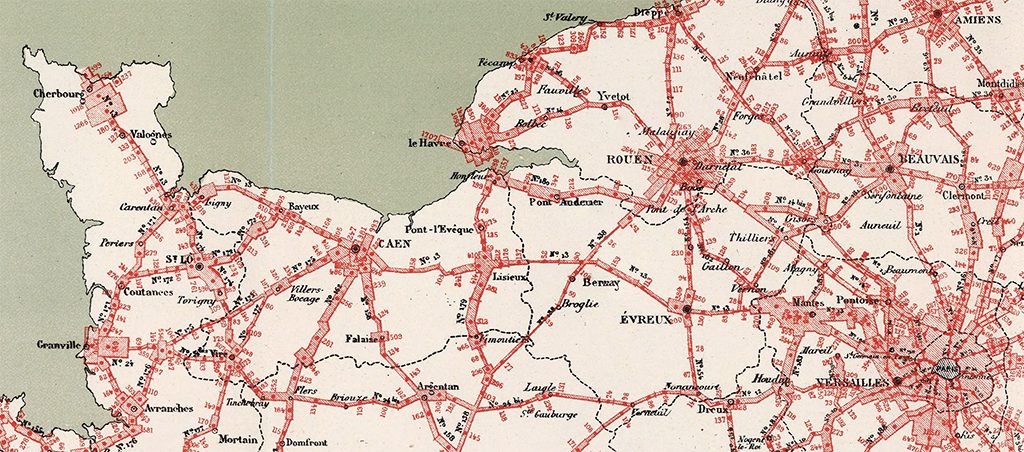
To begin, you need a big clean surface, like a kitchen table. Select an Album and turn past its introductory archaic fonts to get to the good stuff—the thematic maps. Unfold one. It may expand to fifteen times the page size, depending on the map.

These maps transport you. Their scale, beautiful production, and often wild design smacks of something that would be near impossible to make today. It’s like you have landed on a parallel timeline: a French steampunk retro-future loaded with cartographers and information designers who are more sophisticated than us, but bound by Victorian technologies. This is not fantasy, of course. This is the Album de Statistique Graphique.
Howard Funkhouser's gushing 1937 introduction to the Albums brings all not yet devoted to their celcbration up to speed:
The French Ministry of Public Works [Ministère Des Travaux Publics] created in 1878 the Bureau de la Statistique graphique which according to the ordinance of institution was "to prepare representative (figurative) charts and diagrams expressing in graphic form statistical documents relating to the current of travel of passengers and freight on lines of communication of all kinds and at the seaports, and to the construction and exploitation of these lines and these ports, in a word, all the economic facts, technical or financial, which relate to statistics and may be of interest to the administration of public works". … The Albums present the finest specimens of French graphic work in the century and considerable pride was taken in them by the French people, statisticians and laymen alike. H.G. Funkhouser. Historical development of the graphical representation of statistical data, Osiris 3, 1937.
The Ministry’s effort, inspired by Charles Jospeh Minard and led by Émile Cheysson, produced eighteen (mostly) annual Albums, containing over 400 maps and diagrams in total.
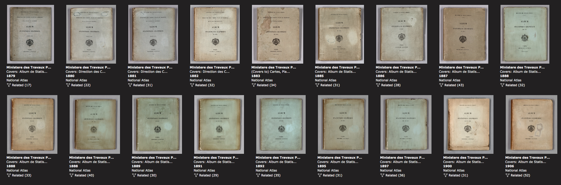
Note how many related documents are assocated with each Album. You can them online in super fine detail thanks to David Rumsey.
Gilles Palsky describes the Album trajectory:
The service led by Cheysson was quick to publish its first results. The first edition of the Album de Statistique Graphique of the Ministry of Public Works was published in 1879. It consisted of only twelve plates, but the Album gradually grew richer as it was published. The second edition has sixteen plates. During the period that follows, most Albums contain between twenty and twenty-five plates, with a maximum of thirty-four plates in 1886. The volumes include not only maps but also a series of diagrams, though in smaller proportion. According to the decree of July 1878, the cartographic content of the Album, while recalling the main directions of Minard's work, appears to be very eclectic. Émile Cheysson made a distinction within the work he directed between "foundation plates" and "long plates". The former illustrate, year after year, a series of recurring themes, allowing eloquent comparisons to be made. The latter are published irregularly (some themes are used only once): they are "devoted to facts that are not fast enough or of sufficient interest to merit an annual study." Gilles Palsky. Des Chiffres et des Cartes, CTHS, 1996. Translated by RJ Andrews for this article.
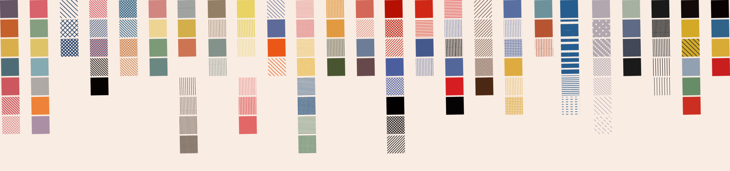
The Albums supply endless opportunity for learning and inspiration. Across Advent 2019 I studied—and recreated—a small selection of their color palettes. All 25 were first published across a month-long Twitter thread. Each recreated color palette is now published as an SVG vector pattern on Github.
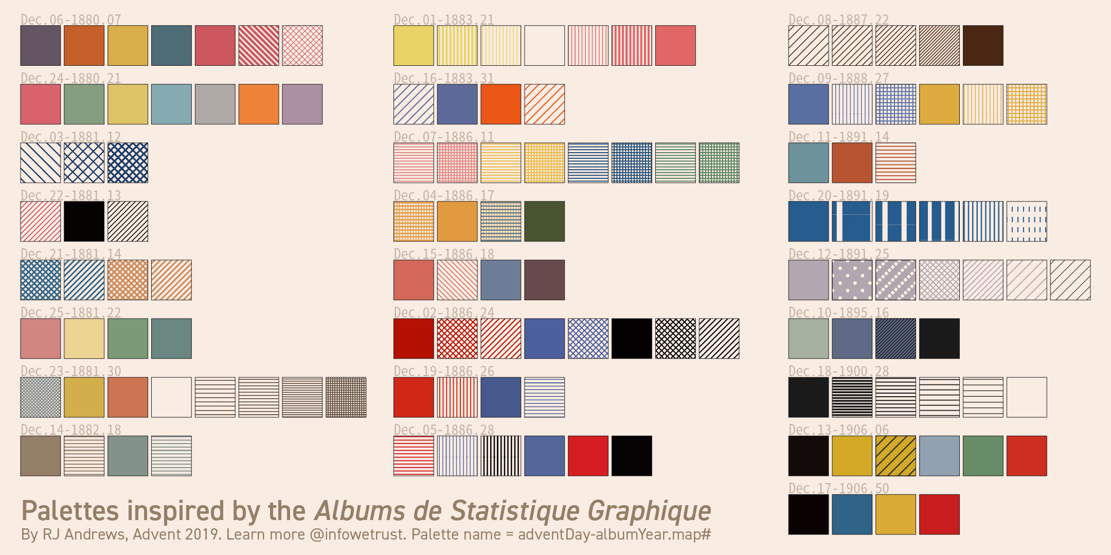
My selection criteria was simple. Color palettes were chosen because they were beautiful, different, or associated with a xenographic I wanted to draw attention to. One interesting way to explore the recreated palettes is by type: sequential, diverging, categorical, and grouped color designs.
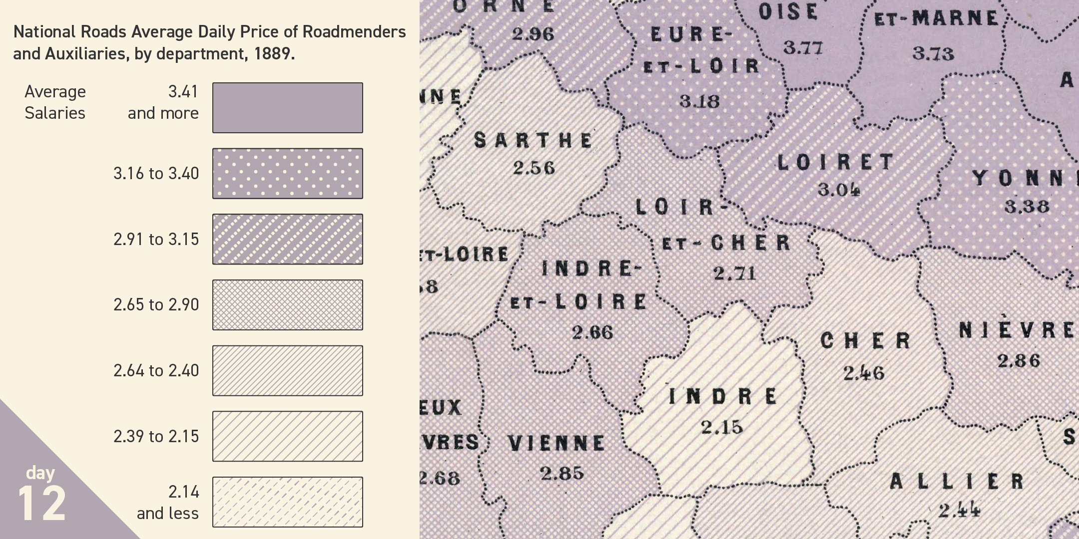
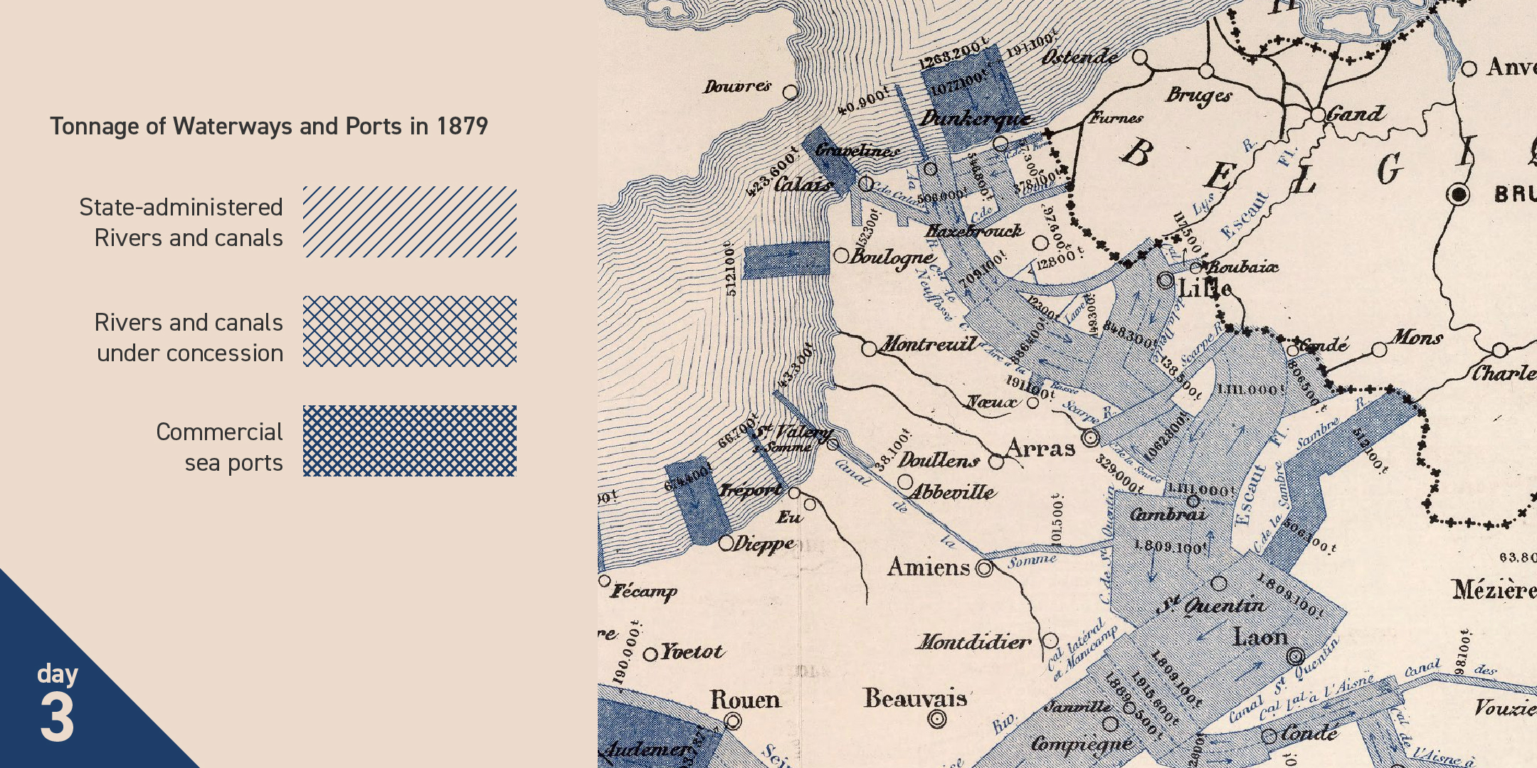
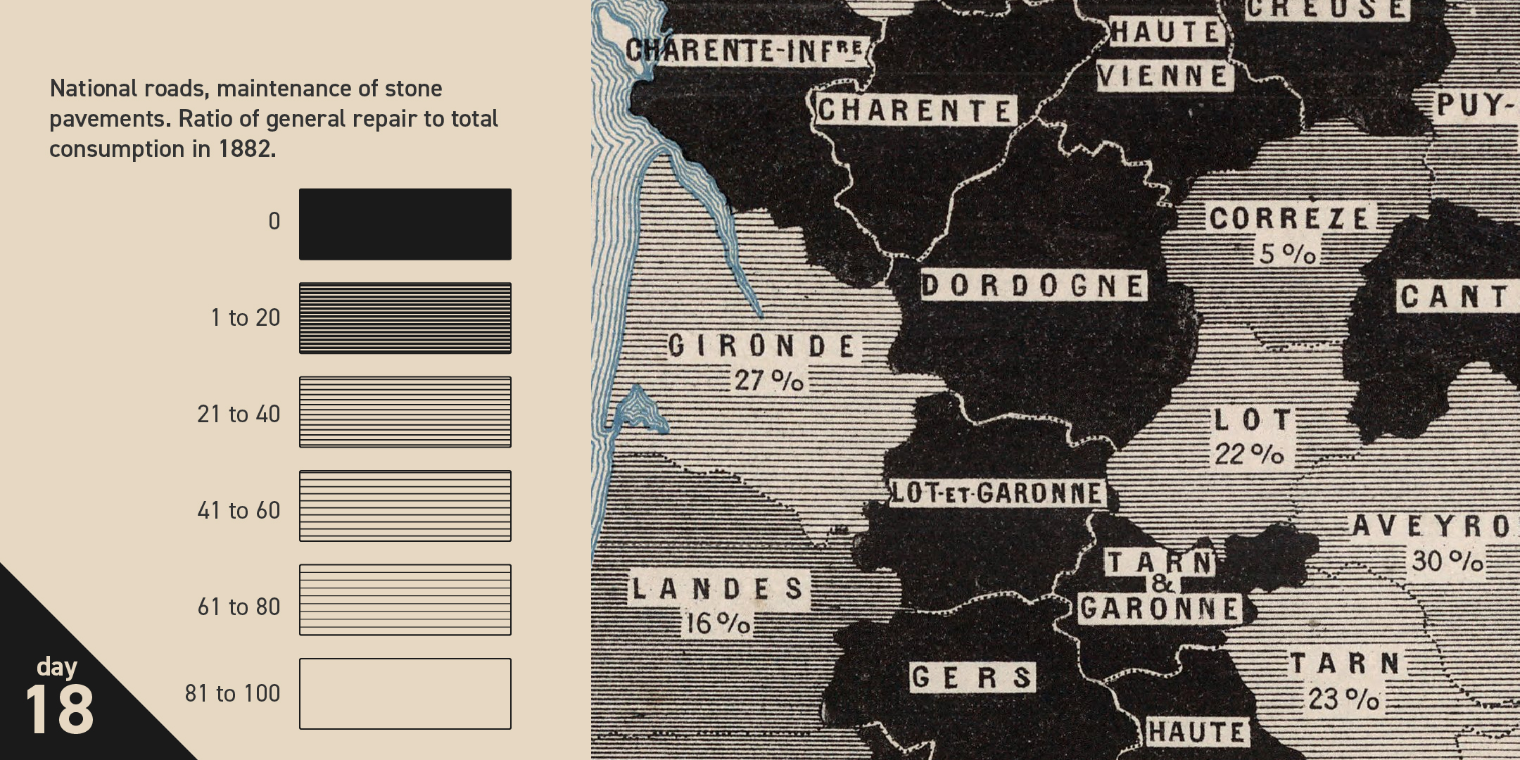
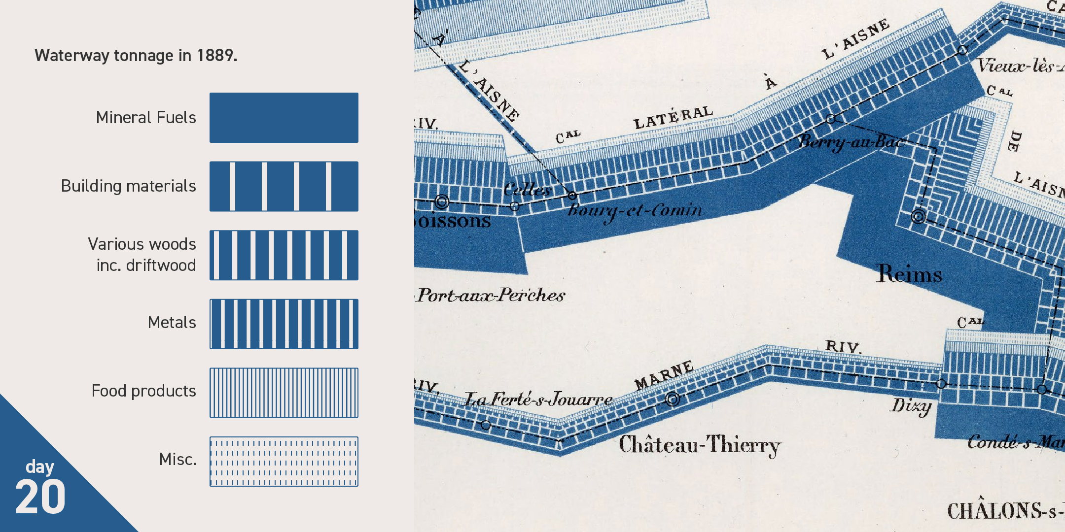
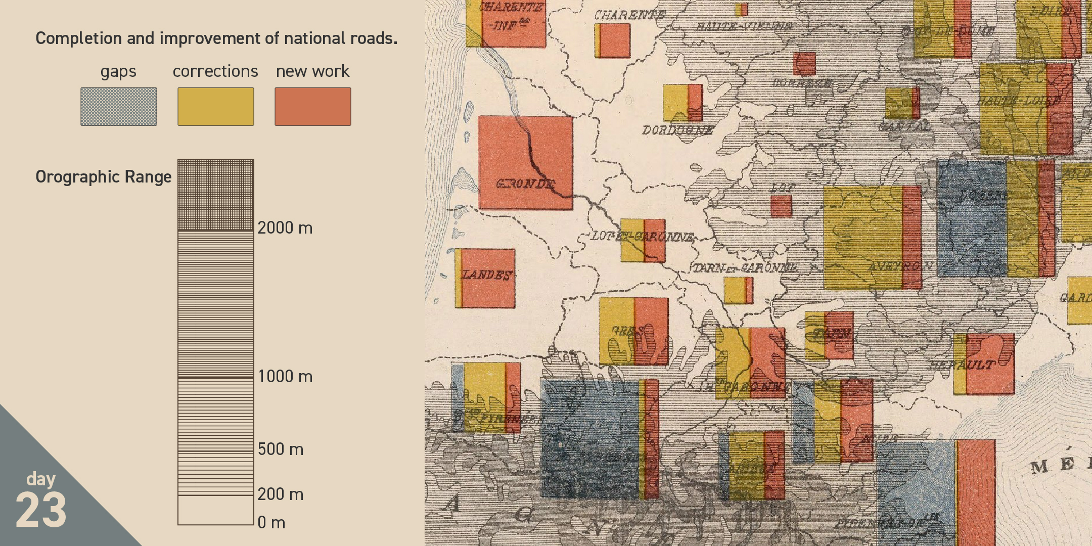
At the outset of this project I realized that these palettes were created totally differently than how we think about today’s digital color. These six sequential palettes, below, best show how a single color ink can be assigned in different patterned textures to create swatches of varying luminance.
The Advent recreations contain only two diverging palettes, each a mirrored join of sequential palettes:
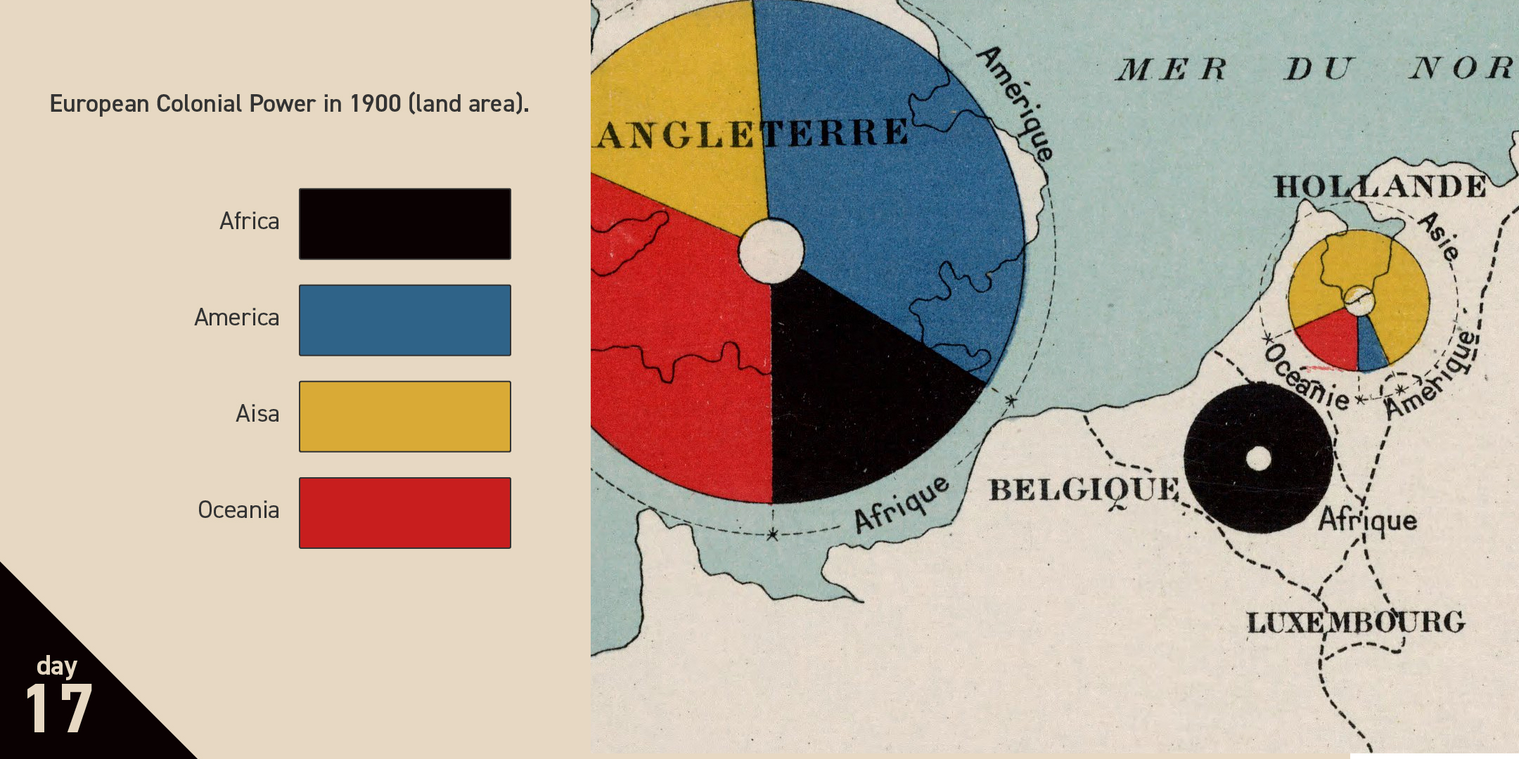
There are six categorical palettes:
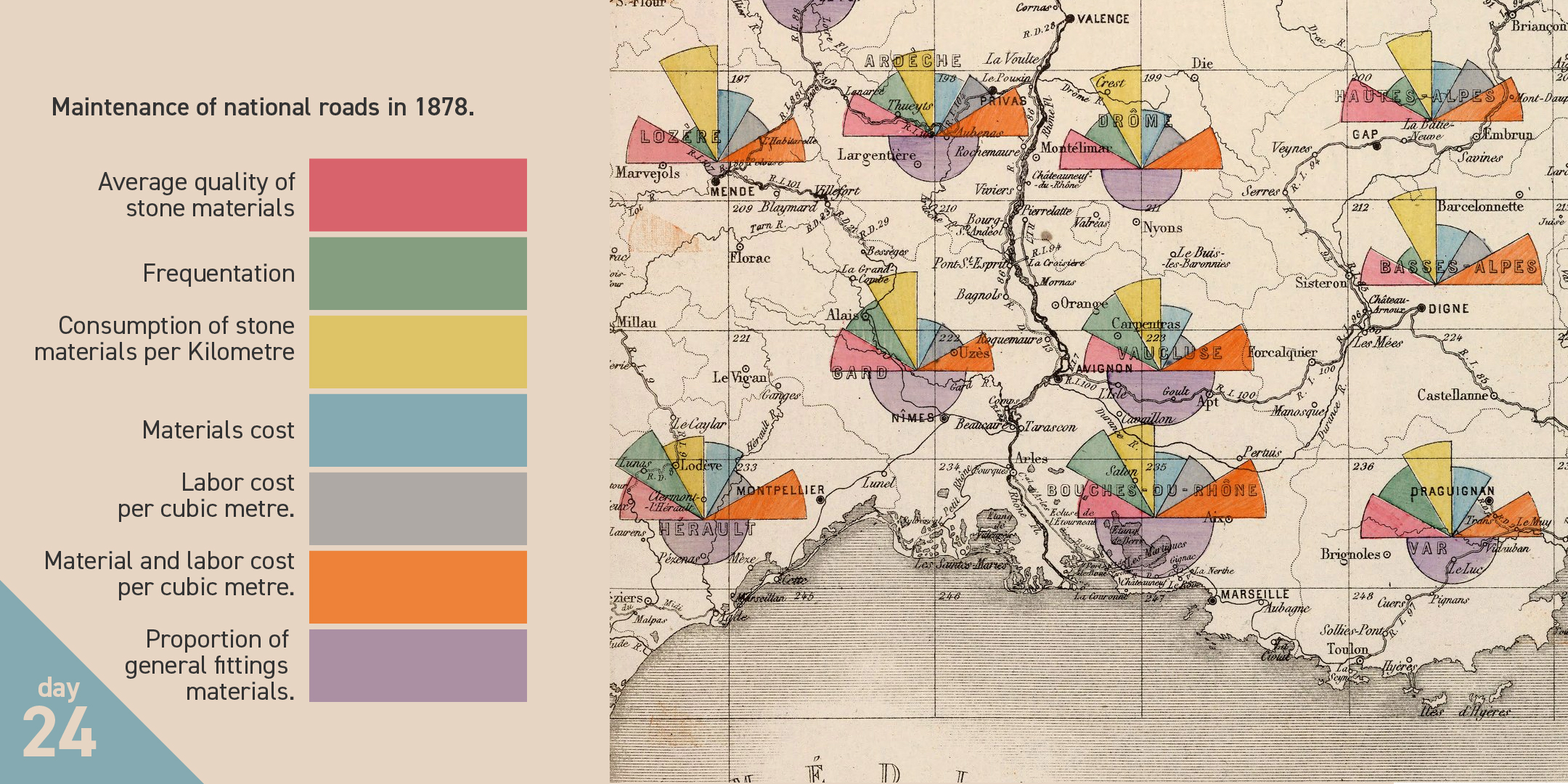
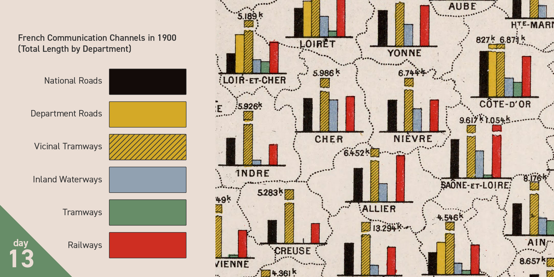
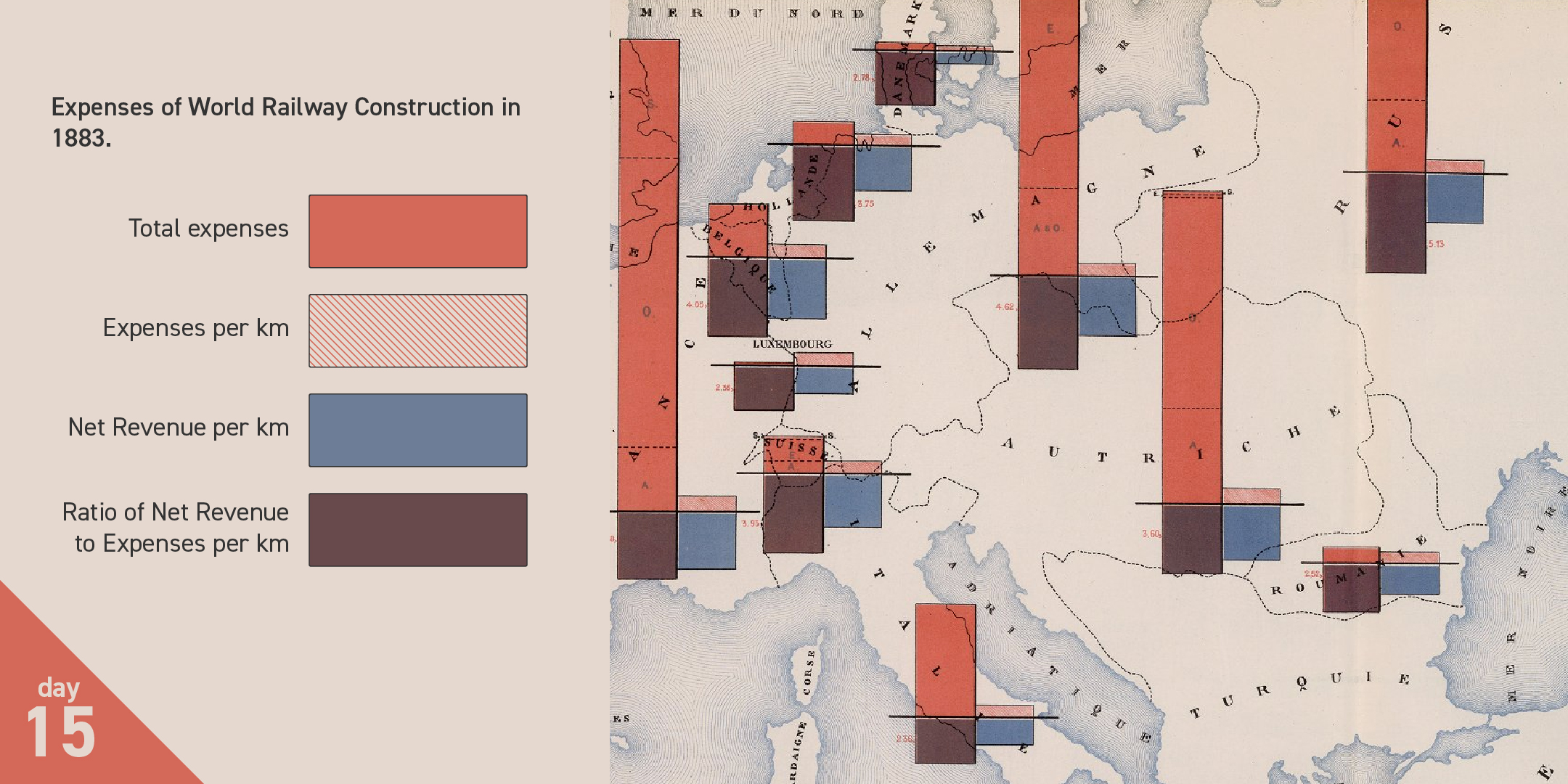
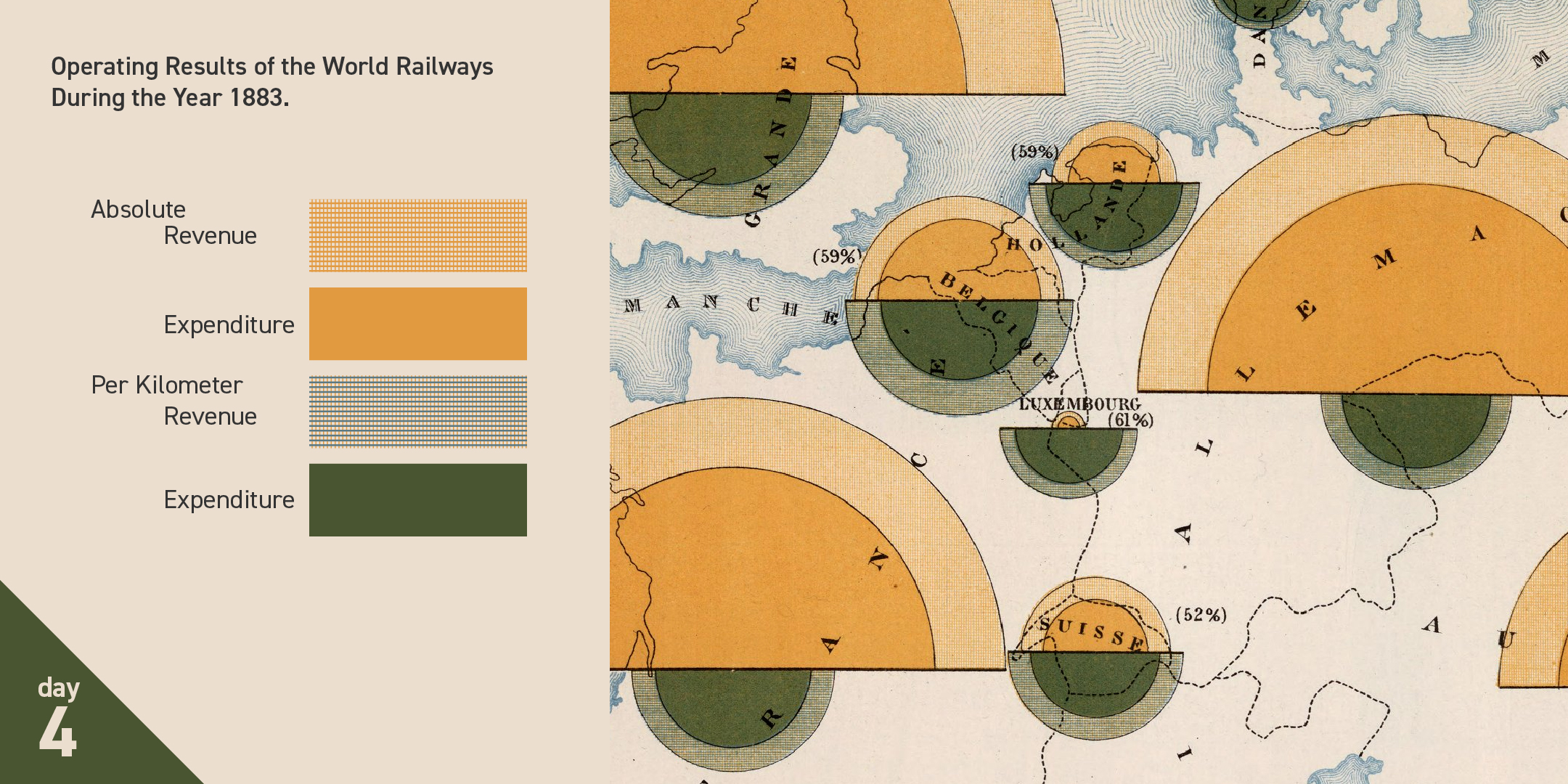
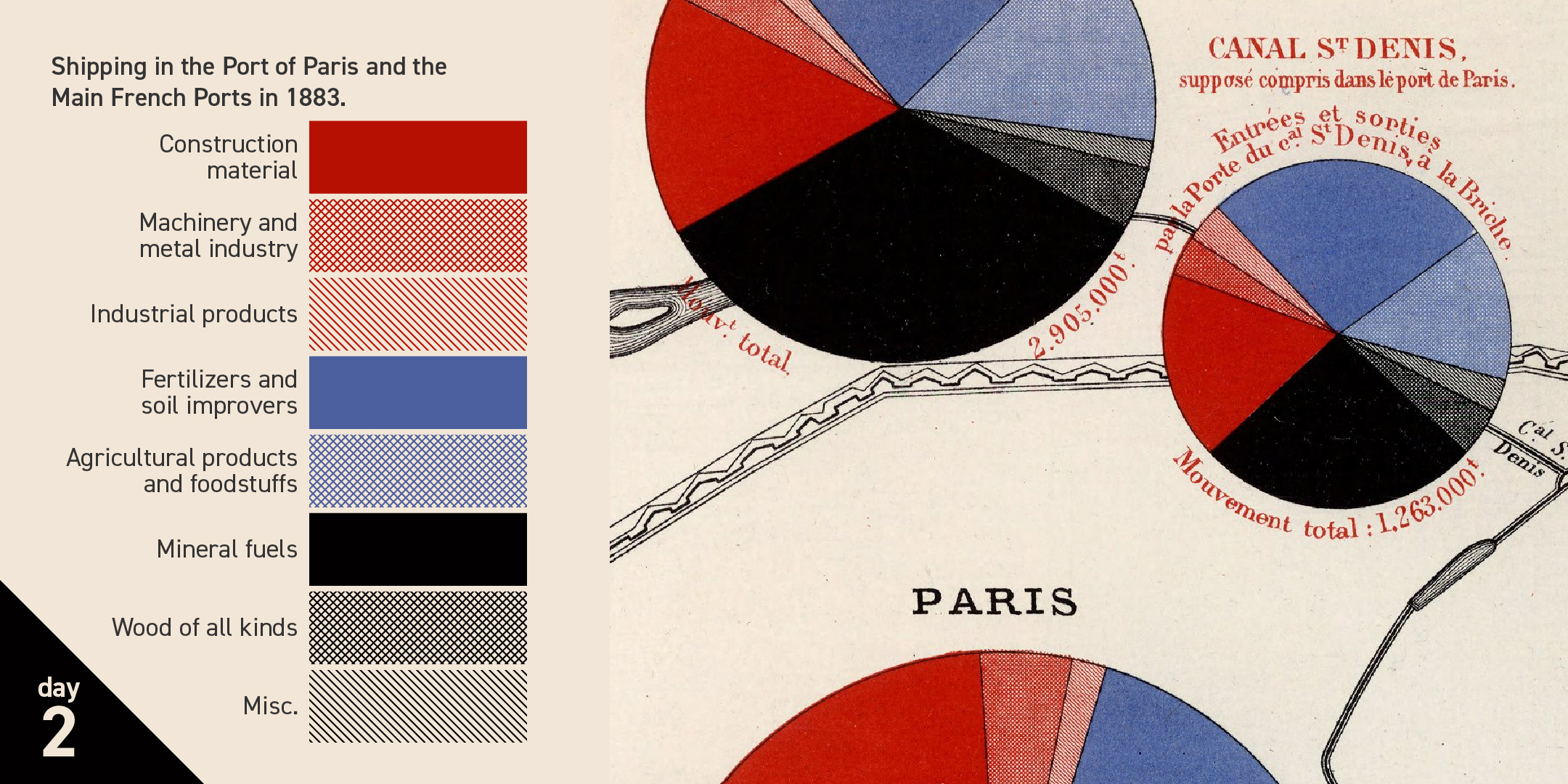
There are a whopping ten grouped palettes. Grouped palettes are often a hybrid of categorical and sequential color design. I first learned about them from Rob Simmon's indispensable The Subtleties of Color essay series. I find that grouped color palettes have a high semantic bond to their data. They deserve an enthusiastic revival:
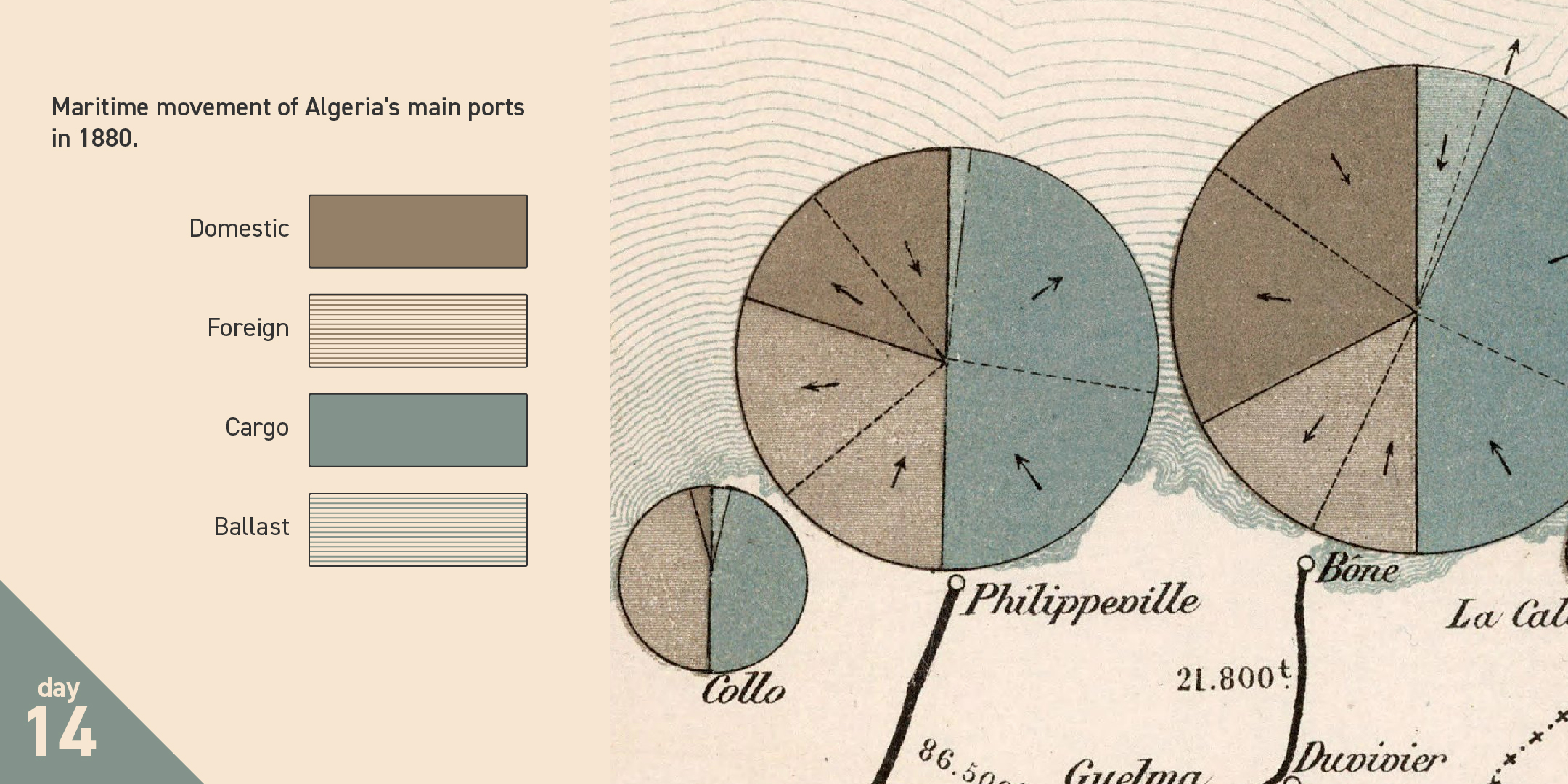
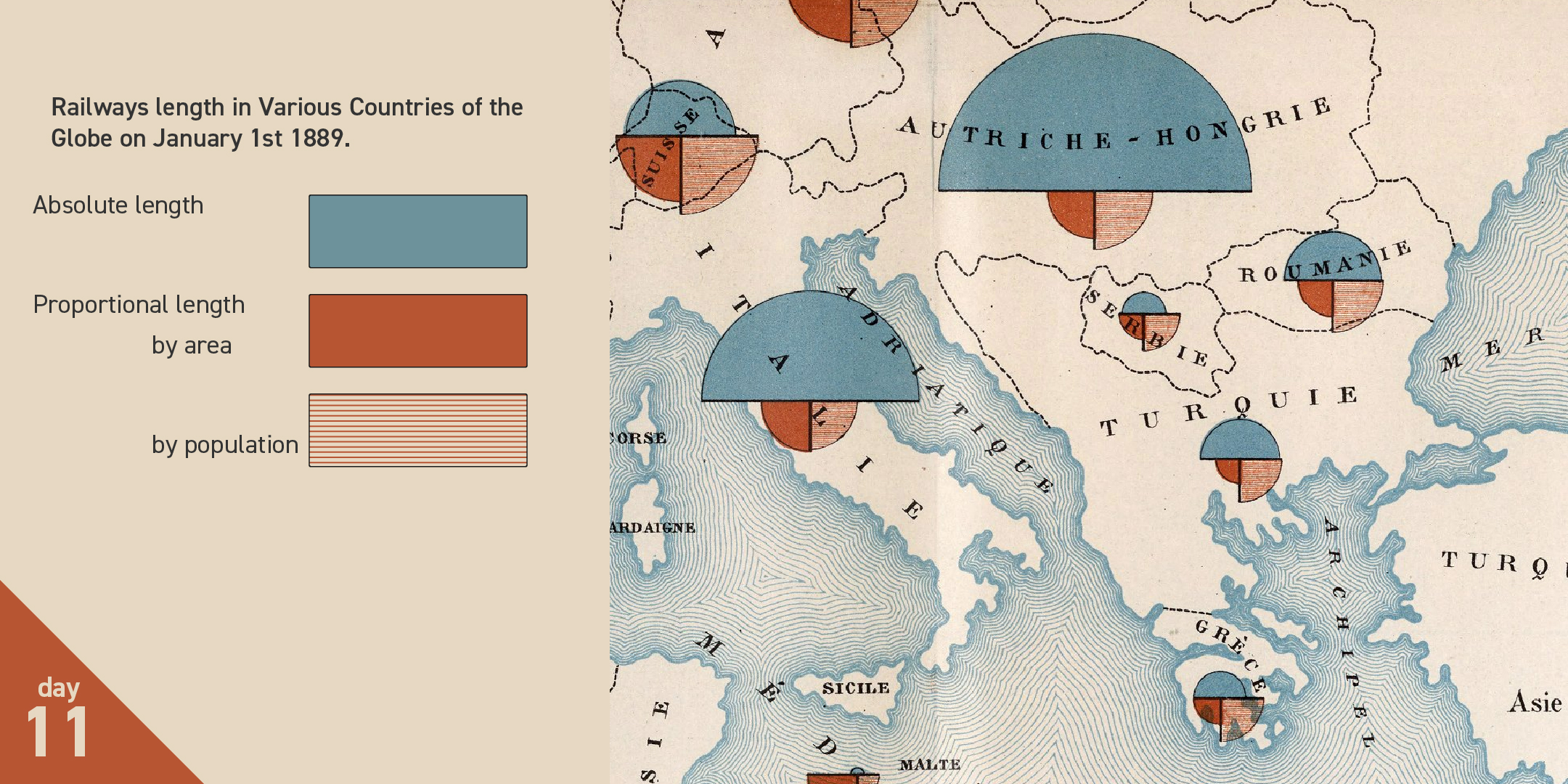
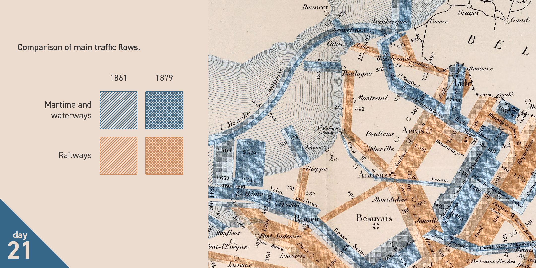
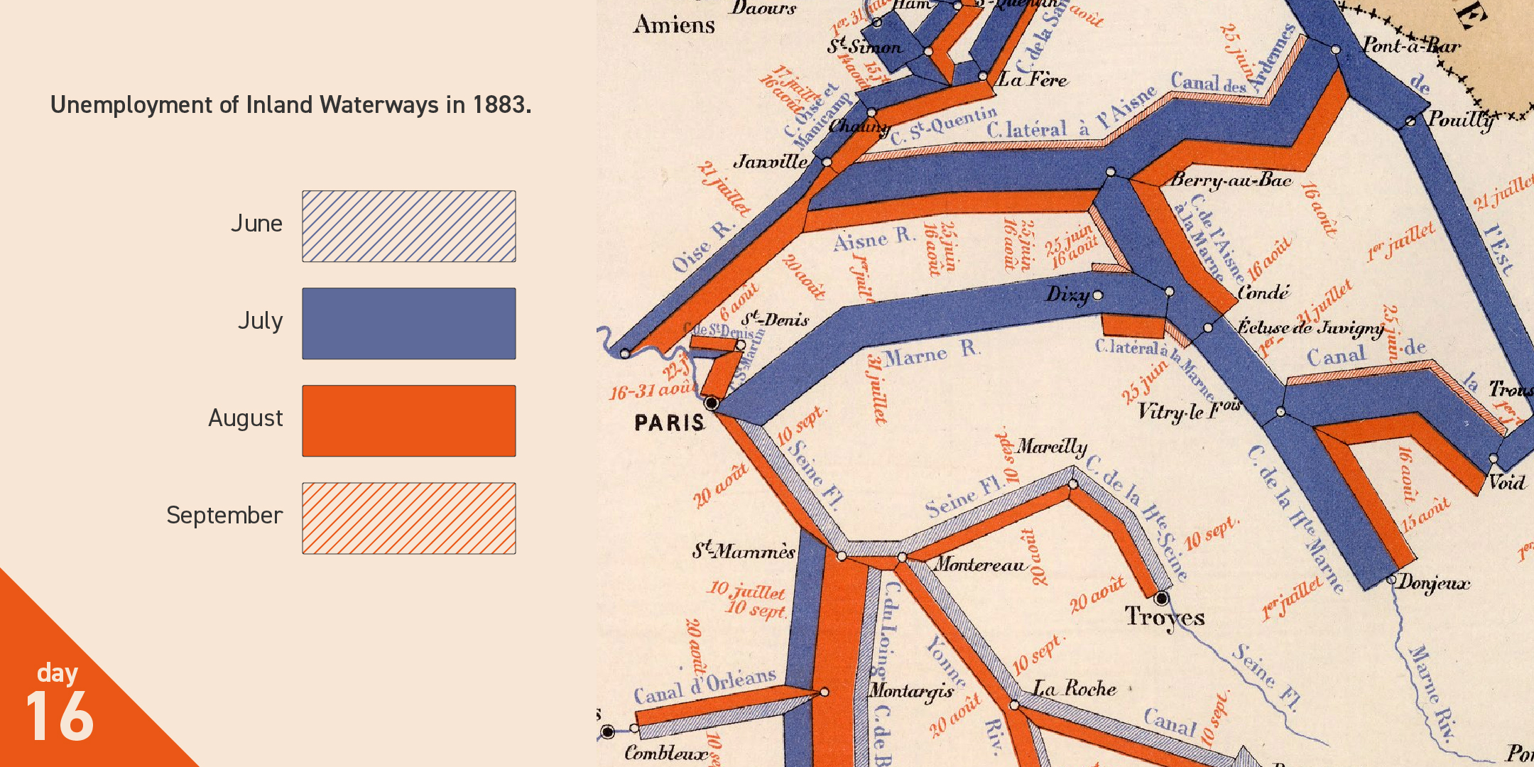
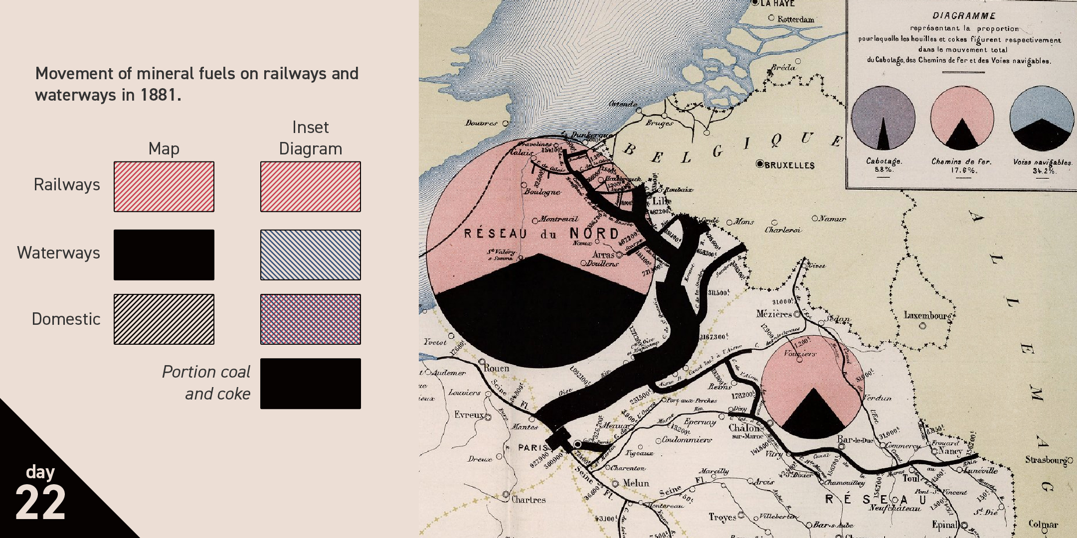
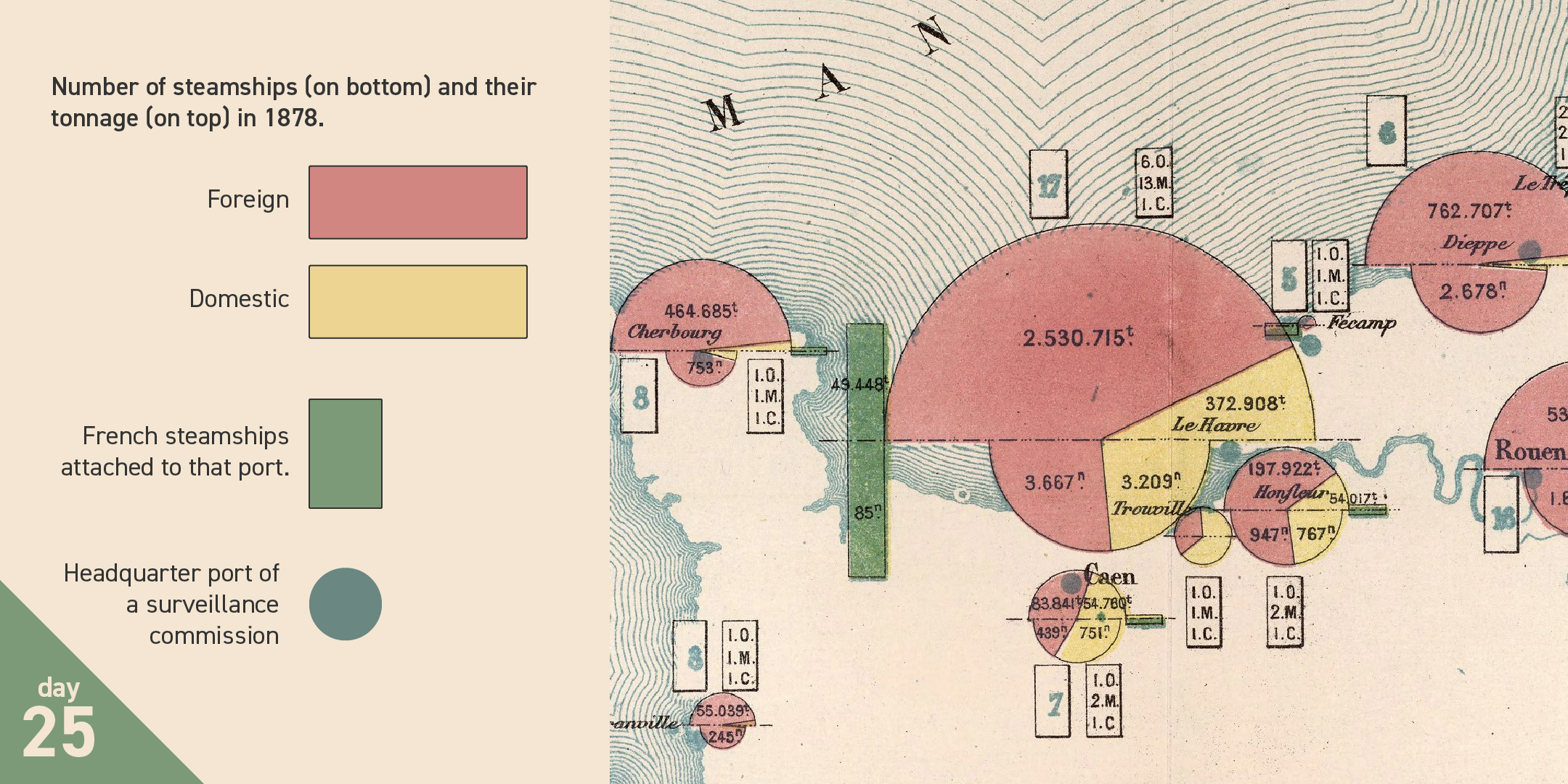
The palettes are referenced and defined in color legends of various construction. My favorite uses an in-legend diagram to explain how a four-color palette is used to indicate different types of travel. A reader of any language can get the picture:
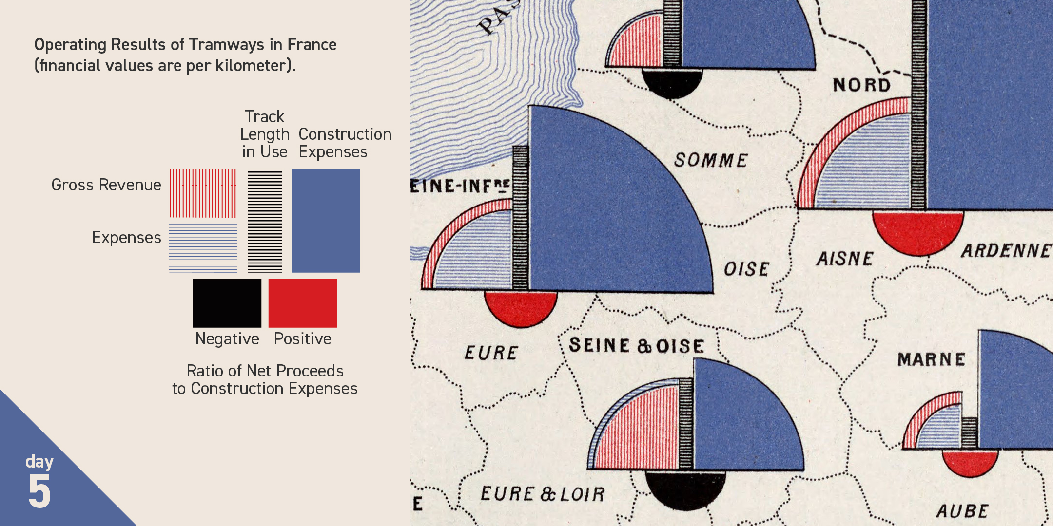
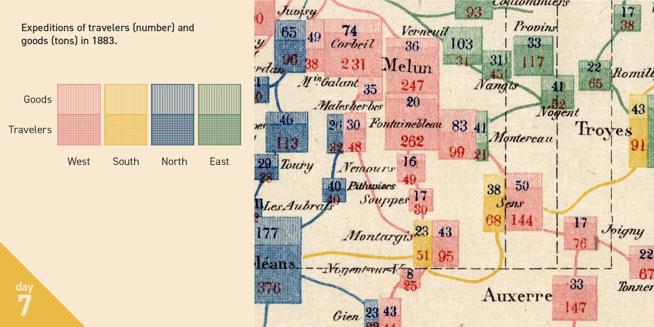
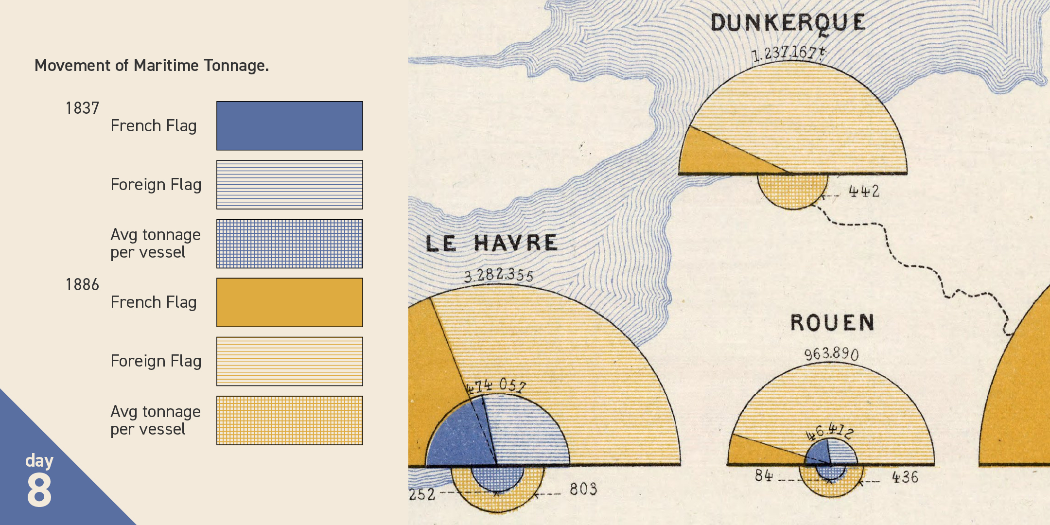
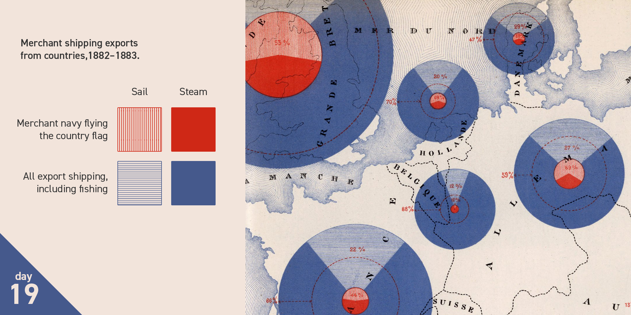
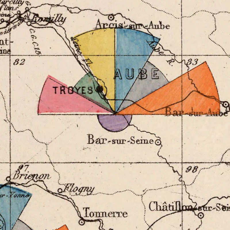
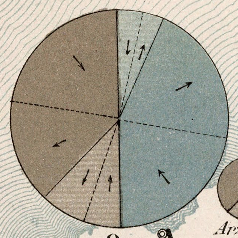
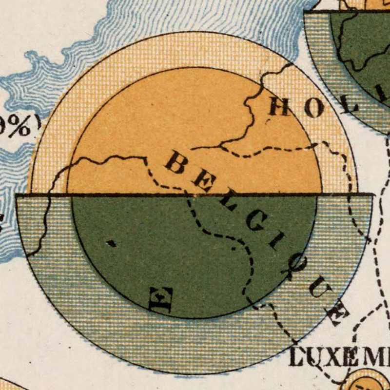
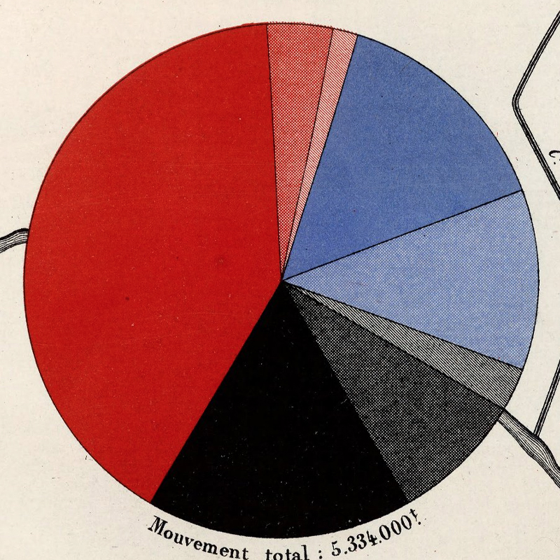
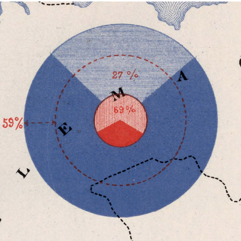
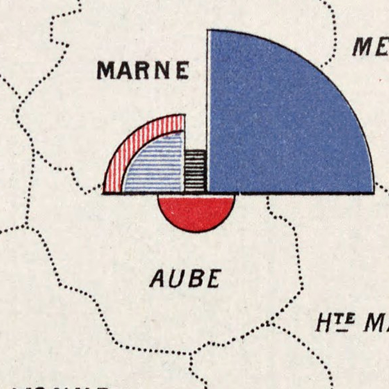
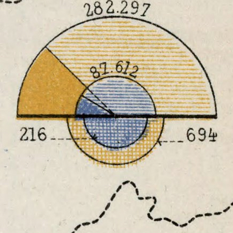
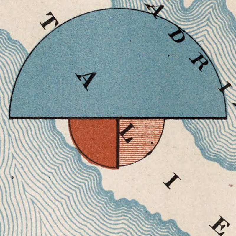
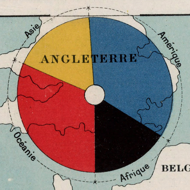
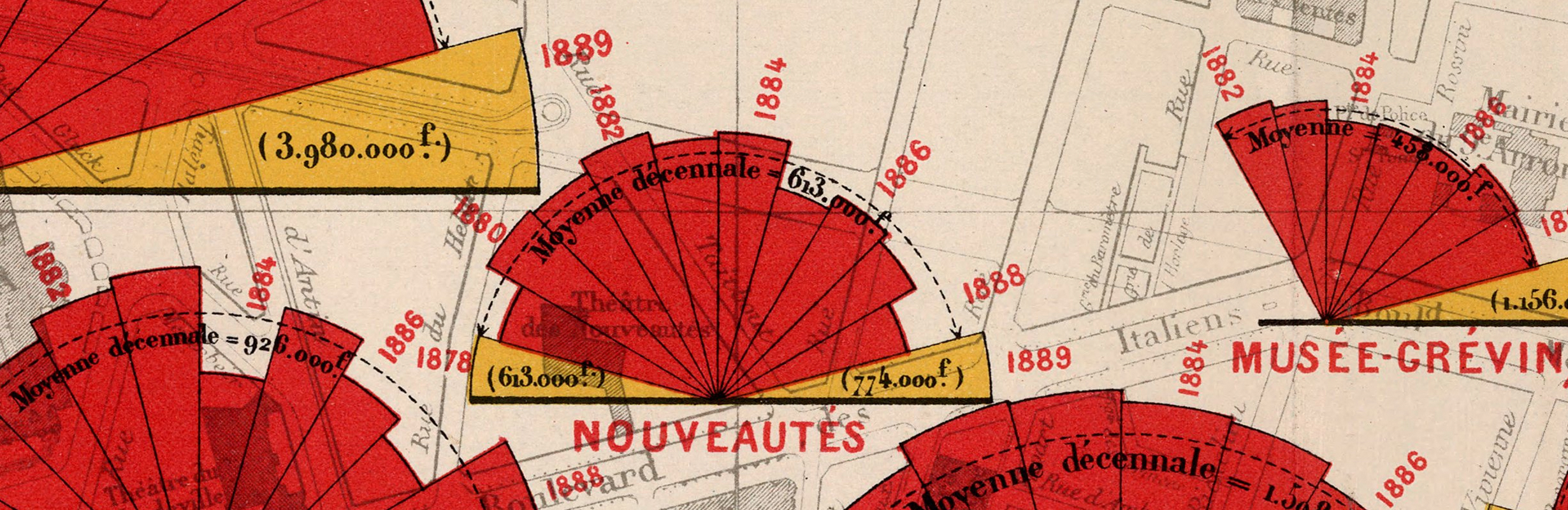
It is easy to drift even further away from color design to so many other Album design details. One particular striking choice across the hundreds of maps is their embrace of divided circles. Reading the Albums is like attending a pie chart clinic.
While there are plenty of interesting comparisons between circless, where the maps really excel is at daring inventions within circles. Compare the arc and area of wedges. Compare horizontal and vertical halves. Compare inside and outside.
Here are ten of my favorite (each image links to the original map). Many also feature fantastic annotation design. Seen all together I hope they enocurage us to embrace and try more with our own circles.
Final all 25 palettes as SVGs on Github. I hope they help and inspire you to make great thematic maps.
Related Reads
Data stories that inspire
Info We Trust is a creative studio that makes powerful data stories. Our craft is fueled by design and science.
We’ve helped Fortune 50 companies, research universities, tech startups, and international NGOs humanize data, build trust, and increase understanding. Along the way our work has won awards and been translated all over the globe. Learn more.

Info We Trust and Visionary Press are DBAs of Information Productions LLC, San Francisco.
Info We Trust ® is a registered service mark. © 2013–2026 RJ Andrews.