"Illustration Invades Everything"
Reflections by Minard on his graphical impact.
RJ Andrews
Jan 28, 2020 • 16 min read
In 1861 Charles-Joseph Minard, eighty years old, published a treatise on his “useful idea.” The folio includes a seven-page essay chronicling the development of his ingenious flow maps. It ends with several colorful examples. Translated, its title proclaims: Graphic Tables and Figurative Maps.
Minard’s work was loved in his own time. Today, his maps inspire us to advance what is possible with visual information. This 1861 treatise reveals the design thinking behind his extraordinary intellectual and creative power.
Minard was eighty years old when he wrote this treatise. He thought he was at the end. We now know that Minard would go on to produce two dozen more flow maps before his death a decade later. They include a beautiful series on cotton imports during the American Civil War, a map showing the spread of ancient languages, and an iconic depiction of Napoléon’s disastrous Russian campaign.
The following new translation positions Minard's original graphic plates within the text (originally they followed the text). Minard’s original plates are augmented with images of works referenced by the text, but not illustrated in the original 1861 publication. These additional graphics are indicated with a blue border. Further context is given by me in [square brackets]. Resources about Minard follow the translation. -RJ Andrews
GRAPHIC TABLES AND FIGURATIVE MAPS
BY M. MINARD, INSPECTOR GENERAL OF BRIDGES AND ROADS, RETIRED.
To each his own.
Today’s great expansion of statistical investigation has made it necessary to record its results in less dry and more useful forms; forms that can be explored faster than numbers alone. Hence the various representations that have been imagined, including my graphic tables and figurative maps.
By giving statistics a visual direction, I followed the general impulse of the mind toward graphic representations.
Today, images apply to everything: Real estate, furniture, and clothing advertisements are always accompanied by plans and drawings. In major criminal trials, the layout of the premises is put before the jurors. The holiday gift book is more the work of the lithographer than of the writer. La Fontaine made animals speak in his fables; but we wish, even more, for Granville to show their likeness.
Jean de La Fontaine was the 17th century author of FABLES, which was re-popularized in the 19th century by caricaturist J. J. Grandville’s illustrations.
In the expectation of publication, a photographer is attached to every expedition; it’s not just science books, as was sometimes seen even two hundred years ago, that show text and image together on the same page.
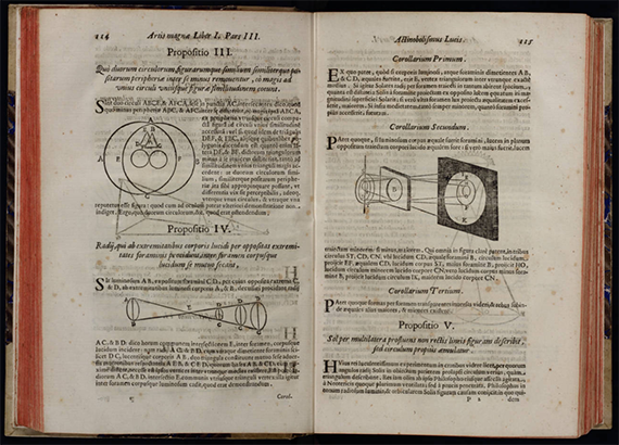
Minard’s footnote cites two examples of illustrated science books: Kircher’s Ars magna lucis et umbrae (1646), shown here via Linda Hall Library, and Grignani’s Discours de la méthode de Descartes (1650).
Illustration invades everything, and by making statistics visual, I satisfied the need of the day. But did I sacrifice to the taste of the time? Or, have I contributed to increasing the usefulness and shortening the time of interpreting statistical studies? That’s what can be judged by reading the following pages.
The dominant principle that characterizes my graphic tables and figurative maps is to make numerical proportions immediately appreciable to the eye, as much as possible.
I first imagined, in 1844, a graphic table of which Plate I is a copy [below]. Published in one hundred copies, it represents the number of passengers on the total and partial routes of several railways.
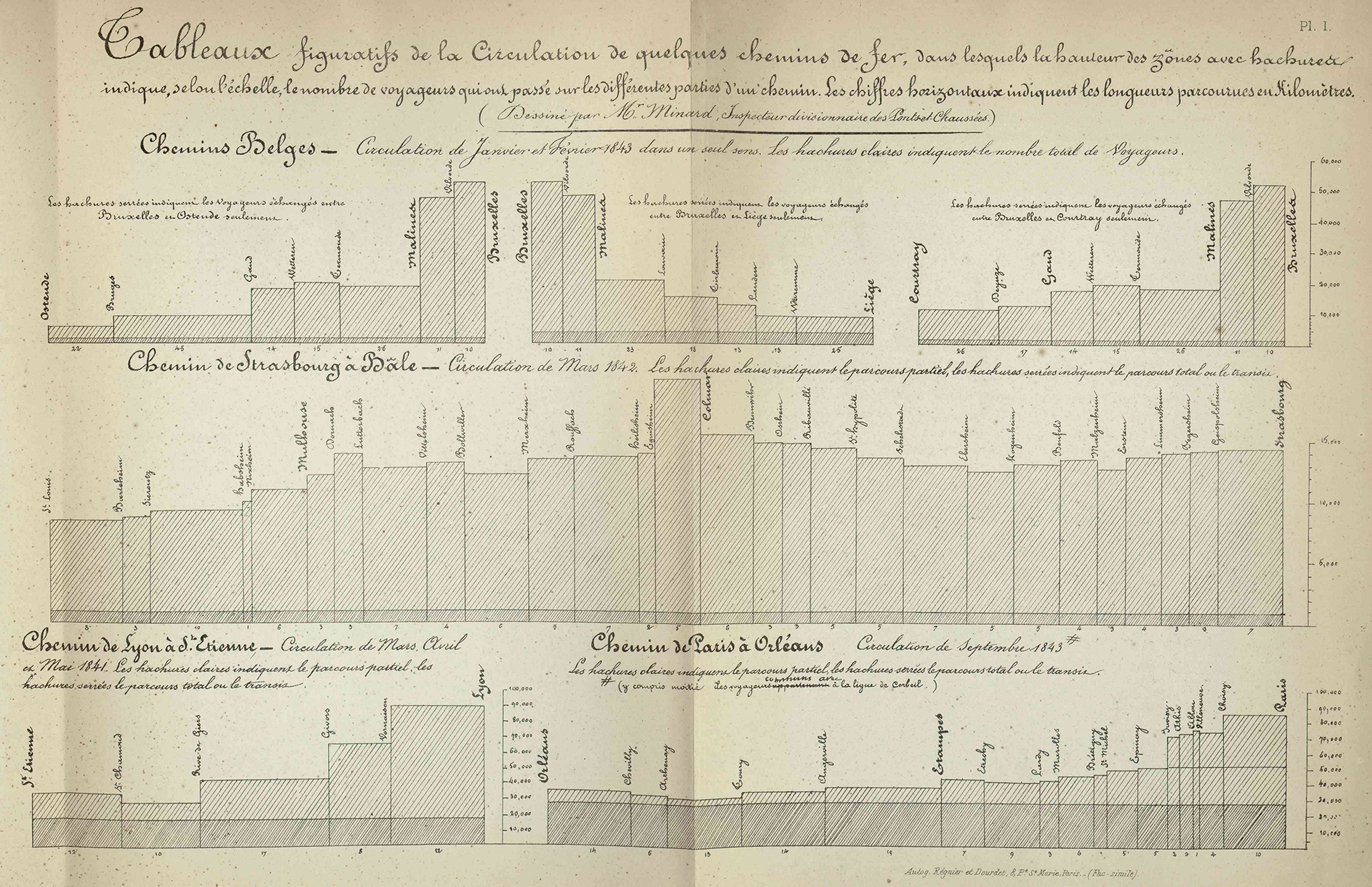
Plate I. Figurative tables of the traffic of several railways (Tableaux figuratifs de la Circulation de quelques chemins de fer). Minard, Charles-Joseph (1781–1870), “Des tableaux graphiques et des cartes figuratives,” ENPC.
On the horizontal line I added, end to end, the lengths between stations. These lengths are the bases of as many rectangles whose vertical heights are proportional to the numbers of all passengers who passed between two consecutive stations.
A portion of these rectangles corresponding to the passengers traveling the total route distance is distinguished by a darker shade than that of the portion relating to the passengers who traveled only part of the total route.
By means of these rectangles and shading, one can see at a glance the ratio of all travelers who passed between any two stations and the ratio between total route and partial route passengers.
Additionally, the total area of each rectangle is proportional to the number of passengers carried 1 kilometer (an important metric of railway traffic). The comparison of these areas promptly give, in one image, what written numbers only give slowly by arithmetic multiplication.
The following year, in 1845, I published, using the same system, the first graphic table on the trade of the Central Canal [Canal du Centre was the first canal allowing boats to pass from the north of France to the south]. Plate III is a facsimile [below]. In this graphic table the rectangles relating to various goods have different colors. This lithographed and colored graphic table was distributed at the end of 1845 to about a hundred people: engineers, deputies, etc.
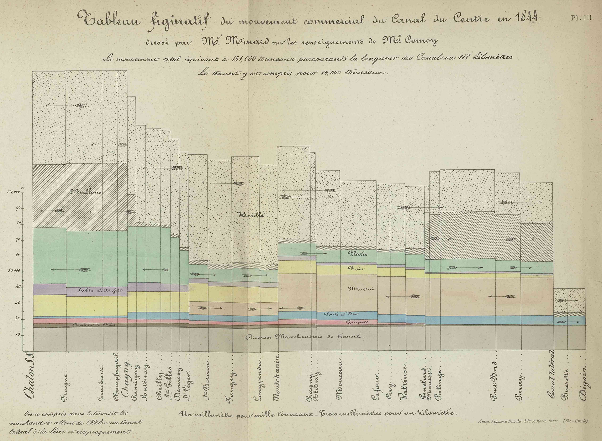
Plate III. Figurative table of commercial traffic on the Central Canal in 1844. Minard notes that this table was referenced in publications by M. Teysserenc, a Member of Parliament, and by M. Comoy in the Annales des ponts et chaussées, March and April 1853, p. 175 . Minard, Charles-Joseph (1781–1870), “Des tableaux graphiques et des cartes figuratives,” ENPC.
This mode of representation has a small disadvantage in terms of commercial use: sometimes the progress of a commodity cannot be easily followed by the eye, because the rectangles of the same color that represent it are separated by those of another color. If we want to be fully aware of the movement of this commodity, we must have a graphic table for it alone.
In that year, applying the same system differently, I arrived at the figurative maps in which the rectangles of the graphic tables are replaced by tinted areas that follow the transport routes and whose widths are proportional to traffic.
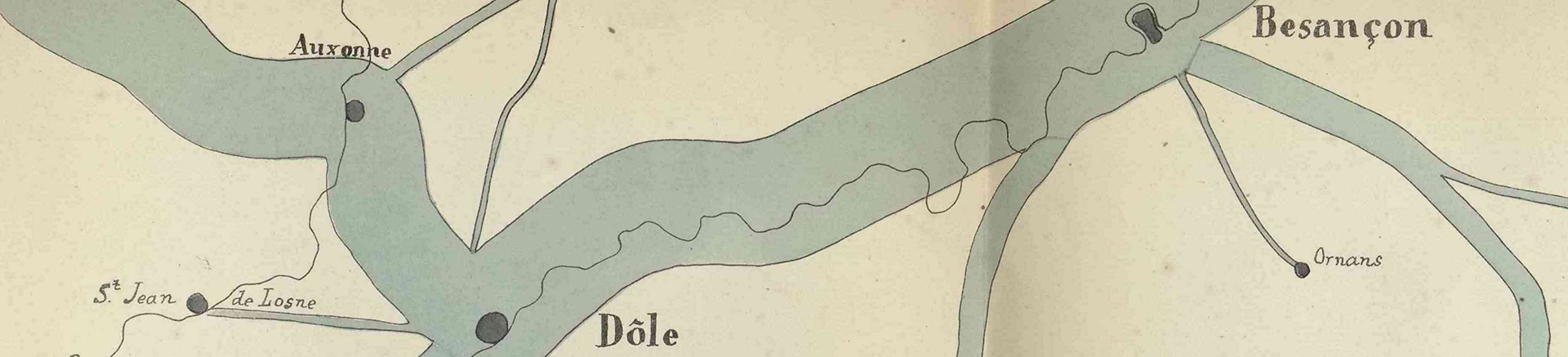
It March 1845, during the [planning] discussion of the railway from Dijon to Mulhouse, I published my first figurative map; Plate II is a facsimile [below]. Passengers traveling on the roads in the region, between two cities, were represented by tinted areas that follow the contours of the roads and have widths proportional to the number of passengers passing through them in public coaches. Mr. Frémy, then an auditor with the State Council and now a State Councillor and Governor of Real Estate Credit, carefully took note of the situation on the spot.
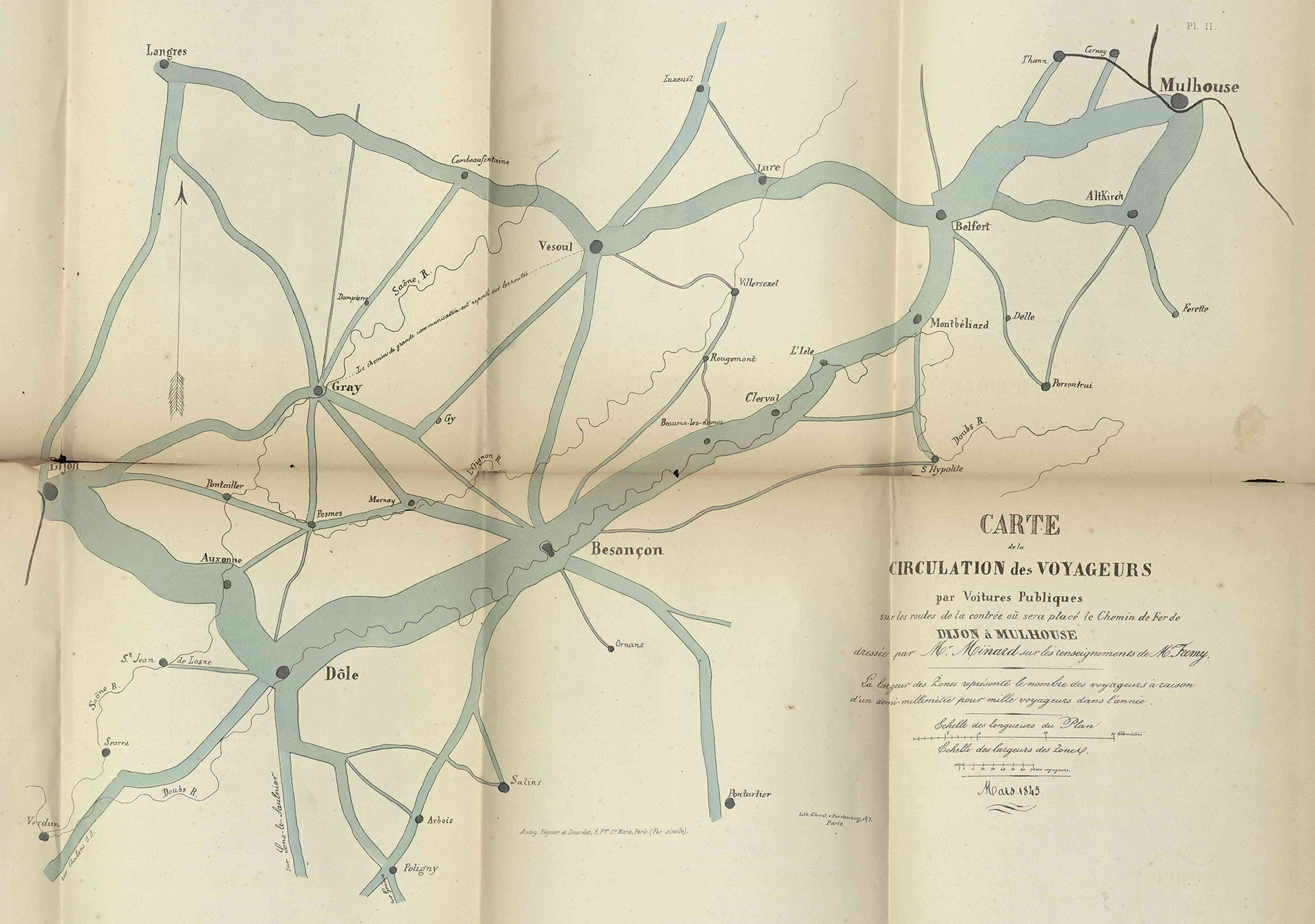
Plate II. Minard, Charles-Joseph (1781–1870), “Des tableaux graphiques et des cartes figuratives,” Bibliothèque numérique patrimoniale des ponts et chaussées, ENPC.
My lithographed map, in two hundred copies, was distributed to the members of the Council of Bridges and Roads, as well as to Representatives of the Departments concerned, to Engineers, etc. and enlightened the meeting’s discussion [Departments are government jurisdictions below administrative regions]. The [figurative map] idea was broadly welcomed to guide opinion in the choice of a route in general, and in particular the route which followed the Doubs valley [see how more coach traffic flows along the Doubs River compared to the Ognon River]. The map was so successful that someone produced, using my name, a forgery where he drew false zones in favor of a rival line through the Ognon valley.
It is by sight alone that this map, which was found to be eloquent, made visible the relationship between the numbers of travelers because, you may notice, it does not include a single numeral.
Advantageously, an instant evaluation of the reported statistical results and their overall configuration can be judged at a glance with figurative maps, as long as they are contained in the ordinary field of vision, while maintaining respective geographic positions.
These benefits were readily grasped by the engineers. A few months after my figurative map of passengers between Dijon and Mulhouse had appeared [Plate II, above], several engineers imitated it to support their railway projects: Mr Reynard for the railway from Grenoble to Valence, Mr Léon for the railway from Poitiers to La Rochelle, Mr Maillebiau for the railway from Bordeaux to Bayonne. All produced, based on my system, figurative maps of the travelers circulating in these regions.
Nevertheless, if my maps immediately afford simple ratios such as double, triple, etc.., which, I repeat, is only obtained from numerals through a rather long mental operation, this advantage fades if you have to compare very disproportionate elements. With numerals, when the smallest has only two digits, with a little time the mind can grasp the quotient; which is why I also write the numerals on several of my maps.
Additionally, the spontaneous evaluation of large quantities has always been very uncertain. Who doesn’t know how difficult it is for a general to count enemy troops that are in sight? Napoléon himself stated that even with his long experience, he was mistaken by a quarter at least. And yet nothing can tell the eye the number of men better than the men themselves placed next to each other.
In the past, I have not seen any expressive maps other than those of the first geographers who depicted countries by their animals.
The application of algebra to the geometry of Descartes gives us geometric curves representing the relationships between two variables. Tidal curves were one of the most remarkable applications of this discovery; I do not know if we know to whom they are due. This is an improvement in graphical representation, since the eye can see the successive heights of the tides.
Ons-en-Bray’s ingenious 1734 idea to draw a graphic table of prevailing winds using the wind itself acting on a mechanism can be applied to the representation of the tides. [top of Ons-en-Bray’s anemograph shown below]
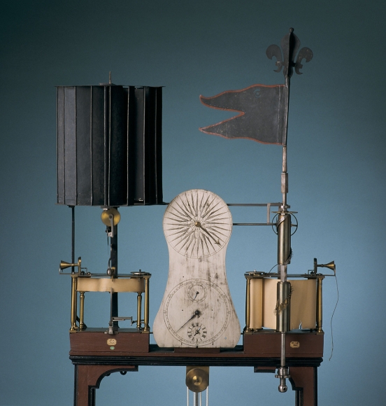
Anemograph for the automatic graphical registration of the wind according to time, direction, speed and change in speed, constructed by Louis Leon Pajot Comte D’Ons-en-Bray, General Postal Director of France, OpenEdition.
Today we have the tide gauge, an instrument by means of which the sea itself draws on paper the heights of the tides across successive hours, giving the most complete and accurate curves of this movement. [The first self-recording tide gauge was created by James Mitchell and installed in 1831 at the Royal Navy’s Sheerness Dockyard in Kent, England]
In the 18th century, we see the first application, I believe, of Descarte’s system to phenomena without determined laws, such as those concerning public economics. Descartes drew curves according to the relationship of two variables. The question was reversed to investigate whether simultaneous, more or less correlative facts, recorded on abscissa and ordinate, could correspond to known curves or give useful representations. [The abscissa and the ordinate are respectively the first and second coordinates of a point.]
William Playfair’s Tableaux d’arithmétique linéaire, first printed in London and then translated into French around 1787, show colored curves representing annual wheat prices, workers’ wages, etc. [Minard’s facsimile, below, with a similar Playfair chart from 1821].
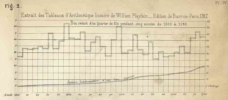
Plate IV Fig. 2, Minard’s facsimilie of Playfair. Minard, Charles-Joseph (1781–1870), “Des tableaux graphiques et des cartes figuratives,” ENPC.
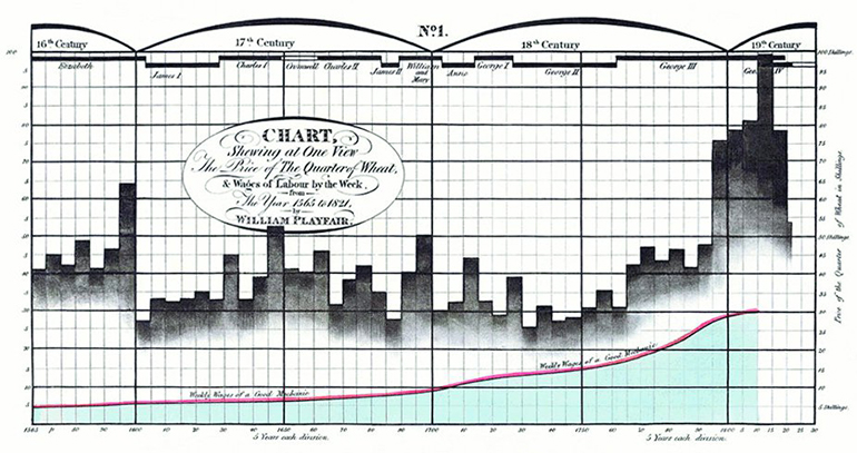
Chart Showing at One View the Price of The Quarterly Wheat. William Playfair (1821) in a letter to Parliament. Playfair used a graph, showing parallel time-series of the price of wheat and the typical weekly wage for a “good mechanic” from 1565 to 1821 to argue that working men had never been as well-off in terms of purchasing power as they had become toward the end of this period.
At first glance, [Playfair’s] wheat prices appear similar to my graphic tables: there are rectangles. But their areas have no statistical significance, while those of my transport route rectangles show the number of tons carried per kilometer. It is such an important metric for traffic that its number is always recorded in the reports.
At the beginning of this century, Layton Cooke published his large tables of colored curves representing the annual prices of wheat, wool, meat, butter, etc. in northern Europe [Cooke example below].
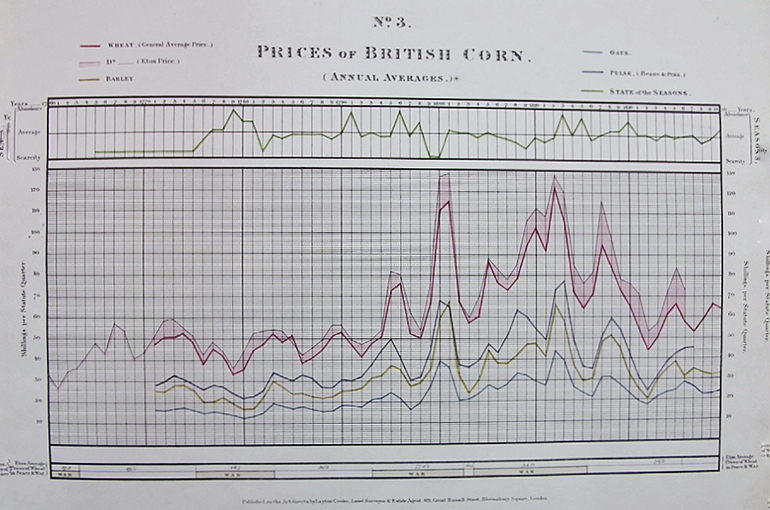
In 1827 or 1828, the estate agent and land surveyor Layton Cooke published “A Series of Statistical Charts shewing the Fluctuations in Quantity and Value of the Products of the Soil, with various ascertainments obviously influential on the husbandry of the British Empire, founded on official and other authentic documents.” Minard may be referring to this series, or something earlier by Cooke. Source.
In 1826, I published, using the same system, the various elements of the maintenance of the paving stone of Paris during the last two centuries.

Charles-Joseph Minard, Paris pavement maintenance (1825). The yellow line represents total paved area. The blue line is total maintenance expenditure. Note drop in both during the French Revolution.
In 1833, still in the same system, Tarbé published tables showing daily deaths in Paris during the cholera of the previous year [Jean Bernard Tarbé de Vauxclairs graphic work on 1832 cholera epidemic was also acknowledged by Marey].
Most engineers recorded daily river water levels in the same way.
These are, among many other applications, those that have been made and are still being made by extending the system indicated by Descartes; but it must be recognized that, whenever the data collected simultaneously have no relationship between them, such as the quantities of goods passing through a canal and the distances they have travelled, the Descartes system has no economic significance nor graphic possibility. Another mode of representing statistical facts was required to compare them by sight alone.
As for my maps, I have heard people say that expressive maps have been made for a long time. However, not only do my maps speak, they count and they calculate for the eye. This is the crucial point; this is the improvement that I have introduced into my figurative maps by the width of the areas, and into my graphic tables by the rectangles.
Other more or less curious representations have appeared in recent years. For example, the number of days with the same prevailing winds in a port was grouped around a compass rose [Minard’s facsimile, Fig. 4, below].
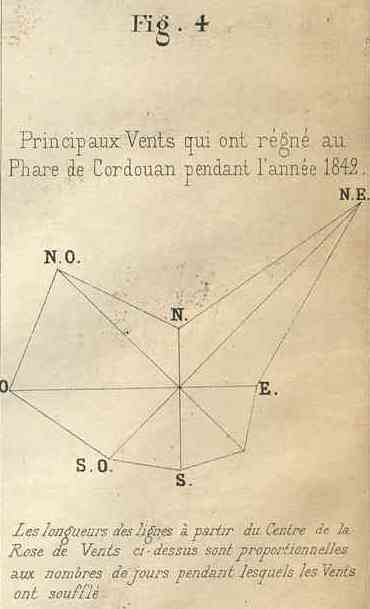
Plate IV, Fig. 4. Minard, Charles-Joseph (1781–1870), “Des tableaux graphiques et des cartes figuratives,” ENPC.
In 1827, Baron Ch. Dupin, Senator, and in 1828, Messrs. Balbi and Guerry sought to show the degrees of education and criminality across departments by more or less dark shading [Minard's facsimile, Fig. 1, below]; this very ingenious representation was not imitated, probably because it does not give a numerical evaluation. We can say that one shade is darker than another; that is obvious. But to say that it is two or three times as dark is not visible, it is not readable.
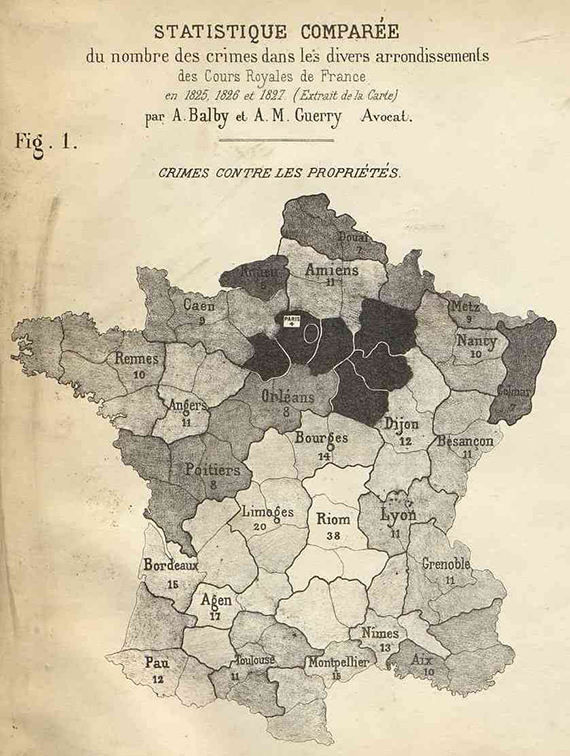
Plate IV, Fig. 1. Comparative statistics of the number of crimes in the various districts. Facsimile of Adriano Balbi and André-Michel Guerry. Minard, Charles-Joseph (1781–1870), “Des tableaux graphiques et des cartes figuratives,” ENPC.
As a way of counting by shades, let me mention, and only by analogy, the ingenious process of chemical analysis of water due, I believe, to Gay-Lussac. [French scientist Joseph Louis Gay-Lussac was known for many achievements including his discovery that water is made of two parts hydrogen and one part oxygen.]
In twelve glasses containing the same quantity of distilled water, one dissolves increasing amounts of salt. By pouring in the same quantity of reagent one gets twelve precipitates of increasing intensity. Carrying out the same operation on the water sample to be analyzed gives a precipitate that one can compare to the initial twelve. By conducting the same operation, it is conceivable that two precipitates will have very close to equal color values, which will give the quantity of salt sought. But it is by the equality of color value (which the eye does not mistake), and not by different [salt] intensities, that one obtains a numerical solution.
Let’s return to graphic representations.
Statisticians divided a circle circumference into 365 equal parts, extended the radii going along these divisions. Lengths proportional to daily observations were extended from the circle. Then the ends of these lines were united by a curve, giving a circular representation of all the observations during the year. This is how the weekly revenues of the Western Railway were calculated in 1858 [Minard’s facsimile, Fig 3., below].
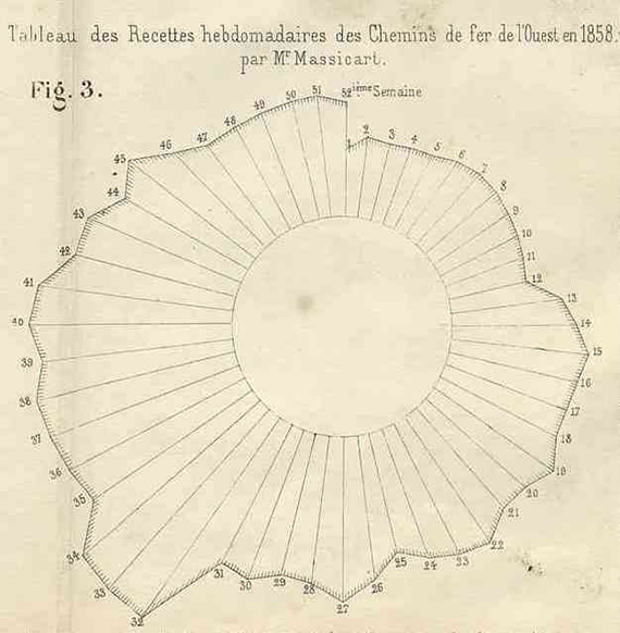
I saw this mode of representation in the statistical office of the Northern Railway as early as 1846.
In 1851, I used proportional circle areas to represent coal mine production [below]…
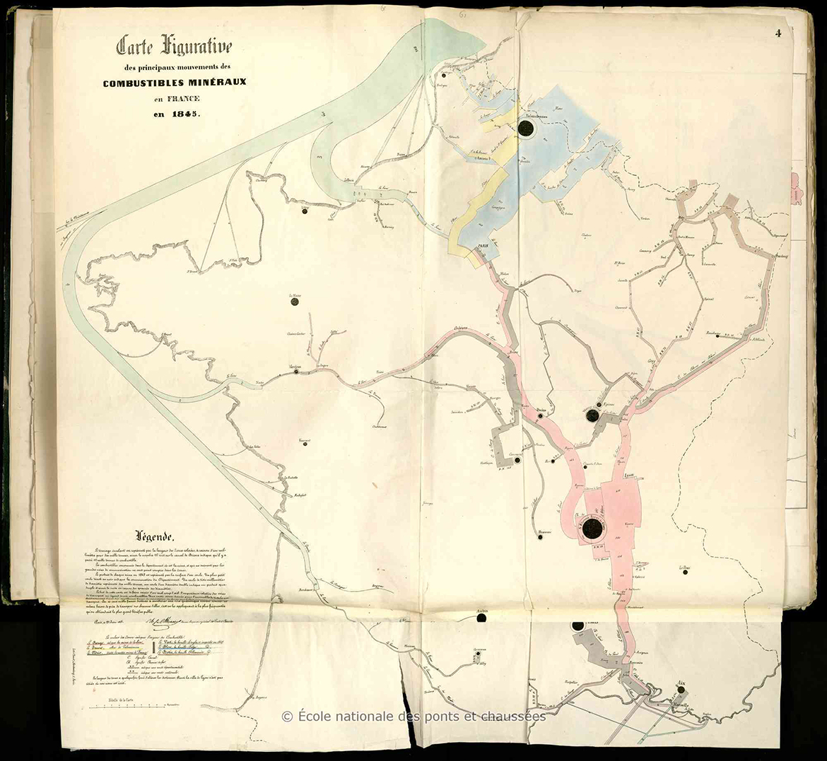
Transport of Mineral Fuels in France, 1845–1860 (June, 1851). The first of a six work series, this is the first in which Minard used proportional circles. Minard, Charles-Joseph (1781–1870), “Tableaux graphiques et cartes figuratives,” ENPC.
…and in 1852, to represent port tonnages [below]. Since this latter representation placed ports with some geographical accuracy, it allowed for comparison by size and position.
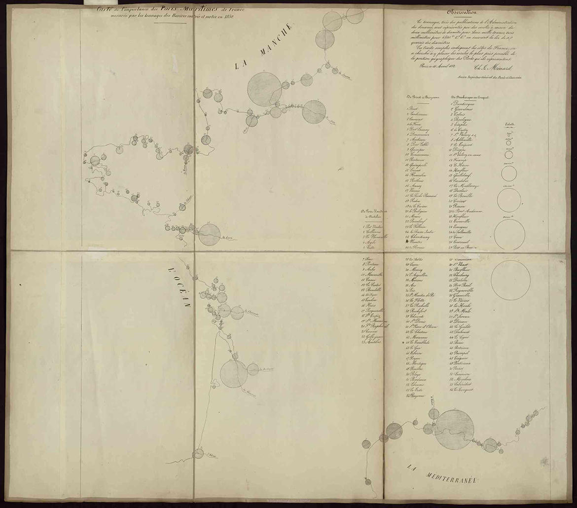
Minard, Charles-Joseph (1781–1870), “Carte de l’importance des ports maritimes de France mesurée par les tonnages des navires entrés et sortis en 1850,” ENPC.
The representation by circles leaves much to be desired. By sight alone, it is very difficult to grasp the ratio of the areas of two circles. One must, in a way, go through the evaluation of the diameters whose squares give the ratio of the circles.
But if separate circles are hard to compare, it is easy to compare sectors of the same circle. That is why I used circle sectors to show the tonnage ratios of each port in my map of sea port tonnages in 1857 [below]. One sector represents cabotage [domestic transport, black] and the other foreign trade [blue]. Circle sectors had already been used before I made use of them [William Playfair introduced the pie chart in his Statistical Breviary (1801) and elaborated its use in 1805.].
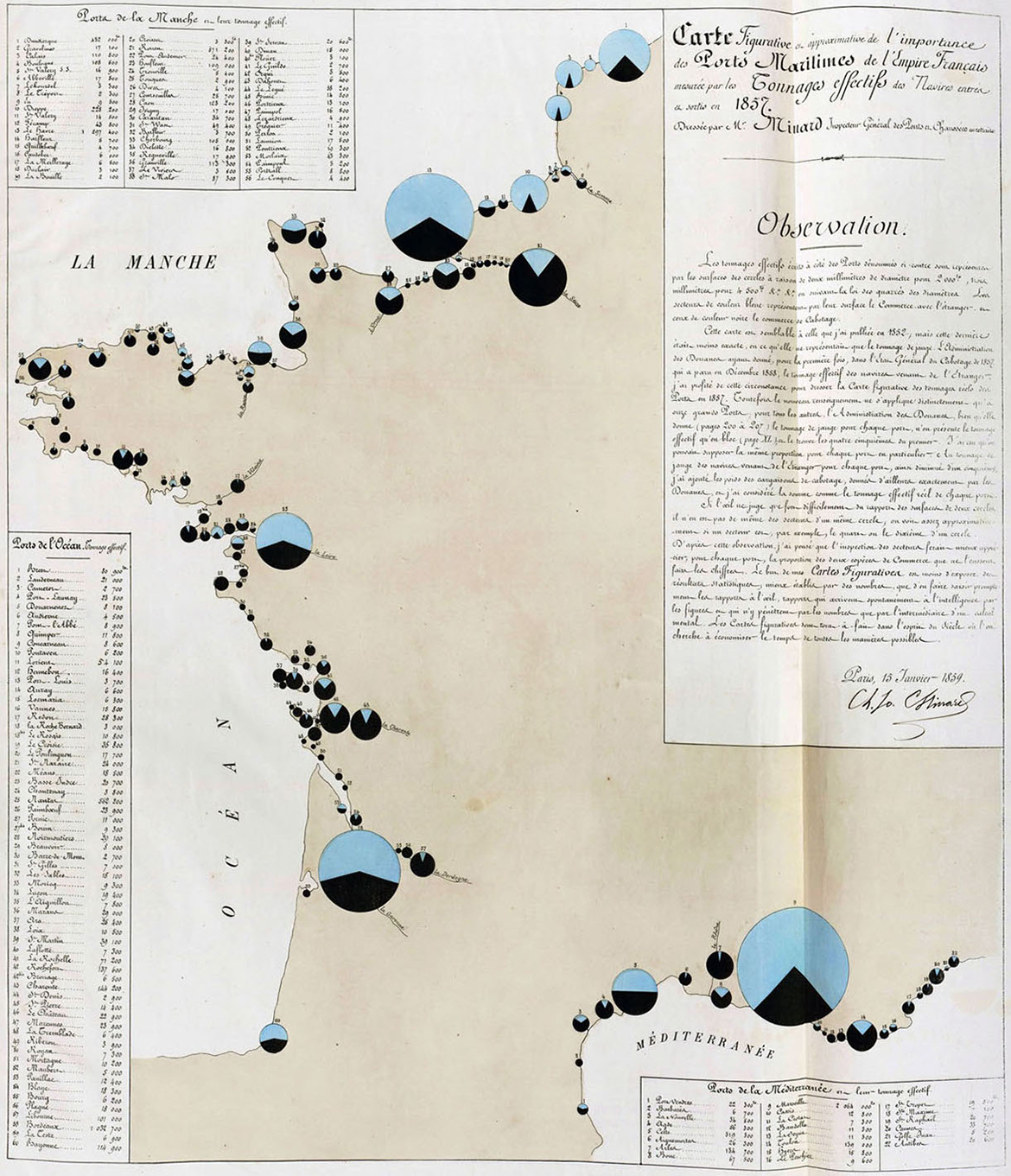
Carte Figurative et approximative de l’importance des Ports Maritimes de l’Empire Français. Charles Joseph Minard, 1859. Reproduction provenant de ENPC via VisionsCarto.
In February 1847, Alphonse Belpaire, a Belgian engineer, published a notice on his beautiful figurative maps (undated) of the roads, rivers and railways of Belgium, drawn up absolutely in the same system as that of my maps. Belpaire says in this notice that his first map [below] appeared about two years earlier, around February 1845. This is the same this time that I published my first figurative map. Thus, if Belpaire’s assertion is accepted, the two inventions arose at the same time, in Belgium and France.
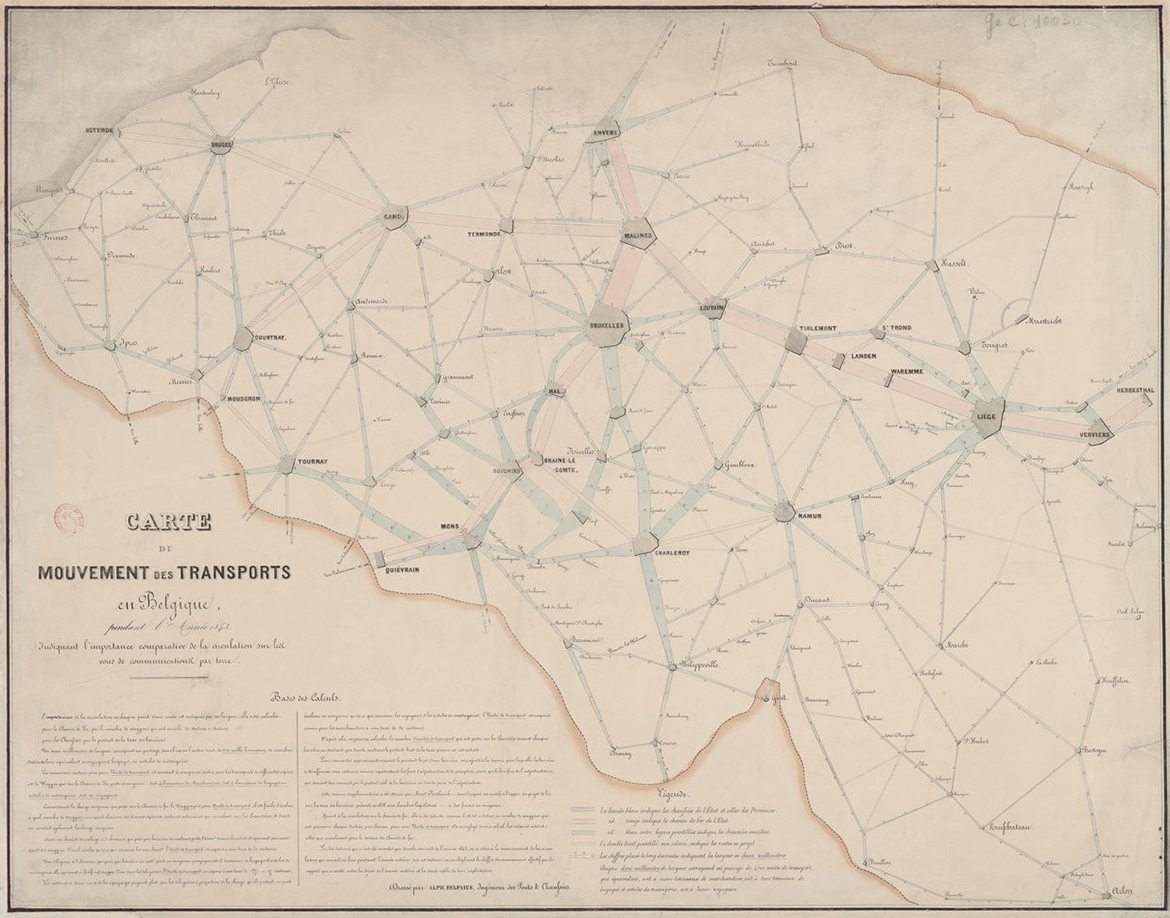
Carte du mouvement des transports en Belgique pendant l’Année 1843, indiquant l’importance comparative de la circulation sur les voies de communications par terre. Dressé par Alph. Belpaire, Ingénieur des Ponts et Chaussées. Gallica.
My publications were imitated more or less immediately. Having sent my 1845 colored graphic table on the Central Canal trade [Plate III, above] to Mr. Comoy, then in charge of that canal, this chief engineer found the idea so good that he continued it, and every year since 1851 he has published graphic tables that imitate mine. He has only added, still following my system, the representation of the size of canal ports.
In a circular dated 20 December 1854, the Civil Engineering Administration recommended the application of Mr. Comoy’s (i.e. my own) graphic tables to the main navigable lines, and this recommendation was followed.
In 1856, Mr. Nicolas, engineer of bridges and roads, compiled interesting graphical tables showing various circumstances under which our railways have operated since their inception. In 1857, Garella, Chief Mining Engineer, published a graphical chart of passenger movement on the western railway network. One of the most successful applications of my figurative map system was made in 1859 by the Chief of Railway Statistics of the Ministry of Public Works; it shows the movement and number of troops sent to the Italian War in 1859. Most recently, the Civil Engineering Administration, adopting my system, published a large 12-sheet figurative map of imperial road traffic in 1856–1857.
In recent years, railway companies have adopted my graphical tables to represent their low-speed traffic. The Orléans company considered a particular aspect of my system, deemed it excellent from the point of view of administration; but it is not up to me to comment on their modifications.
His Excellency the Minister of Agriculture, Trade and Public Works, on the enlightened and benevolent presentation by the Director General of Highways and Railways, was pleased to accept most of my maps. I was able to publish a total of nearly ten thousand copies, graphic tables and maps on various subjects such as passenger traffic on roads and railways; freight traffic in general, and in particular coal, cereals and wine, by water and by rail tonnages of sea ports in France, Europe and world-wide, the consumption of meat in Paris, goods transiting through France and recently the import of raw cotton into Europe, etc., etc.
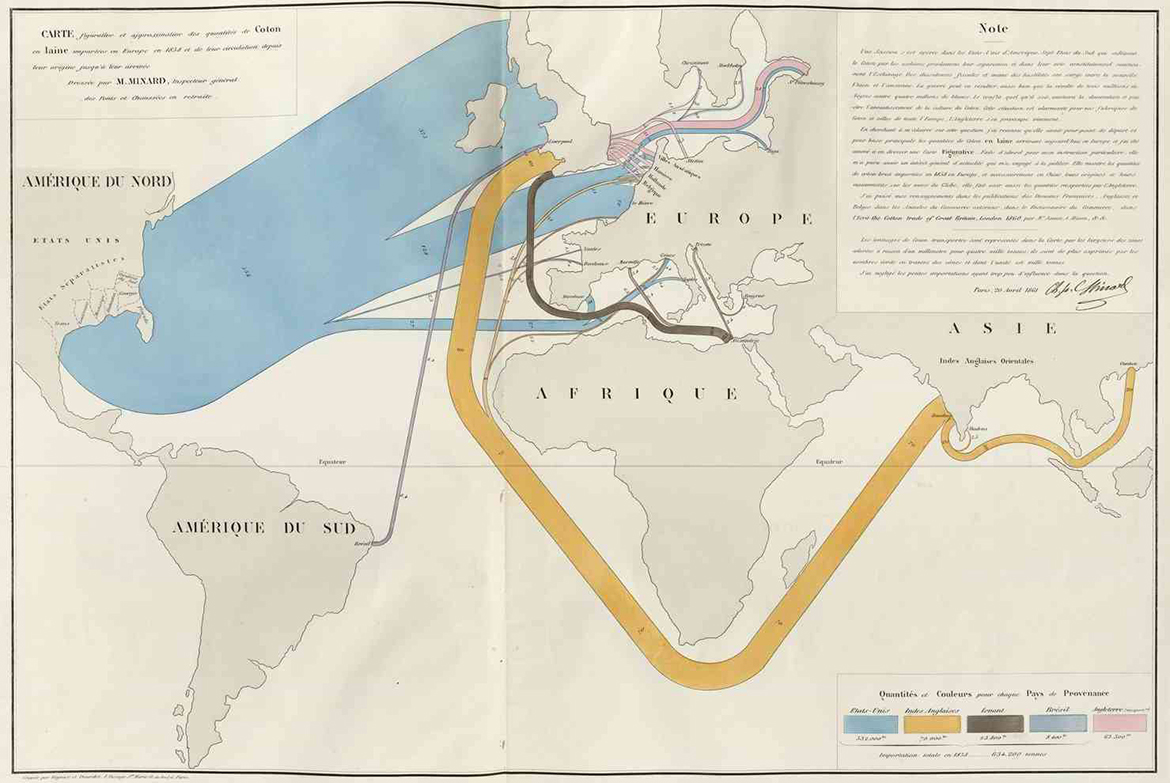
Minard notes that Most recently, the map of cotton imports having been placed before the Emperor’s eyes, « His Majesty examined it with great interest and expressed his intention to consult it if necessary. » Minard, Charles-Joseph (1781–1870), “Tableaux graphiques et cartes figuratives,” ENPC.
My figurative maps and graphic tables having been presented to the Emperor [Napoleon III], His Majesty was kind enough, in accepting them, to let me know “that he had viewed them with interest and that he would make use of them”
Strengthened by this august commendation given to my publications, which are so well received in France and abroad, I feel, at over eighty years old, the satisfaction of having given birth in my old age to a useful idea, of having propagated it through many applications, and of thus still doing some service at the end of my career.
Paris, December 1, 1861.
NOTES ON TRANSLATION: ©2019 RJ Andrews. All rights reserved.
See the 1861 French publication at the library of Minard’s home École nationale. Some of its original footnotes were preserved via incorporation to the main text and image captions.
I am grateful to William Berg, Professor Emeritus as Wisconsin-Madison, for improving this translation effort. Berg is responsible (with Howard Wainer) for translating Jacques Bertin’s landmark Semiology of Graphics into English.
A 2003 translation of the same Minard treatise by Dawn Finley gave me another perspective on a couple of its confusing passages. Sandra Rendgen cites this Minard treatise throughout her book, The Minard System. These translated excerpts were also helpful references.
