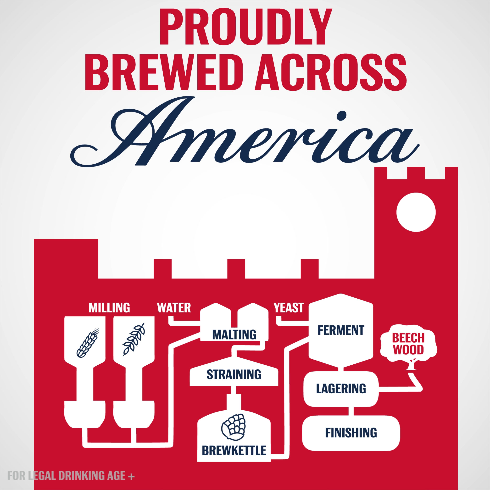
Looping infographic animation commissioned by Weber Shandwick for Budweiser’s 2017 summer campaign.
Read more
July 18, 2017 — Comments are off for this post.
Brewed Across America
January 24, 2017 — Comments are off for this post.
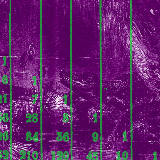
Out of the Swamp
After examining the history of data visualization greats I have decided to collect my learnings in the style of history’s data visualization greats. The fourth of these visual summaries is presented and discussed below. You can explore the entire series here.
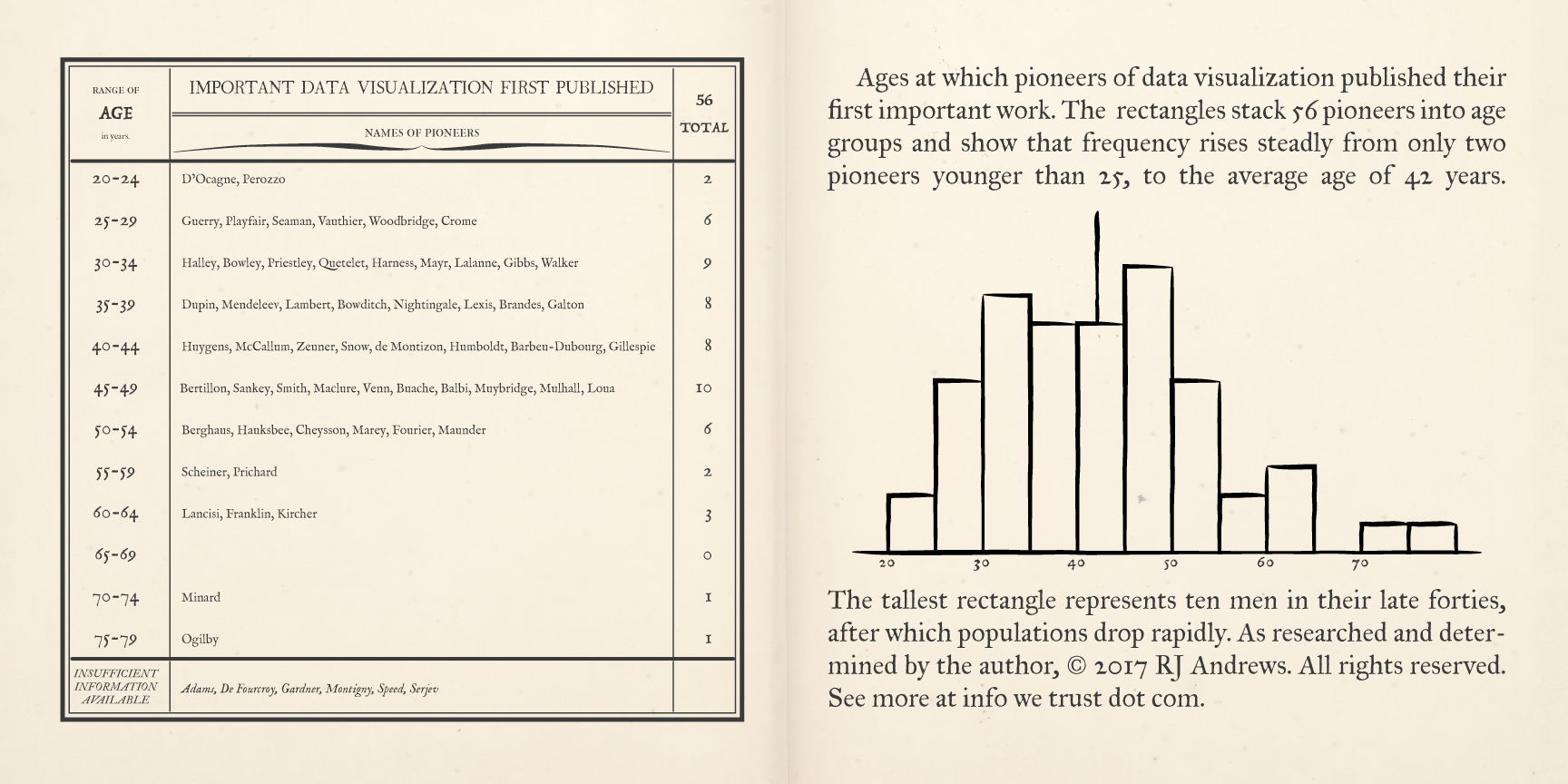
A pair of pages describe early data visualization pioneers, binned by the age at which they first published a significant chart, Read more
Published by RJ Andrews in GIF
January 19, 2017 — Comments are off for this post.
Population Cosmos
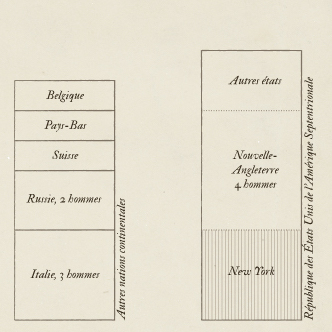
After examining the history of data visualization greats I have decided to collect my learnings in the style of history’s data visualization greats. The third of these visual summaries is presented and discussed below. You can explore the entire series here.
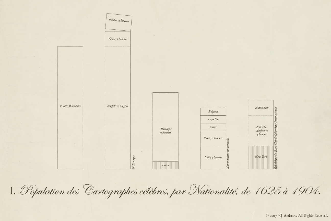
Stacked bars allow comparison across nations of the total number of early data visualization pioneers, Read more
Published by RJ Andrews in GIF

January 5, 2016 — Comments are off for this post.
Complex Curiosity
How an engineer renounced control and embraced the real world

From complicated to complex: my journey through spaceships, an MBA and medicine to learn how to work in an irrational, chaotic, complex world. Illustration by RJ Andrews.
I thought becoming an engineer would help me understand how the world works. As a high school STEM nerd, I saw the world as a technical place and a technical proficiency as a practical necessity — if you could build a jet engine, what couldn’t you do? And doesn’t it sound like fun? And boy did I have fun. I got to work on the Ferrari F430, a stealth warship, and the biggest baddest LEGO set of them all: NASA’s Space Shuttle at the Kennedy Space Center.
But something was missing. Read more
Published by RJ Andrews in GIF
Tags: chaos, complexity, complicated, einstein, engineering, history, irrational, lenin, life lessons, Michio Kaku, peter thiel
March 26, 2014 — Comments are off for this post.
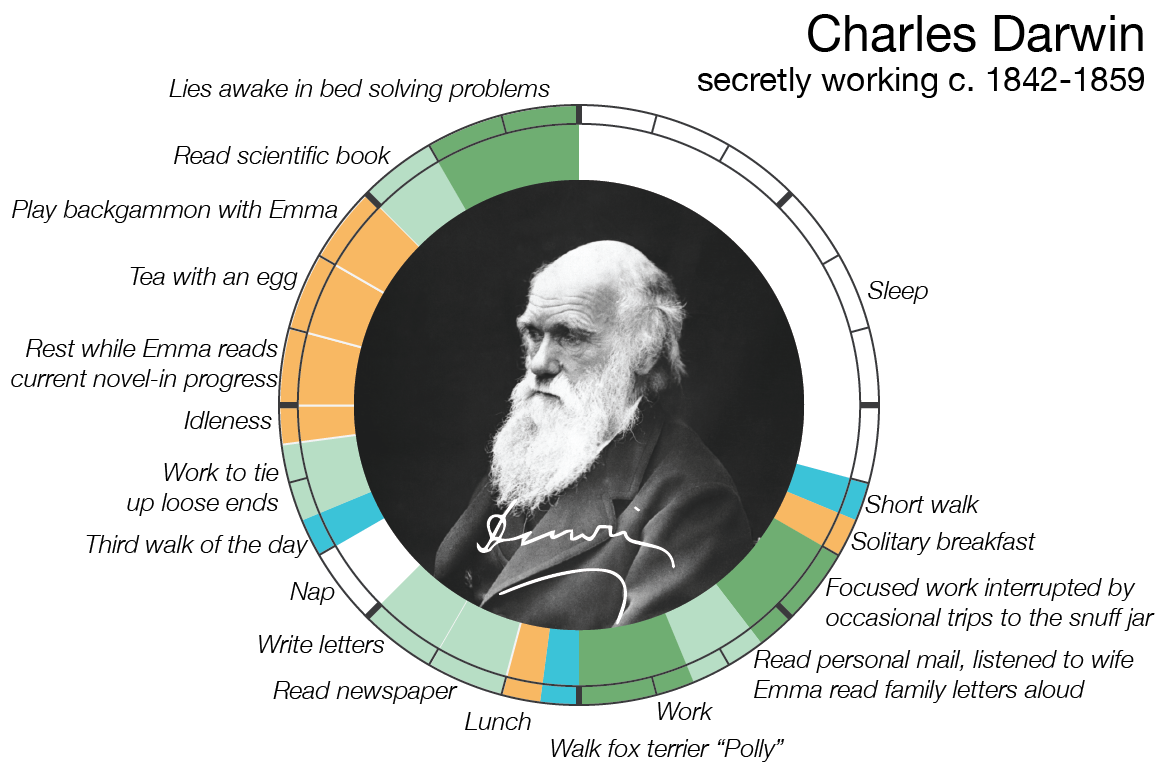
Creative Routines
If you like Creative Routines you will love Info We Trust—the book!
"We all have the same 24 hours that Beyoncé has" and its various iterations took the web by storm in late 2013 as the megastar became the figurehead of not only having it all, but being able to somehow do it all too.
How do creatives - composers, painters, writers, scientists, philosophers - find the time to produce their opus? Mason Currey investigated the rigid Daily Rituals that hundreds of creatives practiced in order to carve out time, every day, to work their Read more
Published by RJ Andrews in GIF
Tags: Balzac, Beethoven, Benjamin Franklin, Beyoncé, Charles Darwin, Charles Dickens, Daily Rituals, data adventure, featured, Flaubert, Freud, Gustave Flaubert, history, Immanuel Kant, infographic, John Milton, Le Corbusier, Ludwig Van Beethoven, Maya Angelou, Mozart, Sigmund Freud, Tchaikovsky, Thomas Mann, Victor Hugo, W.H. Auden

August 21, 2013 — Comments are off for this post.
Calling you to a data-adventure
Welcome aboard to Info We Trust - a data adventure! Together we can explore stories about our history, culture, and way of life with help from the magic of infographics.
Motivation
We must depart the old world of crawling through miles of text. There is a wide gap between the format of the information we consume and the way our mind recalls that same information. Today, information is presented in lists (pages of paragraphs on Wikipedia, newsfeeds on Facebook, search results on Google) which harnesses little of our brain's amazing pattern-recognition abilities. We use ctrl+F, Table of Contents, and other push methods to poke our way into the universe of information.
Imagine instead: complex information organized into visual patterns, with interesting pearls jumping at us visually and pulling us deeper to the most interesting facets. And while we are at it, why not present information beautifully? New types of navigation of our information universe are possible and it is a worthy pursuit to construct them.
Inspiration
I traveled to Queen Victoria's Osborne House at the age of 14 and was spellbound by Max Lindemann's Chart Showing Comparative Length of Reigns. Created to celebrate Victoria's Diamond Jubilee, it mapped the length of British monarchs's reign as ornate columns:

This 19th century infographic not only shows who reigned the longest, it also groups families, shrouds violently killed kings in dark cloth, and provides more detailed information at the bottom. Most importantly, this chart moved me when I first saw it and has stuck with me since because it is aesthetically pleasing. It is not only informative, but beautiful. So beautiful that it was framed and hung on the wall of a Queen's palace.
Since then an amateur education ranging from Charles Minard to the Pioneer Plaque has kept me excited. I am also indebted to many other fantastic infographic blogs which I look forward to writing about soon.
Let's set sail!
Enough with the manifesto - it's time to start exploring! So, please climb aboard the great infographic crystal ship to the stars and get ready for an exciting journey. Subscribe! Comment! and send me the stories that you want to see.
 ©2010-2013 ~InwardPoet
Info We Trust is a data adventure exploring how to better humanize information. The creator, RJ Andrews, is an engineer and proud Northeastern University and MIT graduate. Please reach out through facebook, twitter @infowetrust, or the contact page.
Published by RJ Andrews in GIF
