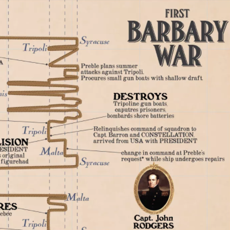
Constitution was called out of ordinary in 1803 and recommissioned in order to fight against the collected Barbary States, leading the third squadron to the Mediterranean in what would be known as the First Barbary War.
Once again, one dimension of geography (this time latitude) is abandoned in favor of providing time as an axis. Read more
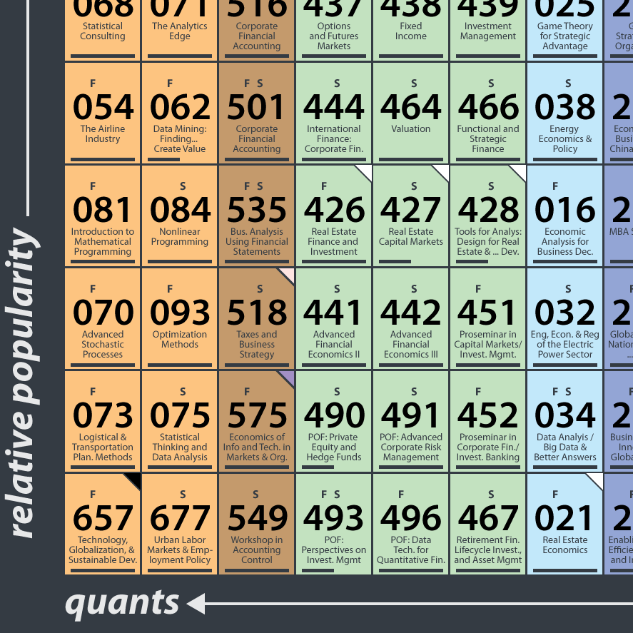
Perhaps it was the chemistry icons of Breaking Bad that drove me to organize the classes of MIT's Course 15 into a handy table. Or maybe it was just reflection on the incredibly knowledge-rich environment of MIT Sloan. For students still taking classes, alumni combing through old notes, and the public digging through MIT's fabulous open courseware (where over 170 management titles are available to all for free), navigate your way though the finest graduate business curriculum around using the Periodic Table of Course 15:
MIT and class names For the unfamiliar, numbers rule at MIT, and classes are no exception. Read more
Welcome aboard to Info We Trust - a data adventure! Together we can explore stories about our history, culture, and way of life with help from the magic of infographics.
Motivation We must depart the old world of crawling through miles of text. There is a wide gap between the format of the information we consume and the way our mind recalls that same information. Today, information is presented in lists (pages of paragraphs on Wikipedia, newsfeeds on Facebook, search results on Google) which harnesses little of our brain's amazing pattern-recognition abilities. We use ctrl+F, Table of Contents, and other push methods to poke our way into the universe of information.
Imagine instead: complex information organized into visual patterns, with interesting pearls jumping at us visually and pulling us deeper to the most interesting facets. And while we are at it, why not present information beautifully? New types of navigation of our information universe are possible and it is a worthy pursuit to construct them.
Inspiration I traveled to Queen Victoria's Osborne House at the age of 14 and was spellbound by Max Lindemann's Chart Showing Comparative Length of Reigns. Created to celebrate Victoria's Diamond Jubilee, it mapped the length of British monarchs's reign as ornate columns:
This 19th century infographic not only shows who reigned the longest, it also groups families, shrouds violently killed kings in dark cloth, and provides more detailed information at the bottom. Most importantly, this chart moved me when I first saw it and has stuck with me since because it is aesthetically pleasing. It is not only informative, but beautiful. So beautiful that it was framed and hung on the wall of a Queen's palace.
Since then an amateur education ranging from Charles Minard to the Pioneer Plaque has kept me excited. I am also indebted to many other fantastic infographic blogs which I look forward to writing about soon.
Let's set sail! Enough with the manifesto - it's time to start exploring! So, please climb aboard the great infographic crystal ship to the stars and get ready for an exciting journey. Subscribe! Comment! and send me the stories that you want to see.
Info We Trust is a data adventure exploring how to better humanize information. The creator, RJ Andrews, is an engineer and proud Northeastern University and MIT graduate. Please reach out through facebook, twitter @infowetrust, or the contact page.