After examining the history of data visualization greats I have decided to collect my learnings in the style of history’s data visualization greats. The fourth of these visual summaries is presented and discussed below. You can explore the entire series here.
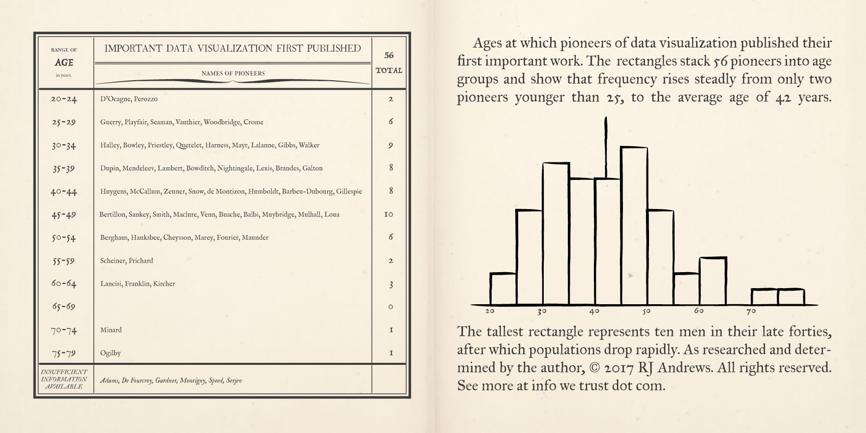
A pair of pages describe early data visualization pioneers, binned by the age at which they first published a significant chart,
loosely styled after the letters in which Adolphe Quetelet charted the probability distribution of two events with equal chance of occurring (sometime called the urn problem):
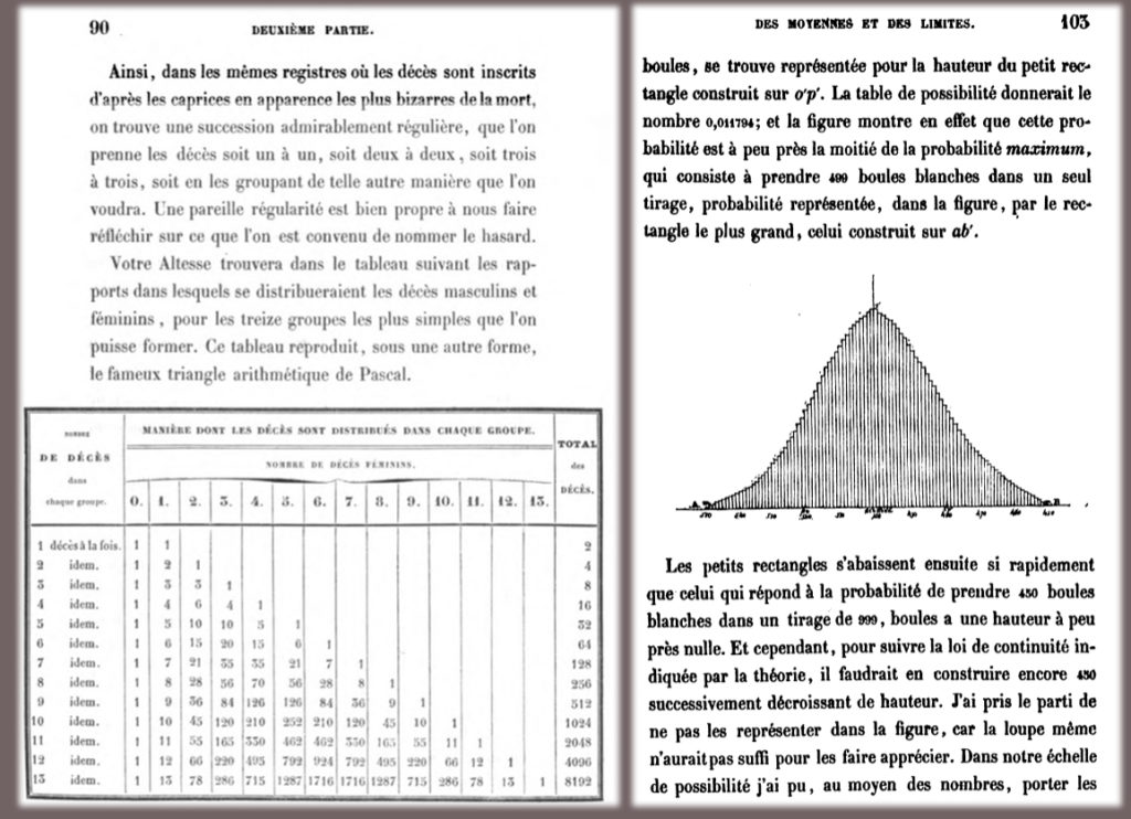
from Letter 15 of Lettres sur la théorie des probabilités appliquée aux sciences (1846), via hathitrust.org
Adolphe Quetelet was a Belgian polymath who was influential in introducing statistical methods to the social sciences. A doctor in mathematics, he conceived and founded the Brussels Observatory, developed the body mass index scale, founded or co-founded several national and international statistical societies and journals, and presided over the first series of the International Statistical Congresses. He appropriated the term "social physics" to describe his investigation of the "average man" - statistical laws underling complex social phenomena such as crime, marriage, and suicide.
via archive.org
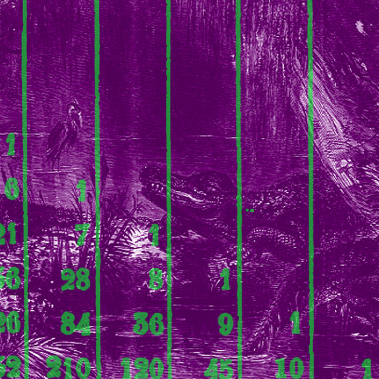
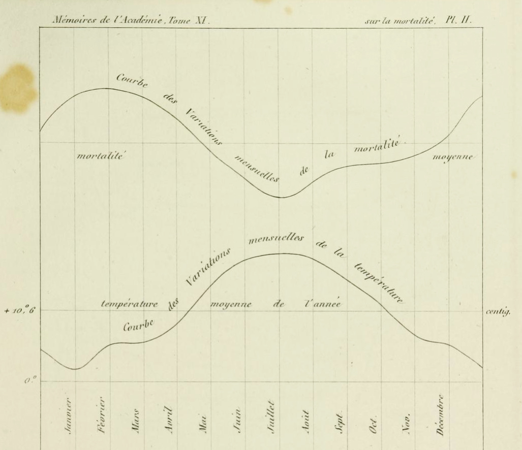
In addition to the normal curve parodied here, Quetelet also contributed some of the first plotted mortality curves (a theme that weaves its way throughout data visualization history). He even charted seasonal death rates, showing how they change compared to monthly temperatures - perhaps a notable precursor to Minard's use of temperature in Napoleon's retreat and an eery reminder of how heatwaves can still drive homicides in American cities. Above is De l'influence des saisons sur la mortalité aux différens ages dans la Belgique (The influence of the seasons on mortality at different ages in Belgium), which shows summer mortality falling above rising temperatures.
Before Quetelet brought the binomial distribution to the social sciences it had its own fascinating history full of famous thinkers: Galileo, Newton, Fermat & Pascal, Huygens, Bernoulli, Poisson, Laplace, Gauss and more. Its refinement stems from two basic needs: how to understand measurement error (especially for astronomical observations with imperfect instruments)... and how to properly calculate gambling odds. Huguenot exile Abraham de Moivre published his landmark The Doctrine of Chances in 1718, noting that as the number of coin flips increased, the shape of the binomial distributions approaches a smooth curve. De Moivre's expression of this curve as a mathematical function was a milestone for our understanding of the normal curve, a distribution that reappears throughout natural phenomena. I leafed through The Doctrine of Chances and was impressed with many beautifully set tables and formulas, but found no visual representation of the curve described.
Design
I have been continually bemused how many historic tables lack any corresponding charts, and then grimace as I remember how much data are still bogged down in tables (especially ugly formats that require extra work to mobilize for analysis and visualization). For me, Quetelet's normal curve depiction hits home not only the power of visualizing a table - but how visualizing was and still can be rare. Like wading through swamp water, digging through tables is not always swift.
It was difficult to determine if Quetelet was indeed the very first to chart the binomial distribution. One of the challenges digging through the history of data visualization is that a lot of modern analysis includes modern charts that are created from historic tables, neglecting to note whether or not a historic chart was ever drafted originally. This incentivizes reading scans of the original works (which are often deliciously available), but it does require some detective work. It seems improbable that Quetelet was first to chart the binomial distribution as it already had a long mathematical history (see more below) and my general observation that most charts that become famous are usually not the first example. That said, Quetelet's distribution is famous, so here it is! Please share if you can point me to evidence of an earlier depiction of the binomial distribution.
One 'feature' of Quetelet's chart was preserved by explaining it in the surrounding text, leaving chart labels to a minimum. One might think that it would be an easy calculation to determine at what age the average dataviz pioneer published their (first) iconic chart, (year chart published) - (year of birth). Alas many data dragons were encountered along the way: what year was the chart composed vs published (consider John Speed's posthumously published table map)? do we even know a birthdate? surprise!: Wikipedia has errors. I did my best to check the data available here that fuels all of the charts in this series, you can see comments on birthdays and publication dates there.
If you like this piece you will love the first installment in the series, a detailed journey through the history of data visualization based on John Ogilby’s 1675 road atlas, which features Quetelet's normal distribution and mortality curves. You can navigate the whole series using:


Info We Trust is an award-winning ‘data adventure’ exploring how to better humanize information. Data storyteller RJ Andrews is based in San Francisco. Please let me know what you think via Twitter @infowetrust, Facebook, or the contact page.

No comments.