After examining the history of data visualization greats I have decided to collect my learnings in the style of history’s data visualization greats. The second of these visual summaries is presented and discussed below. You can explore the entire series here.
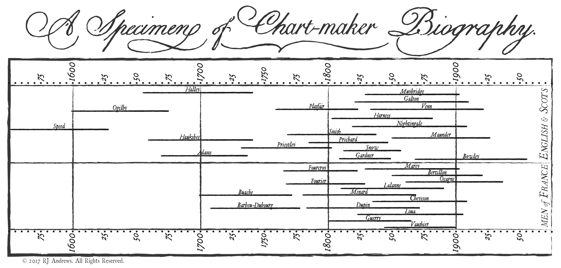
Timeline bars to show you the lives
of some of the most influential chart makers, in the style of Joseph Priestley’s 1765 redacted A Specimen of a Chart of Biography.
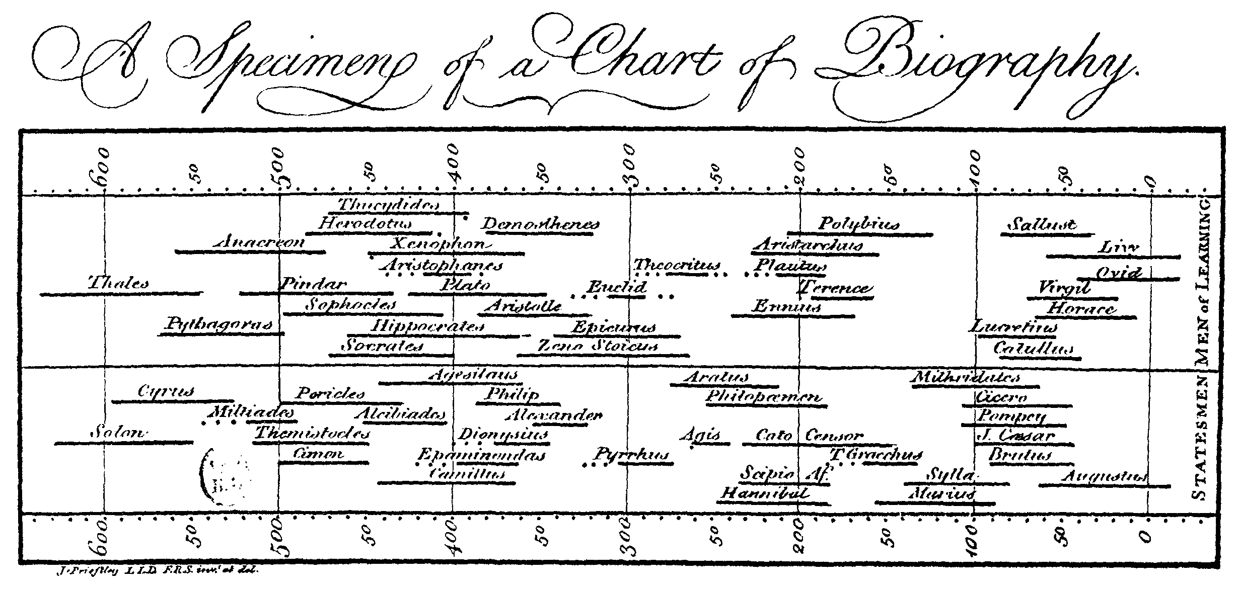
Joseph Priestley was an 18th century English polymath (like so many early chart makers) and clergyman most famous for his discovery of oxygen. He was infamous for trying to fuse Enlightenment rationalism with Christian theism. Priestley wrote histories of science and Christianity in an effort to reveal the progress of humanity. In addition to modernizing aspects of education (including valuing all people's history), this effort also produced a series of wonderful charts. These were the first timeline charts in which individual bars were used to visualize the life span of a person. Thousands of famous people's lives can be compared across 2,000 years:
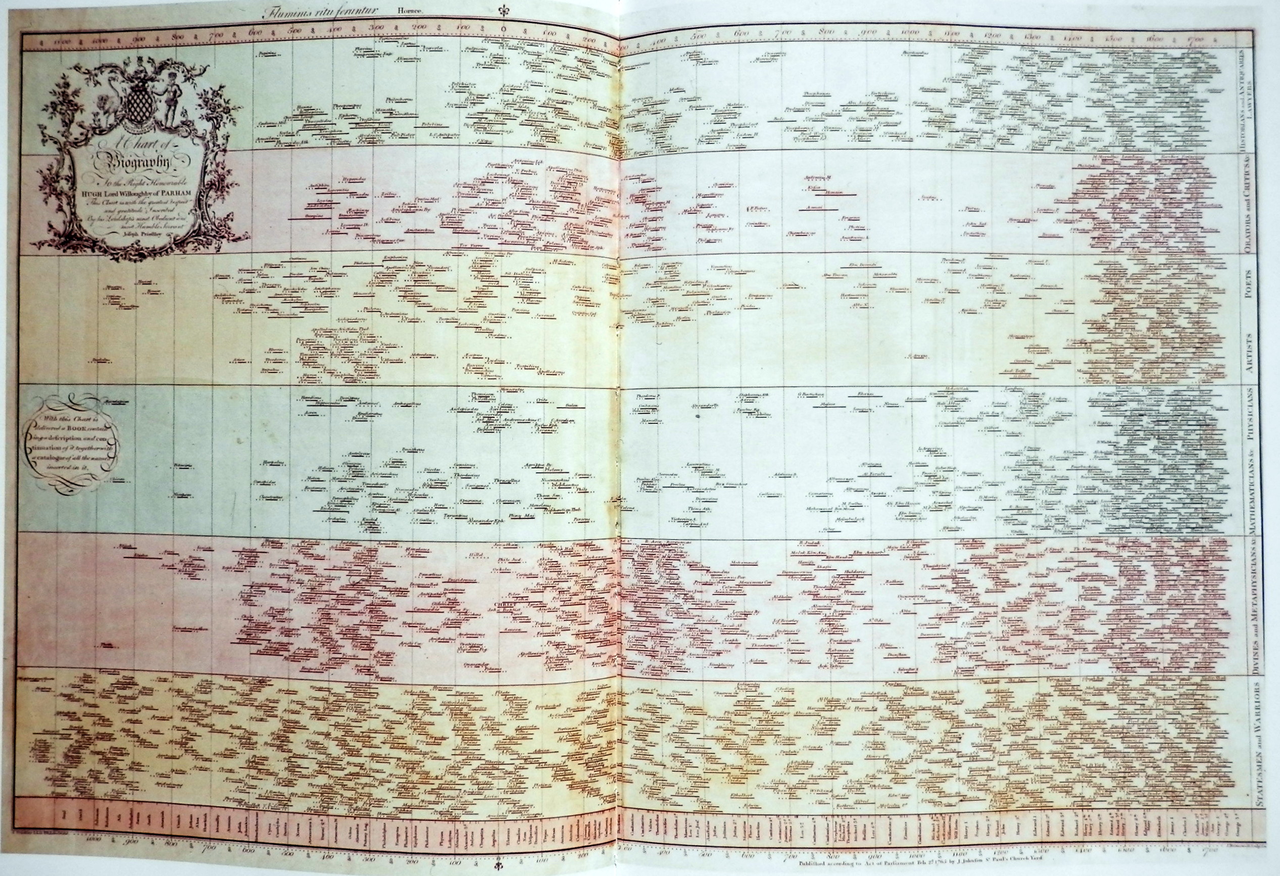
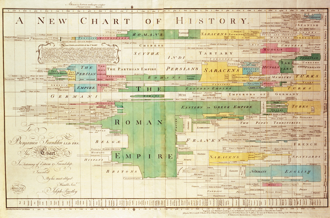
Priestley bested himself with his 1769 A New Chart of History, below. His charts were big hits, going on to dozens of printings and winning him an honorary doctorate. I wonder if a modern university would ever grant an honorary degree for a splendid chart?
Design
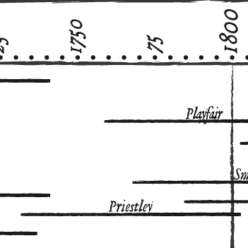
The redacted version of the 1765 chart is the inspiration for today's post. Biographic information is from the same source used to create the first installment in this series, spreadsheet available here. Chart-makers are limited to those who made significant contributions before 1904. Bars and names are a little smaller than the original in order to squeeze everyone in.
I decided to focus on English vs. French in order to approach the simplicity of the original Specimen, but also because I believe historic French data visualization deserves more credit. Beyond Minard, most of our historic icons are British (Playfair, Snow, Nightingale) when in fact the French were also prolific. At one point it seems that every data-on-map innovation was produced with a map of France or Paris. Labeling one row MEN of FRANCE is a gentle jab at highlighting Florence Nightingale's unique presence as the only woman in the collection. Priestley himself is neatly positioned at the center of the chart.
Joseph Priestley's work is a landmark leap, bridging the annotated timeline of Jacque Barbeu-Dubourg and William Playfair's economic charts. If you like this piece you will love the first installment in this exploration, a detailed journey through the history of data visualization based on John Ogilby's 1675 road atlas, where both of Priestley's famous timelines hold places of honor. You can navigate the whole series using:


Info We Trust is an award-winning ‘data adventure’ exploring how to better humanize information. Data storyteller RJ Andrews is based in San Francisco. Please let me know what you think via Twitter @infowetrust, Facebook, or the contact page.

No comments.