After examining the history of data visualization greats I have decided to collect my learnings in the style of history’s data visualization greats. The fifth of these visual summaries is presented and discussed below. You can explore the entire series here.
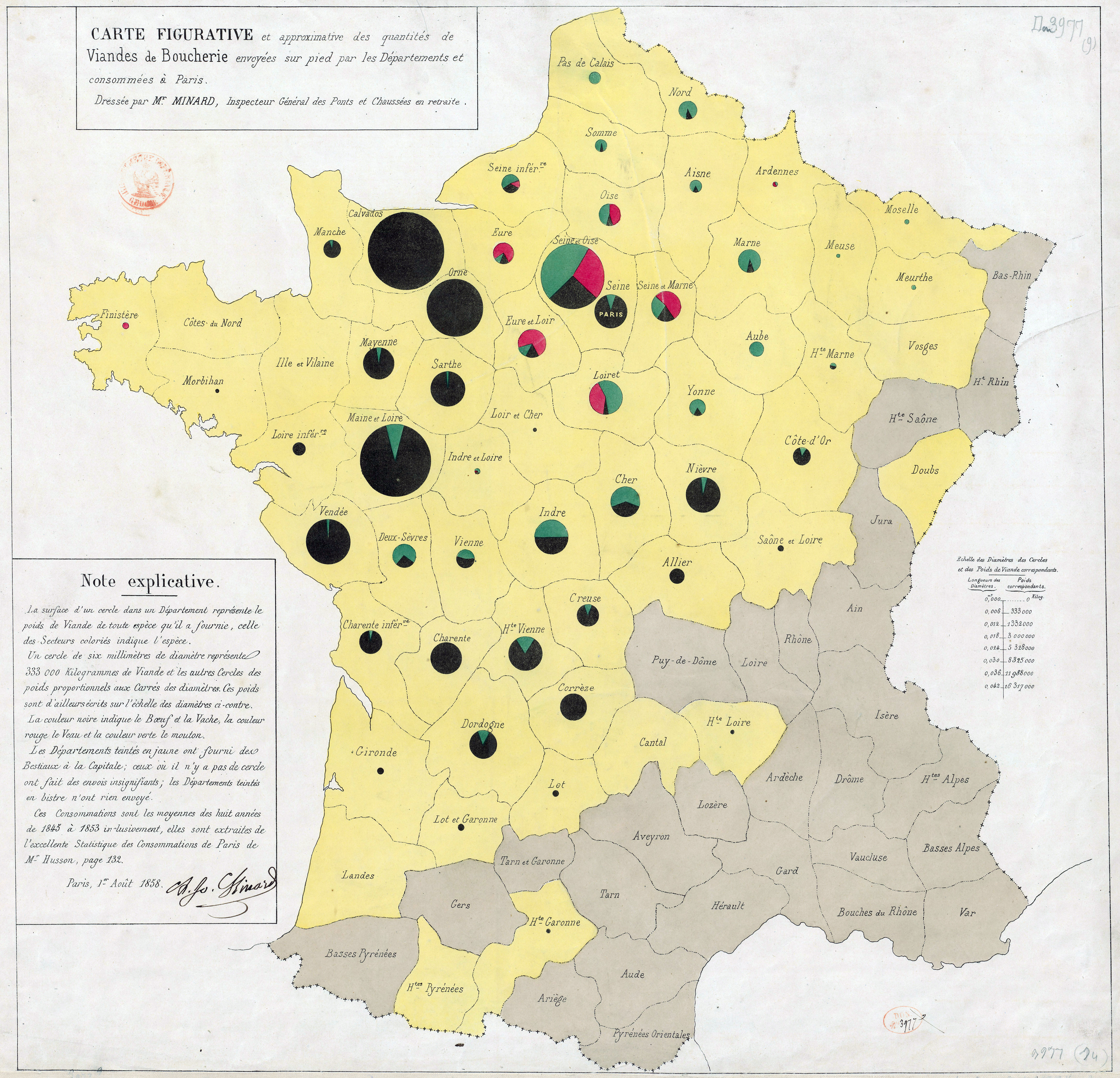
Minard. Carte des quantités de viande. 1858.
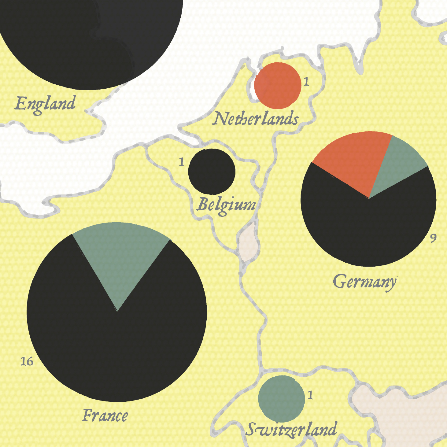
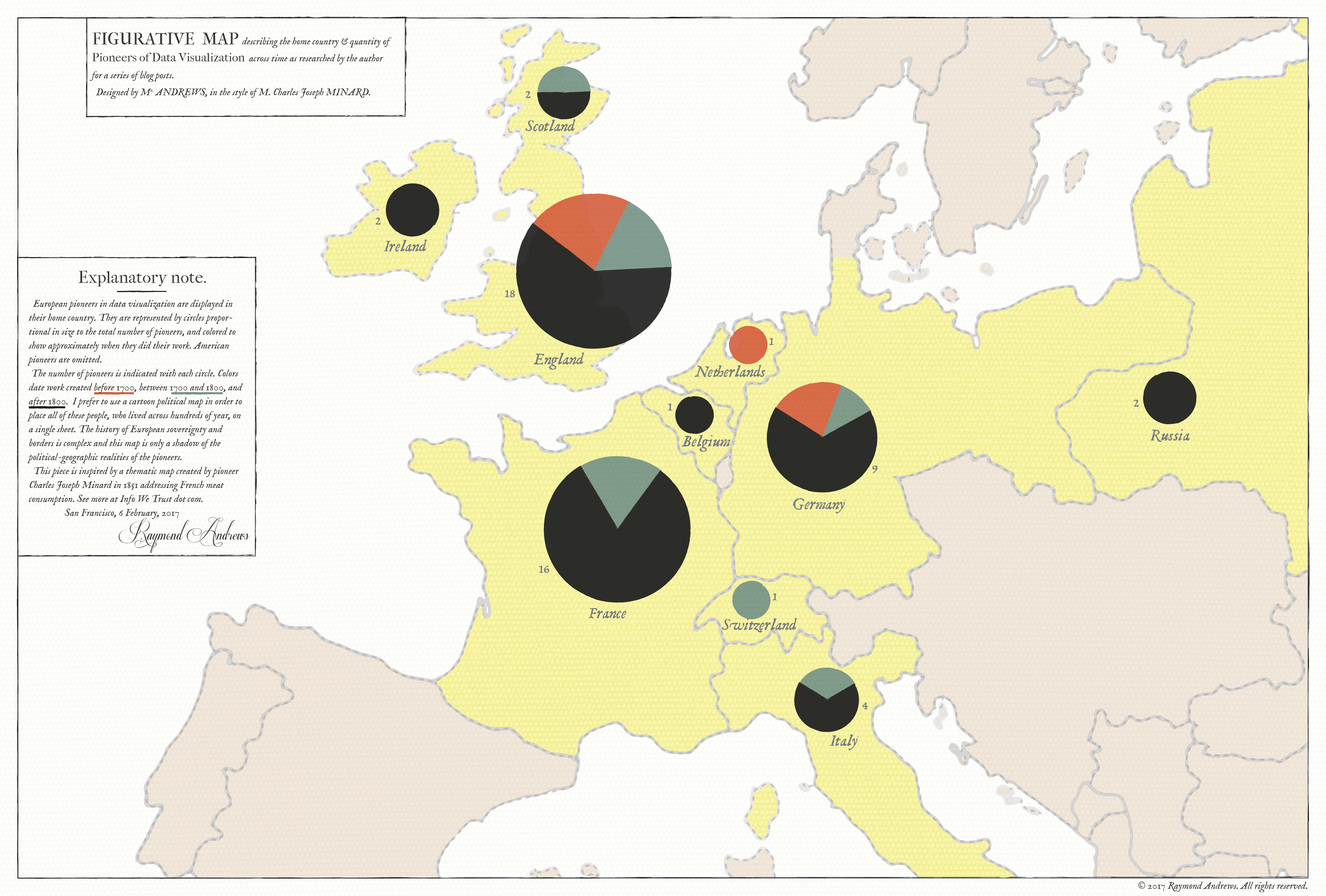
The large thematic map above shows the home country of 300 years worth of European data visualization pioneers, in the style of Charles Joseph Minard's 1858 quantités de viande examination of the supply of meat to Paris - the first work to size pie chart bubbles and place them on a map. I have so much to get to about Minard beyond this little map
that I will direct you to the embedded commentary located within the title and explanatory note boxes if you would like to learn more. Click either map to read the details!
Charles Joseph Minard was a French engineer famous for his depiction of Napoleon's retreat from Moscow. He produced over 50 beautiful maps, most notably dozens that draped the flow of goods and people over geography. This article intentionally dives directly past the Moscow map and deep into a most surprising story of data visualization pioneering.
Minard composed almost all of his maps in retirement after completing a decorated career as an engineer and civil servant. A full biography is warranted, but the highlights of Minard's professional career include studying as a teenager under Lagrange and Fourrier at the Ecole Polytechnique, taking part in many major public works projects, teaching at France's premier civil engineering school (Ecole nationale des ponts et chaussée), being named to the National Order of the Legion of Honour and becoming the Inspector General of Bridges and Roads.
An age limit decree retired Minard on his 70th birthday in 1851, and for us that's where the real fun begins. Minard went on to develop a new visual engineering practice that combined his expert drafting skills and a fascination with how commerce was shaped by transportation technology (especially waterways and railroads). I have assembled a thematically-grouped visual catalog of Minard's work, below. You can interact with the PDF and click-through each map thumbnail to visit a high quality image in the library that houses it.
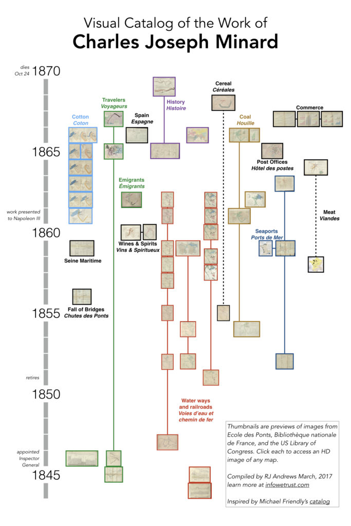
This visual catalog is inspired by the work of Michael Friendly, who maintains an excellent record of Minard's work. I have done my best to blend his list with images available from a number of libraries. You can inspect details of each map (including ones I couldn't find images of) and link through to other sources on Minard by exploring my working spreadsheet.
Design
What stood out to me after assembling the visual catalog, beyond the surprising volume of work, is how often Minard returned to the same themes and chart designs year after year, updating his maps as new data became available. Some of these topics held his attention for over 20 years and provide a window into how his craft evolved as he used each data refresh to tweak design.
Beyond this personal evolution, these series also paint vivid data stories of the different commercial topics Minard was concerned with. These longitudinal visual studies are something Minard was very intentional about. He sometimes included historic predecessors with new charts for easy comparison and annotations that explained why things had shifted. My favorite series from him is on the global cotton trade, which I have highlighted in the following video short:
Imitating historic charts through this series has provided me a wonderful opportunity to slow down and really appreciate the details and design decisions that went into making them. This appreciation for Minard's work goes beyond acknowledging his innovative contributions which include perfecting both the flow map previously introduced by Henry Harness and innovating the use of Playfair's pie chart.
Many best practices can be learned from Minard's work. He employed "approximate" geographic maps that are good enough for reference, but also get out of the way of illustrating data accurately. He packed empty space with lengthy notes that explained how the chart was to be read, where the data came from, his own biases, and key insights. He augmented maps by including corresponding data tables and simple bar charts - building what we might recognize as a dashboard. His flows are often annotated with numbers so that you can get the big picture at a glance and pause to appreciate the details. The innovations are important, but these details are what makes it all sing.
Coda
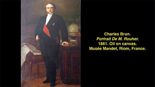
Minard's work was so revered in his day that it was presented to Napoleon III and included in a state minister's official portrait, which you can enjoy in this article's companion piece: Finding Minard.
By 1869, when Minard published the Moscow map, he was 88 years old and hobbled on crutches with arthritis and rheumatism. Prussia marched on Paris the following summer. Remembering the carnage he witnessed at the 1814 Siege of Antwerp, Minard fled for Bordeaux, abandoning his workshop and carrying what he could so that map-making could continue. Almost 90 years old, he caught and succumbed to a fever six weeks after leaving his home.
Kudos
The library of l'Ecole nationale des ponts et chaussée (Minard's home institution) houses the most complete collection of Minard's work, some of which was given by Minard himself. You can explore their entire collection here. Special thanks to Anne Lacourt, responsible for archives and collections of objects and furniture at l'Ecole nationale des ponts et chaussées, who has been incredibly helpful as I've journeyed on my Minard adventure (and very patient with my french). The Bibliothèque nationale de France and US Library of Congress also present several works of Minard.
Approaching the legacy of Minard was intimidating not only because of his incredible work, but also because of the excellent analysis by others that have helped elevate Minard's innovative contributions. Michael Friendly's study of data visualization history, and particularly his enthusiasm for Minard, has been the primary fuel for my own journey. If you want to know more about Minard's life and work I recommend starting with Friendly's paper, Visions and Re-visions of Charles Joseph Minard. If you are still thirsty for more read Minard's 1871 obituary (original french or translation).
If you like this piece you will love the first installment in the series, a detailed journey through the history of data visualization based on John Ogilby’s 1675 road atlas, which features both Minard's meat map and the Napoleon-Moscow sacred cow. You can navigate the whole series using:


Update: it was very exciting to see Betsy Mason include this investigation of Minard in her excellent The Underappreciated Man Behind the “Best Graphic Ever Produced” at National Geographic's All Over The Map.
Info We Trust is an award-winning ‘data adventure’ exploring how to better humanize information. Data storyteller RJ Andrews is based in San Francisco. Please let me know what you think via Twitter @infowetrust or the contact page.

No comments.