navigating data with lessons from master storytellers
As a professional data storyteller, I use pictures to show you numbers. Sometimes the pictures are really pretty, sometimes the numbers are controversial — but the pursuit always is to humanize a complicated and complex world into a package that you can more easily appreciate. To create these experiences with data I have learned a lot from different master storytellers across many media: myth, science, comics, radio and film.
Consider the humble bar chart. By picturing two values next to one another I am forcing you to compare A and B. Without directly highlighting the difference between the bars, I know that you, the audience, are reading the negative space between them.
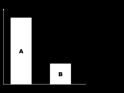
When done well, data storytelling cognitively loads you without ever letting you know it. You compare the bars and see the negative space on your own — and that’s not an accident, everyone sees this. I call this kind of engagement audience interpolation. My job as a data storyteller is to create an experience that gets you to interpolate: I give you nodes and you connect them.
in·ter·po·late: verb, to put (something) between other things or parts
Let’s begin with Joseph Campbell, the legendary comparative mythologist who inspired many modern storytellers including George Lucas. Campbell showed us how we connect our fictional, historical, and personal stories to a giant cultural monomyth, the “hero’s journey.”
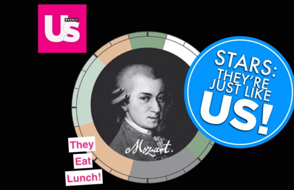
In 2014 I published a work called CREATIVE ROUTINES that was an enormous hit (seen by millions, translated to dozens of languages). Even acknowledging the piece’s appealing design and fantastic data courtesy of Mason Currey, it may not be obvious how its success is linked to Campbell’s monomyth.
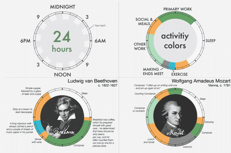
Taking a closer look you can see that little cycle plots may not really be the best way to compare Beethoven to Mozart. But here’s what did work: this piece isn’t about comparing Beethoven to Mozart — it’s about comparing Mozart to you.
People experienced each of these panels individually, comparing their own life to that of each figure. I believe this went viral because of the Stars: They’re Just Like Us! effect. Realizing that perhaps Mozart goes to bed at the same time you do humanizes the hero while also elevating the reader. The audience interpolates between their own life (first node) and the life of the historic celebrity (second node) -realizing a mythic connection I hope Campbell would appreciate.
Science educators are also great storytellers. Astrophysicist Neil deGrasse Tyson reminds us that we are working with caveman brains:
"Our brains are wired to understand whether we will be eaten by a tiger or lion. Space and time, our minds interact with it in very terrestrial ways … we’ve had to come to an understanding of the depth of time and expanse of space that completely transcends what it is natural for us to contemplate."
-Dr. Neil deGrasse Tyson
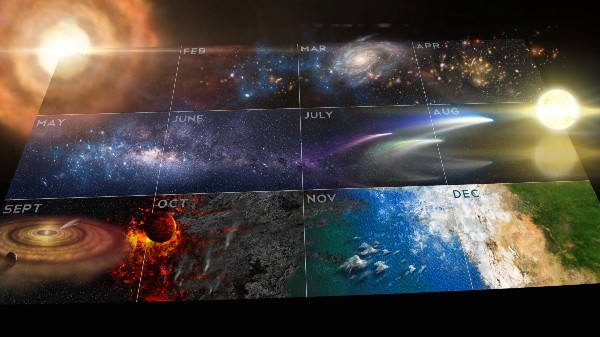
the calendar from Cosmos: A Spacetime Odyssey (FOX), hosted by Dr. Tyson
Dr. Tyson harnesses existing mental models to explain the unknown. By using metaphors to reference what we know (first node), he steps us naturally and instinctively to what is near-incomprehensible. For example, Dr. Tyson compares the timeline of the universe to our twelve month calendar. Other world-class educators use similar techniques — think of David Attenborough telling us the story of a “family” of big cats in terms that remind you of your own relations.
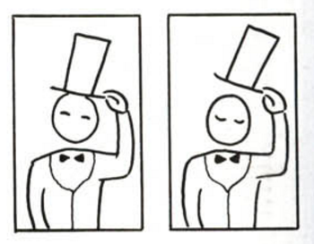
Comics were defined by Will Eisner as “sequential art.” Cartoonist and comic theorist Scott McCloud points out that the the magic of reading a comic book happens in the gutter — the white space between two panels. Even a sequence of two simple images is enough to create kinetic energy. Our mind links the two panels and action is imagined.
Scott McCloud, UNDERSTANDING COMICS
Two separate images, each a visual node, are fused by the reader into a single idea. Fractured moments are connected by our minds to construct one continuous unified reality. If the comic artist presents the nodes well then the audience interpolates between then and the magic happens.
Documentary filmmaker Ken Burns talks about how the whole is greater than its parts, a genuine story means that 1+1=3. He accomplishes this with artful juxtaposition: smashing two ideas together in a way that creates emotional fireworks. A picture of Thomas Jefferson evokes certain ideas, a statement about slavery many others — together they remind us of a powerfully charged story that has continued to reverberate across America’s history.
jux·ta·po·si·tion — noun, the fact of two things being seen or placed close together with contrasting effect
If the goal of the storyteller is for the audience to interpolate, Burns’ juxtaposition is a good way to get there. One of data visualization’s hallowed classics that uses juxtaposition masterfully is John Snow’s 1854 Broad Street Cholera Outbreak. Mapping deaths and water pump locations together, it was impossible for city officials to continue ignoring his insistence that the disease was linked to the unsanitary water infrastructure.
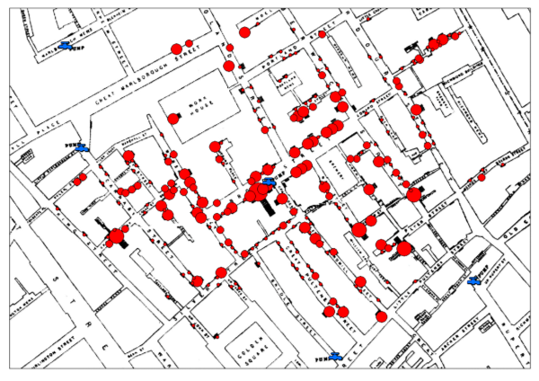
John Snow’s map, with a modern refresh by R.T. Wilson
Radio storytelling is broken down best by NPR’s Ira Glass. He explains that it is essential for a story to have a narrative and meaning. A good narrative is a “momentum building machine,” a sequence of actions (or anecdote) with causal relationships that gets the audience cognitively moving with the storyteller. One action leads to the next, which leads to the next, establishing a unified rhythm analogous to how we stitch together comic book panels. Meaning is often accomplished on his show, This American Life, with a moment of reflection that reminds you why you are listening, suggesting that a great anecdote (like that one crazy night out at the bars) devoid of meaning should probably be avoided.
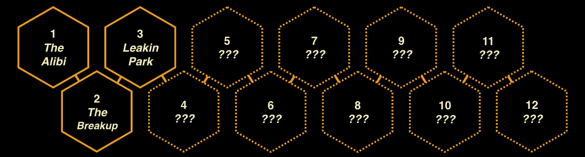
Sarah Koenig, a protégé of Glass, embraces his storytelling principles better than anyone I’ve encountered. I believe that a big reason her SERIAL podcast was so great is that Koenig stakes out her story through the first few episodes (characters + timeline of action) in a way that builds in expectation of what the rest of the series will explore. She doesn’t tell you exactly where she’s going next because she doesn’t have to. After hearing one episode you already have a wonderful sense of where she is moving, as evidenced by her classic closing cliffhangers:
"…and while I don’t exactly know why their suspicions about Adnan start to percolate, I have an educated guess. Next week, on Serial."
Mylast hero of interpolation is Sally Menke, the late great editor and Tarantino collaborator. Film editing is a craft with an important reminder that great stories don’t just happen. They are composed of intentional decisions, creating and placing story-building blocks with precision and care so that the audience can be transported across history, time frames, geography, and emotions. Edited well, the audience will automatically believe the film as it cuts from one scene to another, interpolating what has happened in between (such as we have gone back in time or maybe she disapproves of what just happened).
Stories have entropy, a tendency to get sloppy if not controlled. Without cultivation — careful craft and artful juxtaposition — they will be too demanding for your audience and you will lose them. How can you use interpolation to engage others with your own stories?

No comments.