After examining the history of data visualization greats I have decided to collect my learnings in the style of history’s data visualization greats. The third of these visual summaries is presented and discussed below. You can explore the entire series here.
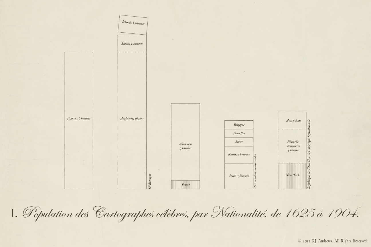
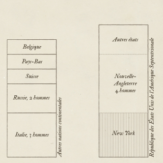
Stacked bars allow comparison across nations of the total number of early data visualization pioneers,
in the style of a chart from Alexander von Humboldt's 1811 Atlas Geographique Et Physique Du Royaume De La Nouvelle-Espagne (Geographic and Physical Atlas of the Kingdom of New Spain):
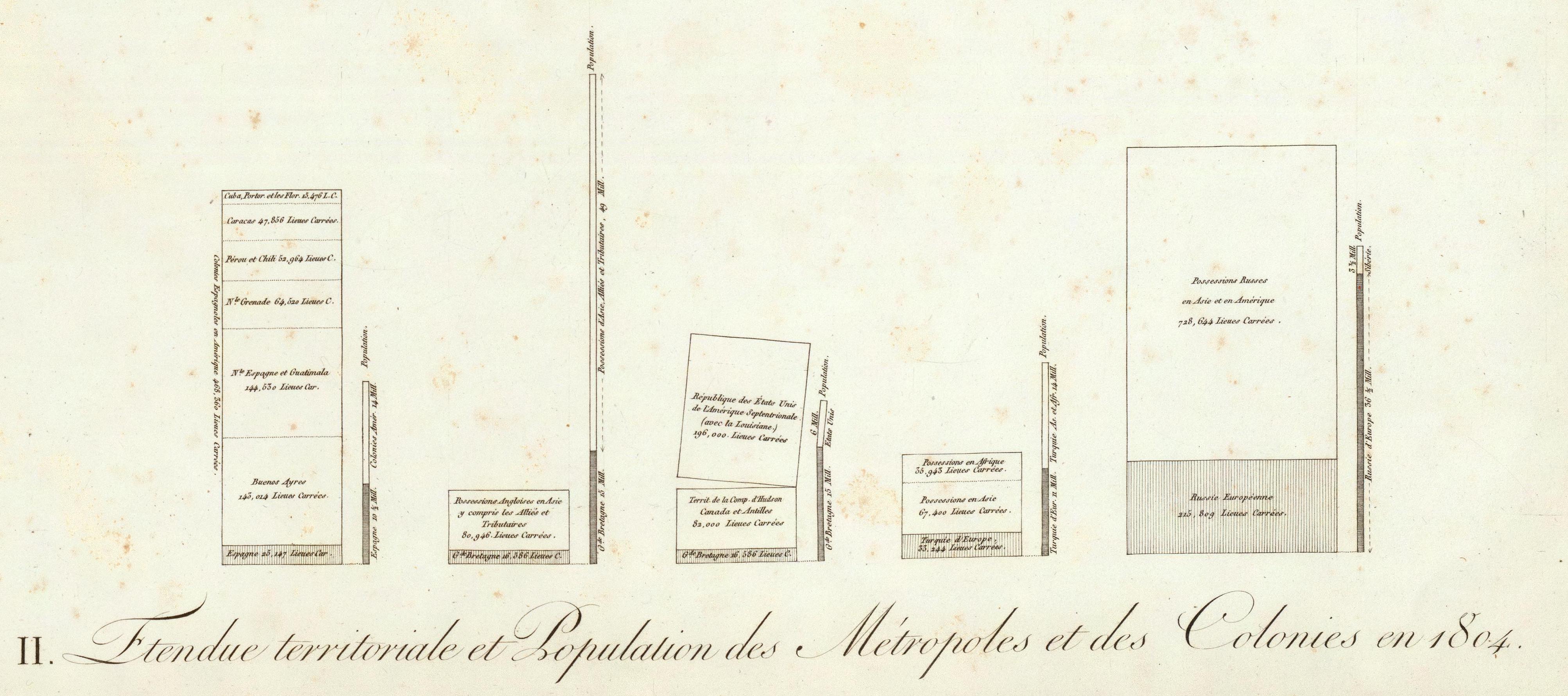
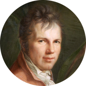
Alexander von Humboldt was a Prussian polymath famous for a scientific expedition to Latin America (1799-1804) which laid the foundation for modern biogeography and long term geomagnetic and meteorological monitoring. He was the first to explore the New World extensively with a modern scientific perspective. He came away from adventures through Venezuela, Cuba, the Andes, Mexico, and the United States, with a fortune of data collected using the most modern scientific instruments available. His quantitative methodology - which featured observation, precision, and the aesthetic ideals of Romanticism - became known as Humboldtian science.
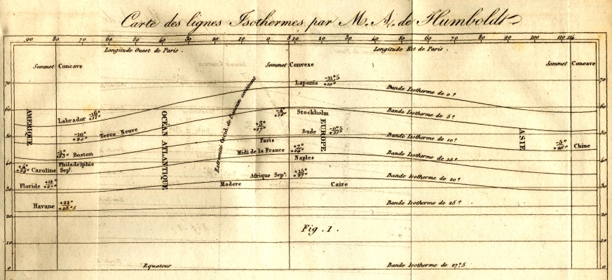
In addition to the stacked bar chart featured here, Humboldt also constructed the first isothermal chart:
Humboldt published prolifically, in several languages, across a series of topics including botany, zoology, astronomy, and mineralogy. He deployed his own personal fortune to publish his findings both quickly and in beautifully illustrated volumes - helping popularize science to the general public. He resurrected the Greek word cosmos for his multi-volume treatise, Kosmos, in which he sought to establish a holistic perception of the universe by bridging diverse branches of scientific knowledge and culture. For his use of the word cosmos, holistic approach and ability to communicate science with stunning visual storytelling, I believe it is fitting to consider Alexander von Humboldt the intellectual ancestor of Carl Sagan and Neil deGrasse Tyson - and certainly a founding father of data storytelling.
Design
The biggest design decision was to produce this one in French. Data visualization was and continues to develop across many languages, and my hope is to call attention to a diverse set of pioneers. An English translation is below:
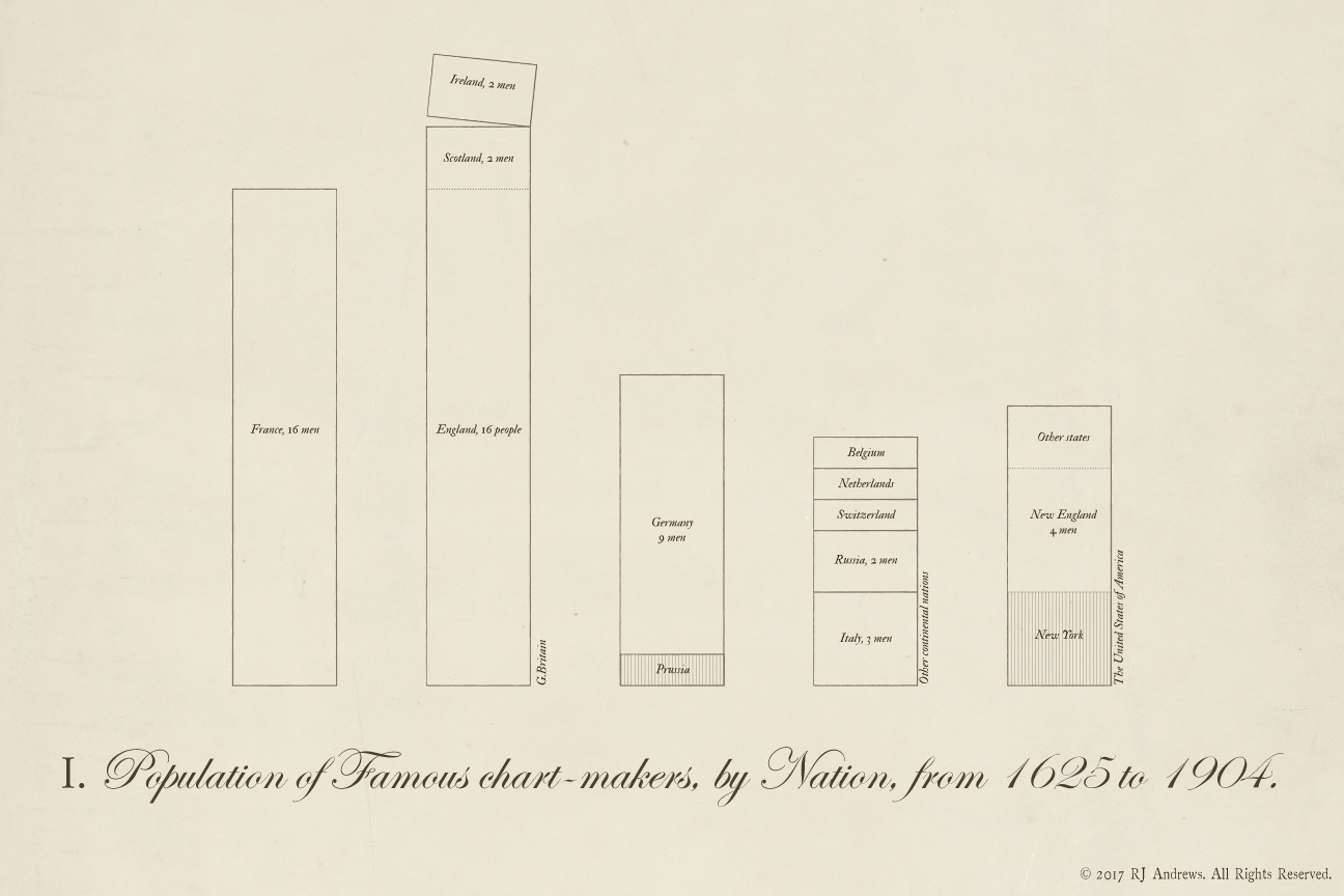
Pioneer information is from the same source used to create each installment in this series, spreadsheet available here. Humboldt's original chart includes two classes of bars: one for land area and one for population of different New World territories. I drafted different versions that included a second set of bars, but ultimately decided against them as I felt like the data was being forced into the form. Humboldt's chart angles the revolutionary United States away from Britain's American colonies, and I incorporated this flourish by breaking off Ireland from Great Britain. The history of the German state is complex - calling attention to only a singular Prussian is in fact paying homage to Humboldt himself. Highlighting New York pays tribute to the state I grew up in.
If you like this piece you will love the first installment in this exploration, a detailed journey through the history of data visualization based on John Ogilby’s 1675 road atlas, which features both Humboldt's stacked bars and isothermals. You can navigate the whole series using:


Info We Trust is an award-winning ‘data adventure’ exploring how to better humanize information. Data storyteller RJ Andrews is based in San Francisco. Please let me know what you think via Twitter @infowetrust, Facebook, or the contact page.

No comments.