Looping infographic animation commissioned by Weber Shandwick for Budweiser’s 2017 summer campaign.
ORIGINS
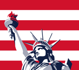
'Lady Liberty' by Malika Favre
The story of beer is tightly linked to the story of civilization itself. The beverage's history is wrapped up with innovations across thousands of year beginning with the earliest days of agriculture, from the Epic of Gilgamesh to the German Renaissance introduction of hops. Immigrant Adolphus Busch brought beer into the modern world with a series of innovations in pasteurization, bottling, and mechanical refrigeration. At the repeal of Prohibition the Busch family came roaring back with sophisticated marketing, decades before its time, that helped cement Budweiser as the King of Beers. Today a national network of growers and brewers serve America.
In 2014 Budweiser launched patriotic packaging designed by Malika Favre. For summer 2016 Budweiser built on that effort by rebranding its flagship product as America and accompanied the new design with a cornucopia of patriotic text that referenced founding documents and patriotic hymns. I visited the original old Brewery in St Louis and Anheuser-Busch's Strategy Office in New York City to learn about the company's history and take notes on its culture and pride. With summer 2017 in sight we began exploring how the art of data storytelling could be folded into the next step of Budweiser’s patriotic branding.
Our goal was to highlight Budweiser as an American product with social media as the end destination in mind. We particular wanted to focus on where ingredients are grown and where Budweiser is brewed. A limited color, 1-font brand guideline, and the tag lines Brewed Across America and America Is In Your Hands provided a focused sandbox to play in. A simple 'farm to backyard barbecue’ story took hold and was refined to two visions: what happens across America outside the brewery, and what happens inside the brewery.
DESIGN
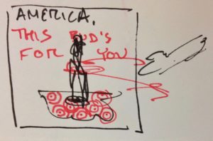
early thumbnail sketch
The first storyboard imagined a map of America that doubles as a bartop: a bottle moves towards the viewer and a hand pulls it out of frame. From this concept we iterated to strengthen the messaging. The Budweiser team are champion storytellers and particularly genius at creating powerful design. We actively engaged across the project, refining its design to achieve a stronger story.
The project was illustrated with Illustrator, animated with AfterEffects, and edited in Premiere Pro. An early storyboard created different statements as each can was removed from the screen:
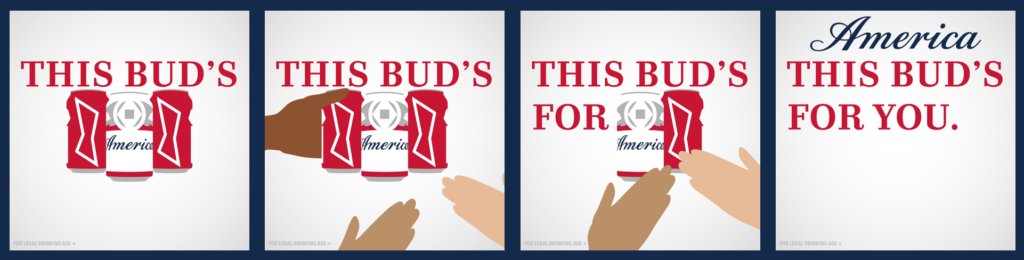
early tag line concept that didn't make the final animation
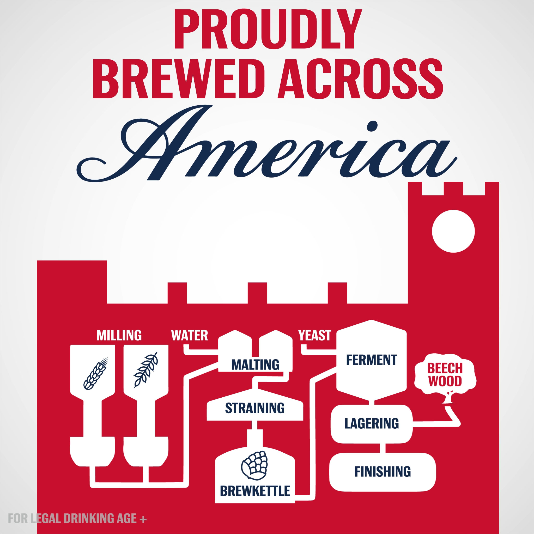
For data, we worked with Budweiser suppliers and referenced USDA maps to identify exactly where to display the location of the ingredients. Brewery locations and brewing process was supplied by Budweiser. Two simple infographics anchor the story: one for inside and one for outside the brewery:
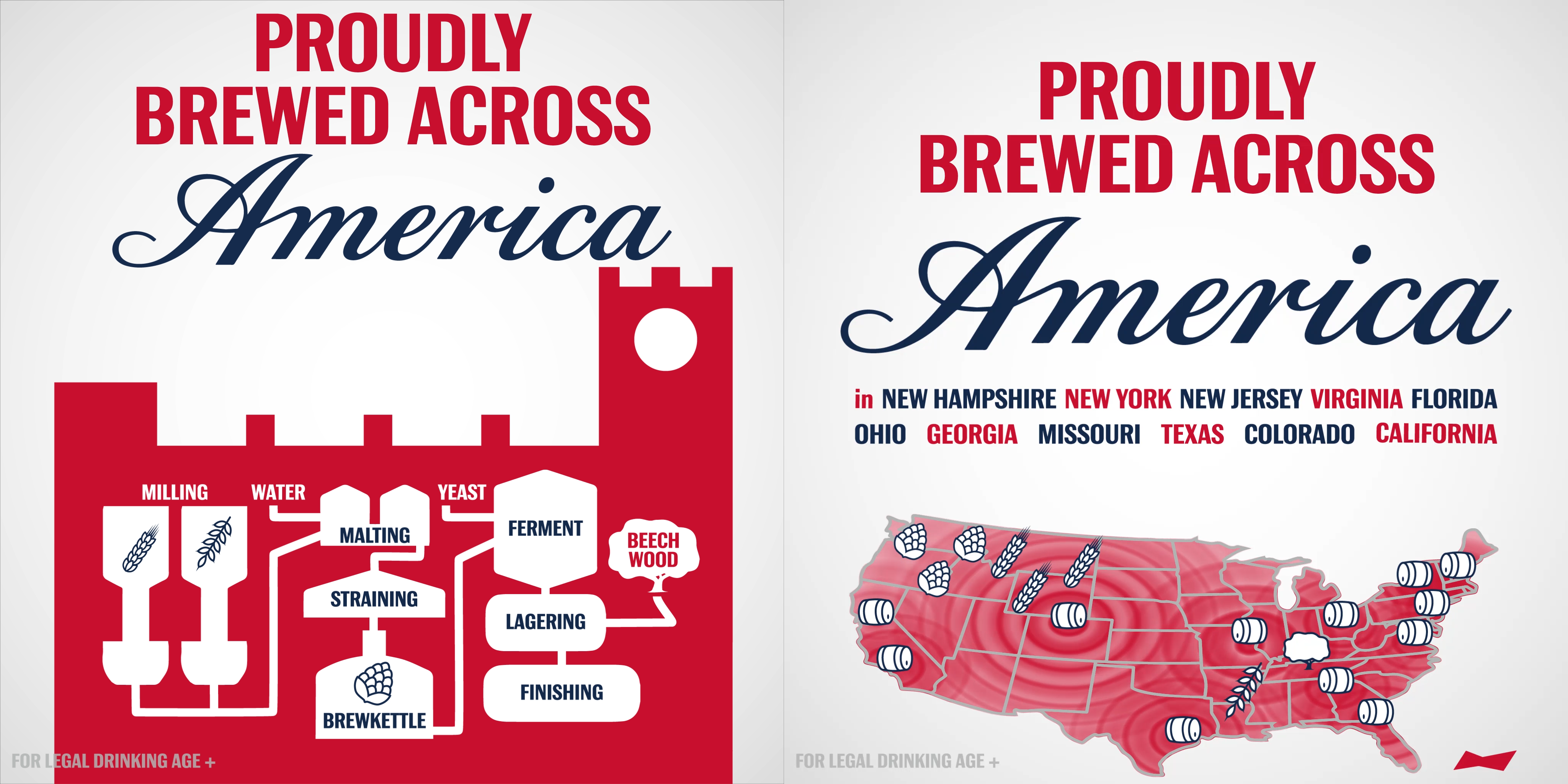
infographic frames from the animation
Illustration
A custom set of map icons was created based on historic Budweiser packaging, which traditionally features brewery ingredients. The historic St Louis Brewery was used to frame the brewing process.
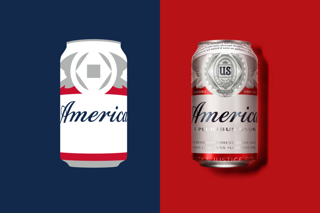
The original America can, originally designed by jones knowles ritchie, was abstracted to its graphic essence:
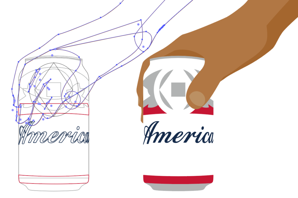
Finally, getting the right balance of hand color, simplicity, and form was hard.
Motion Infographics
I first became really interested in looping animations from Eleanor Lutz's delightful GIFs at Tabletop Whale. She directly inspired me to publish my first looping animation BLOOM, which visualizes the life of all 212 flowers in Jefferson’s Monticello garden across the year
For the Budweiser animation to loop properly we had to go on a journey that ended where we started so it could all start again smoothly. Keeping everything in order was a fun technical challenge. In theory, certain static frames can act as anchors so that segments can be isolated, but in practice I found that was as much trouble as doing the entire animation in one file, which guarantees that each frame would flow smoothly.
The motion design's goal was to keep momentum high. It was paced fast enough to keep energy up, slow enough to catch all the detail on the second loop if you missed something first time around. The word America is always on screen, transformed in different ways to create two different tag lines. The rising brewery is the first blocking curtain, later the main can rises like a theatrical drape rising to reset the stage. The map is flooded with ingredient icons from left to right, and then back again towards the Pacific with the breweries.
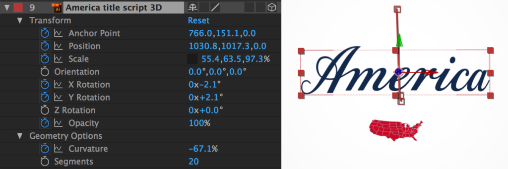
The effect that wrapped the flat America script to create the cylindrical can was accomplished by making the flat title a 3D object and key-framing its curvature and X & Y rotations.
Coda
Creativity happens at the intersection of seemingly disparate domains. In this middle ground new connections are made and something inventive can emerge. I believe that more of the world needs to be folded into data visualization (especially narrative and visual arts) and more data visualization needs to be folded into the world. This project challenged my craft with a novel format, client, and story.
Data storytelling has some things to learn from advertising, there are so many overlaps between the two fields: both combine images and words, both seek to deliver information in a psychologically efficient manner, and both seek to move its audience emotionally and intellectually. I've found Tim Wu's The Attention Merchants and Ogilvy on Advertising to be indispensable. In addition to being a lot of fun, this animation was a fascinating experiment in folding data storytelling into the wider world. I am actively pursuing how to smash more of my craft into new arenas and would appreciate any thoughts you have on the matter.
Behind the scenes: I developed this animation concurrently with a big data mapping project (which I will link to here once it is launched). This interactive map was one of my most technically challenging to date. For it an enormous amount of energy was required to fine-tune data structures for maximum performance - quite a different kind of challenge than developing a looping animation. Playing at both ends of the technical-artistic spectrum helped sharpen why and reinforce how each end is essential. My thoughts are still developing on this, more projects and more reflection soon!
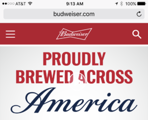
Finally, I was particularly delighted to see the animation take center-stage on Budweiser's homepage. Cause for celebration for sure - Cheers!
Info We Trust is an award-winning ‘data adventure’ exploring how to better humanize information. Data storyteller RJ Andrews is based in San Francisco. Please let me know what you think via Twitter @infowetrust or the contact page.

No comments.